Kibana: Kibana Home - Recently accessed style redesign
This is a design proposal for updating the style of the Recently accessed section of the Kibana Home page. Since we're setting a default to 5 items in the section, the link titles can be eaten up by margins and icons, making the actual content quite difficult to read unless you hover to get a full title tooltip.
Additionally, the more function could be moved down to leave the space for items, but also instead of opening the links in a dropdown, uncollapse the panel to reveal the remaining links. We could set a max to i.e. 9 or 12 links, so we're not pushing down the remaining content, but also keeping what's relevant in the panel.
I've made two variations of the same concept, mostly to test whether we want to apply the extra visual of our app icons in each item.
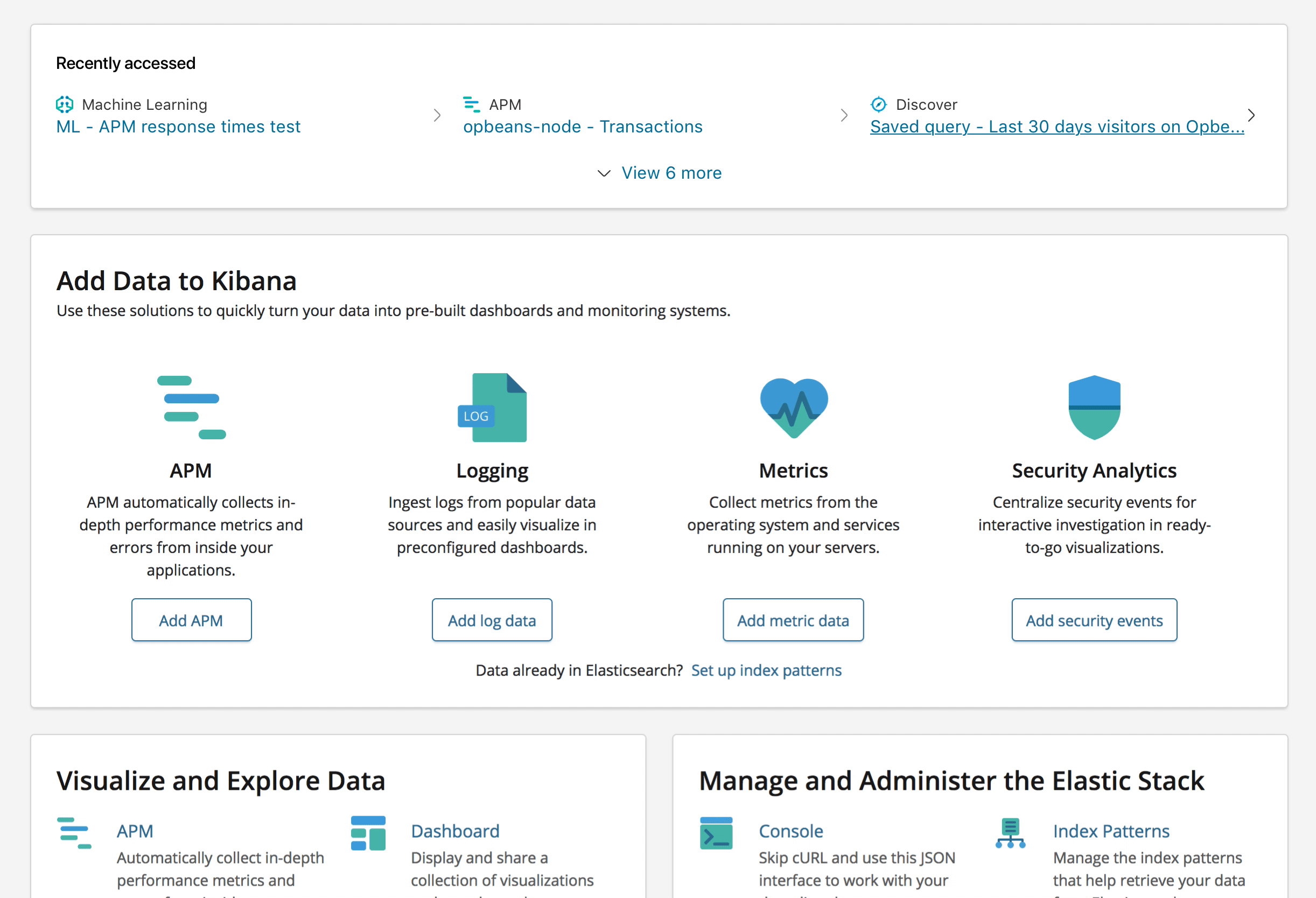
Option 1 - with icons
This version clearly highlights the app icons per link, which can make it easier to decipher by simply recognizing the app first, the link second.
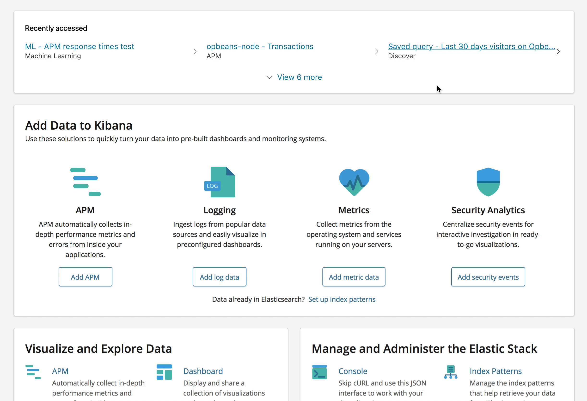
Option 2 - without icons
This simpler version only labels the app, which makes the collection a little less noisy, but also makes everything blur together a little more. Works well enough when you're only viewing the 3 item version, but once you expand the panel, it really gets hairy.
I've created a prototype in InVision to showcase each version - go check it out
I'd also suggest that in either case, we ask that app devs don't include the app name in the link title added to the panel by default. It'd be a lot nicer if we simply added a label reference (with or without icon) that makes it easier for the user to see which app the link is from.
@snide @alexfrancoeur @nreese @cchaos Thoughts on this?
 formgeist
All 9 comments
Looks really nice. I like option 2 the best. Are the icons between the columns even needed?
 nreese
on 18 May 2018
nreese
on 18 May 2018
Without icons gets a vote from me as well
 snide
on 18 May 2018
snide
on 18 May 2018
I think this solution works much better than the current one, even though it reduces the initial visible set to only 3 max.
I too vote for the non-icon version as it puts the name of the object as the prominent piece of info.
I'm a little worried about that right caret though as when I first looked at it, I thought it was a bullet. Meaning, I thought it was connected to the item to the right of it. It might just be a proximity thing and maybe adding more space between the items will help? Or maybe even only showing the caret on hover/focus?
It might also be nice to stylize the more link a little bit. At the moment, it's similarly styled to the rest of the object links though it does something different. Maybe just reducing the font size and not turning the text blue would work?
 cchaos
on 21 May 2018
cchaos
on 21 May 2018
+1 on no icons and and I also agree that the caret may be a bit confusing. I had originally thought it was pointing to element to the right of it. Showing on hover would be a good option but then you lose a separator between the columns. Though I'm not sure this is necessary. Otherwise, this looks great @formgeist! Would be interested in seeing any style changes that @cchaos suggested as well.
 alexfrancoeur
on 21 May 2018
alexfrancoeur
on 21 May 2018
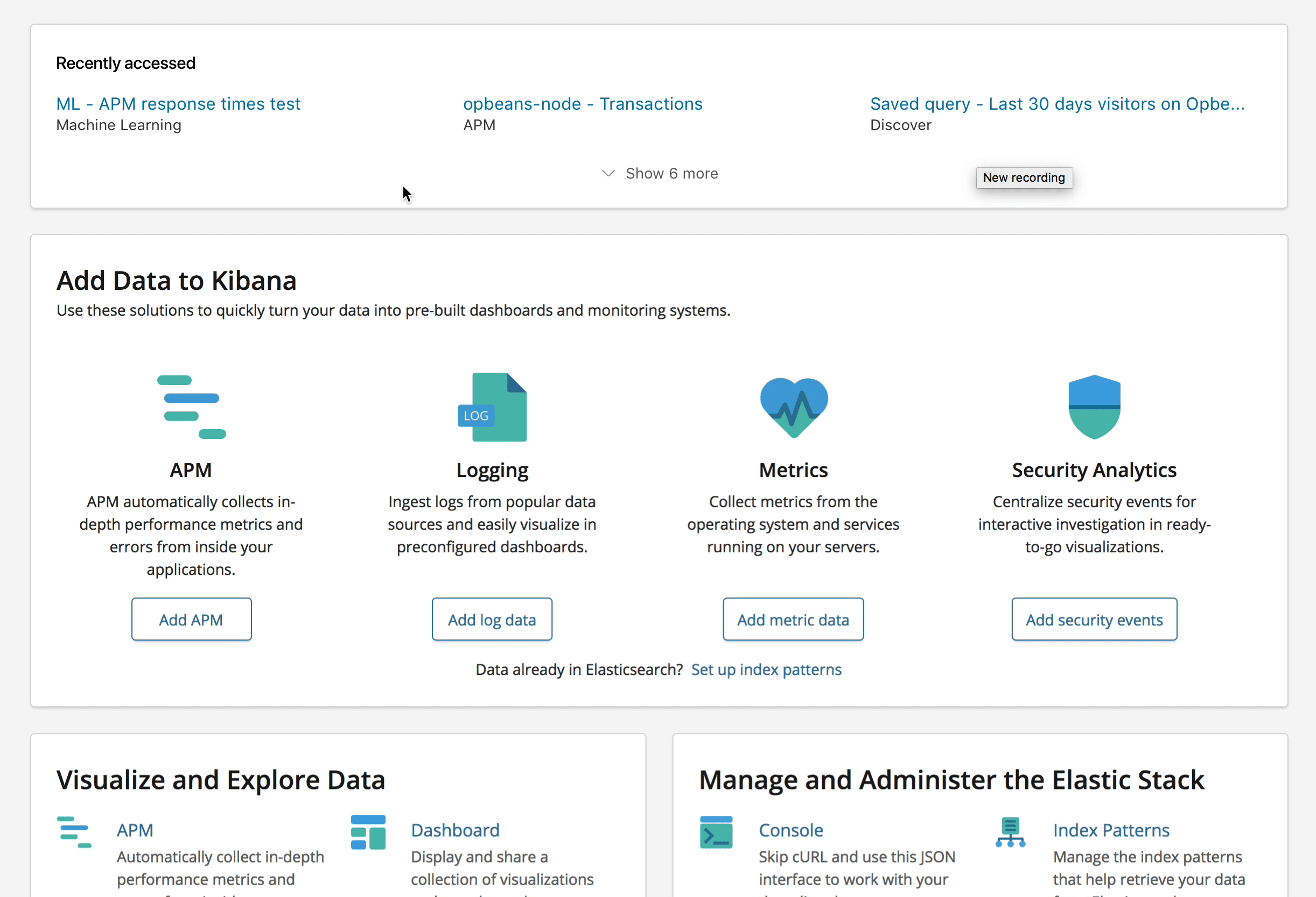
Thanks for the feedback - I've made some style changes to the show more/less option to expand the panel, and changed the caret to only show on hover state. I still think the caret gives the hover state some visual indication that it's moving you from the Home screen to wherever it may take you.
formgeist
on 23 May 2018
LGTM! 👍
cchaos
on 23 May 2018
same, love it. Thanks @formgeist! Now, who can we get to implement this? Would this be design task or should I open a separate issue?
alexfrancoeur
on 23 May 2018
@alexfrancoeur Think it might need more engineering to get the app name label in there, since we don't have it in the current state of the feature.
formgeist
on 24 May 2018
Closing this issue in place of https://github.com/elastic/kibana/issues/23777
Let's talk at EAH.
snide
on 5 Oct 2018
Related issues
 socialmineruser1
·
3Comments
socialmineruser1
·
3Comments
 LukeMathWalker
·
3Comments
LukeMathWalker
·
3Comments
 bradvido
·
3Comments
bradvido
·
3Comments
 timmolter
·
3Comments
timmolter
·
3Comments
 treussart
·
3Comments
treussart
·
3Comments
Most helpful comment
LGTM! 👍