Kibana: [APM] Contextual data tabs redesign
Summary
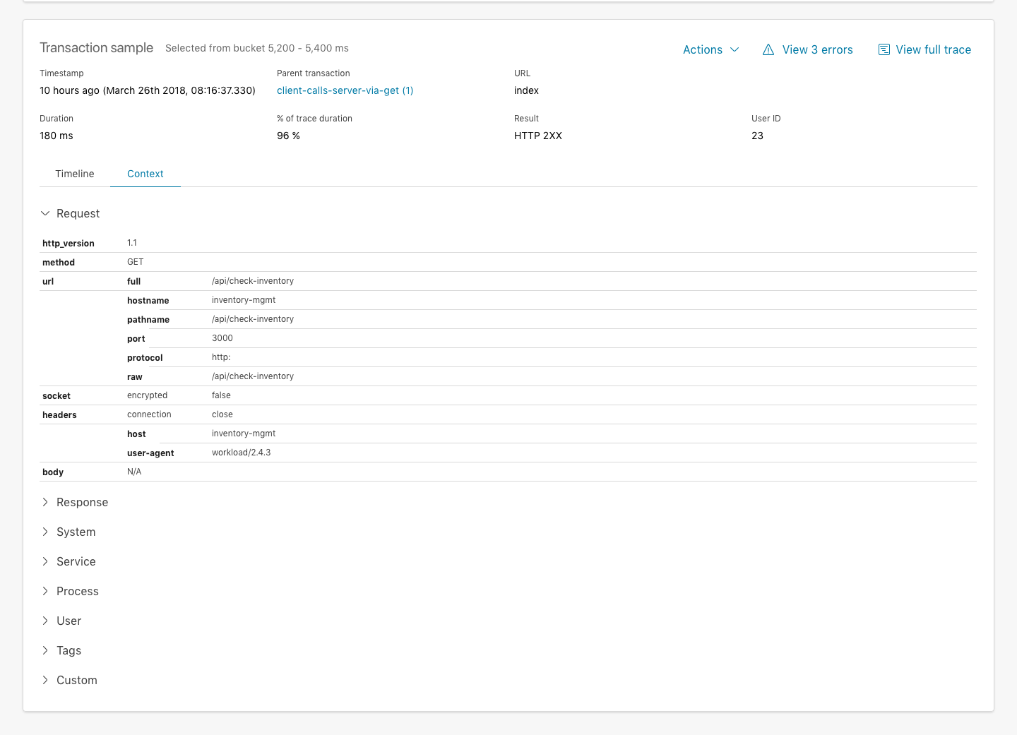
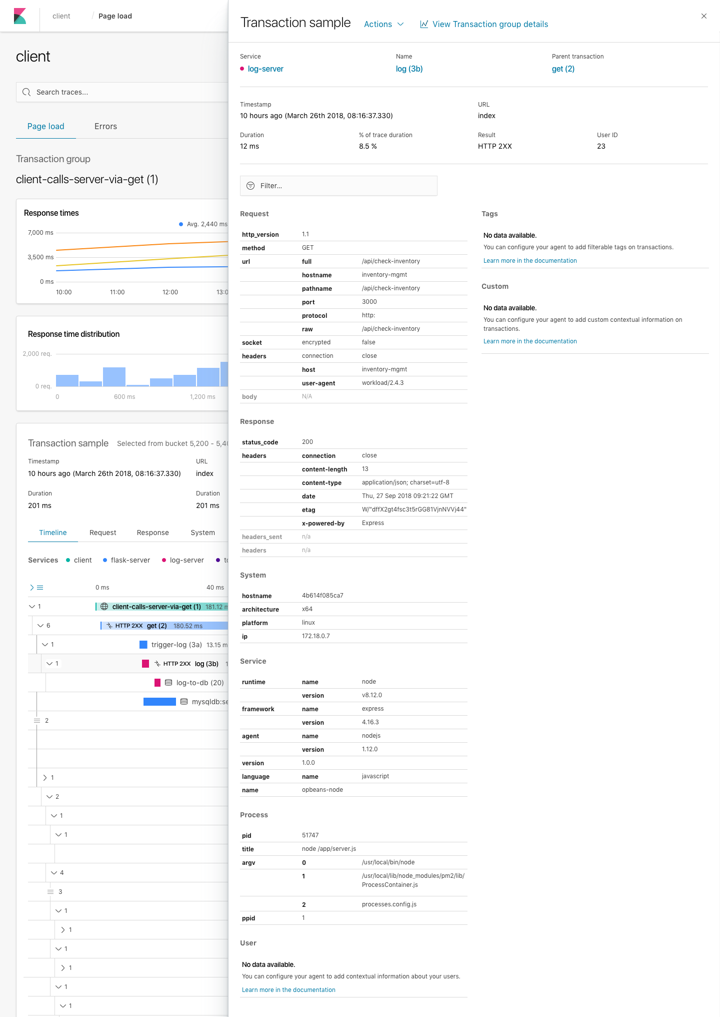
The contextual data design right now consists of many tabs in the transaction and error occurrence view, which could become very difficult to get an overview as an user when we're considering adding even more data to this section.
Designs
Option A - Accordion style
The first option is to combine all tables in one "Context" tab, where each table can be collapsed and expanded in a accordion style master table. It means the user can still focus on a single table at a time, also when navigating to a different sample from the distribution histogram above. It simply presents a more scalable solution instead of showing all tables as horizontal tabs as it's the case today.
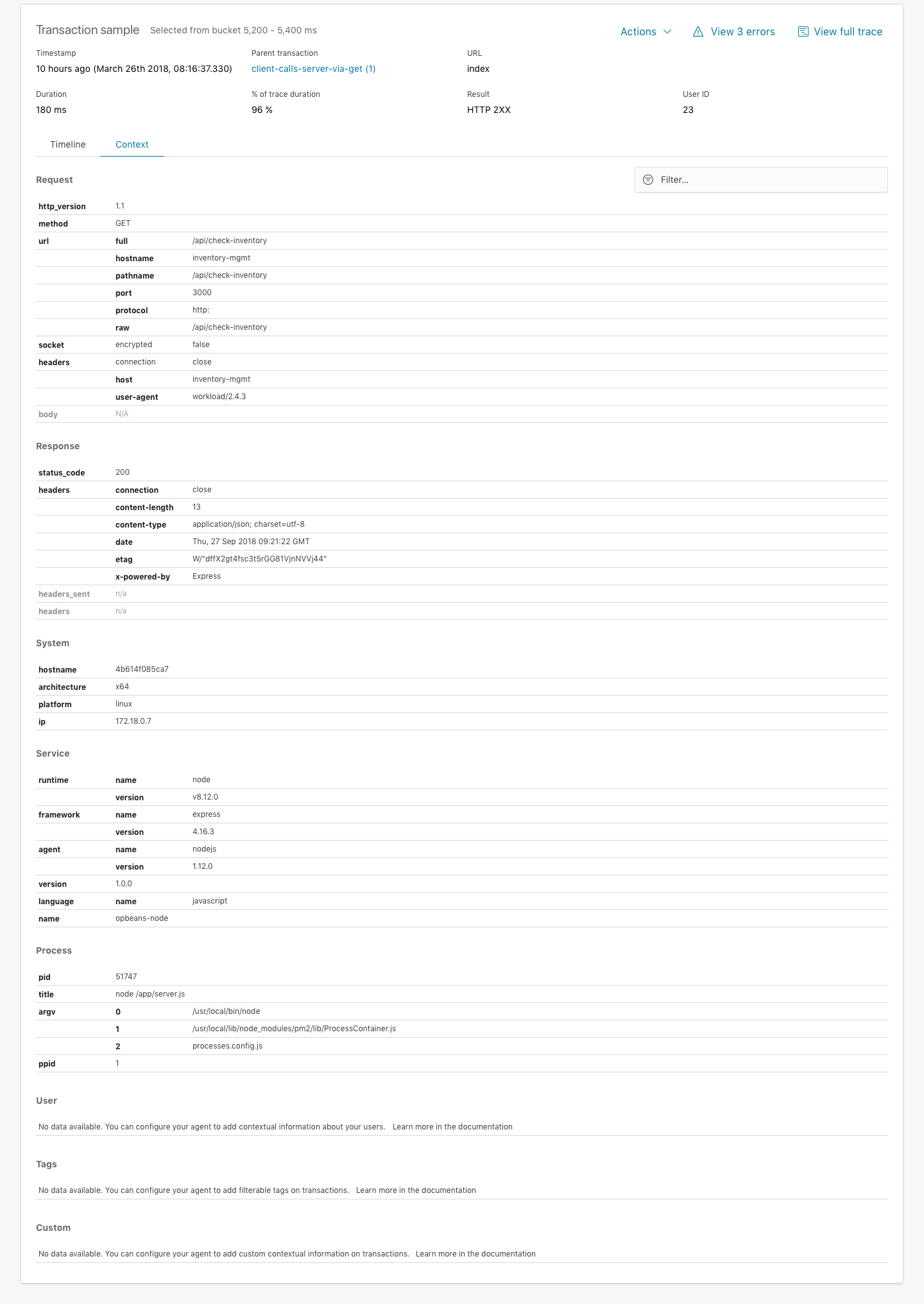
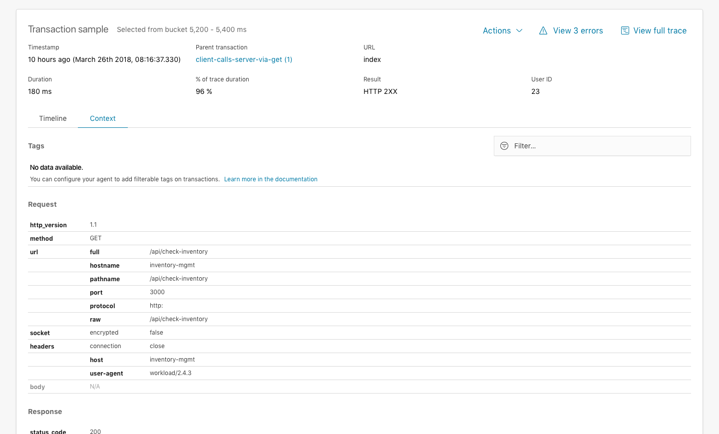
Option B - Show all tables
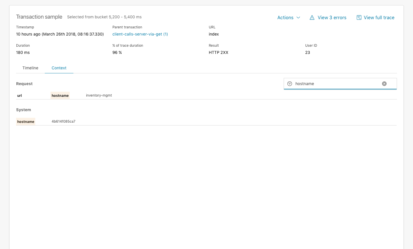
Another option is to simply expand all tables in the Context tab view (not collapse them in accordion style). The benefits here is that all the information is available to the user, not hidden behind collapse/expand functions. Perhaps an added option could be to be able to filter the tables, so you can search for "User" or "host..." if you're investigating a particular problem. And this option perhaps isn't exclusively for this option only, could also be applied to the accordion style.
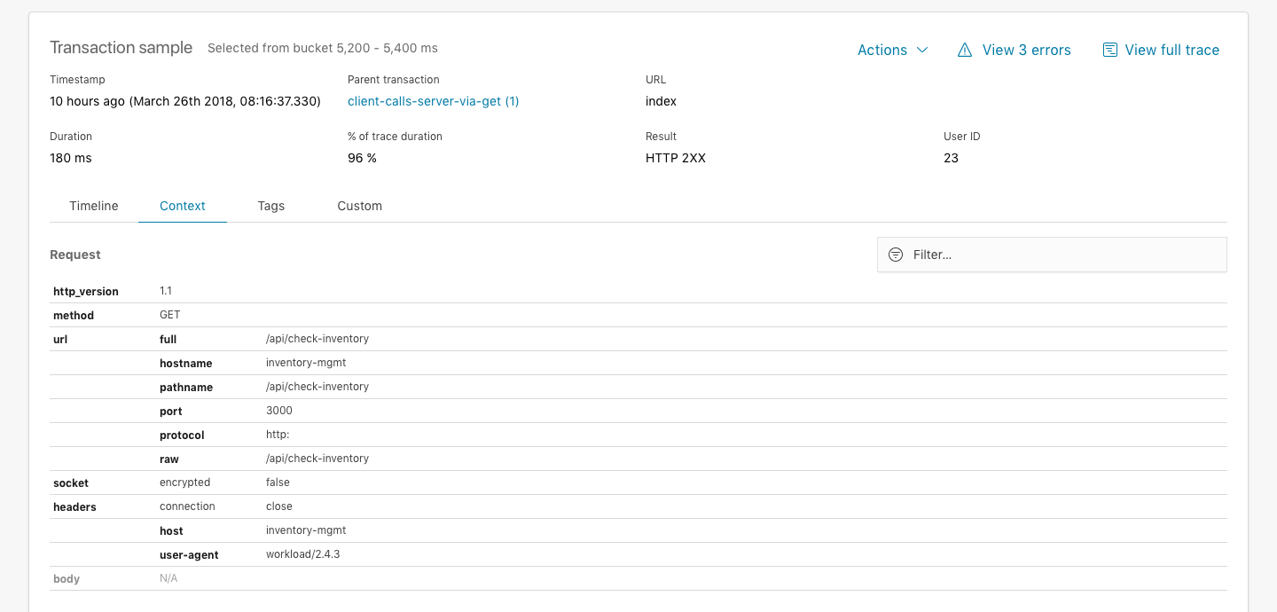
Splitting out customer data (Tags and Custom) to their own tabs
Additionally, I've organized them currently in a single Context tab. We could choose to split out the custom data that the customer might have setup in either Tags or Custom and still have these as separate tabs and tables inside them. That way it's a little bit easier and faster to get to instead of this data always getting buried at the bottom of the tables.
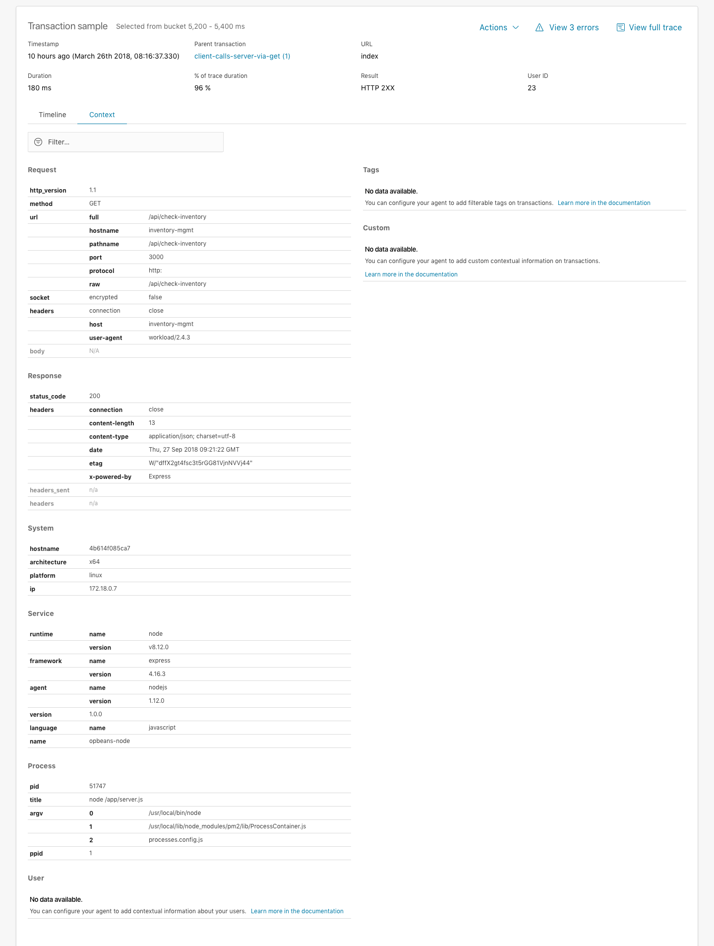
I've not made an example of this in the prototypes, but here's a quick mock of what that might look like.
 formgeist
All 15 comments
Pinging @elastic/apm-ui
 elasticmachine
on 30 Apr 2018
elasticmachine
on 30 Apr 2018
@elastic/apm Would love to hear your opinion on the proposed layout change above, especially keeping in mind we're already discussing how to manage showing context information faster while still keeping custom context information that customer might want to send up separate from what the agent will send up automatically (see https://github.com/elastic/apm-dev/issues/192).
formgeist
on 4 Oct 2018
I really like it! One huge benefit of listing everything in one big honking table IMO: the browser's in-page search works, which I use quite often (and then am frustrated that it doesn't work because the value I'm looking for is unsearchable in a hidden tab).
 beniwohli
on 4 Oct 2018
beniwohli
on 4 Oct 2018
The search issue is a good point, however I prefer tab switches than scrolling...
 eyalkoren
on 4 Oct 2018
eyalkoren
on 4 Oct 2018
I also <3 in-browser searching. So while having everything on one page can be slightly overwhelming, I prefer it.
Would the search filter both keys and values?
 sqren
on 4 Oct 2018
sqren
on 4 Oct 2018
The filter function possibly feels redundant when you have in-browser search, but yeah the idea was you could filter the tables with keys or values. Might look and work better than using the in-browser search, because we can hide the other rows that don't have a match.
formgeist
on 4 Oct 2018
Might look and work better than using the in-browser search, because we can hide the other rows that don't have a match
True, that's nice. Also if the user clicks through the histogram buckets, and are looking for something specific, we can keep the search query, which makes the filter experience much better.
sqren
on 4 Oct 2018
I like it 👍
Another benefit of the one page approach is that we're no longer limited by the width of the page, so it's gonna be easier for us to add new groups to the Context pane in the future.
I do like your idea of splitting out tags and custom separate from the Context tab though 🤔
 watson
on 4 Oct 2018
watson
on 4 Oct 2018
Thanks for the feedback, really appreciate it. I think I'm leaning towards Option B with the added change that we split out the Tags and Custom to separate tabs.
formgeist
on 4 Oct 2018
If Custom and Tags are in their own tabs, don't we lose the benefit of the browser search? Taking a step back, the problem we're trying to solve is discoverability of contextual information as the amount of data increases?
Is it an option to have a single tab, but have two columns? Custom/Tags in the right column. Filter box in the top, which filter sticks as you browse samples.
 makwarth
on 7 Oct 2018
makwarth
on 7 Oct 2018
Here's an example of splitting the tables into two main columns, putting Tags and Custom at the top of the second column for increased discoverability. I'm not sure how well this will fare if the screensize is small, since the columns become quite condensed - especially in the transaction flyout view. Another concern is when you filter, you expect the other values to disappear (we're not just highlighting, you can use the browser search for that); what happens if you filter for a tag and the entire left column is hidden.
In my opinion a one tab full table approach is probably the way to go, but there's a challenge of discoverability of tags especially which might be close to the customer. Does it make sense to re-arrange the tables so Tags is put at the top?
formgeist
on 19 Oct 2018
I think _Tabs On Top_ is a good idea. My guess is there'll seldomly be that many but if they are there, you'll probably always want to be aware of them.
Looks good Casper!
 mikker
on 19 Oct 2018
mikker
on 19 Oct 2018
Yeah, I think you're right about the 1 column layout. I like the idea of putting Tags on top. It's important that the filter is persistent across route changes.
makwarth
on 19 Oct 2018
👍 Putting Tags on top
👉 Showing filtered results
I've updated the InVision prototype so you can check it out for yourselves. Filtered interactions works on Transaction view, flyout and Error occurrence 👍
formgeist
on 19 Oct 2018
I feel there's enough of a consensus across the team to move ahead with this unification of the context tabs with the aforementioned changes (putting Tags on the top). I've created the relevant implementation issues so we can move into development https://github.com/elastic/kibana/issues/24648
formgeist
on 26 Oct 2018
Related issues
 MaartenUreel
·
3Comments
MaartenUreel
·
3Comments
 ctindel
·
3Comments
ctindel
·
3Comments
 stacey-gammon
·
3Comments
stacey-gammon
·
3Comments
 tbragin
·
3Comments
tbragin
·
3Comments
 ynux
·
3Comments
ynux
·
3Comments
Most helpful comment
True, that's nice. Also if the user clicks through the histogram buckets, and are looking for something specific, we can keep the search query, which makes the filter experience much better.