Kibana: [Kibana Home] Formatting of Recently Viewed Objects
For objects with long names the formatting seems a bit off for the new recently viewed section in Kibana Home.
Specifically, we're concerned with how beats modules that have a prefix in the object name are surfaced. If you look at the screenshot below, only the prefix is shown.

When forcing 5 objects, we are formatting the number of characters shown differently as well. What if we didn't force 5 objects?
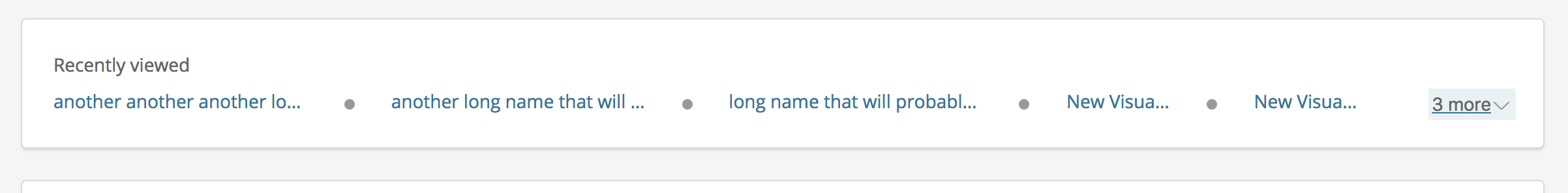
I feel like this could really effect the experience of this feature. Especially given the fact that we are guiding new users to use modules within the UI now. Are there any improvements we can make from either a design perspective or how we dynamically show these? If we increased the max characters and dynamically decided the number of links shown a bit differently, would that help?
cc: @nreese @cchaos @formgeist @snide
 alexfrancoeur
All 11 comments
@alexfrancoeur I agree the varying widths and the constant truncation due to lack of space on the horizontal line, doesn't make for a great reading nor user experience. Since this is set to go out in the next release, perhaps it's not the time to make a big redesign of the component, but we could discuss a few ways to work around the space restraints. We have a design weekly today, so I'd like to raise this with @snide @cchaos and the others.
 formgeist
on 12 Apr 2018
formgeist
on 12 Apr 2018
@formgeist sounds good. I agree that this isn't the time for a large redesign but was hoping we could find ways to make the spacing a bit more dynamic. I'd be interested in hearing if any creative solutions come out of the discussion
alexfrancoeur
on 12 Apr 2018
@alexfrancoeur Spoke to the design team and we can some quick fixes to the current design that will make some difference to the experience;
- Add a tooltip on hover to display the full link title when it's truncated
- Investigate the dynamic truncation, seems like something's messing up
- The separating icon feels too heavy visually, so we'll look into replacing it or at least finding a lighter shade
I'd also like to make a quick mock up of some style changes that could display each item in a cleaner way, and possibly change the way we hide/show more items by not using a dropdown, but expanding the entire element down. I'll get back with a sketch of how that might look and I can talk to @snide or @cchaos how to implement it, but probably not in time for release.
formgeist
on 12 Apr 2018
So I tried to quickly add tooltips in here. Unfortunately since we're doing the truncation in CSS there's no way for me to know when an item is being truncated, so the tooltip would need to show on every item.
Looking at the logic for the truncation it looks to be pretty good to me. I think it's more a problem of stuff so much in the layout and it just needs some more design work (as @formgeist mentions).
Anyways, if this seems better for a shorterm solution lemme know and I can put up a quick PR.

 snide
on 12 Apr 2018
snide
on 12 Apr 2018
Hmm it is a bit odd having the tooltip for urls that don't need it, but on the flip side it's extremely beneficial for the longer names. Honestly, this experience is no different than hovering on the Kibana navigation today. Not ideal, but I haven't heard any complaints. Would it be possible to do the truncation outside of CSS? Might not be worth the effort in the short term. If not, I feel like blindly adding a tooltip is better than nothing. Would honestly be kind of cool to augment the tooltip with the saved object type somehow if it's possible. Dashboard, viz, etc. At least then it provides some additional value.
Separately, we may also have some wiggle room with spacing in between the url's and icons.
alexfrancoeur
on 13 Apr 2018
@snide were we able to get the tooltips into 6.3 or did we miss the boat now?
alexfrancoeur
on 23 Apr 2018
No tooltips appearing in 6.3.0 BC2.
In addition, the resizing appears to be not working (found in Chrome).

 sophiec20
on 2 May 2018
sophiec20
on 2 May 2018
@Stacey-Gammon @nreese sounds like this is actually a bug then. Can we resolve the resizing issue and introduce tooltips?
@formgeist @snide do we want to open another design issue to track enhancements to the design? I recall a mockup but can't seem to find it.
alexfrancoeur
on 2 May 2018
I have a PR up that adds tooltips and allows the "more" button to wrap.
Is this considered a blocker and should go into 6.3?
 nreese
on 2 May 2018
nreese
on 2 May 2018
That's a good question. I think it dramatically improves the UX and resolves a UI flaw that @sophiec20 pointed out. What do you think @epixa?
alexfrancoeur
on 2 May 2018
We can't just treat functionality we're not happy with as a bug. The UI of the feature is working as we intended it to work, it's just not flexible enough for our needs. Improving that is an enhancement and should go into a minor, which means it's also not a blocker.
The broken more link is a bug, for sure. I don't know if I'd consider it a blocker necessarily, but it's worthy of fixing in a patch, so let's fix it in the 6.3 branch. We're likely going to have more respins of 6.3.0 anyway, so if we get the change in now, I'd be surprised if it didn't end up going out.
 epixa
on 3 May 2018
epixa
on 3 May 2018
Related issues
 timroes
·
3Comments
timroes
·
3Comments
 mark54g
·
3Comments
mark54g
·
3Comments
 LukeMathWalker
·
3Comments
LukeMathWalker
·
3Comments
 celesteking
·
3Comments
celesteking
·
3Comments
 stacey-gammon
·
3Comments
stacey-gammon
·
3Comments
Most helpful comment
I have a PR up that adds tooltips and allows the "more" button to wrap.
Is this considered a blocker and should go into 6.3?