Kibana: The smallest visualization box inside a dashboard is yet too large
Kibana version: 5.5.1
Browser version: Chrome 59.0.3071.115
Browser OS version: Windows 7 x64
Original install method (e.g. download page, yum, from source, etc.): zip
Description of the problem including expected versus actual behavior:
Steps to reproduce:
- create several Metric visualizations of type Count. It can be the same metric for the same field in several visualizations
- for these visualizations, un-check
Show Labelsoption - for these visualizations, at Style section decrease the font size to the smallest one (12pt)
- try to arrange the visualizations created in a new dashboard similar (not necessarily the same) to
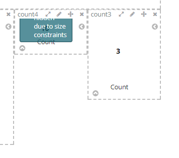
Even if the text inside the visualization is small enough to be visible and to easily fit a smaller visualization box, the smallest area for the visualization is still too large. If I try to make the box smaller I am getting Some labels were hidden due to size constraints even if I don't see why it cannot be smaller.
 astefan
All 7 comments
See #13242. This is in progress.
 ppisljar
on 22 Aug 2017
ppisljar
on 22 Aug 2017
@ppisljar @astefan Hmm, since upgrading to 5.6, it seems small visualisations 'less beautiful', certainly on dark themed dashboards. Check this:
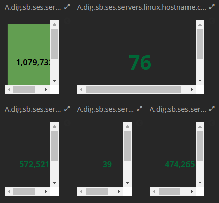
The scrollbars:
- shouldn't be there
- if they really have to be there, at least in dark theme, they should look blackish?
Will this be solved by #13242 too? Is this for Kibana 6?
 willemdh
on 15 Sep 2017
willemdh
on 15 Sep 2017
I can confirm @willemdh problem,
previously I scale all the visualizations on my dashboards to make them fit without any scrollbars etc, with latest 5.6.1 version rollout I discover dramatic situation with gauge type - metric visualizations on dashboards, like in this example:
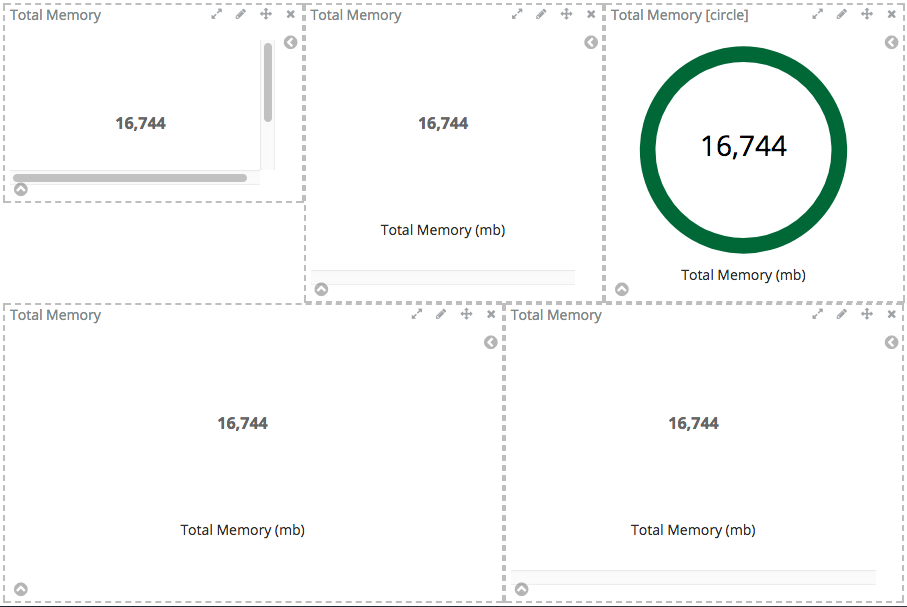
So problem can be summarized as:
new CSS styles in v.5.6 for metric visualization(gauge type - arc/circle) dramatically increase the minimal size of metric (gauge type: metric) on the dashboard.
Problem looks like resolved in upcoming 6.0 release (tested on 6.0.0-beta2)
 v01t
on 21 Sep 2017
v01t
on 21 Sep 2017
same issue, any patches?
 funkydorian
on 2 Nov 2017
funkydorian
on 2 Nov 2017
closing in favour of #13947 (duplicate)
ppisljar
on 17 Nov 2017
Why is this closed ? The issue still persists. The minimum size of the metric is too large. There is no way you can reduce size of the metric. If we do, the we get message like "some labels were hidden due to size constraints" Also the scaling size of each step is too large. For eg: in the original poster screenshot, count4 is the first step of scaling and count5 is the next size available. I cannot size the metric greater than count4 and lesser than count5
 realtabmj
on 27 Mar 2018
realtabmj
on 27 Mar 2018
Imho there should be an autosize option which more or less automatically sizes the content of a box to the maximum size without creating vertical / horizontal scrollbars..
willemdh
on 28 Mar 2018
Related issues
 ctindel
·
3Comments
ctindel
·
3Comments
 bhavyarm
·
3Comments
bhavyarm
·
3Comments
 stacey-gammon
·
3Comments
stacey-gammon
·
3Comments
 snide
·
3Comments
snide
·
3Comments
 bradvido
·
3Comments
bradvido
·
3Comments
Most helpful comment
Why is this closed ? The issue still persists. The minimum size of the metric is too large. There is no way you can reduce size of the metric. If we do, the we get message like "some labels were hidden due to size constraints" Also the scaling size of each step is too large. For eg: in the original poster screenshot, count4 is the first step of scaling and count5 is the next size available. I cannot size the metric greater than count4 and lesser than count5