Kiali: Creation of Istio configuration using a GUI instead of YAML text.
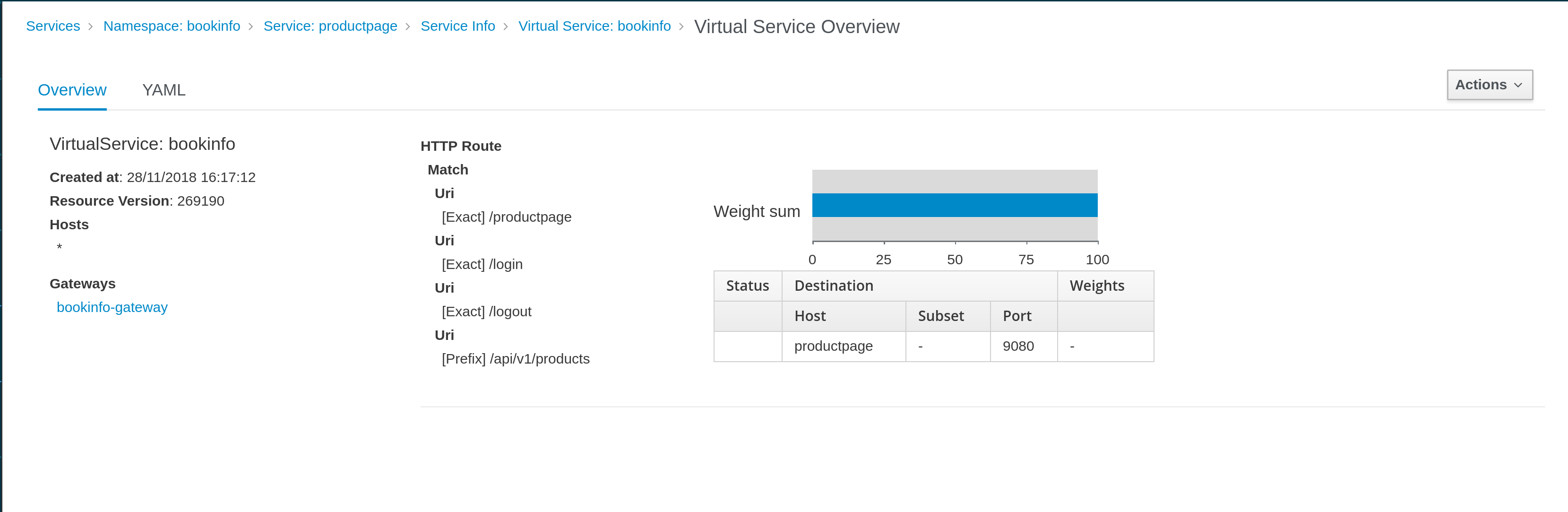
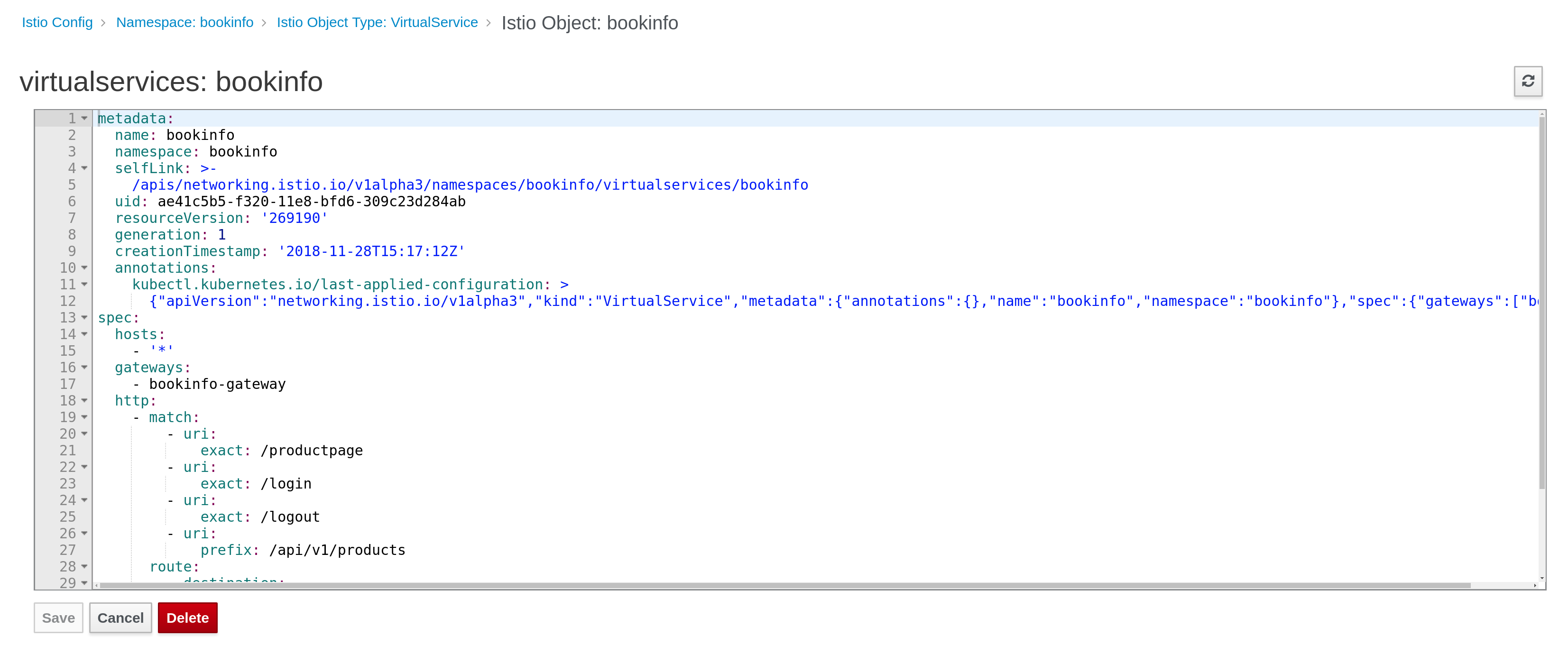
Today Kiali can present Istio configuration using GUI style (in VirtualServices and DestinationRules linked with a Service) or using its YAML representation.
GUI style for a VirtualService linked with a Service:
YAML representation of a VirtualService:
We have started to support "write" operations (delete, update existing configuration from a YAML editor).
Now we want to start adding new objects using a well driven GUI design.
The main requeriments defined in [1] are
Minimum Viable Product: We provide a GUI for doing A/B traffic balancing between two versions of a service. (Possibly having a slider between two versions).
Advanced: We identify the the top five features and provide an in browser workflow aiding the user the feature’s configuration (e.g. for configuring traffic routing we query and return the list of “subsets” as a drop down and ensure all weights add up to 100%).
More suggestions for use cases:
Traffic Routing
Path based routing configuration
Header based routing
Response code routing
Canary Release
Ideal: Users can configure any/all features via a web browser via a guided workflow (without using a YAML editor).
The model used in Istio to implement these use cases are:
- VirtualService object [2]
- DestinationRule object [3]
Probably we may need to use others model, but I think to start defining some work we can start thinking in configurations that need these two objects.
Some questions to discuss:
Where a user can invoke a "create new configuration" operation ?
It seems logical that user may have a button/link to access to this operation from Graph, Service Details or even any of the Service / Istio Config list pages we have.
Also there is a proposal to provide a shortcut for this operation from the graph in
https://issues.jboss.org/browse/KIALI-1962
What operation is going to be performed by the user ?
One aspect not yet discussed is if user will use this GUI to create only or create and update.
This is important, because, if we support update another side scenario is how to map existing configurations to the GUI. (What happens if GUI doesn't support all potential configuration of a VS / DR).
How do we want to perform this operation?
I see two types of approaches: "context driven", where a GUI is asking high level questions to a user and as result configuration is created in a transparent way to the user, versus "form driven" where the VirtualService/DestinationRule models are mapped into a form.
I understand that we are in an agreement to follow a "context driven" approach.
So, some examples based in Istio bookinfo demo:
Example 1:
- Select reviews service (from graph, or service list, or service details).
- Click in "create" operation (button/link ?).
- Select type of operation: "A/B" ?
- Define graphically percentage of traffic between workloads identified for a service ?
Example 2:
- Select productpage service (from graph, or service list, or service details).
- Click in "create" operation (button/link ?).
- Select type of operation: "Matching routing" ?
- Define a filter and a route: "All traffic from region1 goes to productpage version1".
- Define a filter and a route: "All traffic from region2 goes to productpage version2".
From here we can work and ellaborate more examples or provide more details but I hope we have enough context to start discussing the relevant UX aspect to work on this issue.
Thanks,
Lucas
[1] https://issues.jboss.org/browse/KIALI-1836
[2] https://istio.io/docs/reference/config/istio.networking.v1alpha3/#VirtualService
[3] https://istio.io/docs/reference/config/istio.networking.v1alpha3/#DestinationRule
 lucasponce
All 39 comments
@serenamarie125 @cshinn @brianredbeard this is a big topic we need to discuss :)
@lucasponce I see you wrote "I understand that we are in an agreement to follow a "context driven" approach." - I think I missed that part - when/who agreed on this?
Also, I think that if we introduce nice UI for configuration additions, we should introduce it for edit as well at least for some cases. For example changing traffic balancing between versions of service (the slider).
 abonas
on 29 Nov 2018
abonas
on 29 Nov 2018
@lucasponce I see you wrote "I understand that we are in an agreement to follow a "context driven" approach." - I think I missed that part - when/who agreed on this?
In the description of [1], and [2], and in the discussions had with @theute @pilhuhn and rest of the team on calls and IRC is clear we want to focus more on "context driven" scenario rather than having a generic form to create a VS/DR object. I understood that.
Even the MVP description has implicit context, as to route traffic between versions you need first to define which is a version in a DR (a version can be defined with more than simple labelling) and reuse this information in a VS where we can show all options defined.
I assume that we want to drive user in a high level scenario rather than write a low level config but from a form.
That is what I mean by "context" here.
Also, I think that if we introduce nice UI for configuration additions, we should introduce it for edit as well at least for some cases. For example changing traffic balancing between versions of service (the slider).
Yes. It needs some definition work as I see several sync issues, as we won't control that a config is modified externally from Kiali, it should take into consideration how this will work. If slider is just a GUI way to introduce a % graphically instead that uses number, it will work, but when a config has more options that GUI will support, user should have this clear (i.e. user can modify percentage via GUI, but for more complex they need to use yaml editor, etc).
In anyway, these are the interesting content to discuss.
I remember @serenamarie125 drove a workshop with users where they started to define some use cases, so probably we have already some feedback about this.
[1] https://issues.jboss.org/browse/KIALI-1836
[2] https://issues.jboss.org/browse/KIALI-1962
lucasponce
on 30 Nov 2018
I think since this is driving towards an MVP it's completely fine to say (for the time being) "we only are supporting create operations". It could also be possible to solve the "edit" mechanism by using patch to update the object. Then, in the event that there configurations unsupported in the GUI they _may_ be able to be ignored.
@abonas What are the key areas that have identified that we need to cover to continue work towards a MVP?
 brianredbeard
on 6 Dec 2018
brianredbeard
on 6 Dec 2018
@abonas I think the "context driven" refers to my desire to have a context menu on graph element (if possible) to trigger such actions as opposed to force the user to first go to the list of services (or whatever), select something that the user no longer remembers (because we left the graph) and then starts to set up new rules without having the context.
 pilhuhn
on 7 Dec 2018
pilhuhn
on 7 Dec 2018
@abonas What are the key areas that have identified that we need to cover to continue work towards a MVP?
@brianredbeard that's the input we would like to get from you :)
abonas
on 9 Dec 2018
@abonas To follow up on this, what additional questions do you have for me which in regards to the two examples outlined in the first post in this thread?
Rather than trying to solve for two many cases, we called out two examples cited above. Which additional questions can I answer to make the next steps more clear?
brianredbeard
on 3 Jan 2019
Ok, I think we can focus on Sprint 17 on the two first examples, and in next iterations we can improve them.
Some specific UX questions to start in the right direction:
- What is the generic recomendation Wizard ? We can follow patternfly for this https://www.patternfly.org/pattern-library/communication/wizard/ (Wizard guided by steps) ?
In that case steps for our first example can be:
- Step 1: Select the namespace/service (this can be prefilled if wizard has been invoked from graph/service details link).
- Step 2: Versions available for this service will be shown and user can select the % of the traffic with a slider component or similar.
When Wizard is complete, a pair of VS/DR should be defined with a basic traffic route.
I can prototype these steps but some UX guidance would help here.
From here we can add more use cases, like add "matching routing" scenarios, but I think to not add more complexity to this discussion we can focus on the example described for this Sprint.
So, from UX we would like to have some feedback about this scenario.
Is that ok to everyone ?
lucasponce
on 14 Jan 2019
@cshinn I am going to start some PoC, as commented, some general guideline about wizard/forms style is most welcome.
I'm going to use the standard patternfly 3 recommendations for the PoC that we can change in next steps.
lucasponce
on 16 Jan 2019
Some WIP on this:
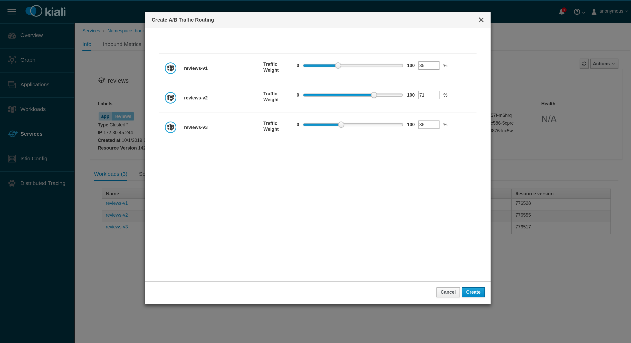
This would cover the scenario proposed for MVP, and from here we can add additional cappabilities.
lucasponce
on 17 Jan 2019
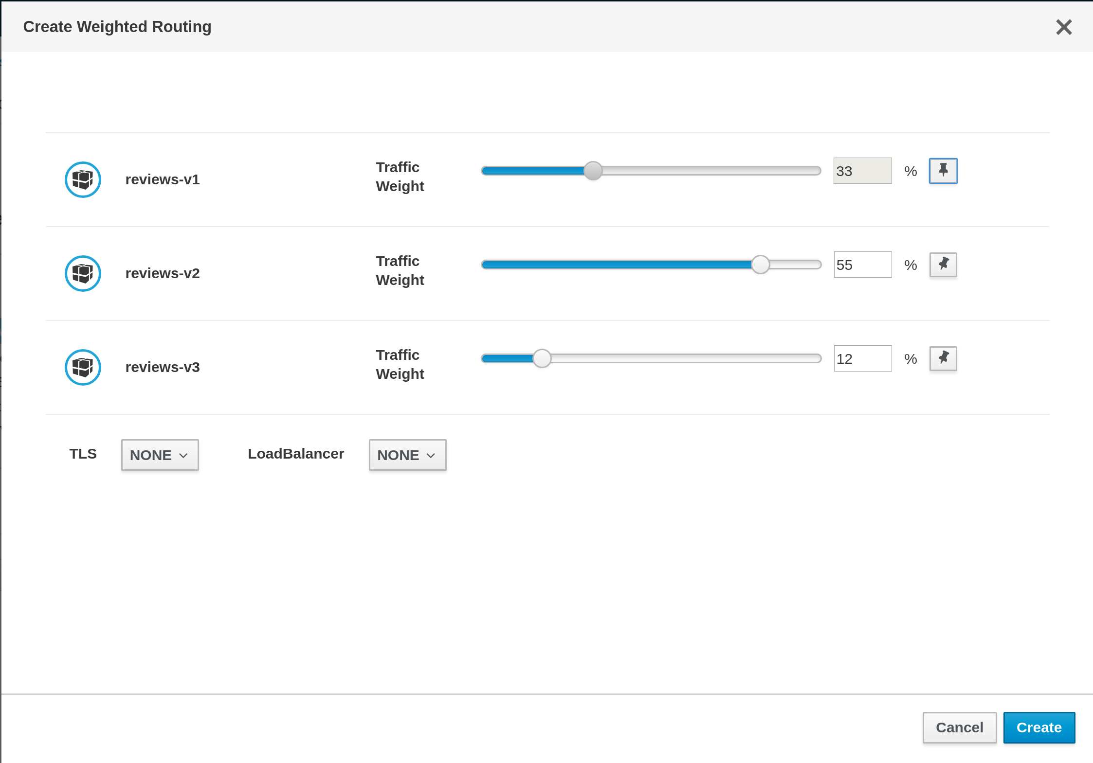
@lucasponce I have a few comments:
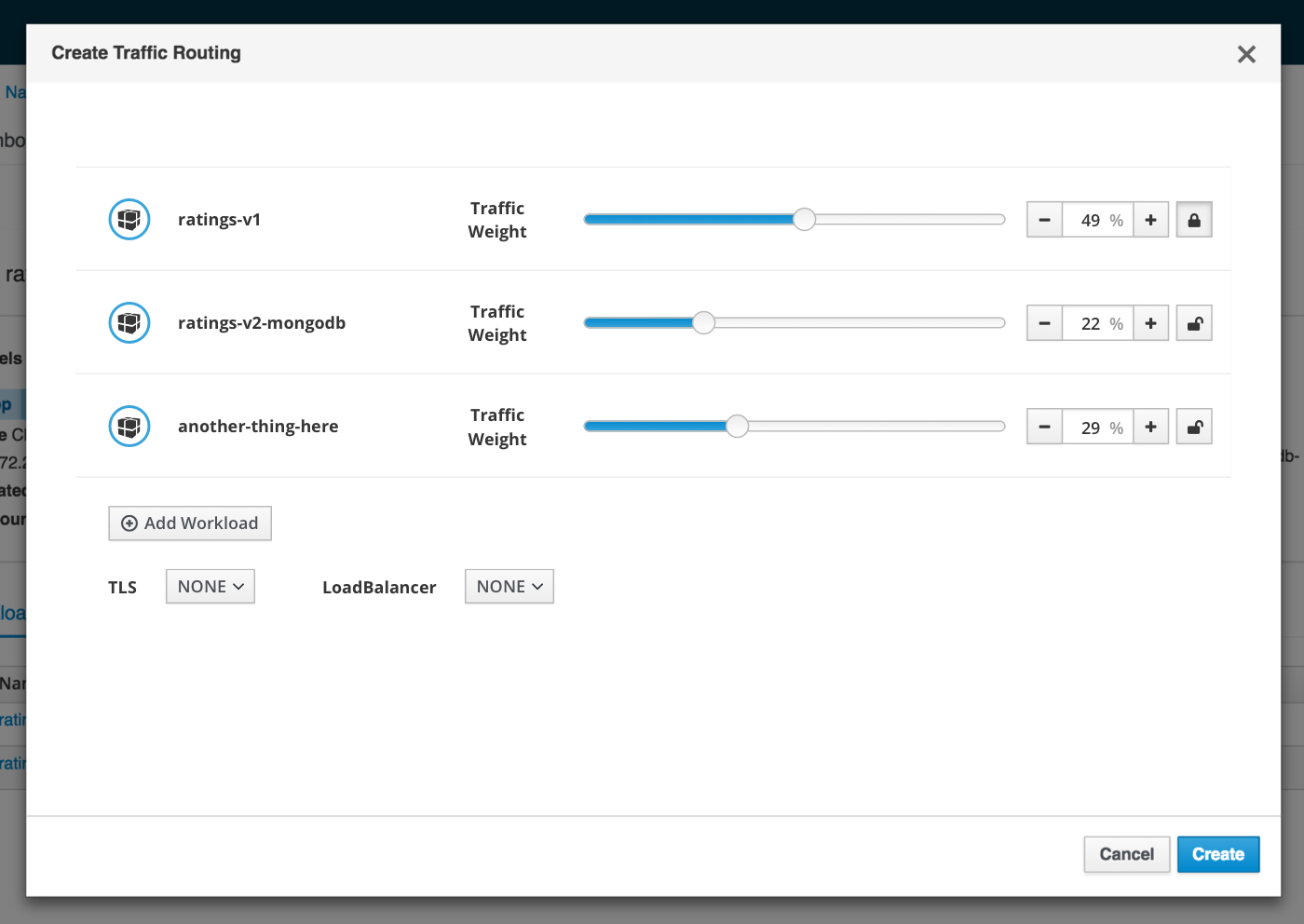
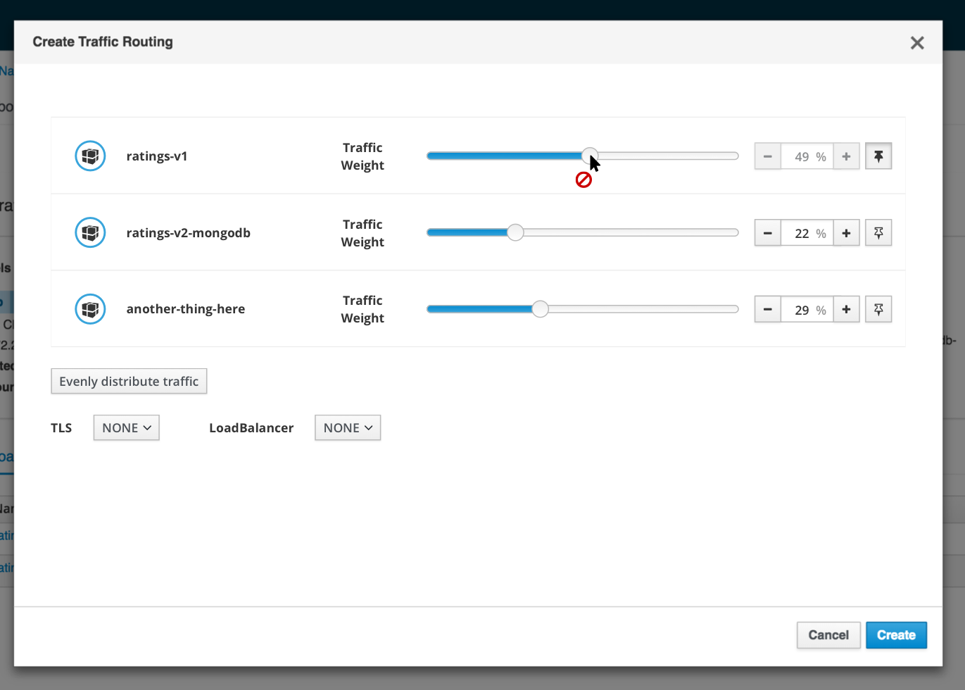
- maybe a nit or a really super early draft, but I want to make sure: A/B testing is typically about 2 compared environments/services. in the example above there are 3 :).
- in the above example there are 3 services that should split the traffic of 100%. each looks like it's measured against 100%, but not against each other - this still makes the users doing the calculations themselves looking constantly through all 3 rows. I'm not sure this is very user friendly.
- related to item 2 -the 3 services' traffic sum to more than 100% but there is no indication about that.
- I'm not sure what is the benefit of the slider in the above proposal, it seems easier just to type in the number. Typically sliders are more convenient when a not precise value is needed, and they are also more problematic from accessibility aspects.
But I really want to leave this to UX experts :)
@cshinn @serenamarie125
abonas
on 20 Jan 2019
I think this is a WIP and Lucas is adressing items 2+3 as we speak.
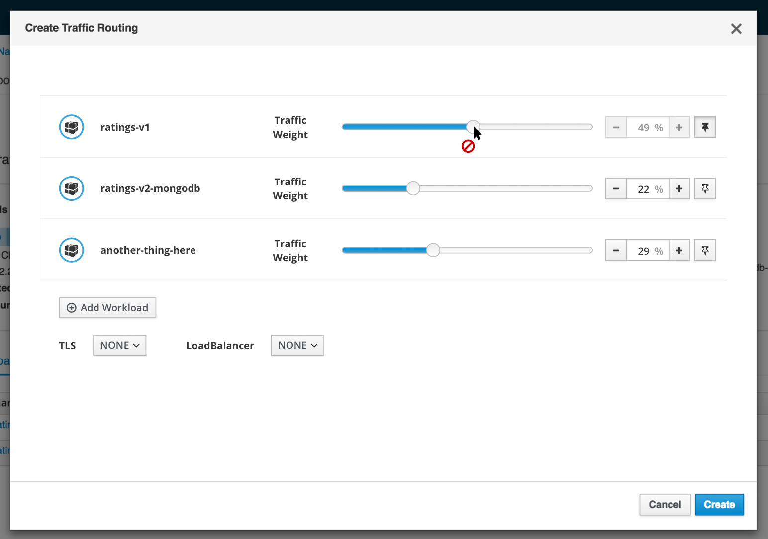
For 1: if you don't look at reviews, but at ratings, the A/B case should be covered (and then the sliders magically make a lot more sense, because %(v1) = 100-%(v2).
Let's continue with this as is until we have something working, so that it is much easier to play with / understand.
pilhuhn
on 21 Jan 2019
@lucasponce @abonas after seeing the demo of this, I feel that looking into other controls for the traffic weight would be beneficial - the slider component could quickly become too complicated with 2+ items. @bmignano and I can do some initial research on other ways of controlling this and make suggestions for you
 maryshak1996
on 4 Feb 2019
maryshak1996
on 4 Feb 2019
@maryshak1996 @bmignano thanks.
As discussed, my main concern is how to group more than one "rule".
On the demo a group of workloads (with its sliders for weight) can be read as a "rule" for traffic routing.
i.e. "All requests" should target to w1 %50, w2 %25 and w3 %25.
In our next iteration we are going to add more "rules".
i.e. "Requests where header == abc" will target to w1 %50, w2 %25 and w3 %25.
"Rest of Requests" will target w1 %100
Note, this is something that actually is represented in VS page:
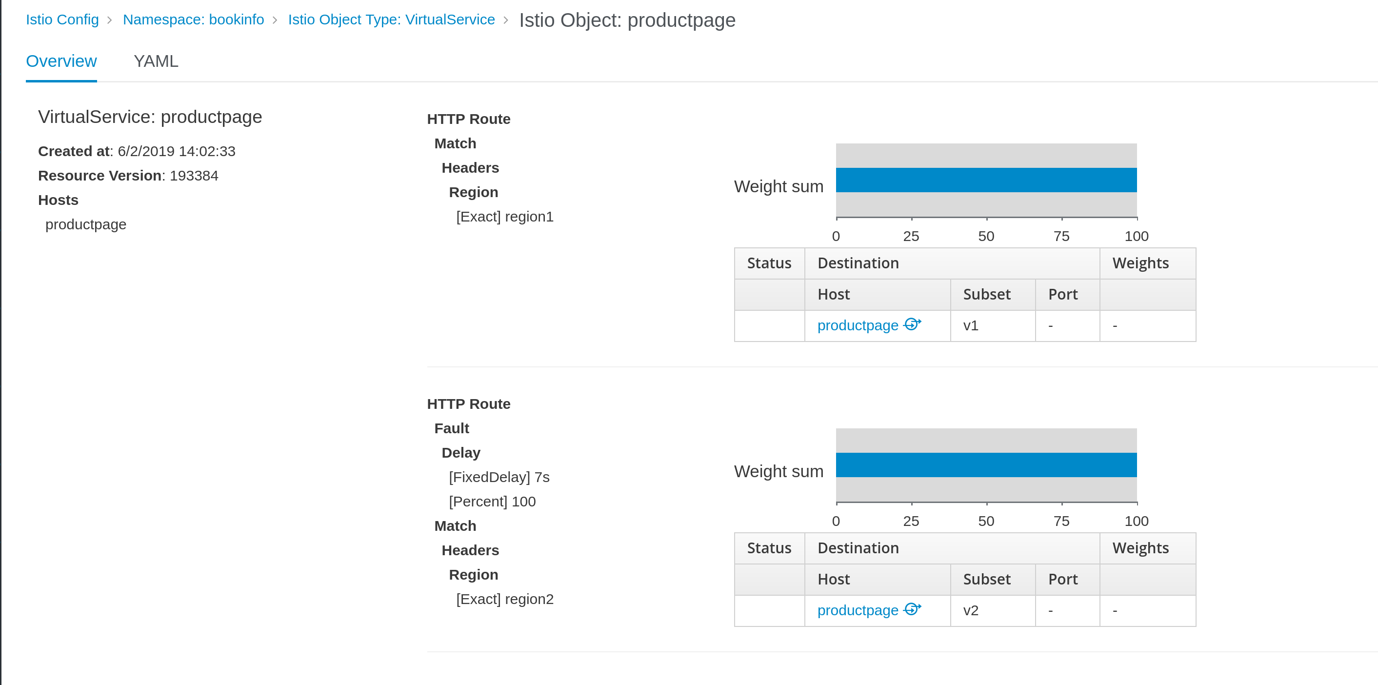
So, the idea is to include these use cases in the Wizard.
lucasponce
on 6 Feb 2019
@maryshak1996 FYI, the scope of this work was defined as an MVP.
While it may require more complexity over time it would likely be best to wait until we get more direct requirements around this and feedback around the feature before we make too many assumptions. In an operational environment, I'm unlikely to try and split traffic between too many endpoints because then it reduces the ability to test functionality between versions.
brianredbeard
on 9 Feb 2019
@brianredbeard can you clarify your comment above? Are you saying that for MVP, the UI only needs to be able to split traffic between endpoints?
 serenamarie125
on 11 Feb 2019
serenamarie125
on 11 Feb 2019
@brianredbeard @serenamarie125 I think there are some mix here.
One aspect is the feature we want to implement, and once the scope of the feature is clear, next step is to work together with designers on the UI.
The scope of the feature and this work is defined in https://issues.jboss.org/browse/KIALI-1836 and also there was a proposal of meeting to discuss it.
There was an email about it on Nov 29th and last email about it was in Dec 13rd.
So, let's move the discussion on the feature in the JIRA and let's use the kiali-design issue to clarify the UI aspects of the work.
lucasponce
on 11 Feb 2019
To follow up on last week's request for some design recommendations, here is @bmignano and I's brainstorming: https://docs.google.com/document/d/199Lrhv_b1c_p8VgAgr3VOqrmLAo33DoG6f-Y7JjUXdE/edit?usp=sharing
It seems like the option with the "lock" icon is well received, so I will create a hi-fi to show in context this week!
maryshak1996
on 11 Feb 2019
as promised, here is a hi-fi mockup of @bmignano and I's suggestion for the lock/unlock option with the slider component
maryshak1996
on 15 Feb 2019
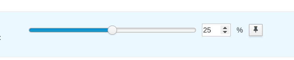
@bmignano @maryshak1996 @lucasponce what is the role of the lock icon next to each slider? There is already a TLS control underneath. Through the different screens in Kiali the lock icon is used to indicate TLS, so if the lock here is used for something completely different, that would be most likely confusing to users. (While at it, I would suggest that the TLS control underneath would have also the lock icon next to the words TLS for consistency with other parts of Kiali)
abonas
on 17 Feb 2019
+1 to change the lock icon.
I'd suggest this one as it's very common for the feature discussed here.

About the other suggestion, I think the lock icon would be good, but to show it only when it's different to "NONE" if not as I user I will think that service is always in mTLS mode.
lucasponce
on 18 Feb 2019
+1 to change the lock icon.
I'd suggest this one as it's very common for the feature discussed here.
I love this suggested icon!
I think a tooltip is needed here as well on the icon.
About the other suggestion, I think the lock icon would be good, but to show it only when it's different to "NONE" if not as I user I will think that service is always in mTLS mode.
how many modes are there for TLS? is it dual on/off? or more states here?
If dual, then this is the standard solution:
https://www.patternfly.org/pattern-library/forms-and-controls/data-input/#onoff-switches
abonas
on 18 Feb 2019
mTLS mode needs to be pre-populated depending on what is (not) set for namespace and mesh-wide.
pilhuhn
on 18 Feb 2019
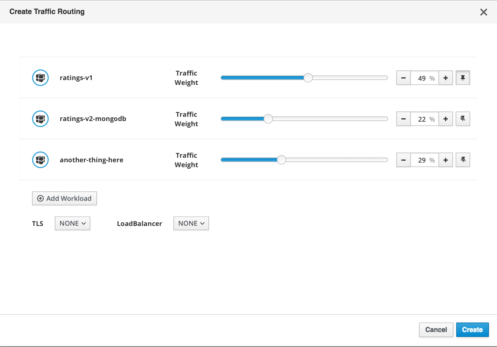
@abonas the lock icon would allow the user to lock a slider in place while adjusting the others (so that they don't all get altered in the changing of just one slider).
@lucasponce I am fine with the pin icon instead of the lock (since the lock does have pre-existing meaning in the UI), but we will need to investigate a way to indicate both 'pinned' and 'unpinned' (similarly to how I have both a 'locked' and 'unlocked' icon in my mockup).
Here's some ideas
Indicate 'pinned' vs 'unpinned' through icon change [this pin with a slash is NOT fontawesome, I created it)
Indicate 'pinned' vs 'unpinned' with icon color change (this stays with fontawesome, but when 'pinned' the icon is blue)
maryshak1996
on 18 Feb 2019
@maryshak1996 I have a WIP with this approach:
I used 'private' icon and 'thumb-tack-o' basically as we don't have a reverse 'thumb-tack-o' icon and using colors can be problematic, also the 'private' icon is different than the lock used for the mTLS and perhaps can suit on this context.
I have a question about the input text component, I'm using the standard patternfly component with already implemented support for arrows:
It's pretty standard, I wonder if we want to continue with it or to implement your proposal of two additional buttons for '-', '+' operations that are already built-in in the component.
lucasponce
on 18 Feb 2019
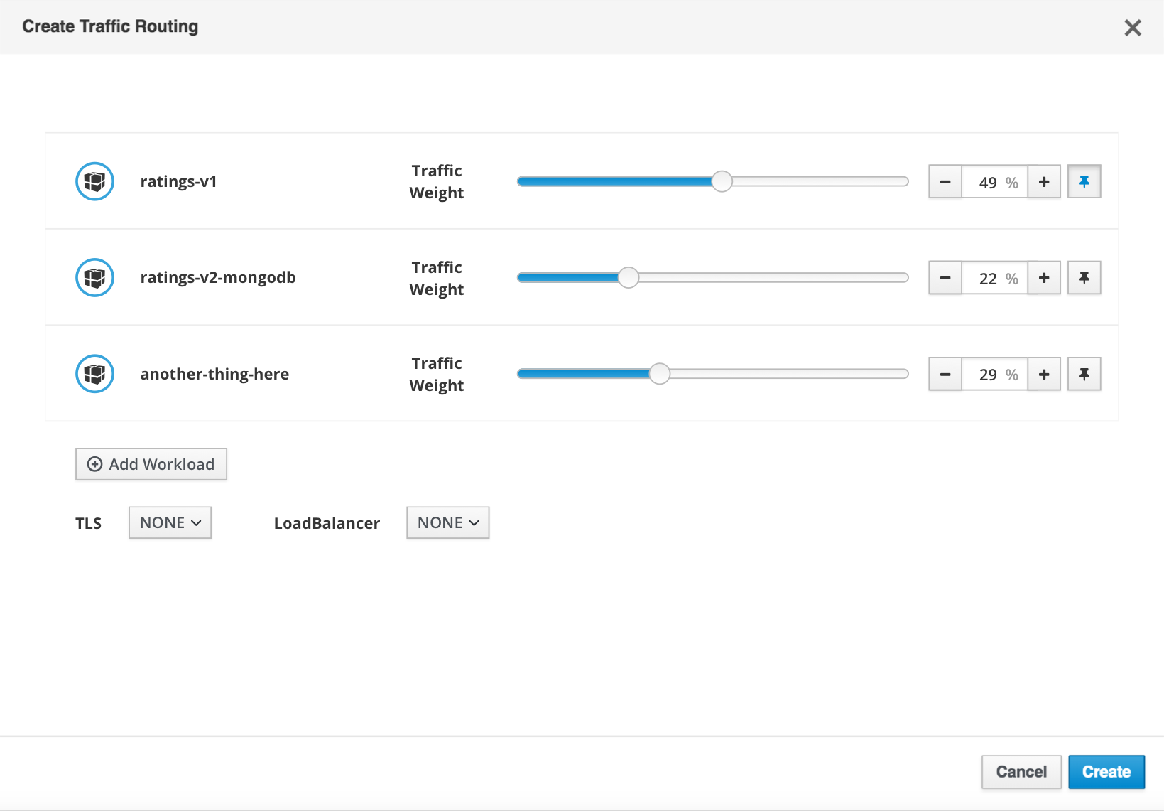
can we make a black pin and a transparent pin? any icon that resembles lock is more suitable IMO for security/permissions.
abonas
on 18 Feb 2019
Sure. @maryshak1996 if you can provide me a couple of icons I can add them to the PR easily.
Thanks
lucasponce
on 21 Feb 2019
@lucasponce sure! I'll put those two icons together and post here by the end of the day
maryshak1996
on 21 Feb 2019
@maryshak1996 also, as a transition solution I checked how other IDEs use the same icon for same use case and they tends to rotate the icon:
I comment it, just if that solution is good, but I can change the icons anytime.
lucasponce
on 21 Feb 2019
and @lucasponce the arrow controls to adjust the percentage is using the patternfly bootstrap touchspin concept (https://www.patternfly.org/pattern-library/widgets/#bootstrap-touchspin). I think that trying to align it as closely as we can to patternfly would be ideal, so this might be worth giving a try :)
maryshak1996
on 21 Feb 2019
The rotated pin is great IMO
pilhuhn
on 21 Feb 2019
@maryshak1996 yes, that was my goal; but the bootstrap-touchspin widget is not available in patternfly-react nor react-bootstrap. But let me work on it to give a try.
lucasponce
on 21 Feb 2019
I think that the lock is still the most clear to the user when it comes to familiarity and recognizability over the pin, but if you decide to move forward with the pin approach this is our design recommendation
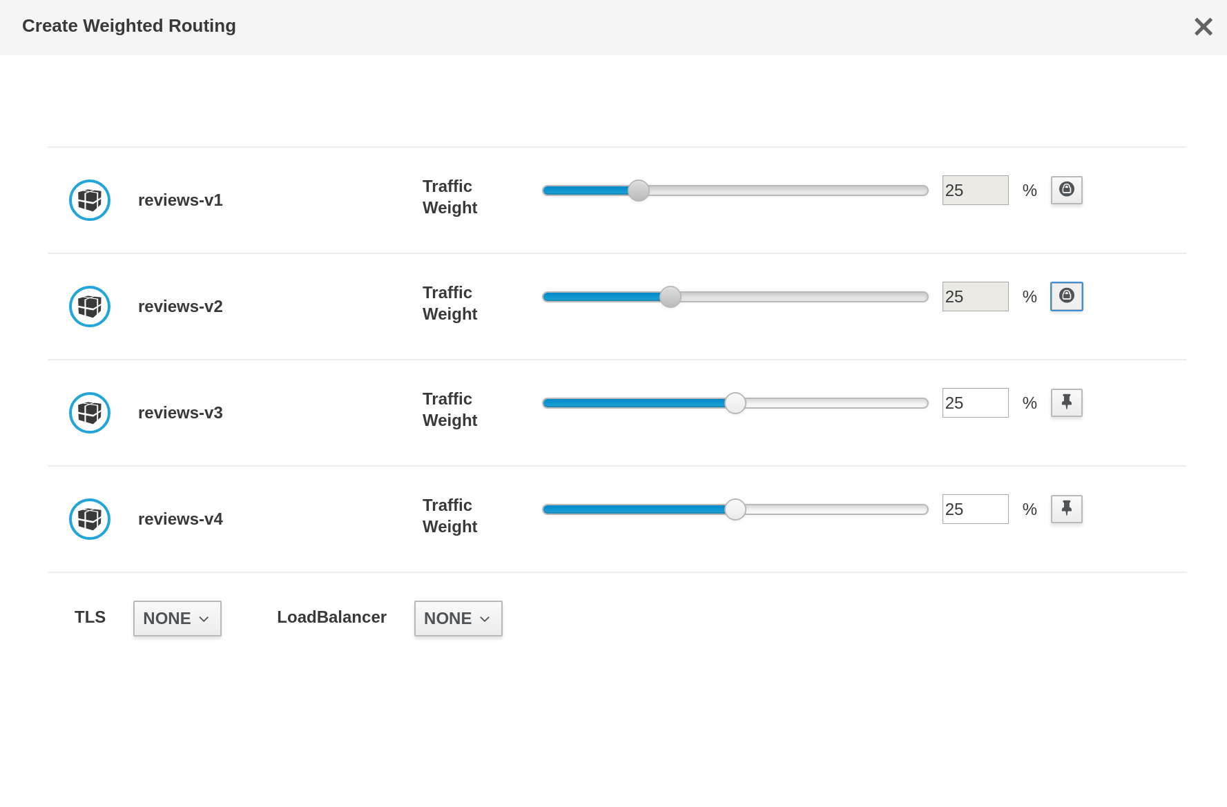
A few things to note here:
- when the slider item is 'unpinned', the touchspin is displayed in an enabled state and a hollow pin icon is shown on a default pf secondary button
-when the slider is 'pinned', the touchspin is displayed in displayed in a disabled (greyed-out) state, a solid pin icon is shown on a disabled pf secondary button, and the danger fa-ban icon appears if the mouse hovers over the slider to indicate that that workload cannot be changed while pinned
Here are the two pin icons in the format of a large PNG (I can provide SVG if that is preferred as well)
kiali-pin-icons.zip
maryshak1996
on 21 Feb 2019
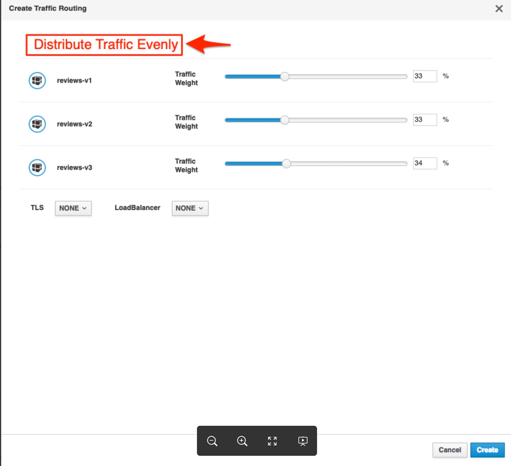
@maryshak1996 what do think about adding a button to evenly distribute the traffic between however many routes there are:
 mtho11
on 21 Feb 2019
mtho11
on 21 Feb 2019
@mtho11 I think that that would certainly be a useful featured to have available :)
I would consider having it at the bottom of all of your rows instead of at the top
maryshak1996
on 21 Feb 2019
@mtho11 @maryshak1996 I can add that button, indeed, when wizard is open, it resets all workloads in that way. So having a button as you describe is easy to add.
But the bootstrap-touchspin component requires more work and that will be addressed in a following step.
There is no a react component and it requires a refactor/re-organization on all the slider work, so, I'll postpone that for next step.
Thanks for the icons :-).
lucasponce
on 22 Feb 2019
ManageIQ / CFME uses the pin with rotation
Straight pin = unpinned, turned pin = pinned.
pilhuhn
on 22 Feb 2019
Finally got it
The bootstrap-touchspin component is not available but I think we can get a closer design with this approach.
lucasponce
on 22 Feb 2019
the + sign looks like it is an "add" button at its current location, while it should be the "+ -" for the input field, right?
abonas
on 24 Feb 2019
closing this in favor of kiali/kiali-design#109
abonas
on 3 Mar 2019
Related issues
 eosantigen
·
6Comments
eosantigen
·
6Comments
 dntosas
·
3Comments
dntosas
·
3Comments
 hhovsepy
·
5Comments
hhovsepy
·
5Comments
 tehleet
·
3Comments
tehleet
·
3Comments
 erSitzt
·
3Comments
erSitzt
·
3Comments
Most helpful comment
+1 to change the lock icon.

I'd suggest this one as it's very common for the feature discussed here.
About the other suggestion, I think the lock icon would be good, but to show it only when it's different to "NONE" if not as I user I will think that service is always in mTLS mode.