Katex: Exponents sometimes collide with fraction bars

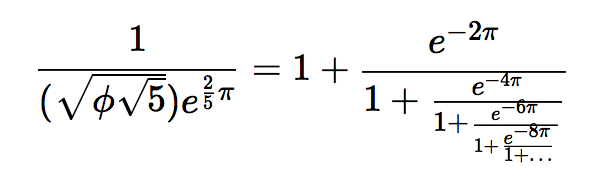
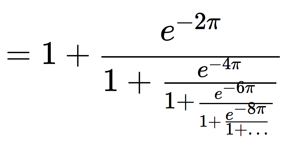
Output on right is from latex for comparison. In KaTeX, the -6 \pi and -8 \pi exponents collide with the fraction bars above them. I'm on OS 10.9.4 and I see this issue in both Chrome and Firefox.
 jwmerrill
All 6 comments
Here's the code:
\frac{1}{(\sqrt{\phi\sqrt{5}})e^{\frac{2}{5}\pi}} =
1 + \frac{e^{-2\pi}}{1 + \frac{e^{-4\pi}}{1 + \frac{e^{-6\pi}}{1 + \frac{e^{-8\pi}}{1+\ldots}}}}
 kevinbarabash
on 17 Sep 2014
kevinbarabash
on 17 Sep 2014
Yep, this is also a browser rendering problem, unfortunately. If you make the font size larger, it's pretty clear that the produced output is reasonable:

I'm not really sure what to do about this. Maybe we can use some fancy CSS to ensure minimum widths of the gaps between elements or something.
 xymostech
on 17 Sep 2014
xymostech
on 17 Sep 2014
Running our texcmp tool against this test case confirms that at large sizes the vertical spacing of KaTeX agrees with what TeX does:

TeX rendering in green, KaTeX in red. (Horizontal spacing is decidedly different, probably because KaTeX uses the same font at all sizes while TeX will use a different font with wider glyphs for smaller styles. Although bugs like #249 may contribute to this as well.)
So if we want TeX compatibility then we have to accept the incorrect rendering by some browsers at some font sizes. If we want to ensure some minimal spacing, then we can certainly do so. I'd say somewhere in this clearance computation. And if we want to give users a choice, we can introduce a config option for this. Perhaps even one where people can choose the amount of additional separation they would like. Such a setting should probably apply to matrices as well.
Maybe we can use some fancy CSS to ensure minimum widths of the gaps between elements or something.
This would in my opinion be fancy only if it were to introduce a font-size specific element, i.e. something like 0.5em + 3px or similar. Doing this kind of thing would break a million places and some very useful applications, so I'd rather avoid it. Anything else would be simply tweaking some shifts in JavaScript code, with no changes to the KaTeX stylesheet.
 gagern
on 7 Oct 2016
gagern
on 7 Oct 2016
confirms that at large sizes the vertical spacing of KaTeX agrees with what TeX does
Well, mostly. In particular there appear to be no major additional gaps in the TeX rendering. However, investigating #408 I found that the actual placement of the exponents is slightly different. Long explanation there, but the summary is that we have the wrong values of σ14 and σ15 for script styles.
gagern
on 7 Oct 2016
I'm in the process making sure we're using the correct sigma values. It isn't fixing this problem. I suspect that this issue comes from the majority of browsers not doing subpixel positioning of DOM elements.
kevinbarabash
on 8 Oct 2016
I was going to close this b/c we fixed the values of sigma14 and sigma15, but there's definitely still an issue. The following was rendered using the sandbox at 16px.
Zooming in highlights the issue:
One thing that sticks out right away is that the fraction bars aren't lined up with the + signs, some are lower than they should be and others are higher than they should be.
kevinbarabash
on 31 Jan 2018
Related issues
 OisinMoran
·
4Comments
OisinMoran
·
4Comments
 HughGrovesArup
·
4Comments
HughGrovesArup
·
4Comments
 mbourne
·
3Comments
mbourne
·
3Comments
 jason-s
·
3Comments
jason-s
·
3Comments
 ylemkimon
·
3Comments
ylemkimon
·
3Comments