Kap: Can't crop to a specific area of the screen?
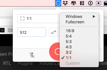
I feel like there was a way to use Kap to crop to a specific place on the screen, instead of a pre-defined aspect ratio. But now the "Custom" option in the select is disabled and I don't know why.
How do you get the crop behavior? I'm just looking to do what RecordIt does simply.
Platform: macOS Sierra 10.12.6
Kap Version: 2.0.0
 ianstormtaylor
All 4 comments
You're not the first to ask about this. It's clear we need to improve the UX for that. You can change the number in the input fields for a custom size or click and drag the borders of the cropper view.
 sindresorhus
on 7 Feb 2018
sindresorhus
on 7 Feb 2018
Referencing this for #113. Will close since it's a duplicate, but a quick question @ianstormtaylor; would it be easier if the cropper triggered automatically when opening Kap (#358)?
 skllcrn
on 7 Feb 2018
skllcrn
on 7 Feb 2018
Good question. For me, before I enter Kap I already know what type of recording I want to do, which as far as I can tell is always one of:
- Rough crop (very often)
- Specific app (sometimes)
- Full screen (rarely)
- Fixed dimensions (rarely)
The amount each individual type of recording would be used probably varies by person. I personally use rough crop and full app most often because I'm usually trying to capture recordings of reproducing bugs. I could see people creating GIFs for documentation wanting to always keep a specific dimension standard to stay consistent, and there's probably a target audience where full screen is their default.
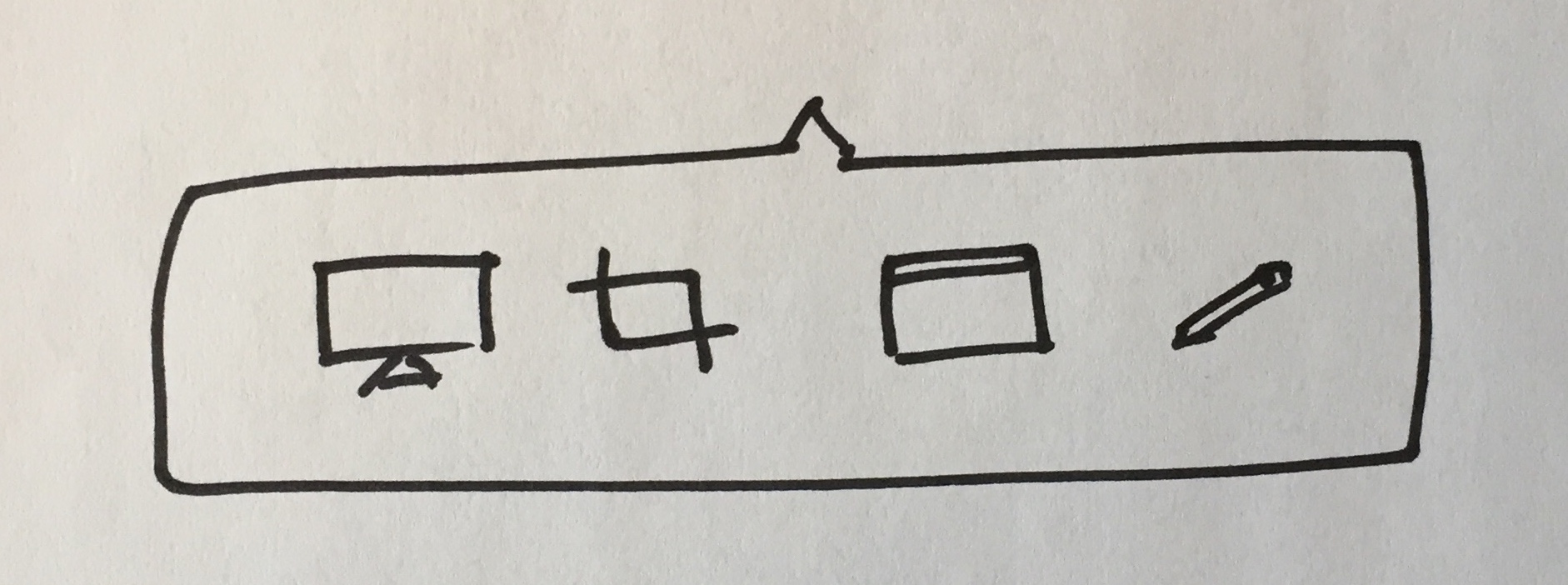
But this makes me think that right now Kap is exposing lots of "configuration" UI, which isn't necessarily matching with how users think. And instead, it might be good to just expose the decision that users are wanting to make, maybe like:
That's one way to do it, but still might be extra work for the user.
You could instead opt to have the rough crop be the default, since you can actually achieve all of the others by hanging their UX off of the rough crop's, like so:
- Rough crop is the default, just drag over the area.
- Full screen is easy, just drag over the entire screen, and feels very natural. I bet RecordIt users already do this even though it provides no specific "full screen" option.
- Fixed dimensions can be done by dragging roughly with an updating indicator of the size ticking by as you drag. And any mistakes can be made by resizing. As an optional way to make it easier and more precise, perhaps clicking (instead of dragging) would prompt you with a set of input fields and aspect ratios—essentially the current Kap interface.
- Specific app is harder to hang off of the rough crop UX. As an optional way I think mimicking the native macOS behavior of going into app mode when spacebar is pressed is a good idea. You'd probably also want a visual indicator of it.
This all might lead to treating the "cropping" UI as the main UI for Kap. You could imagine something like this:
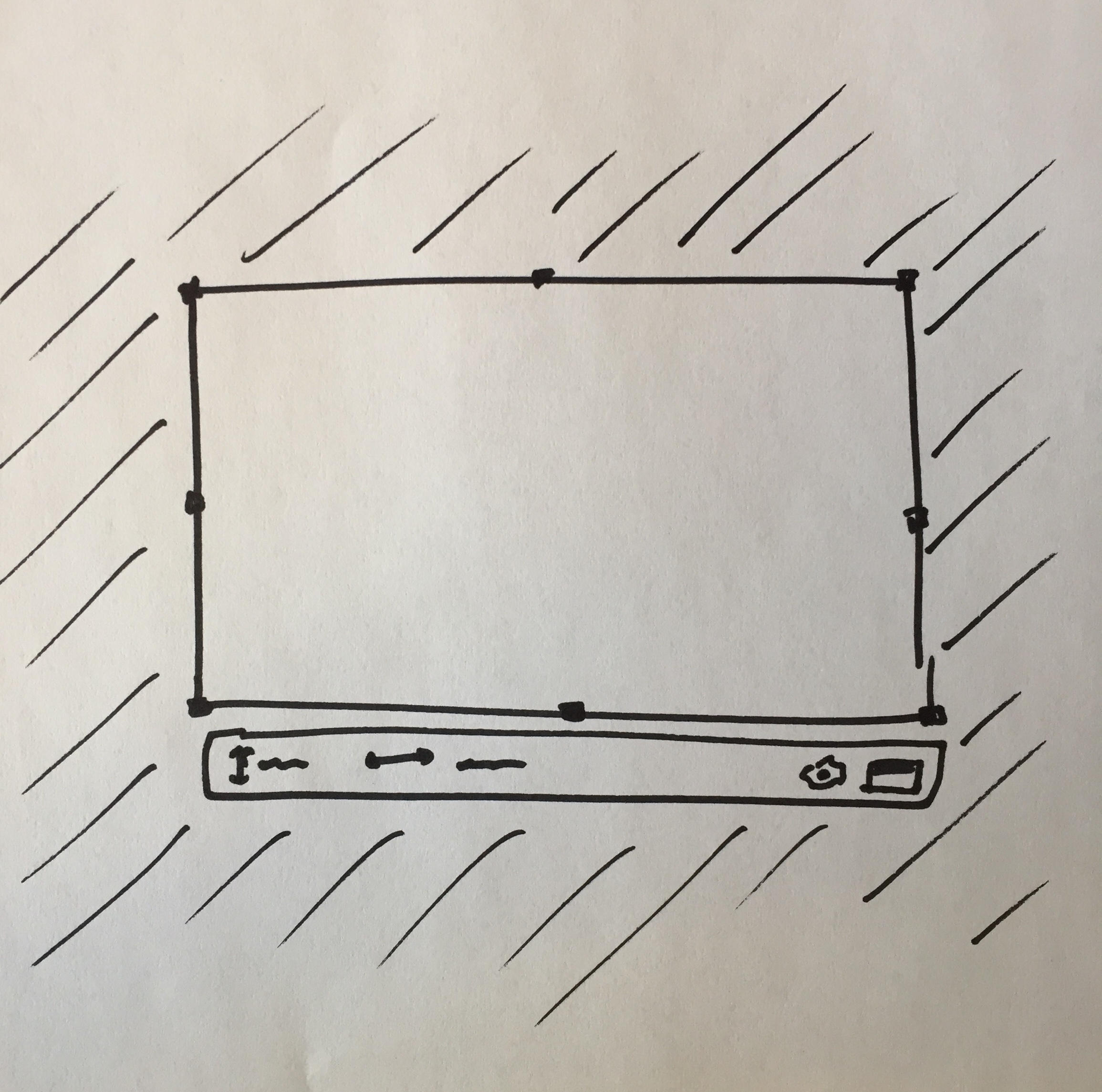
That menu under (and inside when not enough room) is where things like "record" and "specific app" and even inputs to fine tune the dimensions could go, and it all feels natural.
You could even pop-up a crop region with the previously used size already configured, to aid the documentation recording use case, and to make the menu available right away. People can always re-click/drag to create a new crop region.
You could have a well-understood "close overlay" button somewhere in there, which is a pretty easy thing to communicate to people since it's pretty common.
This starts to feel pretty nice I think.
The menubar icon is reduced to just be "click to enable" and "click to stop". And everything else takes place on the screen itself, right where the content is being recorded. I'd even recommend putting a red record button near the crop area itself.
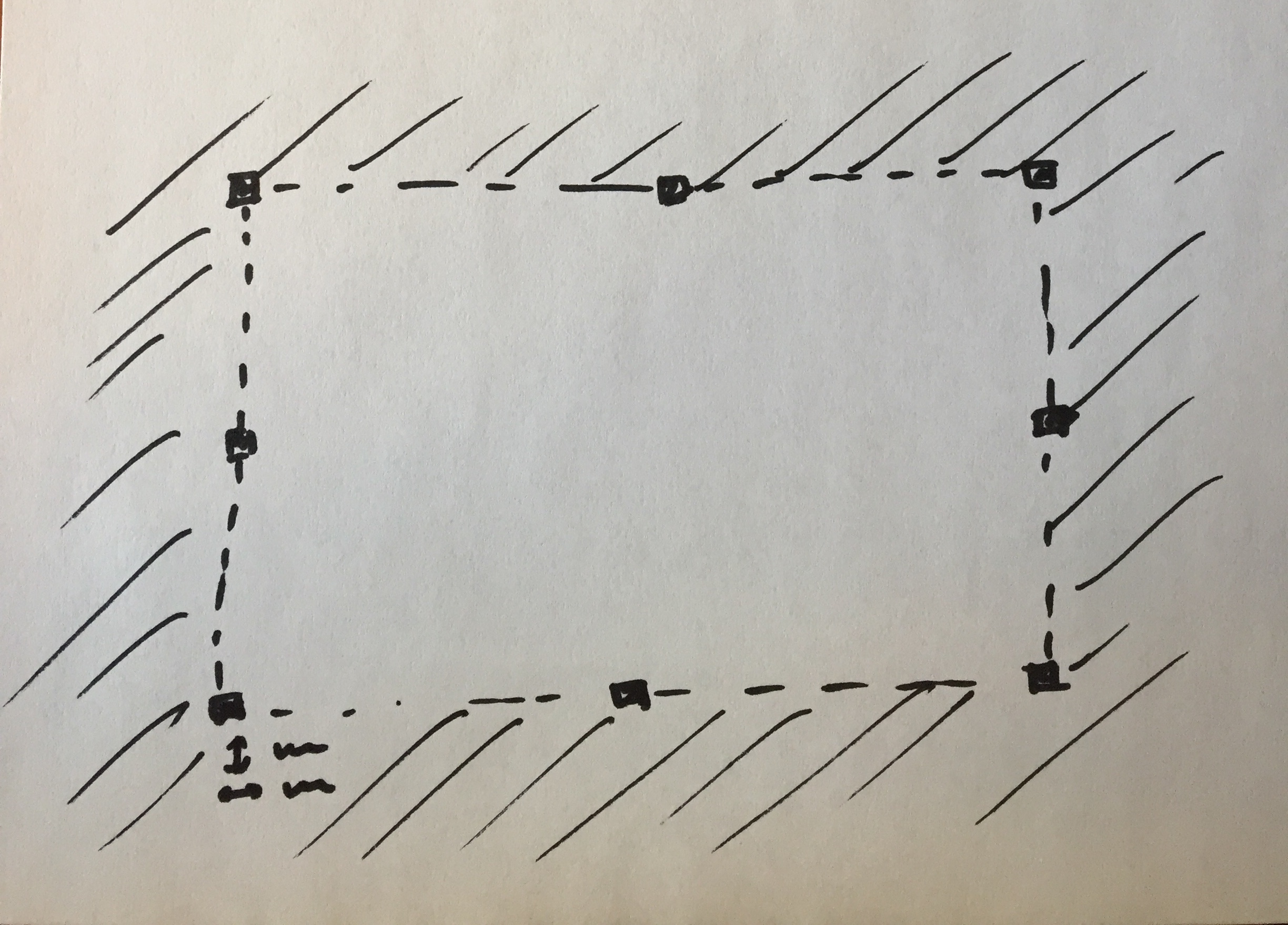
Also, one of the UX issues is that right now the crop area is hard to see and isn't obvious that it's resizable or draggable in any way. This would be solved by darkening the outsides, but also by adding the recognizable drag handles to it:
ianstormtaylor
on 7 Feb 2018
Thank you so much for taking the time to write and sketch this up @ianstormtaylor, it's certainly given me a lot of new input to digest and I really appreciate it. Could I ask to you reference this or copy it to #113 so we can keep the discussion going there?
skllcrn
on 7 Feb 2018
Related issues
 Qix-
·
3Comments
Qix-
·
3Comments
 petetnt
·
4Comments
petetnt
·
4Comments
 danielbachhuber
·
3Comments
danielbachhuber
·
3Comments
 benlumia007
·
3Comments
benlumia007
·
3Comments
 timothyis
·
3Comments
timothyis
·
3Comments
Most helpful comment
Good question. For me, before I enter Kap I already know what type of recording I want to do, which as far as I can tell is always one of:
The amount each individual type of recording would be used probably varies by person. I personally use rough crop and full app most often because I'm usually trying to capture recordings of reproducing bugs. I could see people creating GIFs for documentation wanting to always keep a specific dimension standard to stay consistent, and there's probably a target audience where full screen is their default.
But this makes me think that right now Kap is exposing lots of "configuration" UI, which isn't necessarily matching with how users think. And instead, it might be good to just expose the decision that users are wanting to make, maybe like:
That's one way to do it, but still might be extra work for the user.
You could instead opt to have the rough crop be the default, since you can actually achieve all of the others by hanging their UX off of the rough crop's, like so:
This all might lead to treating the "cropping" UI as the main UI for Kap. You could imagine something like this:
That menu under (and inside when not enough room) is where things like "record" and "specific app" and even inputs to fine tune the dimensions could go, and it all feels natural.
You could even pop-up a crop region with the previously used size already configured, to aid the documentation recording use case, and to make the menu available right away. People can always re-click/drag to create a new crop region.
You could have a well-understood "close overlay" button somewhere in there, which is a pretty easy thing to communicate to people since it's pretty common.
This starts to feel pretty nice I think.
The menubar icon is reduced to just be "click to enable" and "click to stop". And everything else takes place on the screen itself, right where the content is being recorded. I'd even recommend putting a red record button near the crop area itself.
Also, one of the UX issues is that right now the crop area is hard to see and isn't obvious that it's resizable or draggable in any way. This would be solved by darkening the outsides, but also by adding the recognizable drag handles to it: