K-9: Please revert to old, pre v5.400, app icon!
The new icon is really ugly, please give us back to old one! ...at least let the user decide between the two!
Why it has been changed?
 gcalzo
All 121 comments
Seconded. I get that everything is going material now a days but this really looks like a MS Paint doodle.
 mikeloeven
on 29 Dec 2017
mikeloeven
on 29 Dec 2017
...I found where, more than one year ago, someone where talking about the new icon with a few examples...
I bet it's too late for voting... :(
1723
gcalzo
on 29 Dec 2017
I have found an older, closed issue about the same request with a very simple answer... :-(
2834
gcalzo
on 29 Dec 2017
Is this (partly) about the background of the icon being pink? If so I wholehartedly support the reverting!
 Krzmbrzl
on 29 Dec 2017
Krzmbrzl
on 29 Dec 2017
Well, a less "shocking" red could help...
Ciao, Giangi
Inviato da MotoG5 plus con K-9 Mail.
-------- Messaggio originale --------
Da: Raven notifications@github.com
Inviato il: 29 dicembre 2017 19:31:53 CET
A: k9mail/k-9 k-9@noreply.github.com
Cc: gcalzo giangi@gcalzo.net, Author author@noreply.github.com
Oggetto: Re: [k9mail/k-9] Please revert to old, pre v5.400, app icon! (#2998)
Is this (partly) about the background of the icon being pink? If so I wholehartedly support the reverting!
--
You are receiving this because you authored the thread.
Reply to this email directly or view it on GitHub:
https://github.com/k9mail/k-9/issues/2998#issuecomment-354483144
gcalzo
on 29 Dec 2017
I second that. I love the old filigrane icon. The new one is ugly.
 felfert
on 29 Dec 2017
felfert
on 29 Dec 2017
I'm using this app because of its features and not because of its icon. I don't really like the new one, but @cketti has chosen it for this version, so let's accept it. :-)
 korelstar
on 29 Dec 2017
korelstar
on 29 Dec 2017
IMHO a poll would let us express our opinion...
Ciao, Giangi
Inviato da MotoG5 plus con K-9 Mail.
-------- Messaggio originale --------
Da: korelstar notifications@github.com
Inviato il: 29 dicembre 2017 21:49:20 CET
A: k9mail/k-9 k-9@noreply.github.com
Cc: gcalzo giangi@gcalzo.net, Author author@noreply.github.com
Oggetto: Re: [k9mail/k-9] Please revert to old, pre v5.400, app icon! (#2998)
I'm using this app because of its features and not because of its icon. I don't really like the new one, but @cketti has chosen it for this version, so let's accept it. :-)
--
You are receiving this because you authored the thread.
Reply to this email directly or view it on GitHub:
https://github.com/k9mail/k-9/issues/2998#issuecomment-354498807
gcalzo
on 29 Dec 2017
The icon presented by @moctodot in https://github.com/k9mail/k-9/issues/1723 looks much better.
 kq01526
on 30 Dec 2017
kq01526
on 30 Dec 2017
I'm leaving this issue open for a little while longer so people who feel the need to voice their opinion will find it and not open new issues.
However, this won't change the decision. The app icon won't be replaced with the old icon.
 cketti
on 30 Dec 2017
cketti
on 30 Dec 2017
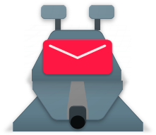
Yes, the icon is depressingly ugly. Whoever designed it has absolutely no idea about visual design and seriously lacks in good taste. It feels as if someone just defecated on one of my favorite apps.
As the owners seem to be deaf to the voice of the - more aesthetically discerning - public (and I find this unwillingness to react quite childish), there is a workaround. Use an app such as Icon Changer or Awesome Icons to create a shortcut with the old icon. You will still have to face the kitschy horror when using the app, but at least your desktop will remain unpolluted.
[edit] Here is a png with transparent background, which can be used for the replacement mentioned above: http://lh6.ggpht.com/4nAIkTwY8Zmo3Vt1XPNXWH3_YVXj9muHfLyLjuT9LUHIxSgiC_RTHFl9PSPqwhAuFW7l=w300
 najgorsza-zmiana
on 30 Dec 2017
najgorsza-zmiana
on 30 Dec 2017
So, stated that a new icon in "Material" design is mandatory and the old one won't be restored, I suggest to open a real poll with (as far as I know) the only two possibile replacement icons:
- the current v5.400 (from @bertob https://github.com/k9mail/k-9/issues/1723#issuecomment-273327881)
- the one from @moctodot https://github.com/k9mail/k-9/issues/1723#issuecomment-258468293
Personally I vote for the second one!
I may eventually _accept_ the first one if the red will be darker!
gcalzo
on 30 Dec 2017
+1 for the second (@moctodot) icon.
najgorsza-zmiana
on 30 Dec 2017
Perhaps we could have some mechanism for changing the icon from within the app's settings menus?
 DavidGriffith
on 30 Dec 2017
DavidGriffith
on 30 Dec 2017
I don't have any problem with the icon itself. Just the _background_ is absolutely horrible
Krzmbrzl
on 30 Dec 2017
Please revert to old icon or give users a choice. The new icon is ugly and obnoxious. It looks like you sold out to T-mobile.
 unitblocks
on 30 Dec 2017
unitblocks
on 30 Dec 2017
@moctodot better than the new logo.
@bertob complete failure, other than worshipping the false gods of bad UI. The K-9 portion of the image is so burdened by the hot-pink envelope that is does not communicate K-9 and omits the original Doctor Who reference. The pink chosen causes confusion in the marketplace with T-mobile's default email offerings. K-9 is a user install, not a default app.
unitblocks
on 30 Dec 2017
I hate the new icon too!
First I had a Doctor Who themed mail program. Now I have some stupid dog themed mail program. And I'm a cat person.
I want the old icon back!
 Rhialto
on 30 Dec 2017
Rhialto
on 30 Dec 2017
Adding my $0.02.
I was surprised by the ugly new icon this morning. Usually I couldn't care less about this but it got to me enough that I came here.
I'd prefer the @moctodot icon or the old icon.
I understand that it had to change due to the material UI requirements but isn't it possible to just adjust the old icon to fit the new requirements rather than completely change it?
 bunk3m
on 30 Dec 2017
bunk3m
on 30 Dec 2017
Pretty much my reaction to the new icon
mikeloeven
on 30 Dec 2017
@cketti I appreciate the work you do, but changing the visual interface is a big deal and shouldn't be blown off.
I hate the new icon so much, I joined GitHub to comment and to actively participate in the project, because I actively use and love this app.
How do I get you to either revert the icon or add a menu preference to revert for the users that despise the new icon?
I'll even see if I can figure out how to cobble together the coffee to do it if you're unwilling to entertain reverting the icon.
 bheiserman
on 31 Dec 2017
bheiserman
on 31 Dec 2017
+1, for reference, the PR appears to be here: https://github.com/k9mail/k-9/pull/2082/files
 ctgraham
on 31 Dec 2017
ctgraham
on 31 Dec 2017
I am ok with the new icon, clearly shows this is about email, not about dogs. But hey, give these people an option in settings. everyone happy? Just use the new icon in appstores etc. and as default icon
 Meteor0id
on 31 Dec 2017
Meteor0id
on 31 Dec 2017
Agree re: option to select icon / revert to old icon in global settings. The latter is a matter of adding a checkbox in the GUI and a couple of if/else statements.
najgorsza-zmiana
on 31 Dec 2017
The new icon is ugly, please bring back the old one. Why do you have to change sg which is just fine? Spend time on other features or just go and have a beer instead.
 katonagl
on 1 Jan 2018
katonagl
on 1 Jan 2018
The old icon was better
 ChristianKreuzberger
on 2 Jan 2018
ChristianKreuzberger
on 2 Jan 2018
+1 for providing an option to use the old icon.
 dhwalker
on 3 Jan 2018
dhwalker
on 3 Jan 2018
I forked the repository and added a couple of new branches which follow master and 5.4-MAINT, but with the icons reverted. I have uploaded a custom build as well: https://github.com/Rhialto/k-9/releases/tag/rhialto-5.4-MAINT-002 that Travis CI made for me (I didn't want to set up an Android build environment right now).
Rhialto
on 3 Jan 2018
The google play comments are a quite clear poll. I think by reverting you will get quite a few stars back ;-).
Personally I use a mail program for its function, but I must say the icon is very ugly and dominates the home screen, while the old one looked really nice and more decent.
In general material design isn't the last word in design, to say the least.
 allo-
on 4 Jan 2018
allo-
on 4 Jan 2018
Hey everyone – I know its tough embracing change, especially when it comes to design. It deals with visual things, and sometimes there are aesthetics that don't fit your subjective taste or perception.
Feedback can be constructive but please try to be nice. Everyone is basically volunteering their time and effort for something like K-9. Although I understand how everyone's comments, even if negative, come from a place of caring about where K-9 goes because a lot of people love this app.
I know I'm not making this discussion any easier, but there's also this version I've made a while back:
https://github.com/k9mail/k-9-design I hear your ideas about having a 'choose your icon' in settings. I was actually thinking of having different K-9 icon options with different 'dog breeds', but I have a sense this isn't what people mean. 🙂

What could actually be helpful is if you specifically point out what you like, and what you dislike about all the icons (the current one, the proposals in https://github.com/k9mail/k-9/issues/1723 and my suggestion above). Be specific but again, try to be nice.
Or - even better - in addition to giving feedback on the current option, draw out what kind of icon you'd like to see. Doesn't have to be a masterpiece. Can be on a napkin. Just to get an idea of what most of you think, visually, as an icon, when you think of K-9.
And if you have any additional thoughts, there's a feedback questionnaire here: (doesn't always work, I'm using a free version, sorry) https://uxquestionnaire.typeform.com/to/SHacN5/
 ghost
on 4 Jan 2018
ghost
on 4 Jan 2018
And just to reiterate - this was @cketti 's decision as he's managing this project. I'm curious to hear everyone's feedback, thoughts, and ideas, though.
ghost
on 4 Jan 2018
In the new icon, the email envelope is too big and too red. It also lacks the background circle that many other material icons have, which would help it be visible. Without it the icon is nearly invisible on most of the newest landscape backgrounds on my Pixel 2. So between the garish red envelope and being invisible, not my favorite redesign choice.
The old icon had enough distinguishing characteristics that it stood out, so was easy to visually identify. It was not the most "material" or related of icons, but I think that only matters for initial install. If anything the distinctive non email icon made me curious enough to read about this app in the first place, as opposed to choosing one of the many other email apps.
bheiserman
on 4 Jan 2018
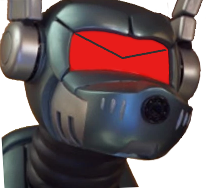
I think the old icon can conform to the material guidance if you simply do something similar to this. Put it in a circle. It is still distinctive, shows the email icon, but retains the personality of K-9.

bheiserman
on 4 Jan 2018
@juliakorbut As an answer to your question to @bheiserman I would say, generally, that it's the old icon's dog-like look that I liked. More specifically, it's the greater emphasis on the ears and snout (while preserving the envelope for the robot "eyes"), as well as the collar. I also prefer the 3/4 view of the dog's head, rather than the flatter, straight-on view of the new icons.
dhwalker
on 4 Jan 2018
Well, if anyone wants to participate in an experiment of drawing the K-9 icon from memory, or what they see when they think 'K-9 mail' – this is an interesting experiment to kind of illustrate what I was going for: https://www.signs.com/branded-in-memory/
so that there's a shared 'understanding' of what K-9 looks like for most users. Just for future reference, or if any of the current contributors want to explore making more icon options
ghost
on 4 Jan 2018
The color is part of the problem. Not because it is girlish, but because its intensity and huge contrast to the rest of my homescreen and the rest of the icon itself. Further the closeup perspective is ugly and it changes the dog icon to a letter icon (which may be intended).
Using a pastel pink may work better, but it still goes from k9-dog to envelope.
And the whole design scheme, even the other suggestions here, seem to move from a plastic model to comic style.
allo-
on 4 Jan 2018
I'm vortig for a less strikingly colored background of the icon. A darker color would suffice for that I think (instead of the current pinkt)
Krzmbrzl
on 4 Jan 2018
I vote for old icon. Forgive me but new icon is childish and indistinct. Does not reflect the quality of the app.
And maybe my resistance is childish but only thing that would tempt me to upgrade to the app with new icon would be if a print facility was introduced.
 kxcooper
on 4 Jan 2018
kxcooper
on 4 Jan 2018
My only real issue is the fact that redesigned icon doesn't reflect the app's mascot. K-9 mail was a reference to the character K-9 from classic Dr Who and the new icon is not identifiable as such
http://olddoctorwho.com/wp-content/uploads/2013/12/k9-classic-doctor-who.jpg
mikeloeven
on 4 Jan 2018
@juliakorbut
What could actually be helpful is if you specifically point out what you like, and what you dislike about all the icons (the current one, the proposals in #1723 and my suggestion above). Be specific but again, try to be nice.
Where should we wrote? Comments into the topics referenced by you and me are still getting deleted...
Someone from the "staff" should open an official topic/poll/whatever so to have just the feedback in one place.
Personally, and I'm repeating for the second or third time:
- I vote for moctodot's one https://github.com/k9mail/k-9/issues/1723#issuecomment-258468293
- as a _secondary preference_ I vote for using a (much) darker red on current one and with a (much) smaller envelope-eyes
gcalzo
on 5 Jan 2018
Could someone explain why a new icon is needed? What is the problem with the previous one?
katonagl
on 5 Jan 2018
I don't think this discussion will lead to anything constructive. Whoever decided to use the new icon clearly has no intention to admit to their tragic mistake - quite immature, as I've said before.
Thus I am no longer a user of K9. I have switched to BlueMail, uninstalled k9 from all my devices and left a 1* review on Google Play. I suggest everyone not satisfied with the new icon and the developer's lack of reaction to the massive negative feedback do the same.
najgorsza-zmiana
on 5 Jan 2018
I agree with the above comments here, The K9 icon needs to be changed back to how it was before, there are a lot of complaints about this on Google Play - I really liked the previous icon & as a Doctor Who fan seeing K9 was a cool icon that needs to return! Please bring it back ASAP and then you will have more 5 star reviews on Google Play.
Also please sort out the syncing issue on receiving messages as this has been an issue for some time now.
Thanks in advance.
 Clive55
on 5 Jan 2018
Clive55
on 5 Jan 2018
I, for one, like the new icon more than the previous one. It’s way better integrated with other MD icons on my phone. That being said, if you don’t like the new icon, just create an Android icon set with only the former icon inside and set it in your launcher as your icon set.
 ArchangeGabriel
on 5 Jan 2018
ArchangeGabriel
on 5 Jan 2018
This is a typical never ending debate I see in many open source projects. It is incredibly unfair and frustrating for developers who put their time and best effort in their projects when others come to complaign and make demands. Unessesary.
In my own opionion, the icon was changed based on the idea that an icon should clearly reflect the nature of the project. In this case an e-mail client. Therefore the email icon was brought forward.
A valid counter argument I read in this treat is that the new icon no longer acuratly reflects the k-9 caracter from the tv-serie doctor who, and therefore does not do justice to the history of the icon.
Both side make valid arguments, however both side are also overexagurating.
I am repeating myself here, but it seems some people haven't gone though the effort of reading my previous comment:
I suggest adding an option in settings to revert back to the previous icon. This seems like a reasonable compromise. However I am not etirely sure if it is technicly possible to switch the icon in android without reinstalling.
Do keep in mind that in appstores, only one icon can be shown. I suggest that being the new icon, since it reflects k9 being an email client, and users new to k9 are unlikely to have a nostagic preference for the old icon.
Tl,dr:
If technicly possible in android, introduce a setting "revert to old icon".
I hope any further discussion on this topic will be constuctive.
Meteor0id
on 5 Jan 2018
Excuse the many typos please, I should have reviewed the text before posting. I do usually write proper English ;)
Meteor0id
on 5 Jan 2018
@Meteor0id I would love an option to roll back the icon.
I also appreciate @juliakorbut suggestions and discussion.
I prefer the old icon. I also think the new icon could be tweaked to be less offensive.
From a design and branding standpoint, I think the material design guidelines are laughable.
Due to this complaint I've now spent way too much time looking at app store icons. You which ones stand out for email clients? The ones that aren't envelopes. Astro mail, Bird mail, etc.
The old icon encapsulated both an envelope and the Doctor Who theme. With minor tweaks it too can fit better into the design guidelines, while also retaining recognizable branding.
bheiserman
on 5 Jan 2018
@bheiserman @Meteor0id Please note that I have an alternative build with the original icons: https://github.com/Rhialto/k-9/releases
My problem with the new icon isn't in the colour (I even like the bright colour by itself) but that it isn't recognizable as the Doctor Who reference. The design from @juliakorbut is somewhat better, but still too far off from K-9.
I don't understand why there needs to be a new icon in the first place. And why "material design"? It is a stupid name since it generally doesn't look like any material. Rather the opposite: it's all very abstract. On the site which purports to be the material design icon site ( https://material.io/icons/ ), all examples are horrible in their flatness, indistinctiveness, colorlessness. The best icons on my phone are the ones that differ from this straightjacket.
And next year there will be a new fashion.
Rhialto
on 5 Jan 2018
@Meteor0id I don’t think it’s technically possible to let user choose the icon from inside the app. However most launchers (the app that runs your home screen, “desktop”, etc.) have support for icon sets and as I suggested above you could create an icon set with the K-9 icon of your choice and use it (all other apps will keep their default icon if you don’t provide any in your set).
@Rhialto Those are not app icons, but icons to be used inside apps (actions icons, etc.). Material designs app icons are more like the ones in https://github.com/PapirusDevelopmentTeam/papirus-icon-theme.
ArchangeGabriel
on 6 Jan 2018
The problem with that suggestion is if you are already using a custom icon set last i checked most launchers dont let you apply multiple icon sets at the same time
mikeloeven
on 6 Jan 2018
Just saying, but sometimes you have to move beyond your roots. Even Dr. Who updated k9. Still, I'd venture that Dr who means nothing to most users of k9 mail. I've never watched Dr. Who. Don't care. I use to mail because it's powerful and it's open source.
But... The interface is stuck in the first season of Dr. Who. Maybe being too tightly tired to that out dated gray Robot dog is unduely influencing the developers. We need a real interface design individual to look at the gray that puked all over to mail.
I do like moctodot's icon.
 shanghaiknight
on 6 Jan 2018
shanghaiknight
on 6 Jan 2018
@mikeloeven Sure, but in that case just add K-9 icon to your current icon set.
ArchangeGabriel
on 6 Jan 2018
@shanghaiknight I'm not opposed to a new design for the app, just the icon. Having a distinctive and unusual icon is solid branding, even if not everyone understands the origins.
bheiserman
on 6 Jan 2018
@bheiserman I don't have a problem with the origin, or maintaining links with that origin - as long as they can do so in an aesthetically pleasing way. The old icon, and the new icon are BOTH by far the ugliest icons I have on my phone. K-9 is also a very aesthetically unappealing app to use. Keep the "Dr Who" theme, if they can do so, and still deliver a visually well designed app. My fear is that their own connection to Dr Who seems to be driving decisions that are not in the best interest of the app. I know people who have stopped using K-9 because the app (icon and app) were unappealing. The developers seem to be stylistically stuck, and K9 desperately needs to be unstuck.
shanghaiknight
on 6 Jan 2018
The new icon could be easily modified to better reflect the Dr. Who K-9 character by:
- shrinking the envelope and altering the color
- styling the nose a bit
- adding a trapezoid for the body
It is quite correct that we shouldn't be complaining or threatening downvoting the app, but rather providing a better alternative.
I have no graphics design experience but I mocked up the attached. Someone with any experience with Inkscape could do better than I.
ctgraham
on 6 Jan 2018
@ctgraham I like that one alot better
mikeloeven
on 6 Jan 2018
Agreed, @ctgraham, much nicer.
bheiserman
on 6 Jan 2018
Hello.
Dear developers, first of all, let me thank you for a great and very stable app I am using for years now already.
To be honest, I do not support much the way the icons are criticized here. These are art, and are subjects of taste.
Let's try to get logical however and think of the app icon role.
It's like a brand symbol. It serves the recognition purposes. Once you got successful and
recognizable, it's your brand and its symbol which keep you being recognized.
This is a great reason not to change disruptively the icon, but evolve it.
Look at the Windows flag, the Apple's apple.. These changed slowly.Or to Google's google, Mercedes Star, BMW circle, Adidas pyramid, Coca Cola symbol. They mostly stayed. There is a reason for that.
Another reason is the one in usability. Fingers search the old doggy to check the emails automatically.
Now there is a lag in the process because the icon changed so dramatically.
The reasons behind the change are also intuitive. Getting more modern.
Slow change could allow for both keeping brand recognition, ui ease and modernization.
I personally like the old icon and this one a lot:
https://user-images.githubusercontent.com/34972645/34548464-3da16246-f0d0-11e7-8f6c-2f4df16ab818.png
I'll get used to the new one too, I guess.
But for now I would prefer a revert to the old one if I had the choice.
@all please, try to be a bit nicer to each other, this will make the whole discussion more constructive.
 qutorial
on 8 Jan 2018
qutorial
on 8 Jan 2018
@qutorial I'm confused. Who's not being nice? You have to have a free flow of ideas to have a meaningful discussion. If everyone is afraid to say what they feel, you end up with sub optimal results. The key is to say what you need to say and for others not to get offended by taking anyone's comments personally. We aren't saying a person is ugly, that's personal and rude. We're saying we don't like the icon and it's not astheticaly pleasing. Hopefully no one takes that personally. We want the best for the app. We are passionate about it because we like it. It's better to have a passionate user base than a disengaged user base that sits idly by while other products pass it by and take market share. Please don't be offended by people who really like the app and want it to be all it could be.
shanghaiknight
on 8 Jan 2018
@shanghaiknight Hello. I was a bit overwhelmed by the number of comments saying the new icon is "ugly" literally. It's honest maybe but still offensive. Maybe the way it is pronounced make @cketti taking a very hard stand posting community with a taken decision instead of considering the options, which is very meaningful in this very case.
qutorial
on 8 Jan 2018
@qutorial I agree with the decision not to change it back. I feel something else is needed. If my "ugly" comments offend, I'm sorry. Don't mean to offend. Something stylistically needs to happen though with app and icon.
shanghaiknight
on 8 Jan 2018
@cketti has the right to choose whatever icon he wants for his project. I can choose to use it or not.
I think the new icon is unattractive. That is my opinion. Unattractive enough that I'm not upgrading. The 5.208 version works fine so I'm sticking with it. Marked as "Ignore All Updates" in F-Droid. Eventually it will break, get a security exploit, or won't work with a new phone. Then I'll check and see if the icon has changed or if I've changed my mind. If neither the icon nor my mind has changed, I'll seek a fork or another email app. That is my choice.
I think this is how popular open-source projects lose their popularity; the developers' goals diverge from the large user base their original goals attracted. They make a fundamental, unpopular change. The hue and cry from many upset users rarely move the developers from their goals. Often it seems to make them dig in their heels. Why should they change their goals? They are making it to scratch _their_ "itch", not the itches of the many users. The first unpopular change usually becomes just the first of many as the divergence gets bigger.
The lucky projects (e.g. OpenOffice, Gnome 2, Netscape) get forked, or find new maintainers, or the developers goals converge again with their users. The unlucky projects just fade away as they lose users, contributors, and visibility. I hope K-9 Mail is one of the lucky ones.
 CPUGPU
on 12 Jan 2018
CPUGPU
on 12 Jan 2018
On Samsung, you can have icons in folders, can you do that in stock android too?
The icon looks like a giant red heart when it's small, in the icon folder. :D
shanghaiknight
on 12 Jan 2018
Food for thought...
If the new icon is so great how come it is not being used on the Google play app page?
https://play.google.com/store/apps/details?id=com.fsck.k9
You can see on that page that the old icon is used as the main icon and in all the sample application screens.
I think the new icon really sucks for many reasons.
I don't care if the old icon comes back but I really would like to see the icon change from what is now.
 bperrybap
on 13 Jan 2018
bperrybap
on 13 Jan 2018
@rancidfrog What the heck are you babbling about?
The point I was making is that if the k9 developers felt the new icon was so fabulous why leave it off the google k9 app page? The icon currently shown there (on the app page an in the sample application screens) is the one that many people believe looks better than the one that is currently used in the actual application.
i.e. why show a different icon on the google k9 app page than what the application is using?
As it is now, it is very misleading.
bperrybap
on 13 Jan 2018
Because you said we need to send suggestions:
I have the photoshop images used to make this, and am willing to share with whomever. Someone with Inkscape could convert this into a drawing...
shanghaiknight
on 13 Jan 2018
rancidfrog,
just two notes.
1) Linux says when you ask root rights:
#1) Respect the privacy of others.
#2) Think before you type.
#3) With great power comes great responsibility.
It can be translated to projects:
#1) Respect your users
#2) Think before you change sg
#3) With big userbase comes great responsibility.
2) Regarding why don't we provide a new icon: I do not have to be a chéf, not even have to know anything about cooking to know that a food is bad.
Would you accept in a restaurant the following answer to your complaint about your order: "Come and show how you do it better".
katonagl
on 13 Jan 2018
@rancidfrog
I'm sorry, a pull request is what you need?
Great, I'm asking for help. I'm not a developer. I've been attempting to discuss icon ideas prior to submitting something.
I think there have been multiple ideas that would be better.
If a pull request is all that's needed, it would have been nice if someone had said so.
bheiserman
on 13 Jan 2018
@shanghaiknight, nice icon. Are you able to for it into the material design icon size specifications?
Can you share them or submit them for others to work on?
bheiserman
on 13 Jan 2018
I know nothing of the specifications. I can give photoshop file to anyone interested. I think the center of the mail icon may need to be shifted slightly to the right... I'm not great at photoshop or anything, but spent an hour or so on that this morning, and I'm at the end of my abilities. If someone knows the specifications, I'll give you the psd file.
shanghaiknight
on 13 Jan 2018
Material design guidelines https://material.io/guidelines/style/icons.html#icons-product-icons
YouTube highlights on it
https://www.youtube.com/watch?v=GiFV-xfW9pk
bheiserman
on 13 Jan 2018
@rancidfrog, there had been at least as many submissions of new icons or changes to the original icon that would match the requirements of the design guidelines. In addition there had been significant explanation of what they don't like about the current icon.
I did a sketch, but forgot to upload it. I'll get to that shortly.
What would be very useful is a statement from @cketti as to what would be accepted? Or at least be given real consideration.
bheiserman
on 13 Jan 2018
Just a remark at the discussion style: No, you do not need to be able to do better or to contribute an alternative to criticize something.
You can even tell something is bad without even knowing which way it would be better. Often you do not know what would be the better alternative, but see when you do not like something.
Of course it is not constructive for finding something new, but still feedback which may help others in the design process. Of course you need to be polite when giving negative feedback.
On the other hand, there is no moral ground to demand something without contributing. And of course everybody has the right to ignore your opinion. But this should not stop you from giving feedback.
But critic should always be okay. Constructive or neutral of course, no flaming.
And do not forget to say thank you, when a nice solution is found! People always get active when something isn't nice, but often forget to give positive feedback when something is great!
allo-
on 13 Jan 2018
@bheiserman I don't really understand how any of that relates to this... Looks like they want a 2-3 color drawing rather than a full color icon. I lightened it up a bit and edited the midpoint of the mail icon. If anyone understands how to make this Material Design compliant, be my guest.

shanghaiknight
on 13 Jan 2018
More than one said the pink was bad design.
I served as lead designer and creative director for an advertising agency and graphic design firm for 10 years. While the previous design was not perfect, the new icon design, in my professional opinion, is garrish, amature, immature, and poor quality.
The new icon communicate is confusingly similar to T-mobile's branding, while at the same time being poorly executed. It communicates that the developers are incompetent, which has been my user experience.
I've been using this app for my second-tier email addresses (about 5000 emails) even though it crashed and rebooted each time I deleted an email from the app or from notifications.
I tolerated this poor performance because (1) I've used worse and (2) the cute little K9 icon reminded me fondly of my youth watching Doctor Who.
This week, the formerly buggy app stopped crashing! Yay!
But still no progress on this terrible icon.
My one solution is to delete the K9 app and reinstall a new fork with the old icon -- a fork that may or may not be maintained -- using file from outside Google Play -- and then rebuild the email data. Sure, I could spend several hours/days on setting up and maintaining the forked app. But the new icon is still terrible.
unitblocks
on 13 Jan 2018
@rancidfrog Honestly, it looks like to me, that K9 has been retired as a character on Dr Who. If he's been retired, what matter does it make which version we use?
In all honesty, as K9 has been retired. I kind of think its _outdated as a concept_, and only appeals to an older generation. A younger generation will have little connection to what K9 means.
Since all of that is true, why not take some artistic license?
I jest, of course, but only slightly so...
shanghaiknight
on 13 Jan 2018
@rancidfrog, your links to forks are helpful, your passive-aggressive, condescending, combative posts are not.
CPUGPU
on 13 Jan 2018
@rancidfrog Someone (@bheiserman) made the claim that no one deriding the new icon had a design background. I've corrected him.
It's not my job to spin my wheels on a new design when the project admin has stated that he won't look at them. If @cketti opens up a NEW ticket for a NEW icon, I may very well contribute. Most users don't check tickets. Users now stunned by the ugliness of the current icon may become more involved -- if @cketti is open to replacing the current icon.
If you produced the trainwreck that was selected as the new icon, you can hang your head in shame but the decision to put it into use was made by @cketti -- and he needs to lead the move forward or delegate that to someone else.
unitblocks
on 13 Jan 2018
@rancidfrog
Even you are admitting that the new icon has issues and needs some tweaks.
You are correct in that this thread does not contain any real suggestions for a new/better icon.
And that may be partially due to the title of this thread "Please revert to old... icon".
This tends to imply a thread about simply wanting to go back to the old icon vs suggestion a new/better icon.
There were some other threads that did contain suggestions for a new icon including #1723 that is still open.
I still think that the google app page should be using the new icon and showing screen images from the actual app rather than continuing to show the old icon.
My person believe is that while very cute, the old icon was a bit too much "dog" and not enough "email" but the new icon is too much "mail" and not enough "dog" .
Moving away from any "dog" reference is ok, but IMO, the current icon has uses some poor color choices and lacks shading to make it visibly appealing.
i.e. if a person never saw either icon i'm betting that those how saw the original icon would not see it as an "email" app icon and those that saw the new icon for the first time would not realize that the extra bits above and below the icon were a "dog" and be a bit shocked by the color choices and might assume it is a tmobile application.
This is problematic for both icons, which is why I'd suggest in in the future not using either the old icon or the current icon.
bperrybap
on 13 Jan 2018
@rancidfrog When I do brand identity design, it's 80 to 200 hours of work starting with ideation (at least 100 ideas), then selecting with client several visual concepts to develop, then fleshing out each use based on end-user needs. Not just vomitting on a page. Communication design and branding is not an exercise in artistic expression.
To me, reverting the design is the best short-term option.
Alternatively, @cketti could revert the icon and open up the process for submissions to the userbase, with specs for required icon sizes, with the old icon as an option for voting/judging.
If there is a serious effort on the part of @cketti to identify a better icon/branding image, I'd be happy to provide constructive feedback on the final candidates.
Currently, @cketti has pledged to ignore this thread, which is not helpful or professional.
unitblocks
on 13 Jan 2018
Here are two issue threads that are relevant, one has been closed:
https://github.com/k9mail/k-9-design/issues/1 which has some history and some other candidates
1723 which is still open.
It looks like issues related to the icon are being addressed over in the k-9-design repository rather than here under the k-9 repository.
bperrybap
on 13 Jan 2018
@bperrybap @unitblocks
Oh, this might be relevant:
k9mail/k-9-design#1 (comment)
Which is exactly why I pointed to that issue.
bperrybap
on 13 Jan 2018
@rancidfrog : it's actually "the Marvellous"... after a character from my favourite author Jack Vance.
He is a "sourcerer", which I find aptly applicable, since I do work with source code :-)
Rhialto
on 13 Jan 2018
@rancidfrog And your post isn't toxic, exaggerated and overly dramatic? I've tried to contribute. So have others. You are contributing to the very environment you condemn.
shanghaiknight
on 14 Jan 2018
honestly I think google is really the one in the wrong here pushing devs towards the arguably horrible material design concept. As long as the icons are in the proper file format and have the correct size and resolution it should render properly on any device regardless of wether or not the actual artwork is material
mikeloeven
on 14 Jan 2018
As I look at my device, only half the icons follow anything close to the material design specifications. Games are notorious for doing something different. I don't think Samsung's Note 8 native icons are fully compliant either.
To quote Barbossa, "The Code is more what you call guidelines, than actual rules"
Aarrrr.
shanghaiknight
on 14 Jan 2018
The main problem is Why it needs to be so red and so glaring?!
In-app it occupies the most prominent area - the top-left corner, so it needs to be subdued: not dark, not light, not red, not glaring.
Or remove it altogether! I'm quite happy with all the apps which don't have any app icon at all inside the app itself.
Dog or cat, 3/4 or close-up - those are minor issues, really.
 123unix
on 15 Jan 2018
123unix
on 15 Jan 2018
I believe this thread can be closed (I could do it by my self but I'll let the admin/moderator do) because we are simply going to nowhere...
IMHO a simple change to the envelope making it darker could be enough but since @cketty is ignoring us even after having wrote here
Ideally, we pick an icon based on popularity
I do not see any benefit on keeping writing...
gcalzo
on 15 Jan 2018
@gcalzo multiple people are actively volunteering to help find a new icon. Closing the thread seems premature.
I'm happy to collaborate to help make an icon that causes less angst.
bheiserman
on 15 Jan 2018
I like the new icon, GD&R.
 big-ant
on 15 Jan 2018
big-ant
on 15 Jan 2018
I'm definitely one who hates the new icon. When I go to open K9 I can't find it. Then I remember it's the ugly envelope thing that doesn't even look like K9.
When you make a coding mistake, it gets flagged, it gets fixed. Well, you've made a branding mistake, it's been flagged, so please fix it. Please?
 mutaunt
on 17 Jan 2018
mutaunt
on 17 Jan 2018
+1 The new icon is like toilet bowl, please revert to old one! It's really very ugly
 linux019
on 21 Jan 2018
linux019
on 21 Jan 2018
I should point out that threads like this are not surveys or polls. People as a rule only comment when they dislike something - that's the nature of user feedback. I'm sure that despite getting lots of comment that the UI is annoying and dated we'll get a lot of complaints when that changes too. We have to make controversial decisions sometimes.
It's also worth saying we had an open issue for ages and we also beta tested it for some time.
Now we could embed a survey in the app. That's an option going forward. We aren't going to poll everything though - it's not design by committee. And it requires a bunch of work to roll out those kinds of things - which is time better spent on other stuff.
But if we are picking an icon on popularity we have to do it properly and not just 'loudest minority opinion wins' - the people who sign up / use GitHub are a specific subset of the total user base for example.
Other ideas in the thread are stuff like 'select an icon'. That's just not practical. You have to pick one for the app store, for the website and so on. I'm not even sure having a changeable app icon is possible technically.
In terms of not updating everywhere, we've just not got round to it as far as I know.
 philipwhiuk
on 21 Jan 2018
philipwhiuk
on 21 Jan 2018
@philipwhiuk Right, it is and it should be your design. You may be open to suggestions, but you may reject them. That's it. Things like a survey in the app or an icon choose are non-features for the app itself.
But there is one thing to take from this thread: There is a lot of negative feedback on the general direction of the current new icon. I think nobody needs to have his favourite icon to be happy with the app. Hey, we all have many apps with icons we may not like that much.
But when so many people come here to complain, it is a sign to do something. This may be anything which improves some of the points people are complaining about. I do not know what actually is the part which would make the difference, but I think there are probably some small changes which would improve the icon a lot for most people here.
That said, I am not able to give real constructive feedback for another new icon. I can tell that I dislike this one, but I do not know enough about design to tell what are the small changes which would make it nice. When I should guess, I would play with the color and make it look more like a dog again.
This said, thank you for the good work on the app!
allo-
on 21 Jan 2018
OK, so I've just found out the new icon and read all of this thread. I know you already have a lot of input on it and nobody asked for my opinion, but I think I can still give some feedback, according to my subjective and unskilled designer thoughts.
- The new icon feels like an improvement to me overall. It's more simple and visual, it fits the Material guidelines, it looks like a mail program. It does its job.
- I don't think it's perfect, however. I don't think you should revert to the original icon, but you could as well try something like @moctodot's icon. In particular, I think the flap's border looks too thin, and the overall envelope looks a little too big.
- The biggest specific complaint I've read is the use of "pink". Really? Is it too bright or girlish for your taste? It actually is still a tone of red, and not only it accurately fits the Material guidelines, it's quite an unique choice and a more welcoming and playful tone than going full red. Keep in mind this is my opinion, but I think it's a lot better than the original red tone. Also pink is not trademarked by T-Mobile, the company is not everywhere and their pink is actually quite different from K-9's logo.
- The other biggest specific complaint is that it's not fully resembling anymore K-9 from Doctor Who. I not only feel like that's not necessary – just stop and think about it for a second. It's still a metallic dog with antenna ears and red(-ish) eyes. The name of the app is still K-9. You can interpret something in many ways, you don't have to stick with an exact carbon copy.
- I think most people who dislike it do so not because of the logo itself, but because of its appearance at the top bar. Honestly, I don't like it there at all. It's way too large, obtrusive, looks vastly different from the rest of the current Holo design – and the overall bar has some weird margins and alignments. The best solution to "fix" the icon would be to put it in a fitting interface, IMHO.
 xerz-one
on 25 Jan 2018
xerz-one
on 25 Jan 2018
@espectalll
For the Telekom part, you're wrong. Telekom has copyright on a certain trademark/color: Magenta.
And the "pink" might be too similar to that.
Apart from that I'd vote for just a simplified version of the old logo/icon, 3D style but less detail and a certain color palette, just as the material guidelines recommend, including pixel rounded icon so compatible launchers can use that for respecting design standards.
 x2k13
on 26 Jan 2018
x2k13
on 26 Jan 2018
Pretty sure you can't copyright an entire color and if you could that copyright/ trademark can only be enforced if said color is being used in relation to the owners logo or other Intelectual Property.
mikeloeven
on 26 Jan 2018
Copying the instantly recognizable color scheme and style to be confusingly similar is called "trade dress infringement."
Although the new icon uses T-mobiles distinctive color scheme (I raised the point above), I think highly unlikely that T-mobile would issue a cease and desist order unless K-9 started providing telecommunication services.
unitblocks
on 26 Jan 2018
@mikeloeven
It isn't about copyright, it is trademark and yes Tmobile does have a valid & active trademark on the "Tmobile" color with respect to telecommunication services.
@unitblocks
but.... email could potentially be considered a "telecommunication service".
Also, IMO, the new icon is so simplified, that at least to me it is unrecognisable as a "dog" unless you knew what it was before. So I could see how things could get potentially tangled up in that it could be argued that since the icon uses a color that while it is not the exact Tmobile color, it is very close to the Tmobile color, that to the uninformed/casual user/observer, it may appear to be a Tmobile provided email application and email could be considered a Tmobile telecommunication service just like T-mobile's Visual Voicemail. or Tmobile TV etc...
bperrybap
on 26 Jan 2018
Here is a link to more information: https://trademarks.justia.com/787/98/n-78798428.html
Notice the mark includes broader uses including telecommunication and technology services like "two-way wireless transmission of electronic mail, text and images between mobile telecommunications terminals and computers"
Which would appear to cover an email application like k9.
bperrybap
on 26 Jan 2018
Hmm, that does look like a trademark on magenta for telecommunications... 🤔
I did get that wrong, sorry. But my point overall stands – besides, K-9 is not using magenta, so we shouldn't get C&D's anytime soon.
xerz-one
on 26 Jan 2018
You all are out of your mind.
1, it is NOT the same color
2 it is NOT used as the background as stated in the trademark filing.
3 even if it was used in the background as stated, the color in K9 is still a different color.
shanghaiknight
on 26 Jan 2018
4 Suing an open source project looks terrible
5 We don't have any income anyway
6 we would just change it
philipwhiuk
on 26 Jan 2018
@shanghaiknight you seem to not quite grasp that things don't have to be identical be an issue.
It only matters if they are close enough that a reasonable person might be mislead or confused into believing that the image represents a product from the company with the trademark.
And that is something that often gets argued in court.
I can't speak for the others, but on my Galaxy S4 with auto brightness enabled (which creates a bit dimmer screen) and when using the default Galaxy S4 sky blue background, the colors appear quite similar. It is obviously a slightly different color when comparing the k9 icon side by side to that of a an actual Tmobile icon, but when just looking at the K9 icon, it is difficult to tell that the k9 is a different color from the Tmobile color using nothing but the memory of the Tmobile color.
And that is what can create issues. There can be a perception that the color is the Tmobile color even though it isn't. And it is the perception that matters since it could confuse people into believing/thinking that the product is a tmobile product.
@philipwhiuk
I have been in the middle of several patent lawsuits - which are somewhat similar.
Sometimes, it doesn't matter about the money. You have to defend your trademark/patent rights or you can end up losing them. So in some cases it isn't about trying to crush the infringer but rather a defense of your rights to make sure that they are not lost or challenged by someone else in the future. i.e. if you don't rigorously defend your rights at some point in the future a challenger could claim that you abandoned your rights since you have not defended them.
I'm still trying to figure out why a color similar to the tmobile color was selected anyway.
The older icon had a much more red color on the envelop. The change to the bright pinkish/magenta color was quite jarring - at least to me.
Wherever the k9 icon ends up going, I'd recommend picking a color further away from the tombile color for the envelop to avoid any potential issues.
bperrybap
on 26 Jan 2018
Pretty sure the K9 logo is not confusingly similar to any T-Mobile product
mikeloeven
on 26 Jan 2018
@bperrybap Seriously, get off this silly argument.

The Color of the Envelope is: ff3158 255,49,88 and classified as "VIVID RED"

The Color of TMobile is: #ff009f 255,0,159 is classified as "Magenta"

Look at the colors, look at the color profiles, look at the percentage of the color make up.. It is completely different! Not anywhere near the same!
We have a greater chance of Heinz suing K9 because K9 is the exact color of ketchup, than T mobile suing K9.
shanghaiknight
on 26 Jan 2018
But nice try though ;-)
Am 26. Januar 2018 21:46:22 MEZ schrieb shanghaiknight notifications@github.com:
@bperrybap Seriously, get off this silly argument. you don't seem to
grasp these two colors have NOTHING in comon.
The Color of the Envelope is: ff3158 255,49,88 and classified as
"VIVID RED"
The Color of TMobile is: #ff009f 255,0,159 is classified as "Magenta"
Look at the colors, look at the color profiles, look at the percentage
of the color make up.. It is COMPLETELY DIFFERENT! NOT ANYWHERE NEAR
THE SAME!We have a greater chance of Heinz suing K9 because K9 is the EXACT
color of ketchup, than T mobile suing K9.--
You are receiving this because you commented.
Reply to this email directly or view it on GitHub:
https://github.com/k9mail/k-9/issues/2998#issuecomment-360899763
big-ant
on 26 Jan 2018
Guys,
I never said that the colors were the same color. They obviously are not.
However on a an actual phone, when looking at the k9 icon, at least on my galaxy S4 phone particularly when the brightness is automatically controlled and with the sky blue background, the color appears to be reminiscent of the tmobile color.
The "pink" icon color on my phone is a lot less red than what shows up on my computer monitor
Now if you put the k9 icon right next to a tmobile icon on the actual phone, you can see that there is a difference but they still do look a bit similar. And because of this, in the absence of seeing them both together, the k9 color reminds me of the tmobile color.
Now I have noticed that the colors do diverge a bit more when the brightness is cranked way up but even then the color still reminds me of the tombile color.
Maybe it is due to the color accuracy and saturations on the Samsung OLED screen but from some of the other comments in this thread, I'm not the only one that is reminded of the tomobile color.
@mikeloeven it isn't necessarily that the icon would be confused with an existing T-mobile product but rather that people might see the icon and assume that it was a product by/from T-mobile.
As a very unscientific single point of reference, my wife looked at the k9 icon (having never seen it or the old k9 icon before). She didn't recognize it as being a dog and without any prompting thought the color was the tmobile color.
Stuff like this this is a very subject thing and like I said it is often argued in the courts.
bperrybap
on 26 Jan 2018
The easiest way to get this icon reverted would be to ask T-mobile's intellectual property attorneys their opinion on whether the new icon infringes on their trade dress.
; )
unitblocks
on 26 Jan 2018

This is actually quite difficult to photograph but this kind of shows what I'm talking about.
To my eye, the colors on the actual phone screen are much more vibrant, and the whites are whiter, but the pink/magenta color tones used in each of the icons are about the same.
Can you tell they are different? Sure, especially when you see them both together.
But when not seeing them together, the k9 icon color reminds me of the tmobile color.
@unitblocks
I totally agree.
bperrybap
on 26 Jan 2018
Still think I'm crazy?
Here is a real life lawsuit. Take a look at the colors. To me, they are even further apart than the current k9 icon color is from the Tmobile color.
http://www.androidpolice.com/2014/02/08/t-mobile-wins-lawsuit-against-atts-aio-wireless-for-magenta-trademark-infringement/
Take note of John Legere's comment:
... we fight for our brand color
And that is a great example of what I was talking about earlier where you have to vigorously defend your trademarks/patents.
bperrybap
on 26 Jan 2018
Calm down guys, there's nothing wrong with a civilized discussion, just don't jump on one another for no good reason.
Anyway, I asked someone who's not familiar with K9 Mail at all about the logo and got this response: "what's that supposed to be? a robot with weird eyes and a wheel underneath?" They didn't even recognize the "mail" reference.
To me, that's a clear sign the the logo design should be reconsidered as such, given the fact that non-nerd people don't even get what the logo actually means. My 2 Cents...
x2k13
on 26 Jan 2018
@bperrybap I believe @unitblocks was being sarcastic.
AIO is a wireless carrier. It makes sense not to use "Plum" next to "Magenta"
The colors look totally different, totally different industries. Again, drop it. Get tested for color-blindness, and maybe get a new phone. S4 is woefully out of security updates.
Verisign uses a much more similar color to TMobile - and I think they'd be much more likely to be sued.
Other apps with similar reds to TMobile: Scanbot, firefox focus, WPS Office, wehearit, justalk, appear.in, grammar (ocoder), wheretoget, insightly, Crew, Mobile@work
Other TECH companies with similar reds to K-9: VErizon, XFinity, Opera, Nintendo, McAfee, Sandisk, Oracle, Sisco, Gaia, Jujitsu, Adobe, RedBack, Pintrest, Dish, Lastpass, Mixlr, ADP, Anydesk
Really, I think we're safe here.
shanghaiknight
on 26 Jan 2018
@bperrybap Even on that screen it's more similar to the red in the Google logo. The Google Mail envelope is a close red to ours. We aren't changing the colour because it's similar to T-Mobile on a screen with an extremely limited palette and poor contrast. End. If we make it darker it'll be because it looks better.
@x2k13 The original logo was even less clearly identifiable as an email. The current one is more envelope, less dog. Given we are called 'K-9' we are unlikely to the drop the robot dog bit. Few names and logos obviously portray meaning - "Apple" is a fruit for example - and the logo isn't a computer.
Right now we have 3 material-ish options submitted, the current one, mocdot's and juliakorbut's. If you legitimately have what you think is a better design, feel free to put it on #1723 If you want it darker, provide a PR / attachment with a darker icon. Personally I have other priorities.
philipwhiuk
on 26 Jan 2018
@philipwhiuk
No offence meant. I already made a proposal a few posts earlier. In sense of design, I think K9 (canine, dog) and email (dog fetch mail) is basically a perfect concept. Straightforward, which is good.
x2k13
on 26 Jan 2018
I'm not being sarcastic. I am being humorous.
I am, in good humor, pointing out that someone can force this ugly new logo to be changed by reporting trade dress infringement to the right T-mobile intellectual property attorneys.
Of course, K-9's legally astute developers might already have contacted T-mobile to enter into a licensing agreement (for a meaningless percent of sales or an equally meaningless cross-licensing agreement) so that T-mobile defends its trade dress on paper and it costs K-9 developers nothing (but their pride and the indignity of having this logo on their product).
@bperrybap @shanghaiknight As you see, I can be cheeky and accurate at the same time.
unitblocks
on 27 Jan 2018
@unitblocks , I get it. And it is pretty funny...
bperrybap
on 27 Jan 2018
My only complaint about the new icon is at first glance I had no clue what it was. The envelope dominates and the k9 bits disappear into the background. Now I recognised it again it's just an icon. Not my favourite but..
 matt-matt2
on 17 Feb 2018
matt-matt2
on 17 Feb 2018
@cketti I get you made a design decision to update the icnon. I'm in the "I hate it camp", but I accept that this is highly subjective.
Is there any chance that you could do the following:
create a new Android Widget that uses the old icon, and starts the app when clicked; then I can remove the app icon from the home screen and add the old-style widget.
- define two app themes (using old and new icons) so that the icons in all of the activities were based on the old one based on a setting in preferences
This would make me very happy because I would once again be able to upgrade the app.
 Grunthos
on 23 Feb 2018
Grunthos
on 23 Feb 2018
I like the new icon. It doesn't look like a Terminator dog anymore. 👍👍
In the future, I could think of an even more streamlined version, stressing the mail aspect even more.
Great work anyway.
 srkunze
on 2 Aug 2018
srkunze
on 2 Aug 2018
Ugly icon persists. Still not fixed.
unitblocks
on 1 Mar 2019
Related issues
 maltfield
·
3Comments
philipwhiuk
·
3Comments
maltfield
·
3Comments
philipwhiuk
·
3Comments
 bam80
·
4Comments
bam80
·
4Comments
 robsmith11
·
3Comments
robsmith11
·
3Comments
 frederiiiic
·
3Comments
frederiiiic
·
3Comments
Most helpful comment
I'm leaving this issue open for a little while longer so people who feel the need to voice their opinion will find it and not open new issues.
However, this won't change the decision. The app icon won't be replaced with the old icon.