Julius: A lot of useless space for a bit of useful info?
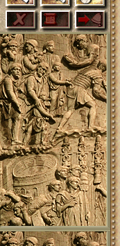
Maybe this vertical mural is valued as a historical value, but very useless, u know.
But, behind, there is a good place to show informations? Unemployment % for example? Current Taxes\Wages\Taxing Area? Current people happiness? Count of Luxury Palaces for now? Count of free houses to immigrate?
 ArtySh0ck
All 40 comments
I've suggested tweaking that aswell, but i got an response that it would take way too much time to work on that plus maybe it couldn't even be done at all
 Sagatt
on 27 Jan 2020
Sagatt
on 27 Jan 2020
Can we perhaps add the game speed and ratings here, instead of in the top bar?
 bvschaik
on 28 Jan 2020
bvschaik
on 28 Jan 2020
Maybe...
ArtySh0ck
on 28 Jan 2020
Humm.. On the top bar the default green font looks good because the background image is more or less an uniform color.
That's not the case here, so some background would have to be added in order for the text to be readable.
For debugging purposes I sometimes use that part of the sidebar and I basically give it the same background of a tooltip: a black, 1 pixel border and then a white rectangle with the text. That is good enough for debugging purposes, but I think it looks ugly for an effective UI element.
So my question is: what could be used instead?
 crudelios
on 28 Jan 2020
crudelios
on 28 Jan 2020
The same background as used for the "inner" panels in the advisors/building info? This is the same as the info box in the editor side panel.
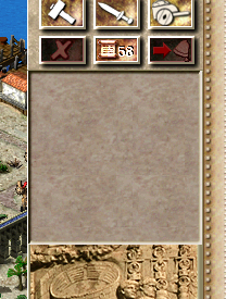
bvschaik
on 28 Jan 2020
Looks good! Is that a "programmer's mockup"? ;)
crudelios
on 28 Jan 2020
Wow, it looks very good.
ArtySh0ck
on 28 Jan 2020
Looks good! Is that a "programmer's mockup"? ;)
Yes, a one-minute "just draw an inner panel here please" programmer's mockup 😉
So, next question: what do we want to have displayed in this panel?
bvschaik
on 28 Jan 2020
Game speed (with buttons)?
Expanded ratings?
Culture x/total
Prosperity x/total
Peace x/total
Favor x/total
Target population is X
I'm not sure the target population will fit.
crudelios
on 28 Jan 2020
Happiness of people, unemployment %...
ArtySh0ck
on 29 Jan 2020
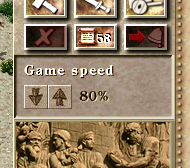
So far I have this. I tried adding the ratings but there's not enough space for "prosperity 80/100" on one line, and I didn't even try more verbose languages (German, I'm looking at you).
bvschaik
on 29 Jan 2020
So far I have this.
I like it!
For the ratings, how about displaying Objectives 5/5 and the specific ratings appear on a tooltip?
crudelios
on 29 Jan 2020
Re missing space: Maybe put it into two lines like with game speed?
Culture
x/total
Prosperity
x/total
Peace
x/total
Favor
x/total
 m-mohr
on 29 Jan 2020
m-mohr
on 29 Jan 2020
So far I have this. I tried adding the ratings but there's not enough space for "prosperity 80/100" on one line, and I didn't even try more verbose languages (German, I'm looking at you).
This one is good for android touching supprt!
 411752230
on 29 Jan 2020
411752230
on 29 Jan 2020
I didn't even try more verbose languages (German, I'm looking at you).
@bvschaik As a German, I'm aware of the issue, but in this case it's quite funny that German is interestingly less verbose in most cases:
Culture (7 chars)
Kultur (6 chars)
Prosperity (10)
Wohlstand (9)
Peace (5)
Frieden (7)
Favor (5)
Gunst (5)
:-)
This one is good for android touching supprt!
Although on phones this is probably cut off (at least on my phone).
m-mohr
on 29 Jan 2020
Although on phones this is probably cut off (at least on my phone).
It most probably won't fit on a phone. It will fit in tablets though.
crudelios
on 29 Jan 2020
there's not enough space for "prosperity 80/100" on one line
maybe prosp. for prosperity? cult. for culture? something like that
ArtySh0ck
on 29 Jan 2020
@bvschaik As a German, I'm aware of the issue, but in this case it's quite funny that German is interestingly less verbose in most cases:
Haha, irony indeed 🤣
maybe prosp. for prosperity? cult. for culture? something like that
That won't work. How do you abbreviate it in Russian or Chinese?
It most probably won't fit on a phone. It will fit in tablets though.
It also fits (barely) on Switch and Vita, which both use a resolution of 960x540.
bvschaik
on 29 Jan 2020
First test build is available here: https://bintray.com/bvschaik/julius-branches/windows/sidebar-extra-info-1.2.0.54-0ea8d24f#files
bvschaik
on 29 Jan 2020
Works fine for me!
crudelios
on 29 Jan 2020
Works for me, too.(German)
m-mohr
on 30 Jan 2020
Works for me!
 Legionary2
on 30 Jan 2020
Legionary2
on 30 Jan 2020
Works flawlessly with Chinese
411752230
on 30 Jan 2020
Refreshing to see UI changes being done
Sagatt
on 30 Jan 2020
Guys, how may i install another language of c3 but no corrupt my english c3? i want to try russian version with this test build. what i have to do?
ArtySh0ck
on 30 Jan 2020
Guys, how may i install another language of c3 but no corrupt my english c3? i want to try russian version with this test build. what i have to do?
You will need some extra image files besides the language files, do you have them?
If you do, I usually do the following to change the language:
- Change the extension of all
*.engfiles to something like*.engold - Copy the new language files as the
*.engfiles - Play the game
To revert back to english, I usually do this:
- Change the extension of the current language to its idiom. For example, if you have the russian files as the
*.eng, I change them all to*.rus - Revert back the
*.engoldto*.eng
As an alternative, you can set a folder for each language. It's your choice, really. What matters is that the *.eng files correspond to the language you want.
crudelios
on 30 Jan 2020
I just did another installation of 1C rus version ))
And for russian version this sidebar looks good too!
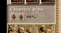
ArtySh0ck
on 30 Jan 2020
and it disappeared... why 1.2.0.56 doesnt have a speed game bar ? =(
ArtySh0ck
on 31 Jan 2020
why 1.2.0.56 doesnt have a speed game bar ? =(
Because it's a work in progress that's dependent on #284
crudelios
on 31 Jan 2020
The latest master now has this information (if window is sufficiently tall):
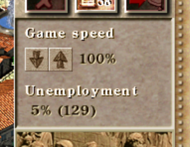
In case of worker shortage, this will display "0% (-15)" if you are 15 workers short.
bvschaik
on 2 Feb 2020
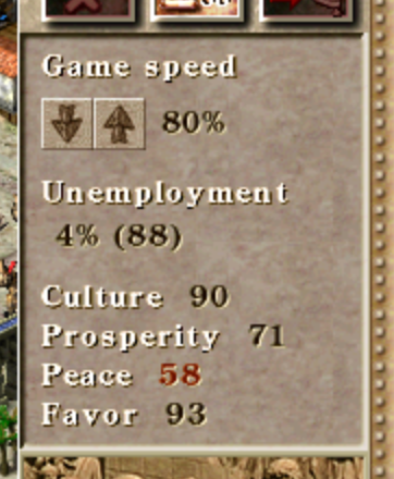
I just had a light-bulb moment for the ratings. How about this? Green = reached, red = not yet reached.
bvschaik
on 5 Feb 2020
Are those different colors? I'm color blind (I have difficulty precisely in the red-green spectrum) and can't notice the difference...
Also, most times people want to know the rating objective.
What if you simply reduce the font size for the ratings?
crudelios
on 5 Feb 2020
@crudelios Yes, the "58" is red.
@bvschaik It would still be useful to get the required numbers. If there's not enough space, maybe use tooltips? That could also be added as tooltip to the population count in the top menu.
Another light-bulb moment: My idea is to do it similarly as for the unemployment. Show the difference from the required numbers. So If Peace required 70 and you have 58, show -12. If Culture required 50 and you have 90, show +40. That would solve the color issue and basically shows you what to do without showing two numbers. The tooltip then could show "Culture: 50/90".
m-mohr
on 6 Feb 2020
@m-mohr Showing the difference will be very confusing. I'm definitely not thinking "oh, I need 3 more culture rating and then I'm done".
Reducing font size will be ugly because the small font is not anti-aliased.
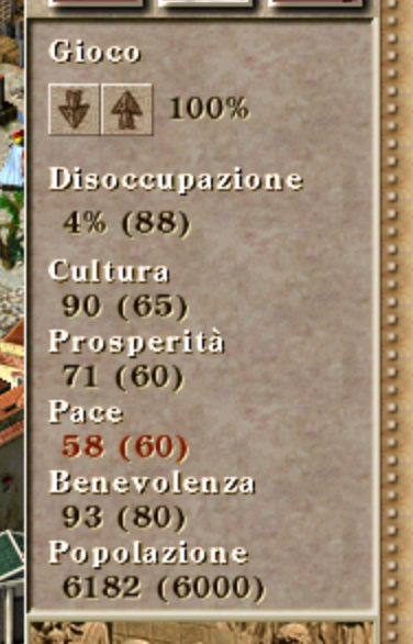
Ok, how about this, then?
bvschaik
on 6 Feb 2020
@bvschaik I don't think it is confusing, but maybe I'm just trained to think differently in this regard ;-)
I like the implementation shown, although the population number is then shown twice on the screen.
And you are saying German is verbose? Italian is! :-D
m-mohr
on 6 Feb 2020
Population is now indeed shown twice. The alternative is not having it there but then you miss the requirement.
French can also be very verbose for some phrases.
bvschaik
on 6 Feb 2020
I really like that last implementation, even with the repeated population. However, can you make the font colors for the achieved and not achieved objectives a bit more different please?
crudelios
on 6 Feb 2020
Unfortunately not. These are the prerendered, anti-aliased, and shadowed fonts FONT_NORMAL_GREEN and FONT_NORMAL_RED, which cannot be colored. Even if they could, I don't want to mess with the colors there since any tinting easily looks wrong.
bvschaik
on 6 Feb 2020
Oh it's those fonts. Ok, no problem then!
crudelios
on 6 Feb 2020
Alright. Latest unstable has the ratings added.
I'm going to close this issue, if anyone has more ideas for things to add, please open a new issue.
bvschaik
on 7 Feb 2020
Related issues
ArtySh0ck
·
3Comments
 atolstoy
·
4Comments
atolstoy
·
4Comments
 devnoname120
·
5Comments
devnoname120
·
5Comments
 TheRealAyCe
·
7Comments
TheRealAyCe
·
7Comments
 mirh
·
9Comments
mirh
·
9Comments
Most helpful comment
The latest master now has this information (if window is sufficiently tall):
In case of worker shortage, this will display "0% (-15)" if you are 15 workers short.