Jfoenix: JFXTabPane CSS problem with tabs
I am facing the below css problem when selecting the tabs in the TabPane , for some reason that line below is going also to other tabs ... what i mean :


If i selected though the last tab it works ok .

What might be the problem , i have no clue :) Love JFoenix community so much!!!!
 goxr3plus
All 12 comments
Hello,
share love with JFoenix community :p. I think it's related to the font size or something. can you provide SSCCE for this issue?
Regards,
 jfoenixadmin
on 7 Aug 2018
jfoenixadmin
on 7 Aug 2018
You want the css file you mean :) ?
goxr3plus
on 7 Aug 2018
that would help too
jfoenixadmin
on 8 Aug 2018
Here is the css , the problem is simple :
.specialJFXTabPane .tab-header-area .tab-header-background {
    /*-fx-opacity: 0.0;*/
    -fx-background-color:#252525 !important;
}

.specialJFXTabPane .tab-header-area .jfx-rippler{
    -fx-rippler-fill:firebrick !important;
    -fx-cursor:hand;
}

.specialJFXTabPane .tab-header-area  .tab-selected-line{
     -fx-stroke: firebrick !important;
}

.specialJFXTabPane .tab .tab-label {
    -fx-alignment: CENTER;
    -fx-text-fill: white;
    -fx-font-size: 13.5px; /* before it was 12px */
    -fx-font-weight: bold;
    -fx-wrap-text: true;
    -fx-cursor:hand;
}

.specialJFXTabPane .tab:hover .tab-label{
    -fx-text-fill:white;
    -fx-background-color:red !important;
    -fx-background-radius: 0.0;
}

.specialJFXTabPane .tab:selected .tab-label{
    -fx-background-color:#FFFFFF27;
}
I am increasing the font size and also adding a FontIcon using Ikonli FontIcons .
Even if i remove the FontIcon and reducing the font size back to normal the same problem . What kind of bug is this ....

goxr3plus
on 10 Aug 2018
Also how i can change the color of the green line below the tabs .... like i am lost . Pappa help me :)
goxr3plus
on 10 Aug 2018
Which JFoenix version are you using? plz update to the latest one 8.0.7 / 9.0.6
as I was not able to reproduce the issue
jfoenixadmin
on 12 Aug 2018
This is very interesting i just updated on JFoenix 9.0.6 and still the same thing .... Papa why this happens ?


This behaviour is very strange .... below is the entire css that i am using for the application :) . Apart from that what i am doing is just creating a JFXTabPane from fxml ...
*{
-light-black: rgb(74.0, 75.0, 78.0);
-dark-highlight: rgb(87.0, 89.0, 92.0);
-dark-black: rgb(39.0, 40.0, 40.0);
-darkest-black: rgb(5.0, 5.0, 5.0);
-mid-gray: rgb(216.0, 222.0, 227.0);
}
/*******************************************************************************
* bread-crumb-bar *
******************************************************************************/
.bread-crumb-bar {
-fx-background-color: #101010;
}
.bread-crumb-bar .button {
/*-fx-padding: 8.0 12.0 8.0 20.0;
-fx-border-color: null;
-fx-border-insets: 0.0;
-fx-content-display: left;
-fx-background-position: left center;
-fx-background-repeat: no-repeat;
-fx-background-color: transparent;
-fx-border-color: transparent;
-fx-shape: null;
*/
-fx-cursor:hand;
}
/*.bread-crumb-bar .first {
-fx-background-color: transparent ;
-fx-border-color: transparent;
-fx-font-size: 1.11em;
-fx-text-fill: #000;
-fx-background-image: null;
-fx-shape: null;
-fx-padding: 8.0 12.0 8.0 0.0;
}
.crumb {
-fx-text-fill: white;
}
.crumb:hover, .crumb:selected, .crumb:focused {
-fx-background-color: rgba(0.0,0.0,0.0,0.1);
-fx-border-color: null;
-fx-font-weight:bold;
-fx-text-fill: white;
}
*/
/*******************************************************************************
* SplitPane *
******************************************************************************/
.split-pane{
-fx-background-color:transparent ;
}
.split-pane .split-pane-divider{
-fx-background-color:
-darkest-black,
-dark-highlight,
linear-gradient(to bottom, -light-black 2.0%, -dark-black 98.0%);
}
.split-pane .split-pane-divider:hover{
-fx-background-color:firebrick;
}
/*******************************************************************************
* PieChart *
******************************************************************************/
.chart .chart-title .text{
-fx-font-size:9.0px;
}
.chart-pie-label {
-fx-fill: white;
/*-fx-font-weight:bold;*/
-fx-font-size: 1.0em;
}
.chart .chart-title .text{
-fx-font-weight:bold;
-fx-fill:white;
}
.chart .chart-content .chart-pie-label-line {
-fx-stroke: #8b4513;
-fx-fill: #8b4513;
}
/*******************************************************************************
* XYChart *
******************************************************************************/
.bar-chart:vertical{
-fx-background-color:#202020;
}
.axis:left{
-fx-tick-label-fill: white;
-fx-minor-tick-visible:false;
}
.bar-chart:vertical .chart-content .chart-plot-background{
-fx-background-color:#202020;
}
.bar-chart:vertical .chart-title{
-fx-background-color:#202020;
-fx-font-weight:bold;
-fx-font-size:15.0px;
}
.axis:bottom{
-fx-background-color:#252525;
}
.axis:bottom .axis-tick-mark{
-fx-fill:red;
}
.axis:bottom .axis-label .text{
-fx-fill:white;
}
/*******************************************************************************
* CheckBox *
******************************************************************************/
/*.check-box .box {
-fx-background-color: -fx-shadow-highlight-color, -fx-outer-border, -fx-inner-border, -fx-body-color;
-fx-background-insets: 0.0 0.0 -1.0 0.0, 0.0, 1.0, 2.0;
-fx-background-radius: 2.0, 2.0, 1.0, 1.0;
-fx-padding: 16.0; 3 -- padding from the outside edge to the mark
}
*/
/*******************************************************************************
* PlayListsSettingsController *
******************************************************************************/
.settingsLabel{
-fx-border-color: white white transparent white;
-fx-text-fill:gold;
-fx-font-weight:bold;
-fx-font-size:18.0;
}
.settingsRadioButton{
-fx-text-fill:white;
-fx-font-weight:bold;
-fx-cursor:hand;
}
.white-black-label{
-fx-text-fill:white;
-fx-font-size:14.0px;
-fx-font-weight:bold;
-fx-background-color:#151515;
}
/*******************************************************************************
* ToolBar *
******************************************************************************/
.tool-bar{
-fx-background-color: -mid-gray;
-fx-base: -dark-black;
-fx-font-size: 15.0pt;
-fx-font-weight:bold;
-fx-background-color:
linear-gradient(to bottom, derive(-fx-base,-30.0%), derive(-fx-base,-60.0%)),
linear-gradient(to bottom, -light-black 2.0%, -dark-black 98.0%);
-fx-background-insets: 0.0, 0.0 0.0 1.0 0.0;
/*-fx-padding: 0.9em 0.416667em 0.9em 0.416667em;*/
-fx-effect: dropshadow(two-pass-box,black,5.0,0.2,0.0,0.0);
}
.tool-bar2{
-fx-base: white;
}
.segmented-button-bar .button , .segmented-button-bar .toggle-button{
-fx-background-color:
-darkest-black,
-dark-highlight,
linear-gradient(to bottom, -light-black 2.0%, -dark-black 98.0%);
-fx-background-insets: 0.0, 1.0 1.0 1.0 0.0, 2.0 1.0 1.0 1.0;
-fx-background-radius: 0.0 !important;
-fx-padding: 0.4em 1.833333em 0.4em 1.833333em;
}
.segmented-button-bar .button.first {
-fx-background-insets: 0.0, 1.0, 2.0 1.0 1.0 1.0;
-fx-background-radius: 3.0 0.0 0.0 3.0, 2.0 0.0 0.0 2.0, 2.0 0.0 0.0 2.0;
}
.segmented-button-bar .button.last {
-fx-background-insets: 0.0, 1.0 1.0 1.0 0.0, 2.0 1.0 1.0 1.0;
-fx-background-radius: 0.0 3.0 3.0 0.0, 0.0 2.0 2.0 0.0, 0.0 2.0 2.0 0.0;
}
.segmented-button-bar .button:hover{
/*-fx-background-color:firebrick;*/
}
.toggle-button2{
-fx-background-color:
-darkest-black,
-dark-highlight,
linear-gradient(to bottom, -light-black 2.0%, -dark-black 98.0%);
-fx-background-insets: 0.0, 1.0 1.0 1.0 0.0, 2.0 1.0 1.0 1.0;
-fx-padding: 0.4em 1.833333em 0.4em 1.833333em;
}
.toggle-button2:hover{
-fx-background-color:rgb(255.0,106.0,0.0);
}
.toggle-button2:selected{
-fx-background-color:rgb(255.0,106.0,0.0);
-fx-border-color:black;
-fx-border-radius:32.0;
-fx-border-width:2.0px;
}
/*******************************************************************************
* TableView *
******************************************************************************/
.media-table-view{
-fx-background-color: #202020;
-fx-table-cell-border-color: transparent;
}
.media-table-view:row-selection:constrained-resize .placeholder .label .text{
-fx-fill:white;
-fx-font-weight:bold;
}
.media-table-view:row-selection:constrained-resize .column-header-background .filler{
-fx-background-color: #151515;
}
.media-table-view:row-selection .column-header-background .filler{
-fx-background-color: #151515;
}
.media-table-view:focused{
/*-fx-background-color: transparent;*/
}
.media-table-view .column-header {
-fx-background-color: transparent;
-fx-border-color:transparent white transparent transparent;
-fx-border-width:0.1;
}
.media-table-view .column-header-background{
-fx-background-color: #151515;
}
.media-table-view .column-header-background .label{
-fx-background-color: transparent;
-fx-font-weight:bold;
-fx-text-fill: white;
}
.media-table-view .table-column{
-fx-alignment:center;
}
/* ------------- .table-row-cell ------------- */
.table-row-cell{
-fx-table-cell-border-color: transparent;
-fx-background-color: #101010;
-fx-background-insets: 0.0, 0.0 0.0 0.0 0.0;
-fx-padding: 0.0em;
}
.table-row-cell:disabled{
-fx-opacity:0.5;
-fx-background-color:darkgray;
}
.table-row-cell:disabled .text{
/*-fx-strikethrough: true ;*/
}
.table-row-cell .text{
-fx-font-weight:bold;
-fx-fill: white ;
}
.table-row-cell:even { /* <=== changed to even */
-fx-background-color: #202020;
}
.table-row-cell:hover{
-fx-table-cell-border-color: transparent;
/*-fx-table-cell-border-width: 2.0;*/
}
.table-row-cell:hover .text , .table-row-cell:selected .text{
-fx-fill: black ;
}
.table-row-cell:hover:selected .text, .table-row-cell:focused:selected .text{
-fx-fill:white;
}
.table-row-cell:focused:disabled{
-fx-background-color:darkgray;
}
.table-row-cell:hover , .table-row-cell:selected{
/*-fx-background-color:rgb(0.0,191.0,255.0);*/
/*-fx-background-color: linear-gradient(#328BDB 0.0%, #207BCF 25.0%, #1973C9 75.0%, #0A65BF 100.0%);*/
-fx-background-color:rgb(255.0,106.0,0.0,0.85);
/*-fx-background-color: linear-gradient(#FF9400 0.0%, #FF7F00 25.0%, #FF5D00 75.0%, #FF4300 100.0%);*/
}
/* ------------- row-selection -------------------*/
.media-table-view:row-selection:constrained-resize .column-header-background .show-hide-columns-button{
-fx-background-color:black;
-fx-cursor:hand;
-fx-padding:5.0px;
-fx-min-width:32.0px !important;
-fx-max-width:32.0px !important;
-fx-pref-width:32.0px !important;
}
.media-table-view:row-selection:constrained-resize .column-header-background .show-hide-columns-button:hover{
-fx-background-color:black;
}
.media-table-view:row-selection:constrained-resize .column-header-background .show-hide-columns-button .show-hide-column-image{
-fx-background-color:white;
-fx-padding:6.0px;
}
.media-table-view:row-selection:constrained-resize .column-header-background .show-hide-columns-button .show-hide-column-image:hover{
-fx-background-color:white;
}
/*.table-row-cell:focused{
-fx-background-color:firebrick;
}*/
/*.table-row-cell:focused .text {
-fx-fill: white ;
} */
/*------------------------------*
/*
.table-view .table-cell{
-fx-font-weight:bold;
-fx-text-fill:black;
}
.table-row-cell{
-fx-background-color: white;
-fx-background-insets: 0.0, 0.0 0.0 1.0 0.0;
-fx-padding: 0.0em;
}
.table-row-cell:odd{
-fx-background-color: orange;
-fx-background-insets: 0.0, 0.0 0.0 1.0 0.0;
-fx-padding: 0.0em;
}
.table-view {
-fx-background-insets: 0;
-fx-padding: 10;
-fx-alignment: center;
}
.table-view .column-header-background {
-fx-background-color: transparent;
-fx-border-color: transparent transparent rgba(255,255,255,0.3) transparent;
-fx-border-width: 1;
-fx-background-insets: 0;
-fx-padding: 0 10 0 0;
}
.table-view .column-header, .table-view .filler {
-fx-border-color: transparent;
}
.table-view .column-header .label {
-fx-text-fill: firebrick;
-fx-font-weight: bold;
}
.table-view .table-cell {
-fx-background-color: transparent;
-fx-border-color: transparent;
-fx-text-fill: black;
-fx-alignment: center;
}
.table-view .table-row-cell:filled:selected:focused,
.table-view .table-row-cell:filled:selected {
-fx-background-color: rgba(0,0,0,0.3);
}
*/
/*******************************************************************************
* ListView *
******************************************************************************/
.list-view{
-fx-background-color:#101010;
}
.list-cell:filled:selected:focused, .list-cell:filled:selected {
-fx-background-color: linear-gradient(#328BDB 0.0%, #207BCF 25.0%, #1973C9 75.0%, #0A65BF 100.0%);
}
.list-cell{
-fx-font-weight:bold;
-fx-text-fill: white;
-fx-background-color: #101010;
}
.list-cell:even { /* <=== changed to even */
-fx-background-color: #202020;
}
.list-cell:filled:hover {
-fx-background-color: #0093ff;
-fx-text-fill: white;
}
/*******************************************************************************
* DialogPane *
******************************************************************************/
.dialog-pane{
-fx-background-color:#202020;
}
.dialog-pane:header .header-panel {
-fx-background-color: #202020;
-fx-border-color:transparent transparent firebrick transparent;
-fx-border-width:2.0;
}
.dialog-pane:header .header-panel .label{
-fx-background-color: #202020;
-fx-background-radius:10.0px;
-fx-text-fill:white;
-fx-font-size:15.0px;
}
/* .dialog-pane >.content{
-fx-background-color:red;
}
*/
.dialog-pane > .content.label {
-fx-padding: 0.5em 0.5em 0.5em 0.5em;
-fx-background-color: #202020;
-fx-text-fill:white;
-fx-font-size:15.0px;
}
.dialog-pane > .button-bar > .container {
-fx-background-color:#202020;
-fx-border-color:white transparent transparent transparent;
}
.dialog-pane .button:armed,
.dialog-pane .button:hover,
.dialog-pane .button:focused{
-fx-background-color:rgb(255.0,255.0,255.0,0.9);
-fx-text-fill:black;
}
.dialog-pane .button {
-fx-background-color:rgb(255.0,255.0,255.0,0.4);
-fx-background-radius: 0.0px;
-fx-background-insets: 0.0px;
-fx-cursor:hand;
}
/* .dialog-pane .button:hover{
-fx-background-color:rgb(255.0,119.0,0.0,0.7);
-fx-font-weight:bold;
}*/
/*******************************************************************************
* ToolTip *
******************************************************************************/
.tooltip{
-fx-background-color: white;
-fx-text-fill:black;
-fx-font-size:11.0;
/* -fx-effect: dropshadow( three-pass-box, black, 10.0, 0.0, 0.0, 0.0); */
-fx-wrap-text:true;
}
/*******************************************************************************
* TitledPane *
******************************************************************************/
.titled-pane {
-fx-background-color:transparent;
-fx-font-weight:bold;
-fx-text-fill:white;
}
.titled-pane > *.content {
/*-fx-effect: innershadow(three-pass-box, red , 15.0, 0.0, 0.0, 0.0);*/
-fx-background-color:transparent;
-fx-border-color:transparent;
}
.titled-pane > .title {
-fx-background-color: linear-gradient(#38424b 0.0%, #1f2429 20.0%, #191d22 100.0%);
/*-fx-background-color: -fx-box-border, -fx-inner-border, -fx-body-color;*/
-fx-background-insets: 0.0, 1.0, 2.0;
-fx-background-radius: 5.0 5.0 0.0 0.0, 4.0 4.0 0.0 0.0, 3.0 3.0 0.0 0.0;
-fx-padding: 0.166667em 0.833333em 0.25em 0.833333em; /* 2 10 3 10 */
}
/*******************************************************************************
* JFXTabPane *
*
* .jfx-tab-pane#specialJFXTabPane .tab:hover .tab-label{
*
* }
******************************************************************************/
#specialJFXTabPane2 .tab-header-area .tab-header-background {
/*-fx-opacity: 0.0;*/
-fx-background-color:rgb(0.0,0.0,0.0,0.8) !important;
}
.specialJFXTabPane .tab-header-area .tab-header-background {
    /*-fx-opacity: 0.0;*/
    -fx-background-color:#252525 !important;
}

.specialJFXTabPane .tab-header-area .jfx-rippler{
    -fx-rippler-fill:firebrick !important;
    -fx-cursor:hand;
}

.specialJFXTabPane .tab-header-area  .tab-selected-line{
     -fx-stroke: firebrick !important;
}

.specialJFXTabPane .tab .tab-label {
    -fx-alignment: CENTER;
    -fx-text-fill: white;
    -fx-font-size: 13.5px; /* before it was 12px */
    -fx-font-weight: bold;
    -fx-wrap-text: true;
    -fx-cursor:hand;
}

.specialJFXTabPane .tab:hover .tab-label{
    -fx-text-fill:white;
    -fx-background-color:red !important;
    -fx-background-radius: 0.0;
}

.specialJFXTabPane .tab:selected .tab-label{
    -fx-background-color:#FFFFFF27;
}
/*******************************************************************************
* Magic Tab Pane *
******************************************************************************/
.magicTabPaneVersion1 .tab-header-area {
-fx-padding: 0.0 0.0 0.0 35.0 !important;
}
.magicTabPaneVersion2 .tab-header-area {
-fx-padding:0.0 !important;
}
/*******************************************************************************
* TabPane *
******************************************************************************/
.tab-pane .tab-header-area .tab-header-background {
/*-fx-opacity: 0.0;*/
/*-fx-background-color:linear-gradient(#38424b 0.0%, #1f2429 20.0%, #191d22 100.0%); */
-fx-background-color:#303030;
}
.tab-pane{
-fx-tab-min-width:90.0;
}
.tab-pane .tab{
-fx-background-color: black;
-fx-background-radius: 0.0 45.0 0.0 0.0 ;
-fx-border-color:transparent transparent transparent transparent;
-fx-focus-color: transparent;
-fx-faint-focus-color: transparent;
-fx-cursor:hand;
}
.tab-pane .tab:selected{
-fx-background-color: #FF6E00;
}
.tab-pane .tab:selected:hover{
-fx-background-color: #FF9D00;
}
.tab-pane .tab:hover{
-fx-background-color:#FF9D00;
}
.tab-pane .tab .tab-label {
-fx-alignment: CENTER;
-fx-text-fill: white;
-fx-font-size: 13.0px; /* before it was 12px */
-fx-font-weight: bold;
-fx-wrap-text: true;
}
.tab-pane .tab:selected .tab-label {
-fx-alignment: CENTER;
-fx-text-fill:white ; /* before it was BROWN */
/*-fx-font-size:130.0%;*/
}
.tab-pane .tab:hover .tab-label{
-fx-text-fill:black;
-fx-background-color:white;
-fx-background-radius: 0.0 0.0 0.0 0.0;
}
/*******************************************************************************
* Special Tab Pane *
******************************************************************************/
/*Special Tab Pane */
#SpecialTabPane .tab-header-area .tab-header-background {
-fx-background-color:transparent;
}
#SpecialTabPane .sTab.tab{
-fx-background-color:
-darkest-black,
-dark-highlight,
linear-gradient(to bottom, -light-black 2.0%, -dark-black 98.0%);
-fx-background-insets: 0.0, 1.0 1.0 1.0 0.0, 2.0 1.0 1.0 1.0;
-fx-background-radius:0.0 0.0 45.0 45.0;
-fx-text-fill: white;
-fx-font-size: 13.0px;
-fx-font-weight:bold;
-fx-padding:3.0em -1.3em 3.0em -1.3em;
-fx-cursor:hand;
}
#SpecialTabPane .sTab.tab:hover{
-fx-background-color:orange;
}
#SpecialTabPane .sTab.tab:selected{
-fx-background-color:firebrick;
}
#SpecialTabPane .sTab.tab:pressed{
-fx-background-color:
-darkest-black,
rgb(55.0, 57.0, 58.0),
linear-gradient(to top, -light-black 2.0%, -dark-black 98.0%);
}
#SpecialTabPane .sTab.tab .tab-label{
-fx-text-fill:white;
-fx-background-color: transparent;
-fx-background-radius:0.0px;
-fx-rotate:90.0;
}
#SpecialTabPane .sTab.tab:hover .tab-label,#SpecialTabPane .sTab.tab:selected .tab-label{
-fx-text-fill:black;
-fx-background-radius: 0.0 45.0 45.0 0.0;
-fx-background-color: white;
}
/*#SpecialTabPane .tab-header-area .tab-header-background {
-fx-background-color:transparent;
}
#SpecialTabPane .STab.tab .tab-label{
-fx-text-fill:white;
-fx-background-color: transparent;
-fx-background-radius:0.0px;
-fx-rotate:90.0;
}
#SpecialTabPane .STab.tab:selected .tab-label{
-fx-text-fill:white;
}
#SpecialTabPane .STab.tab:hover .tab-label{
-fx-text-fill:black;
-fx-background-radius:5.0px;
-fx-background-color: white;
}
#SpecialTabPane .STab.tab{
-fx-background-color:black;
-fx-background-radius: 0.0 0.0 20.0 20.0;
-fx-padding:3.0em 0.0em 3.0em 0.0em;
-fx-cursor:hand;
-fx-effect: innershadow(two-pass-box, white, 15.0, 0.0, 0.0, 0.0);
}
#SpecialTabPane .STab.tab:selected{
-fx-effect: innershadow(two-pass-box, red, 15.0, 0.0, 0.0, 0.0);
}
*/
/* LibrariesTabPane */
#MultipleLibrariesTabPane .tab-header-area .tab-header-background {
-fx-background-color:rgb(0.0,0.0,0.0,0.8);
-fx-background-radius:5.0 5.0 0.0 0.0;
}
/*******************************************************************************
* Button *
******************************************************************************/
/**About Button ----------------------------------------*/
.button , .menu-button , .segmented-button-bar .toggle-button {
/*-fx-effect: dropshadow( three-pass-box , rgba(0.0,0.0,0.0,0.6) , 5.0, 0.0 , 0.0 , 1.0 );*/
/* -fx-background-color: linear-gradient(#38424b 0.0%, #1f2429 20.0%, #191d22 100.0%); */
-fx-background-color: -darkest-black, -dark-highlight, linear-gradient(to bottom, -light-black 2.0%, -dark-black 98.0%);
-fx-background-insets: 0.0, 1.0 1.0 1.0 0.0, 2.0 1.0 1.0 1.0;
-fx-text-fill: white;
-fx-font-size: 13.0px;
-fx-font-weight:bold;
-fx-background-radius:45.0;
}
.button:hover , .menu-button:hover , .segmented-button-bar .button:hover , .segmented-button-bar .toggle-button:hover{
-fx-background-color:rgb(255.0,106.0,0.0);
/*-fx-background-color:
linear-gradient(from 0.0% 93.0% to 0.0% 100.0%, #a34313 0.0%, #903b12 100.0%),
#9d4024,
#d86e3a,
radial-gradient(center 50.0% 50.0%, radius 100.0%, #ea7f4b, #c54e2c);*/
}
.button:pressed , .menu-button:pressed , .segmented-button-bar .button:pressed{
-fx-background-color:
-darkest-black,
rgb(55.0, 57.0, 58.0),
linear-gradient(to top, -light-black 2.0%, -dark-black 98.0%);
}
.toggle-button {
-fx-cursor:hand;
}
.segmented-button-bar .toggle-button:selected{
-fx-background-color:#E47434;
-fx-text-fill:#202020;
}
.jfx-button:armed,
.jfx-button:hover,
.jfx-button:focused{
-fx-background-color:rgb(255.0,255.0,255.0,0.9);
-fx-text-fill:black;
}
.jfx-button,.jfx-menu-button {
-fx-background-color:rgb(255.0,255.0,255.0,0.4);
-fx-background-radius: 0.0px;
-fx-background-insets: 0.0px;
-fx-cursor:hand;
}
.jfx-button2:armed,
.jfx-button2:hover,
.jfx-button2:focused{
-fx-background-color:rgb(0.0,0.0,0.0,0.8);
-fx-text-fill:white;
}
.jfx-button2 {
-fx-background-color:rgb(0.0,0.0,0.0,0.4);
-fx-background-radius: 0.0px;
-fx-background-insets: 0.0px;
-fx-cursor:hand;
}
.jfx-button3:armed,
.jfx-button3:hover,
.jfx-button3:focused{
-fx-background-color:rgb(255.0,106.0,0.0);
-fx-text-fill:black;
}
.jfx-button3 {
-fx-background-color:-darkest-black, -dark-highlight, linear-gradient(to bottom, -light-black 2.0%, -dark-black 98.0%);
-fx-background-radius: 0.0px;
-fx-background-insets: 0.0px;
-fx-cursor:hand;
}
.jfx-button5:armed,
.jfx-button5:hover,
.jfx-button5:focused{
-fx-background-color:rgb(0.0,0.0,0.0,0.8);
-fx-text-fill:white;
}
.jfx-button5 {
-fx-background-color:rgb(0.0,0.0,0.0,0.4);
-fx-background-radius: 0.0px;
-fx-background-insets: 0.0px;
-fx-cursor:hand;
-fx-text-fill:white;
}
/**About SongButton ----------------------------------------*/
.songButton{
-fx-background-color: linear-gradient(#38424b 0.0%, #1f2429 20.0%, #191d22 100.0%);
-fx-background-radius: 5.0;
-fx-text-fill: white;
-fx-font-size: 13.0px;
}
.songButton:hover{
-fx-background-color:orange;
-fx-text-fill:black;
}
.songButton:focused{
-fx-background-color: linear-gradient(to bottom,black 60.0, #141414 60.2%, orange 87.0%);
-fx-text-fill:white;
}
.songButton:marked{
-fx-background-color:cyan;
-fx-background-radius:5.0;
-fx-text-fill:black;
-fx-font-size:13.0px;
}
/**About ArrowButon(in Libraries) ----------------------------------------*/
/**About ArrowButon(in Libraries) ----------------------------------------*/
.arrowButton{
-fx-background-color:rgb(255.0,255.0,255.0,0.2);
-fx-background-radius:45.0;
-fx-cursor:hand;
}
.arrowButton2{
-fx-background-color:#101010;
-fx-background-radius:45.0;
-fx-cursor:hand;
}
/**About SpecialButton(in Navigation Bar) ----------------------------------------*/
.specialButton{
-fx-background-color:black;
-fx-text-fill:white;
-fx-background-radius:20.0px;
-fx-effect: dropshadow( three-pass-box , orange , 5.0, 0.0 , 0.0 , 1.0 );
-fx-cursor:hand;
}
.specialButton:hover{
-fx-background-color:white;
-fx-text-fill:black;
}
.windowButton{
-fx-font-size:9.0;
-fx-font-weight:bold;
-fx-background-radius:0.0;
}
/*******************************************************************************
* CSS Styles for the ContextMenu,MenuItem,.. *
******************************************************************************/
.context-menu {
-fx-background-color:#202020;
-fx-background-radius:5.0;
-fx-border-width:2.0;
-fx-border-radius:2.0;
/*-fx-border-style:segments(4.0); */
-fx-cursor:hand;
}
.menu-item .label{
-fx-text-fill:white;
-fx-font-weight:bold;
-fx-font-size:15.5;
}
.menu-item:focused {
-color: rgb(255.0,95.0,0.0);
/*-fx-background-color:linear-gradient(
from 0.0px 0.75em to 0.75em 0.0px,
repeat,
-color 0.0%,
-color 49.0%,
derive(-color, 30.0%) 50.0%,
derive(-color, 30.0%) 99.0%
);*/
-fx-background-color:rgb(255.0,106.0,0.0,0.85);
}
.menu-item:focused .label{
-fx-text-fill:white;
}
/*******************************************************************************
* Label-Menu-Item *
******************************************************************************/
.title-menu-item .label{
-fx-text-alignment:center;
}
.title-menu-item .label .text{
-fx-text-alignment:center;
}
/* When the Label-Menu-Item is disabled [Always it is cause i don't want the user to be able to click it] */
.title-menu-item:disabled {
-fx-opacity: 1.0;
-fx-border-color:transparent firebrick firebrick firebrick;
-fx-border-width:2.0;
-fx-cursor:default;
}
.title-menu-item:disabled:hover{
-fx-background-color: transparent;
}
.title-menu-item:disabled .label {
-fx-opacity: 1.0;
-fx-font-size:11.0;
-fx-font-weight:bold;
-fx-text-fill:white;
-fx-text-alignment:center;
-fx-text-fill: #BBFF00;
}
.title-menu-item:disabled:hover .label {
-fx-background-color: transparent;
}
/*******************************************************************************
* ScrollPane *
******************************************************************************/
.scroll-pane .viewport {
-fx-background-color: transparent;
}
.scroll-pane {
-fx-background-color:transparent;
}
.corner {
-fx-background-color: #202020 ;
}
/* The main scrollbar CSS class of ListView */
.scroll-bar:horizontal ,
.scroll-bar:vertical{
-fx-background-color:#202020;
-fx-cursor: hand ;
}
/* The increment and decrement button CSS class of scrollbar */
.increment-button , .decrement-button {
-fx-background-color:transparent;
-fx-background-radius: 2.0em;
-fx-border-radius: 2.0em;
-fx-border-width:2.0px;
}
.increment-arrow , .decrement-arrow{
-fx-background-color:white;
-fx-border-color:white;
-fx-background-radius: 2.0em;
}
/* The main scrollbar **track** CSS class */
.scroll-bar:horizontal .track,
.scroll-bar:vertical .track{
-fx-background-color: #202020;
-fx-border-color:black;
-fx-opacity:0.9;
-fx-background-radius: 2.0em;
-fx-border-radius:2.0em;
}
/* The main scrollbar **thumb** CSS class which we drag every time (movable) */
.scroll-bar:horizontal .thumb,
.scroll-bar:vertical .thumb {
-fx-background-color: white;
/*-fx-background-insets: 2.0, 0.0, 0.0;*/
-fx-background-radius: 2.0em;
}
/*.scroll-bar:vertical{
-fx-pref-width:10px;
}
.scroll-bar:horizontal{
-fx-pref-height:10px;
}
.scroll-bar:vertical:hover{
-fx-pref-width:20px;
}
.scroll-bar:horizontal:hover{
-fx-pref-height:20px;
}*/
/* The main scrollbar **track** CSS class on event of "hover" and "pressed" */
.scroll-bar:horizontal:hover .track ,
.scroll-bar:horizontal:pressed .track ,
.scroll-bar:vertical:hover .track,
.scroll-bar:vertical:pressed .track{
-fx-background-color: #101010;
-fx-opacity: 0.9;
/* -fx-background-radius: 0.0em; */
}
/* The main scrollbar **thumb** CSS class on event of "hover" and "pressed" */
.scroll-bar .thumb:hover,
.scroll-bar .thumb:pressed{
-fx-background-color: white;
}
.increment-button:hover , .decrement-button:hover {
-fx-background-color:#151515;
-fx-border-color:white;
-fx-padding:10.0px;
/* -fx-background-color:derive(#202020,100.0%);
-fx-border-color:derive(#202020,80.0%);
-fx-padding:10.0px;*/
}
/*----------------OLD CODE-------------------------------------- */
/* .scroll-bar{
-fx-background-color: transparent;
}
.scroll-bar:vertical{
-fx-cursor: hand;
}
.scroll-bar:horizontal:hover .track , .scroll-bar:horizontal:pressed .track , .scroll-bar:vertical:hover .track, .scroll-bar:vertical:pressed .track{
-fx-background-color: derive(#434343,20.0%);
-fx-opacity: 0.2;
-fx-background-radius: 0.0em;
}
.scroll-bar .thumb:hover,.scroll-bar .thumb:pressed{
-fx-background-color: derive(black,50.0%);
}
.scroll-bar:horizontal .increment-arrow {
-fx-background-color: black;
-fx-shape: "M 0 0 L 4 8 L 8 0 Z";
-fx-padding: 0.3em;
-fx-rotate: -90.0;
}
.scroll-bar:horizontal .decrement-arrow {
-fx-background-color: black;
-fx-shape: "M 0 0 L 4 8 L 8 0 Z";
-fx-padding: 0.3em;
-fx-rotate: 90.0;
}
.scroll-bar:vertical .increment-arrow {
-fx-background-color: rgb(211.0,211.0,211.0);
-fx-shape: "M 0 0 L 4 8 L 8 0 Z";
-fx-padding: 0.3em;
-fx-rotate: 0.0;
}
.scroll-bar:vertical .decrement-arrow {
-fx-background-color: rgb(211.0,211.0,211.0);
-fx-shape: "M 0 0 L 4 8 L 8 0 Z";
-fx-padding: 0.3em;
-fx-rotate: -180.0;
}
.scroll-bar:vertical .increment-button,
.scroll-bar:vertical .decrement-button {
-fx-background-color:transparent;
}
.scroll-bar:horizontal .increment-button,
.scroll-bar:horizontal .decrement-button {
-fx-background-color:transparent;
}
*/
/*----------------END OF OLD CODE-------------------------------------- */
/*******************************************************************************
* Color Picker *
******************************************************************************/
.color-picker{
-fx-background-color: #101010;
-fx-background-radius:0.0;
}
.color-picker:hover{
-fx-background-color:rgb(255.0,106.0,0.0);
}
/*******************************************************************************
* TreeView *
******************************************************************************/
.tree-view{
-fx-background-color:#202020;
}
.tree-cell {
-fx-background-color: #202020 ;
-fx-text-fill: white ;
}
.tree-cell:selected {
-fx-font-weight: bold ;
-fx-text-fill:white;
-fx-underline: true;
}
.tree-cell {
-fx-padding: 0.75em 0.0em 0.75em 0.0em ;
}
.tree-cell:sub-tree-item {
-fx-padding: 0.25em ;
}
.tree-cell > .tree-disclosure-node > .arrow {
-fx-background-color: white;
}
.tree-cell:expanded > .tree-disclosure-node > .arrow {
-fx-background-color: white;
}
.tree-cell-2 {
-fx-text-fill: firebrick ;
}
.tree-cell-2:selected {
-fx-font-weight: bold ;
-fx-text-fill:firebrick;
-fx-underline: true;
}
/*******************************************************************************
* ProgressBar/ProgressIndicator *
******************************************************************************/
.progress-label{
-fx-text-fill:white;
-fx-font-weight:bold;
-fx-font-size:20.0;
-color: firebrick;
-fx-background-color:linear-gradient(
from 0.0px 0.75em to 0.75em 0.0px,
repeat,
-color 0.0%,
-color 49.0%,
derive(-color, 30.0%) 50.0%,
derive(-color, 30.0%) 99.0%
);
}
.progress-indicator{
-color: firebrick;
-fx-accent:linear-gradient(
from 0.0px 0.75em to 0.75em 0.0px,
repeat,
-color 0.0%,
-color 49.0%,
derive(-color, 30.0%) 50.0%,
derive(-color, 30.0%) 99.0%
);
}
.progress-indicator:determinate .determinate-indicator .percentage{
-fx-fill:white;
}
.dropbox-progress-indicator{
-color: #007EE5;
-fx-accent:linear-gradient(
from 0.0px 0.75em to 0.75em 0.0px,
repeat,
-color 0.0%,
-color 49.0%,
derive(-color, 30.0%) 50.0%,
derive(-color, 30.0%) 99.0%
);
}
/* .progress-bar{
-fx-progress-color:orange;
}
* */
.progress-bar > .bar {
-fx-accent:firebrick;
/*-fx-background-color:firebrick;*/
-fx-background-color: linear-gradient(
from 0.0px 0.75em to 0.75em 0.0px,
repeat,
-fx-accent 0.0%,
-fx-accent 49.0%,
derive(-fx-accent, 30.0%) 50.0%,
derive(-fx-accent, 30.0%) 99.0%
);
-fx-background-insets: 3.0;
-fx-padding: 0.2em;
}
.transparent-progress-bar:determinate .track,.transparent-progress-bar:indeterminate .track{
-fx-background-color:rgb(0.0,0.0,0.0,0.5);
}
/* .transparent-progress-bar */
.transparent-progress-bar > .bar,.transparent-progress-bar:indeterminate .bar{
-fx-accent:firebrick;
}
/* transparent-volume-progress-bar */
.transparent-volume-progress-bar:determinate .track,.transparent-volume-progress-bar:indeterminate .track{
-fx-background-color:rgb(0.0,0.0,0.0,0.5);
}
.transparent-volume-progress-bar1 > .bar,.transparent-volume-progress-bar1:indeterminate .bar,.transparent-volume-progress-bar1:determinate .track,.transparent-volume-progress-bar1:indeterminate .track{
-fx-accent:rgb(255.0, 95.0, 0.0);
-fx-background-radius:0.0;
-fx-border-radius:0.0;
}
.transparent-volume-progress-bar2 > .bar,.transparent-volume-progress-bar2:indeterminate .bar,.transparent-volume-progress-bar2:determinate .track,.transparent-volume-progress-bar2:indeterminate .track{
-fx-accent:rgb(0.0, 144.0, 255.0);
-fx-background-radius:0.0;
-fx-border-radius:0.0;
}
.transparent-volume-progress-bar3 > .bar,.transparent-volume-progress-bar3:indeterminate .bar,.transparent-volume-progress-bar3:determinate .track,.transparent-volume-progress-bar3:indeterminate .track{
-fx-accent:#fc4f4f;
-fx-background-radius:0.0;
-fx-border-radius:0.0;
}
.transparent-volume-progress-bar2-nostrip > .bar,.transparent-volume-progress-bar2-nostrip:indeterminate .bar,.transparent-volume-progress-bar2-nostrip:determinate .track,.transparent-volume-progress-bar2-nostrip:indeterminate .track{
-fx-accent:rgb(0.0, 144.0, 255.0);
-fx-background-color: -fx-accent;
-fx-background-radius:0.0;
-fx-border-radius:0.0;
}
.transparent-volume-progress-bar3-nostrip > .bar,.transparent-volume-progress-bar3-nostrip:indeterminate .bar,.transparent-volume-progress-bar3-nostrip:determinate .track,.transparent-volume-progress-bar3-nostrip:indeterminate .track{
-fx-accent:#fc4f4f;
-fx-background-color: -fx-accent;
-fx-background-radius:0.0;
-fx-border-radius:0.0;
}
/*******************************************************************************
* TagsBar *
******************************************************************************/
.tags-bar {
-fx-background-color:white;
-fx-background-radius:15.0px;
-fx-min-height: 45.0;
-fx-alignment:center-right;
-fx-spacing: 3.0px;
-fx-padding: 3.0px;
}
.tags-bar .tag {
-fx-background-color:black;
-fx-background-radius:10.0px;
-fx-alignment: center;
-fx-padding:1.0px;
-fx-cursor:hand;
}
.tags-bar .tag .label{
-fx-text-fill:white;
-fx-font-size:14.0px;
}
/*******************************************************************************
* Amazon *
******************************************************************************/
.media-information{
-fx-background-color:#202020;
}
.media-information .label{
-fx-font-weight:bold;
-fx-text-fill:white;
}
.media-information .mediaInfoLabel{
-fx-border-color: transparent firebrick transparent transparent;
-fx-font-weight:bold;
-fx-text-fill:white;
}
/*******************************************************************************
* Library *
******************************************************************************/
.library{
-fx-background-color:rgb(0.0,0.0,0.0,0.65);
-fx-background-radius:5.0;
}
.library .libraryNameLabel{
-fx-background-color:rgb(0.0,0.0,0.0,0.8);
-fx-text-fill:white;
-fx-font-size:14.0;
-fx-font-weight:bold;
/*-fx-font-family:"Younger than me";*/
}
.library:opened .libraryNameLabel{
-fx-text-fill:lightgreen !important;
-fx-font-size:15.0;
}
/*******************************************************************************
* LibrarySettings *
******************************************************************************/
.librarySettings {
-fx-background-color: #202020;
}
.librarySettings .label{
-fx-text-fill:white;
-fx-font-size:12.0px;
-fx-font-weight:bold;
-fx-border-color:transparent white transparent transparent ;
-fx-border-insets: 5.0px;
}
.librarySettings .text-area{
-fx-background-color: white;
-fx-background-radius:5.0;
-fx-text-fill:black;
-fx-font-size:13.0;
}
.librarySettings .text-area .content{
-fx-background-color:transparent;
}
.librarySettings .text-area:focused{
-fx-background-color: firebrick, white;
-fx-background-insets: -0.1, 2.0;
}
.inline-css-text-area{
-fx-background-color:#151515 !important;
}
/*******************************************************************************
* search-box,libraries-search-box *
******************************************************************************/
.special-text-field {
-fx-background-insets: -0.1, 2.0;
-fx-background-radius: 5.0;
-fx-border-radius:5.0;
-fx-border-width:1.0;
-fx-prompt-text-fill:black;
-fx-text-fill:black;
-fx-font-size:13.0;
-fx-font-weight:bold;
-fx-focus-color: firebrick;
}
/*.special-text-field:focused , .special-text-field:hover{
-fx-background-color: firebrick;
-fx-border-color:white;
-fx-text-fill:white;
-fx-prompt-text-fill:white;
}*/
/* .search-box .text-field, .libraries-search-box .text-field {*/
/*-fx-effect: dropshadow( three-pass-box, red , 10.0, 0.0,0.0,0.0);*/
/*-fx-background-insets:3.0;*/
/*-fx-background-radius: 5.0;
-fx-border-radius:5.0;*/
/*-fx-background-insets: -0.1, 2.0;
-fx-border-width:1.0;
-fx-prompt-text-fill:black;
-fx-text-fill:black;
-fx-font-size:13.0;
-fx-font-weight:bold;
}*/
/* .search-box .text-field:focused, .libraries-search-box .text-field:focused,.search-box .text-field:hover, .libraries-search-box .text-field:hover{ */
/*-fx-effect: null;*/
/*-fx-background-insets: -0.1, 2.0;*/
/*-fx-background-color: firebrick;
-fx-border-color:white;
-fx-text-fill:white;
-fx-prompt-text-fill:white;
}*/
.search-box-window-item{
-fx-background-color:white;
/*-fx-background-radius:5.0;*/
-fx-text-fill:black;
-fx-font-size:15.0;
-fx-font-weight:bold;
-fx-cursor:hand;
}
.search-box-window-item:hover{
-fx-background-color:#353535;
-fx-text-fill:white;
}
.search-box-window-label{
-fx-text-fill:white;
-fx-font-weight:bold;
-fx-font-size:15.0;
}
.tree-view-search-box {
-fx-background-radius: 45.0;
-fx-border-radius:45.0;
-fx-border-width:1.0;
-fx-background-color:white;
-fx-text-fill:black;
-fx-prompt-text-fill:#808080;
-fx-font-weight:bold;
}
.tree-view-search-box:hover{
-fx-border-width:2.0;
}
/*******************************************************************************
* StationCofigurator *
******************************************************************************/
.station-configurator{
-fx-background-color:white;
}
.station-configurator .text-area {
-fx-prompt-text-fill:white;
}
.station-configurator .jfx-text-field,.jfx-text-area{
-fx-background-color:white;
-fx-focus-color:yellow;
-fx-unfocus-color:black;
-fx-prompt-text-fill:black;
-fx-font-weight:bold;
}
/*******************************************************************************
* StarWindow *
******************************************************************************/
.starWindow{
-fx-background-color:#151515;
}
/*******************************************************************************
* SearchSettings *
******************************************************************************/
.searchSettings .jfx-text-field{
-fx-background-color:black;
-fx-focus-color:black;
-fx-unfocus-color:black;
-fx-prompt-text-fill:black;
-fx-font-weight:bold;
}
/*******************************************************************************
* xPlayerSecondLayerTabPane *
******************************************************************************/
.xPlayerSettingsTab{
-fx-font-weight:bold;
-fx-font-size:15.0;
-fx-text-fill:black;
}
/*******************************************************************************
* DragAdjustableLabel *
******************************************************************************/
/* @font-face{
src: url("../fonts/Younger than me.ttf");
}*/
.drag-adjustable-label{
-fx-background-color:#202020;
-fx-background-radius:15.0;
-fx-border-radius:15.0;
-fx-border-color:white;
-fx-border-width:2.0px;
-fx-font-size:18.0;
/*-fx-font-family:"Younger than me";*/
-fx-text-fill:white;
-fx-font-weight:bold;
}
#LoginScreenTopLabel{
/*-fx-font-family:"Younger than me";*/
}
#time-field-normal{
-fx-background-color:#202020;
-fx-padding:-2.0 8.0 -2.0 8.0;
-fx-background-radius: 0.0 0.0 0.0 0.0 ;
-fx-border-radius:0.0 0.0 0.0 0.0 ;
-fx-font-weight:bold;
-fx-font-size:15.0;
-fx-text-fill:white;
-fx-cursor:hand;
}
#time-field-reversed{
-fx-background-color:#202020;
-fx-padding:-2.0 8.0 -2.0 8.0;
-fx-background-radius: 0.0 0.0 0.0 0.0;
-fx-border-radius:0.0 0.0 0.0 0.0 ;
-fx-border-color:firebrick;
-fx-border-width:2.0;
-fx-font-weight:bold;
-fx-font-size:15.0;
-fx-text-fill:white;
-fx-cursor:hand;
}
/*******************************************************************************
* SideBar *
******************************************************************************/
.miniControl{
-fx-text-fill:black;
-fx-background-color:white;
-fx-background-radius:10.0;
-fx-cursor:hand;
}
#sideBar{
-fx-background-color:#202020;
}
.sideBarSectionLabel{
-fx-border-width:2.0;
-fx-border-color:black transparent transparent transparent;
-fx-text-fill:black;
-fx-font-weight:bold;
-fx-font-size:15.0;
}
.windowMode{
-fx-background-color:black;
-fx-border-radius:10.0;
-fx-border-width:2.0;
-fx-text-fill:white;
-fx-font-weight:bold;
-fx-cursor:hand;
}
.windowMode:hover{
-fx-background-color:firebrick;
}
.windowMode:selected{
-fx-text-fill:yellow;
-fx-background-color:firebrick;
}
/*******************************************************************************
* .menu-button *
******************************************************************************/
.menu-button{
-fx-background-radius:0.0;
-fx-cursor:hand;
}
.menu-button .label{
-fx-text-fill:white;
}
.menu-button .label:hover{
-fx-background-color:rgb(0.0,0.0,0.0,0.7);
-fx-background-radius:45.0;
-fx-text-fill:white;
}
.menu-button .arrow-button .arrow{
-fx-background-color:white;
}
.visWindowMenuButton .label{
-fx-text-fill:white;
}
.visWindowMenuButton .label:hover{
-fx-background-color:rgb(0.0,0.0,0.0,0.7);
-fx-background-radius:45.0;
-fx-text-fill:white;
}
.menu-button2 .label{
-fx-text-fill:white;
}
.menu-button2 .label:hover{
-fx-background-color:transparent;
-fx-text-fill:white;
}
/*******************************************************************************
* VisualizerWindow *
******************************************************************************/
.transparency-slider{
-fx-cursor:hand;
}
.transparency-slider .axis .axis-tick-mark, .slider .axis .axis-minor-tick-mark {
-fx-text-fill:white;
-fx-stroke:white;
}
.transparency-slider .axis {
-fx-tick-label-fill: white;
-fx-tick-label-font-weight: bold;
-fx-tick-length: 7.0px;
}
.transparency-slider .thumb{
-fx-background-color:
-darkest-black,
-dark-highlight,
linear-gradient(to bottom, -light-black 2.0%, -dark-black 98.0%);
-fx-background-radius:0.0;
-fx-border-color:#151515;
-fx-border-radius:0.0;
-fx-border-width:1.0;
}
.transparency-slider:vertical .thumb{
-fx-pref-width:25.0px;
}
.transparency-slider:horizontal .thumb{
-fx-pref-height:36.0px;
}
.transparency-slider .thumb:hover{
-fx-background-color:
-darkest-black,
-dark-highlight,
linear-gradient(to bottom, rgb(255.0,106.0,0.0) 2.0%, rgb(255.0,106.0,100.0) 98.0%);
}
.transparency-slider .track{
-fx-background-color:
-darkest-black,
-dark-highlight,
linear-gradient(to bottom, -light-black 2.0%, -dark-black 98.0%);
}
.transparency-slider2:vertical .track{
-fx-pref-width:13.0px;
}
.transparency-slider3:horizontal .track{
-fx-pref-height:15.0px;
-fx-background-color:transparent;
}
.transparency-slider3:vertical .track{
-fx-pref-height:25.0px;
-fx-background-color:transparent;
}
.transparency-slider3:vertical .thumb{
-fx-pref-width:35.0px;
}
.transparency-slider3:horizontal .thumb{
-fx-pref-height:25.0px;
}
/* Timer Slider */
.timer-slider .track{
-fx-pref-height:25.0px;
-fx-background-color:transparent;
}
.timer-slider .thumb{
-fx-pref-width:20.0px;
-fx-pref-height:22.0px;
}
/* Speed Slider */
.speed-slider:vertical .track{
-fx-pref-width:15.0px;
-fx-background-radius:0.0px;
}
.speed-slider:vertical .thumb{
-fx-pref-width:30.0px;
}
/* Volume Slider */
.volume-slider:vertical .track{
-fx-pref-width:15.0px;
-fx-background-radius:0.0px;
}
.volume-slider:vertical .thumb{
-fx-pref-width:32.0px;
}
/*******************************************************************************
* UpdateScreen *
******************************************************************************/
#updateScreenButtonLabel{
/*-fx-font-family:"Younger than me";*/
-fx-text-fill:blue;
}
/*******************************************************************************
* KeyBindings *
******************************************************************************/
.shortCutKey{
-fx-background-color:#202020;
-fx-text-fill:white;
-fx-font-weight:bold;
}
.applicationSettingsLabel{
-fx-background-color:#202020;
-fx-text-fill:white;
-fx-font-weight:bold;
-fx-border-color:transparent transparent firebrick transparent;
-fx-border-width:2.0;
}
.applicationSettingsLabel2{
-fx-background-color:#202020;
-fx-text-fill:white;
-fx-font-weight:bold;
-fx-border-color:transparent transparent white transparent;
-fx-border-width:2.0;
}
/*******************************************************************************
* Online Music *
******************************************************************************/
.online-music-root{
-fx-background-color:#101010;
}
.online-music-root-vbox{
-fx-padding:0.0 10.0 0.0 0.0;
}
.online-music-title-label{
-fx-font-size:17.0;
-fx-background-color:#202020;
-fx-text-fill:white;
-fx-font-weight:bold;
-fx-cursor:hand;
-fx-alignment:center;
}
.online-music-vbox-box{
-fx-background-color:#202020;
}
.online-music-vbox-box-label{
-fx-background-color:#202020;
-fx-text-fill:white;
-fx-font-weight:bold;
-fx-border-color:transparent transparent firebrick transparent;
-fx-border-width:2.0;
}
.online-music-vbox-box-stack-label{
-fx-background-color:rgb(20.0,20.0,20.0,0.95);
-fx-text-fill:white;
-fx-font-weight:bold;
-fx-cursor:hand;
}
/*******************************************************************************
* Combo Box *
******************************************************************************/
.combo-box-base{
-fx-background-color: #202020;
-fx-padding: 2.0 2.0;
}
.combo-box-base:editable{
-fx-background-color: #FF0;
}
.combo-box-base:editable > .text-field {
-fx-border-image-source: null;
-fx-background-color: transparent;
-fx-padding: 1.0 0.0;
}
.combo-box-base > .arrow-button {
-fx-background-color: #202020;
-fx-padding: 0.0 4.0;
}
.combo-box-base > .arrow-button > .arrow {
-fx-background-color: white;
-fx-background-insets: 0.0 0.0 0.0 0.0;
-fx-padding: 2.0 4.0;
-fx-shape: "M 0 0 H 7 L 3.5 4 z";
}
.combo-box-popup > .list-view {
-fx-border-style: solid;
-fx-border-width: 1.0;
-fx-border-color: black;
-fx-background-color: white;
-fx-background-insets: 0.0, 1.0;
}
.combo-box-popup > .list-view > .virtual-flow > .clipped-container > .sheet > .list-cell {
-fx-padding: 1.0 10.0;
-fx-background: red;
}
.combo-box-popup > .list-view > .virtual-flow > .clipped-container > .sheet > .list-cell:filled:selected {
-fx-background: green;
-fx-background-color: orange !important;
}
.combo-box-popup > .list-view > .virtual-flow > .clipped-container > .sheet > .list-cell:filled:hover,
.combo-box-popup > .list-view > .virtual-flow > .clipped-container > .sheet > .list-cell:filled:selected:hover {
-fx-background-color: silver !important;
}
.combo-box-popup > .list-view > .placeholder > .label {
-fx-text-fill: blue;
}
/*******************************************************************************
* MenuButton *
******************************************************************************/
.menu-button2 > .arrow-button > .arrow {
-fx-shape: "M3.5 0 L7 10 Q3.5 7 0 10z";
/* arrow down = M3.5 10 L7 0 Q3.5 3 0 0z */
}
.menu-button3 > .arrow-button > .arrow {
-fx-shape: "0";
/* arrow down = M3.5 10 L7 0 Q3.5 3 0 0z */
}
/*******************************************************************************
* TextFields *
******************************************************************************/
.dark-text-field,.search-box .text-field, .libraries-search-box .text-field,.dark-text-field-rectangle{
-fx-background-color:#202020;
-fx-text-fill:white;
-fx-font-weight:bold;
-fx-accent: firebrick ;
}
.dark-text-field-rectangle{
-fx-background-radius:0.0px;
}
.dark-text-field-rectangle:disabled{
-fx-opacity: 1.0;
}
.dark-text-area{
-fx-background-color:#202020;
-fx-text-fill:white;
-fx-fill:white;
-fx-accent: firebrick ;
-fx-font-weight:bold;
}
.dark-text-area .content {
-fx-background-color: #202020;
}
/*******************************************************************************
* Side - Bar *
******************************************************************************/
.side-bar{
-fx-background-color:#202020;
}
/*******************************************************************************
* Dark Buttons etc *
******************************************************************************/
.toggle-button3,.jfx-menu-button2,.jfx-button4,.dark-menu-button,.dark-round-jfx-button,.jfx-button-dark-white-selection{
-fx-background-color:rgb(20.0,20.0,20.0);
-fx-text-fill:white;
-fx-background-radius: 0.0px;
-fx-background-insets: 0.0px;
-fx-cursor:hand;
-fx-font-weight:bold;
}
.jfx-button-dark-white-selection,.split-menu-button:openvertically,.split-menu-button2 .label .text,.split-menu-button2 .arrow-button{
-fx-background-color:rgb(20.0,20.0,20.0) !important;
-fx-text-fill:white !important;
-fx-background-radius: 0.0px;
-fx-background-insets: 0.0px;
-fx-cursor:hand;
-fx-font-weight:bold;
}
.split-menu-button2 .arrow-button .arrow{
-fx-background-color:white;
}
.dark-menu-button .label{
-fx-background-color:transparent;
}
.dark-menu-button .label:hover{
-fx-background-color:transparent;
}
.jfx-button4:hover,.dark-menu-button:hover{
-fx-background-color:rgb(255.0,106.0,0.0,0.9);
}
.toggle-button3:hover{
-fx-background-color:rgb(255.0,106.0,0.0,0.9);
}
.toggle-button3:selected{
-fx-background-color:rgb(255.0,106.0,0.0,0.65);
}
/*.toggle-button3:armed,
.toggle-button3:hover,
.toggle-button3:focused{
}
*
*/
.dark-round-jfx-button{
-fx-background-radius:45.0;
-fx-background-color:#000000;
}
.jfx-button-white-selection:hover,.jfx-button-dark-white-selection:hover{
-fx-background-color:#FFFFFF !important;
-fx-text-fill:#000000 !important;
}
.jfx-button-red{
-fx-background-color:#ff5959 !important;
}
.jfx-button-red:hover{
-fx-background-color:#FF0C59 !important;
}
.jfx-button-green{
-fx-background-color:#A6C400 !important;
}
.jfx-button-green:hover{
-fx-background-color:#93AD00 !important;
}
.jfx-button-yellow{
-fx-background-color:#E0B235 !important;
}
.jfx-button-yellow:hover{
-fx-background-color:#D8AA34 !important;
}
/******************************************************************************
*
* Dark theme
*
*****************************************************************************/
.notification-bar.dark > .pane {
-fx-background-color: #202020;
}
.notification-bar.dark > .pane .title,
.notification-bar.dark > .pane .label {
-fx-text-fill: white;
}
/******************************************************************************
*
* Close button
*
*****************************************************************************/
.notification-bar > .pane .close-button {
-fx-background-color: #202020;
-fx-background-insets: 0.0;
-fx-background-radius: 2.0;
-fx-padding: 0.0 0.0 0.0 0.0;
-fx-alignment: center;
}
.notification-bar > .pane .close-button:hover {
-fx-background-color: firebrick;
}
.notification-bar > .pane .close-button:pressed {
-fx-background-color: firebrick;
}
.notification-bar > .pane .close-button > .graphic {
-fx-background-color: white;
-fx-scale-shape: false;
-fx-padding: 4.5 4.5 4.5 4.5; /* Graphic is 9x9 px */
}
.notification-bar > .pane .close-button:hover > .graphic {
-fx-background-color: #202020;
}
.notification-bar > .pane .close-button:pressed > .graphic {
-fx-background-color: #202020;
}
/******************************************************************************
*
* Separator
*
*****************************************************************************/
.separator *.line {
-fx-border-style: solid;
-fx-border-width: 1.0px;
-fx-border-color:rgb(255.0,95.0,0.0);
-fx-background-color:rgb(255.0,95.0,0.0);
}
/******************************************************************************
*
* Check-Box
*
*****************************************************************************/
.medium-check-box > .box {
-fx-padding: 1.0em 1.0em 1.0em 1.0em ;
}
.medium-check-box > .box > .mark {
-fx-padding: 1.0em 1.0em 1.0em 1.0em;
}
.medium-check-box .box ,.small-check-box .box{
-fx-background-color: #101010;
-fx-border-color:grey;
-fx-border-radius:3.0px;
-fx-text-fill:white;
}
.medium-check-box:selected .mark ,.small-check-box:selected .mark{
-fx-background-color: white;
}
.medium-check-box:selected .box,.small-check-box:selected .box{
-fx-background-color: orange;
-fx-border-color:transparent;
}
.small-check-box .text,.medium-check-box .text{
-fx-fill:white;
-fx-font-weight:bold;
}
I removed the line until we find a solution on this topic :
.jfx-tab-pane .tab-selected-line { -fx-background-color: transparent; }
It's very strange it seems to work when i run with -Dprism.allowhidpi=false for Java 9 . Hm interesting . I will do more testing and tell for sure .
goxr3plus
on 12 Aug 2018
this issue is similar to #728
jfoenixadmin
on 11 Sep 2018
I have the same problem
Using OpenJDK 11. Windows has 125% DPI scaling.
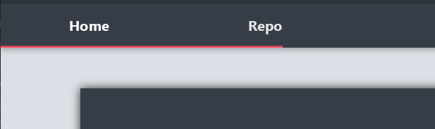

 mnxn
on 11 Oct 2018
mnxn
on 11 Oct 2018
I'll close this as it's duplicate to #728
jfoenixadmin
on 26 Nov 2018
Related issues
 swftvsn
·
3Comments
swftvsn
·
3Comments
 rickyzhangca
·
4Comments
rickyzhangca
·
4Comments
 RodrigoSantiago
·
3Comments
RodrigoSantiago
·
3Comments
 deme78
·
3Comments
deme78
·
3Comments
 ivanskodje
·
4Comments
ivanskodje
·
4Comments
Most helpful comment
Here is the css , the problem is simple :
I am increasing the font size and also adding a FontIcon using Ikonli FontIcons .
Even if i remove the FontIcon and reducing the font size back to normal the same problem . What kind of bug is this ....