Jetpack: Instant Search: Filter Icon on mobile needs work
The filter icon is not quite right and needs to be reworked, or we should change it to the word "Filter". If we change it to the word "Filter" we probably need to move it under the search box in which case the sorting options could go next to it.
Additionally, we should display a dot to indicate if any filters are currently activated. Make it clear that there is something in there that could be toggled.
 gibrown
All 8 comments
Here are two different options to solve this problem, both of which we discussed in person @gibrown
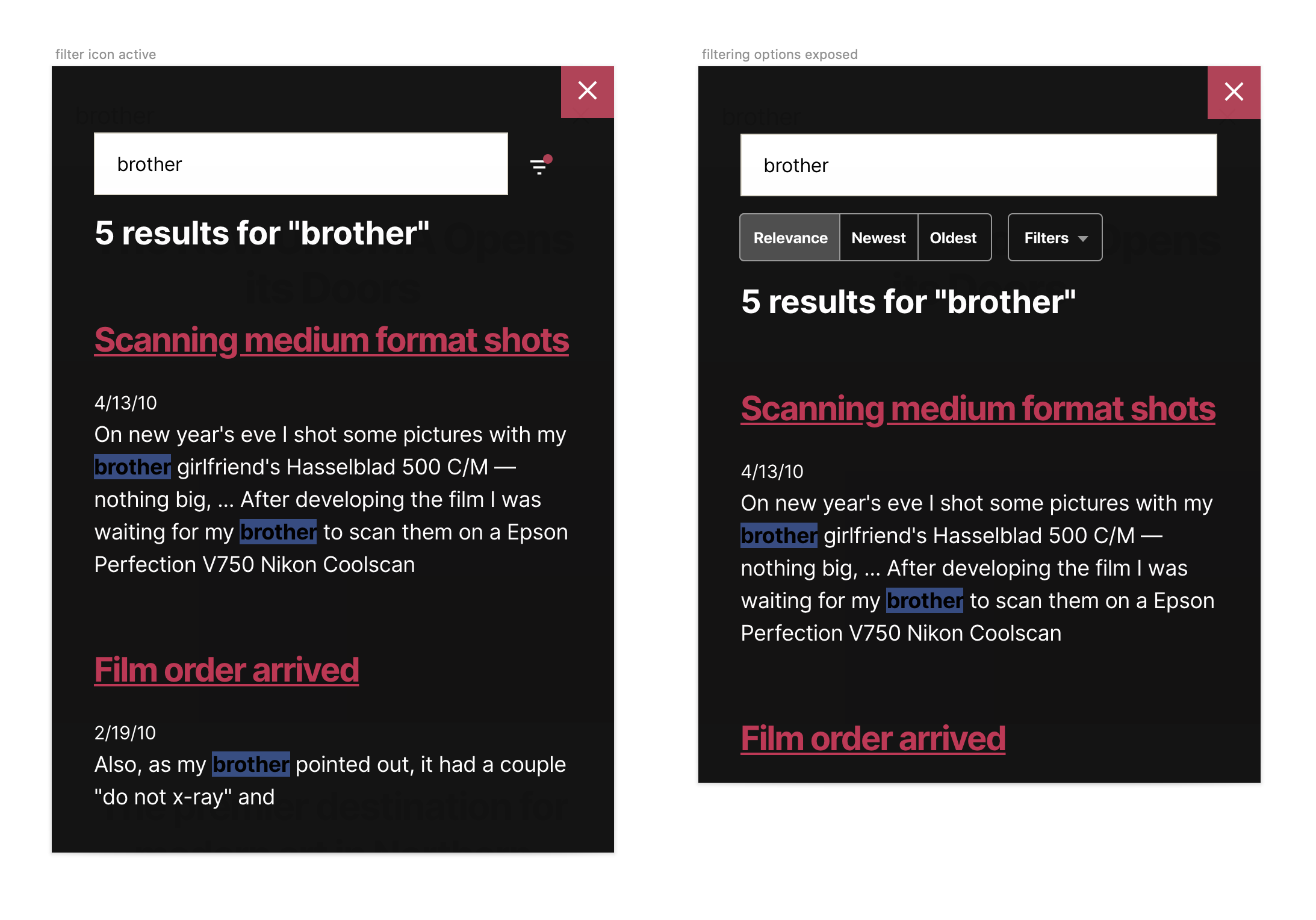
Filter icon active
A simple notification-like dot to highlight that one or more filters are selected. I like the visual cue, but I'm not a fan of adding even more meaning to that element when it doesn't mean much by itself.
Filtering options exposed
We also discussed this approach: getting rid of the icon altogether, which only exists on mobile, are exposing all filtering options below. The label could highlight how many filters are selected — Filters (3) — though I'm concerned about the real estate these elements require, especially because we're talking about mobile.
Curious to know what you think @jsnmoon and @gibrown .
 keoshi
on 11 Feb 2020
keoshi
on 11 Feb 2020
though I'm concerned about the real estate these elements require, especially because we're talking about mobile.
ya, it does take a bit of space. I like the second one a lot better though. More discoverable and it makes it very fast to interact with. I feel like we should go with it and see how it feels in general and if we get any feedback about it. Screen sizes have been getting bigger...
gibrown
on 11 Feb 2020
Ok, that's great. Adding an hybrid version that gets rid of the icon and provides a more comprehensive way into filtering:

Doesn't expose sorting options immediately, but that's the only negative when compared to the previous two options.
Thoughts?
keoshi
on 12 Feb 2020
Super hard to decide. I'm leaning towards having both the sorting and filtering shown.
Some thoughts:
- either way i think we get three results on my iphone (esp once we remove the date)
- in general search queries have gotten longer so this gives more space to show and edit the query
- for e-commerce sorting seems important
- unsure how long the word "Filter" will be in various langs so uncertain we want to put it next to the search box
- changing the sorting with a single tap seems like it would be great and fast
I don't have a super strong opinion.
gibrown
on 12 Feb 2020
I agree with all of those. Exposing the filters and showing that they also work instantly feels like a much more meaningful benefit than whatever real estate is lost there.
If we're all in agreement on this, I can start a PR for the styling of the components and then @jsnmoon can hook it all up?
keoshi
on 13 Feb 2020
@keoshi 👍
 jeffgolenski
on 14 Feb 2020
jeffgolenski
on 14 Feb 2020
I know this doesn't help, but I think all three approaches look good 😆
 jsnmoon
on 14 Feb 2020
jsnmoon
on 14 Feb 2020
@keoshi @jsnmoon let's go with the sorting buttons and filter drop down all being visible on mobile.
Also, turn the sorting on desktop into buttons rather than a dropdown?
gibrown
on 17 Feb 2020
Related issues
 jeherve
·
3Comments
jeherve
·
3Comments
 ockham
·
3Comments
ockham
·
3Comments
 htdat
·
3Comments
htdat
·
3Comments
 beaulebens
·
3Comments
ockham
·
3Comments
beaulebens
·
3Comments
ockham
·
3Comments
Most helpful comment
I agree with all of those. Exposing the filters and showing that they also work instantly feels like a much more meaningful benefit than whatever real estate is lost there.
If we're all in agreement on this, I can start a PR for the styling of the components and then @jsnmoon can hook it all up?