Jetpack: [Shortcopy] WP Admin Connection Banner: Reframe content
Refocusing Jetpack around Security and Performance.
Design TBD
 folletto
All 17 comments
@joanrho @keoshi
Here's my concept for our connection banner cupcake. Our color updates should be launched fairly soon, so I thought it would be nice to mod the content as well as color. A super quick cupcake. Wouldn't take more than an hour to make both the content and style changes.
Final content: tbd
Final illo color: tbd

Thoughts on this direction?
See the figma project for the live design.
 jeffgolenski
on 12 Mar 2019
jeffgolenski
on 12 Mar 2019
I really dig the overall look! I'm a big fan of how the green shines against this dark blue, and this feels like a nice bridge between Jetpack in wp-admin and the new onboarding. This will ensure a much smoother transition when connecting JP!
In terms of content, this does seem like a wall of text that I would probably avoid reading. :( I like that we're being descriptive, but even in this large resolution this banners takes over more than half the Dashboard real-estate. We can probably be more straight to the point with the copy, and refine the white space around the text, illo, and the Set up Jetpack button to make them even more effective.
Can we test how the text could overflow to two different columns in large resolutions? Maybe we can even reduce the content to the point where we don't even need that. What if the illo comes out of the right edge of the banner?
Great work, Jeff! I like this new direction a whole lot.
 keoshi
on 12 Mar 2019
keoshi
on 12 Mar 2019
Adding a couple of rough ideas for how much content I had in mind and how the elements could play off each other:
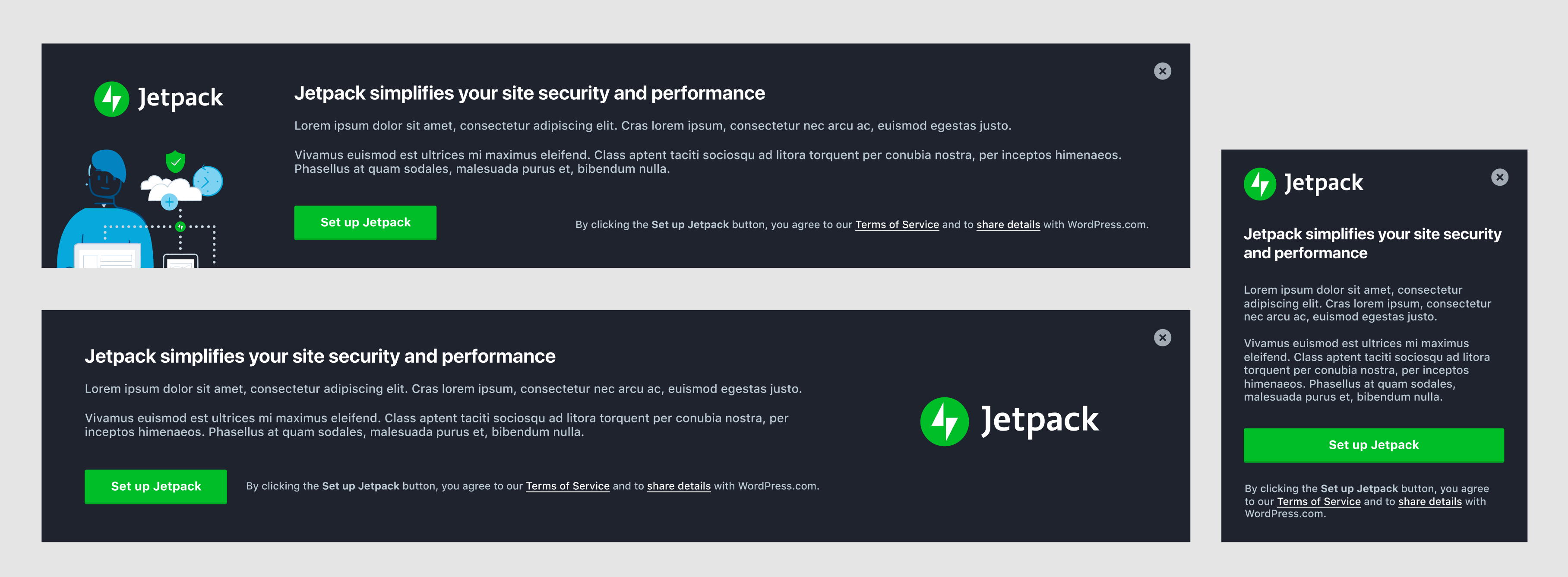
I've added these to the Figma project as well.
keoshi
on 12 Mar 2019
@keoshi I'm a huge fan of your first iteration with the logo and illo on the left side. Minimal text. I think it looks really nice.
jeffgolenski
on 12 Mar 2019
@keoshi Content is still TBD, but I worked on the illustration color and stole your format. I think, we're getting closer. How do you feel about something like this?
The illustration is in dropbox as well. Illustrations > jetpack specific
jeffgolenski
on 12 Mar 2019
Heck yeah, I love it! I really like how you worked the colors into the illustration, and I must say I'm surprised how well the bright tones work in the dark background.
My only two nitpicks would be:
- The large white space at the bottom. But I'd rather have the logo + title align at the top anyway, so if we can't have both I'm on board.
- Can we play a bit more with the proportions of the logo and illo? The logo could have more preponderance, and I think the content would benefit from having a smaller illustration (demanding less attention).
Again, minor minor details. I think this is ready to be built and then we can refine little things later on.
Awesome work, Jeff — thanks for running with this!
keoshi
on 12 Mar 2019
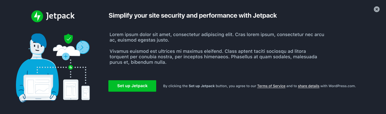
@keoshi I made a few more adjustments - the illo is now smaller to place more emphasis on the logo, I adjusted the alignment of some elements, and I just tossed some more real sample text instead of the lipsum. I'm all in favor with polishing this off in development if you are.
jeffgolenski
on 13 Mar 2019
Love it — let's ship it!! 🙌
keoshi
on 13 Mar 2019
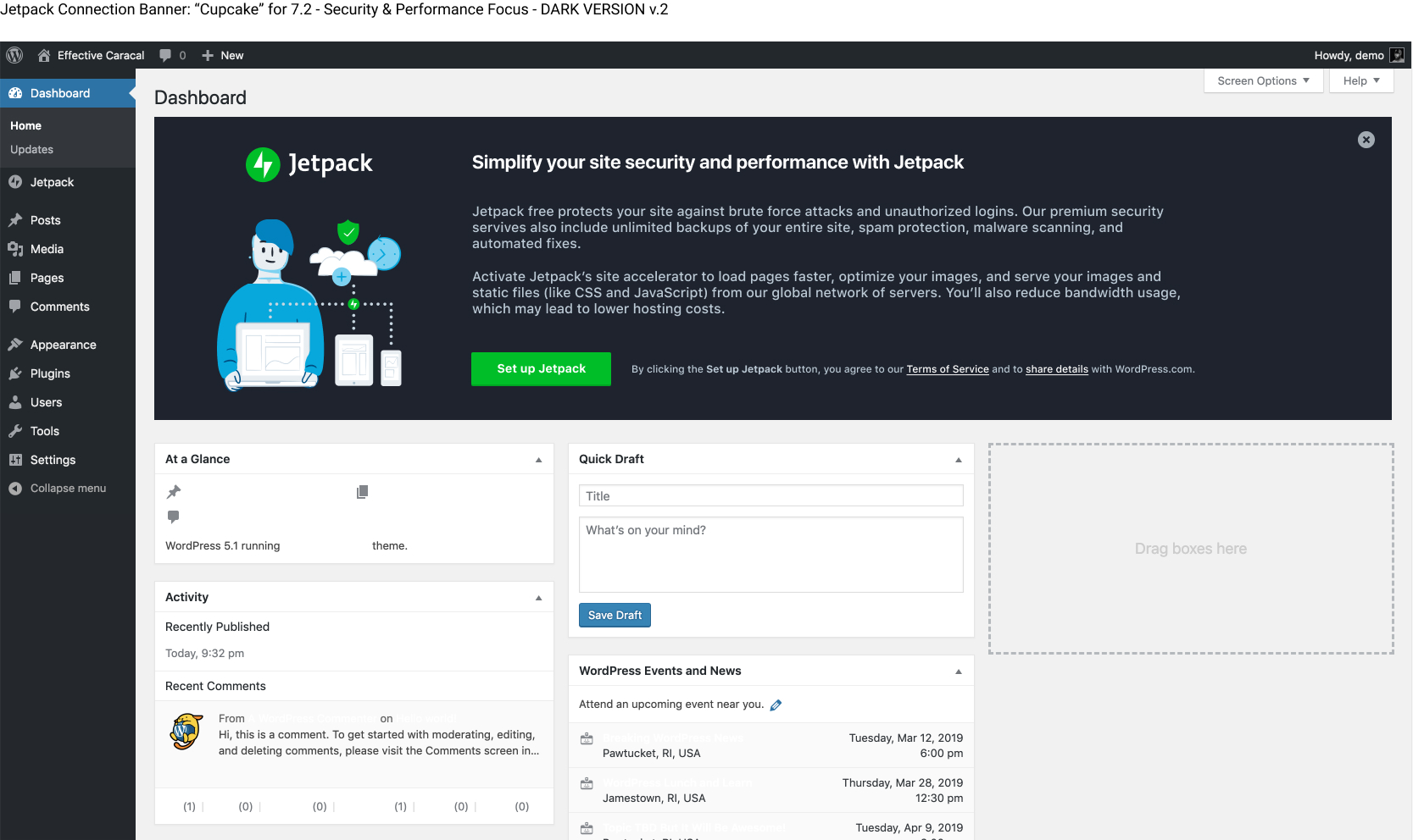
Based on the conversation and feedback in visual status today, I've reverted the color-scheme back to its original until we can dedicate more time into refining it properly.
Attached is our new IA / content changes, but with our current color scheme. BUT, I've modified the color of the illustration to match the work that @drw158 did a while back. Let me know what you think:
Special note: With our early January plugin release, we added a controversial green bar to the top of the banner in order to gain more attention in the hectic wp-admin UI. In this mockup I've changed it to match the illo color scheme from Dave's work - reserving the green for the logo and CTA. The idea here is that it will still gain attention, but with a more a11y friendly scheme.
Here's what the banner currently looks like:
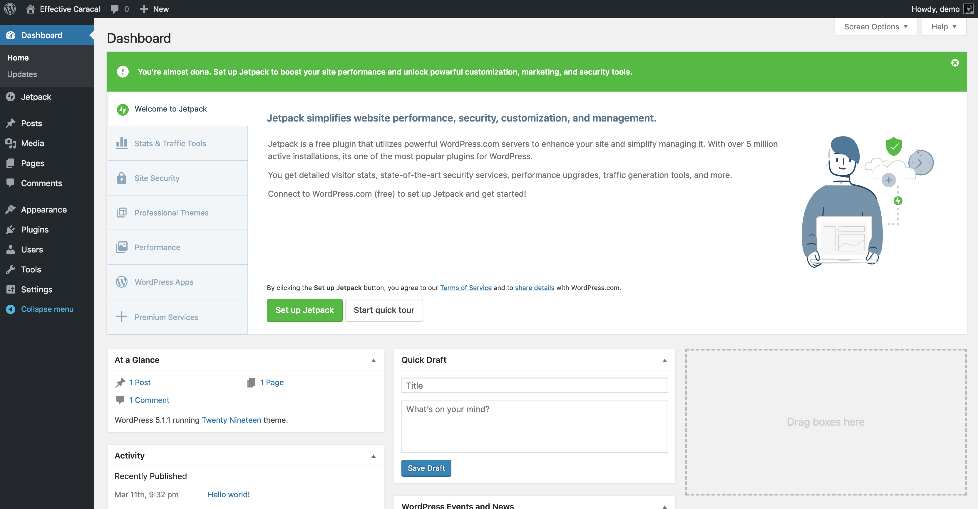
I've been watching the data trends over the past several months with these banners. Our connections with this banner since that release with the green bar (both in wp-admin/index.php and wp-admin/plugins.php) have increased substantially. I won't link to the tracks data there, but I'd urge us to keep it or at the very least entertain a conversation about it.
@keoshi @shaunandrews @joanrho
jeffgolenski
on 14 Mar 2019
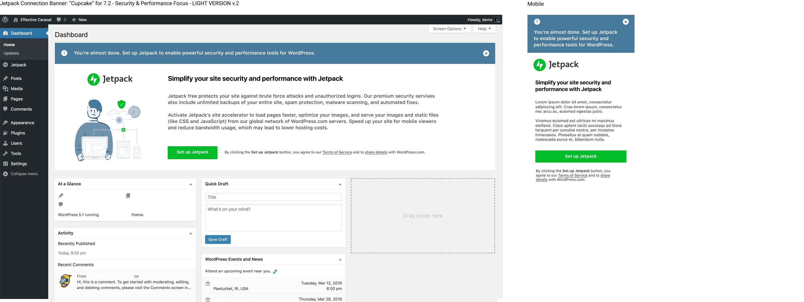
I don't know that we need the (!) icon in the top left corner. To me that says “warning” and conveys a not so positive message.
I'm also unsure that we need the top portion at all, but if we can correlate that change to an increase in number of connections, let's keep it. Just seems odd to have what is essentially a banner inside another banner, but I get why it works. Won't the color change to the grayish blue make it too subdued and annul its effect though?
Finally, I think we should ping @jennyzhu (or look up that thread) about the TOS line having to come before the Set up Jetpack button, to clear that up.
Everything else looks great, let's ship it!!
keoshi
on 14 Mar 2019
@keoshi Go to bed, it's late. haha
I'm also unsure that we need the top portion at all, but if we can correlate that change to an increase in number of connections, let's keep it. Just seems odd to have what is essentially a banner inside another banner, but I get why it works. Won't the color change to the grayish blue make it too subdued and annul its effect though?
I'm down to remove the (!) icon for sure. You're right.
Everything is an experiment. Given the fact that we can't acquire data on how many people who actually see this and don't act on it vs. do act on it, dilutes our hypothesis strength pretty badly I think.
I'm afraid with a subtle white banner with just a small green button, the effectiveness of getting people's attention will dwindle.
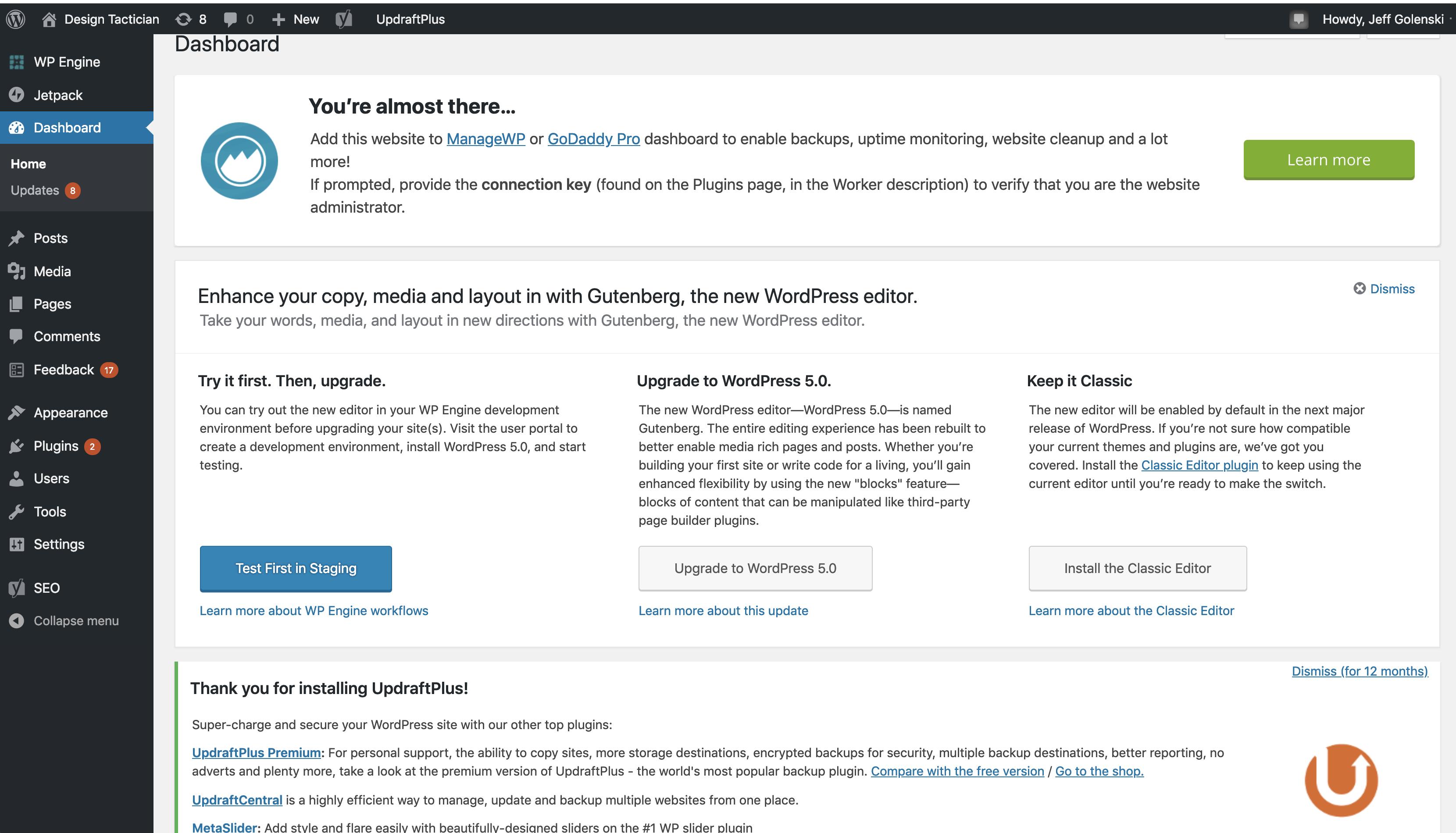
Here's an example of what one of my wordpress dashboards actually looks like. Look at all the banners and green buttons of our competitors...
jeffgolenski
on 14 Mar 2019
Yeah, maybe it’s better that we ship just an MVP right now (keep the top portion) and continue to evaluate how it performs, as opposed to making lots of changes and not knowing the source if something goes awry.
keoshi
on 14 Mar 2019
Absolutely!
jeffgolenski
on 14 Mar 2019
@eliorivero Regarding the conversation above here, just leave that green strip above the connection banner for now, like this:
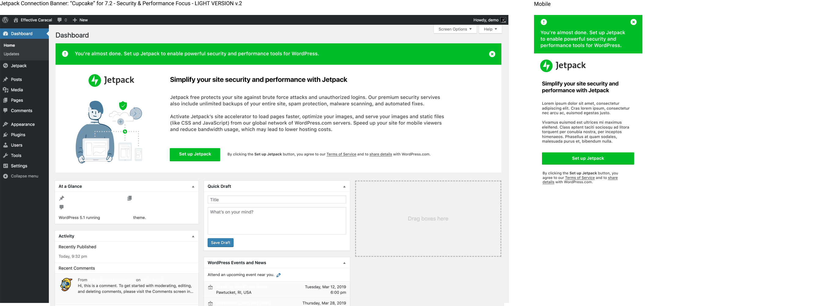
We're taking 6 "slides" down to 1 in this iteration, so the navigation on the left can just be removed in the banner.
The SVG is located here: https://www.dropbox.com/s/yc7ghy93fx9sc9w/jetpack-all-devices-2019.svg?dl=0
Here's the interim text:
Jetpack free protects your site against brute force attacks and unauthorized logins. Our premium security servives also include unlimited backups of your entire site, spam protection, malware scanning, and automated fixes.
Activate Jetpack’s site accelerator to load pages faster, optimize your images, and serve your images and static files (like CSS and JavaScript) from our global network of WordPress.com servers. Speed up your site for mobile viewers and reduce bandwidth usage, which may lead to lower hosting costs.
@Automattic/editorial This is the same content I asked for review here, your thoughts are greatly appreciated!
jeffgolenski
on 14 Mar 2019
@eliorivero Also, can we assign a new tracks event for this button? Right now the buttons in each respective slide are named based on jetpack v 4.4 (when we initially implemented it), slide number and their location within wp-admin. This connection banner displays on wp-admin/index.php and also plugins.php as I'm sure you're already aware of.
So the names look like this:

Can we add a convention like this for this new banner?
connect-banner-72-dashboard
connect-banner-72-plugins
@keoshi Would love your input here as well
jeffgolenski
on 14 Mar 2019
Ok will do 👍
If possible, can you add an issue for this and its card in the project board?
 eliorivero
on 15 Mar 2019
eliorivero
on 15 Mar 2019
Sorry, @jeffgolenski — this ping got lost in the Sea of Email™.
That sounds great to me, I like having the release version so we can pinpoint the data we get back. Faaantastic!
keoshi
on 15 Mar 2019
Related issues
 kraftbj
·
3Comments
kraftbj
·
3Comments
 beaulebens
·
3Comments
beaulebens
·
3Comments
 dougaitken
·
3Comments
dougaitken
·
3Comments
 tyxla
·
3Comments
tyxla
·
3Comments
 Viper007Bond
·
3Comments
Viper007Bond
·
3Comments
Most helpful comment
@eliorivero Also, can we assign a new tracks event for this button? Right now the buttons in each respective slide are named based on jetpack v 4.4 (when we initially implemented it), slide number and their location within wp-admin. This connection banner displays on
wp-admin/index.phpand alsoplugins.phpas I'm sure you're already aware of.So the names look like this:

Can we add a convention like this for this new banner?
connect-banner-72-dashboardconnect-banner-72-plugins@keoshi Would love your input here as well