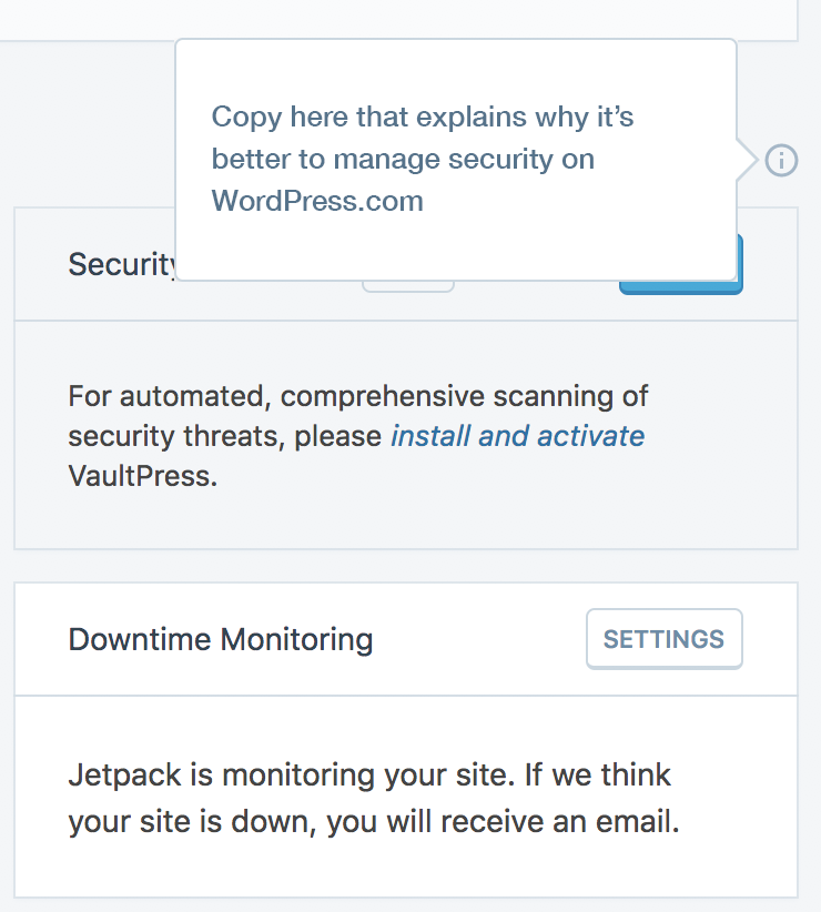
Jetpack: Add "i" icon with explanation next to "Manage security on WordPress.com"
As part of Jetpack dashboard improvement initiative (p6TEKc-1WA-p2), and to remove confusion around managing security on WordPress.com (instead of your own site) we decided to add "i" icon next to "Manage security on WordPress.com" to explain to users why they should do it/why it's like that.
I'd like to get help with a copy from someone more versed in Jetpack (because I don't even know why myself... :) )
 nozomimimi
All 6 comments
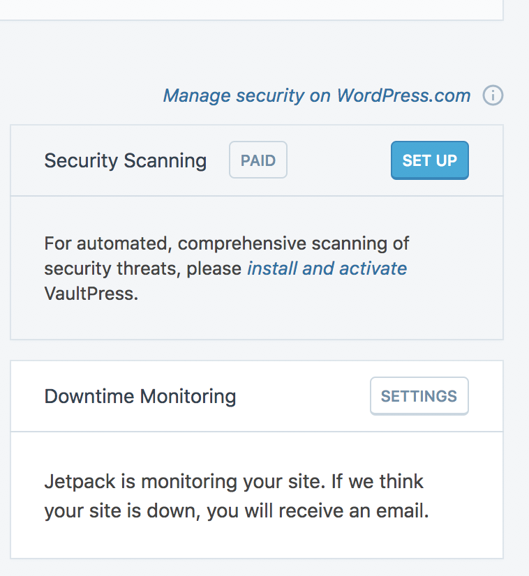
@benhuberman Do you have bandwidth the help us with this one? This is especially tricky because that component shows this:

The cog of the left redirects the user to the Security settings in their wp-admin, the link of the right redirects the user to the Security settings on dotcom. The latter shows more options, such as Downtime Monitoring and Spam filtering. Should we allude to the “full suite” being available only on WordPress.com?
 keoshi
on 12 Jun 2018
keoshi
on 12 Jun 2018
Taking a step back here for a second, this is _very_ disorienting. We're giving the user a fork in the road to do nominally the same thing (only with more options in one place than in the other place). I don't know that any single bit of copy could resolve this tension effectively (though it doesn't hurt to try), so I wonder if there's a way to focus on what we'd like the user to do / achieve here. If the goal is to steer them to WP.com, does it make sense to have the cogwheel? If we want to prioritize the settings on their site, why add a link to WP.com in the first place (and are the two extra security features enough of an incentive for clicking away)? Actually, do we need either? Can't the WP.com link be a CTA in its own block / embedded in one of the existing blocks on that screen? The intent of this change is to avoid confusion, which is really welcome, but the confusion seems to be baked in.
In case the current direction is one you're all set on pursuing for now and still need copy for this area, I'd recommend something like the following:
- I'd change the "main" copy to something like:
Access more security options on WordPress.com.
The idea being that you want the user to already know _why_ they should even consider going elsewhere (i.e. "more").
- In the tooltip copy, I'd try to sell the benefits with more specificity, e.g.:
> Give your site an extra layer of protection with downtime monitoring and spam filtering.
Do you think that might work, @keoshi ? Happy to think of other directions, or, in case the above design changes into something less potentially confusing, happy to work on messaging for whatever alternative you end up with.
 benhuberman
on 12 Jun 2018
benhuberman
on 12 Jun 2018
I 100% agree with you, @benhuberman — this one is not easy to solve, and we've created this confusion. The tooltip in particular could quickly become outdated when we release any more features on dotcom, but have to wait for a JP release to update it.
What do you mean by this?
Can't the WP.com link be a CTA in its own block / embedded in one of the existing blocks on that screen?
Think I like the idea, but not sure if I understand it fully.
cc'ing @MichaelArestad since you've worked on settings and might have a better solution for this experience fork.
keoshi
on 14 Jun 2018
What do you mean by this?
@keoshi It was just an inelegant way of proposing to move the link to the WP.com settings to another element on that page -- like the CTA of another feature block, or alternatively, a new element that introduces the "advanced" features on WP.com with a link there. Basically: instead of framing it as a choice, make it into one of the available options on this screen. That said, I haven't looked at that screen as a whole with too much attention, so it might not be a great solution after all. (Though still less confusing, to me anyway, than the current state.)
benhuberman
on 14 Jun 2018
This issue has been marked as stale. This happened because:
- It has been inactive in the past 6 months.
- It hasn’t been labeled `[Pri] Blocker`, `[Pri] High`.
No further action is needed. But it's worth checking if this ticket has clear reproduction steps and it is still reproducible. Feel free to close this issue if you think it's not valid anymore — if you do, please add a brief explanation.
![stale[bot] picture](https://avatars.githubusercontent.com/in/1724?v=4&s=40) stale[bot]
on 11 Dec 2018
stale[bot]
on 11 Dec 2018
Due to the age of this issue and given that is what not resolved, I would like to close it.
I think there is a bigger issue here beyond just the copy we use. We are providing links to settings on the dashboard screen. A clear split between settings and the dashboard seems simpler.
We are also not repeating this pattern for the performance section of the 'at a glance' screen.
 scottsweb
on 20 Jun 2019
scottsweb
on 20 Jun 2019
Related issues
 aheckler
·
3Comments
aheckler
·
3Comments
 abidhahmed
·
3Comments
abidhahmed
·
3Comments
 tyxla
·
3Comments
tyxla
·
3Comments
 MichaelArestad
·
3Comments
MichaelArestad
·
3Comments
 dougaitken
·
3Comments
dougaitken
·
3Comments
Most helpful comment
@keoshi It was just an inelegant way of proposing to move the link to the WP.com settings to another element on that page -- like the CTA of another feature block, or alternatively, a new element that introduces the "advanced" features on WP.com with a link there. Basically: instead of framing it as a choice, make it into one of the available options on this screen. That said, I haven't looked at that screen as a whole with too much attention, so it might not be a great solution after all. (Though still less confusing, to me anyway, than the current state.)