Jetpack: Welcome message post-purchase on Jetpack dashboard
This is another part of giving our users a warm welcome. We should show a view that gives them a bit of a smile and encourages them that what they just purchased is pretty dang cool/valuable. This should be implemented in the same fashion as used in Jumpstart.
This is a really rough version of what it could look like. Obviously the copy could use a bit of a massage.

More about warm welcome: p6TEKc-1hL
 MichaelArestad
All 16 comments
This will require a change in the current connection flow right? Currently the purchase flow leaves the user in Calypso's plan page.
 dereksmart
on 22 Jun 2017
dereksmart
on 22 Jun 2017
@dereksmart I don't think it will require a change in the connection flow. It will remain visible the next time the user visits the dashboard, though I think we may customize a version of it for those who purchased immediately during connection flow.
MichaelArestad
on 22 Jun 2017
@MichaelArestad can you mock up some for the other plans as well? Or are we only going to show this for Premium?
dereksmart
on 24 Aug 2017
I will be iterating on this mockup and adding content for each plan first thing tomorrow.
MichaelArestad
on 25 Aug 2017
But the basic layout/template should be pretty dang close to what is above.
MichaelArestad
on 25 Aug 2017
For initial implementation, let's just have one for each plan level. Let's not worry about if they upgrade from one plan to another. If they do, we'll show the new plan level's welcome message.
@cristelrossignol can we commission an image (or three) for these? We are already using the image of the person at a computer with a rocket flying over earlier in the flow.
UPDATED - used all of @nicoleckohler's suggestions
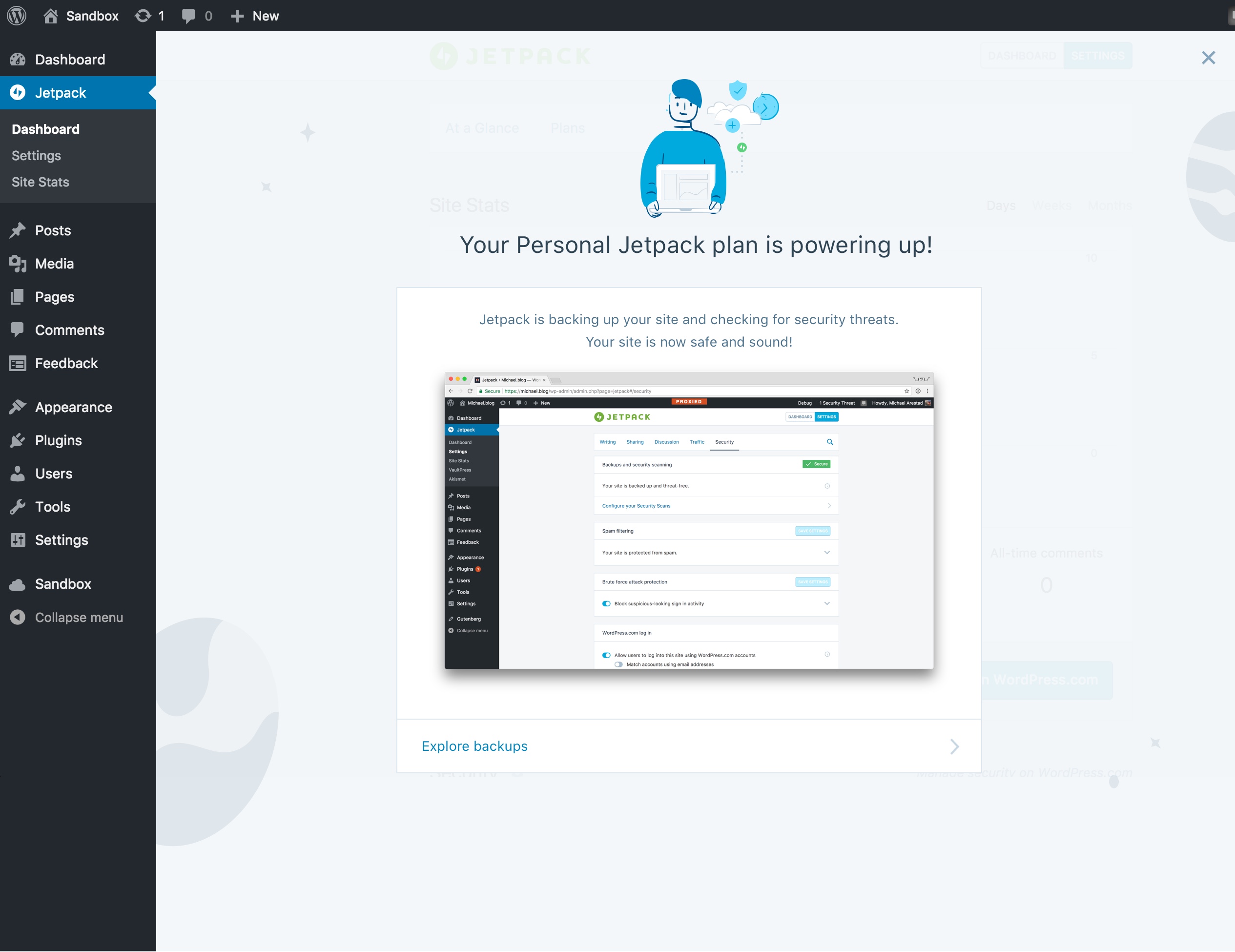
TITLE: Your Personal Jetpack plan is powering up!
IMAGE: TBD
BODY COPY: Jetpack is backing up your site and checking for security threats. Your site is now safe and sound!
BUTTON: Neat!
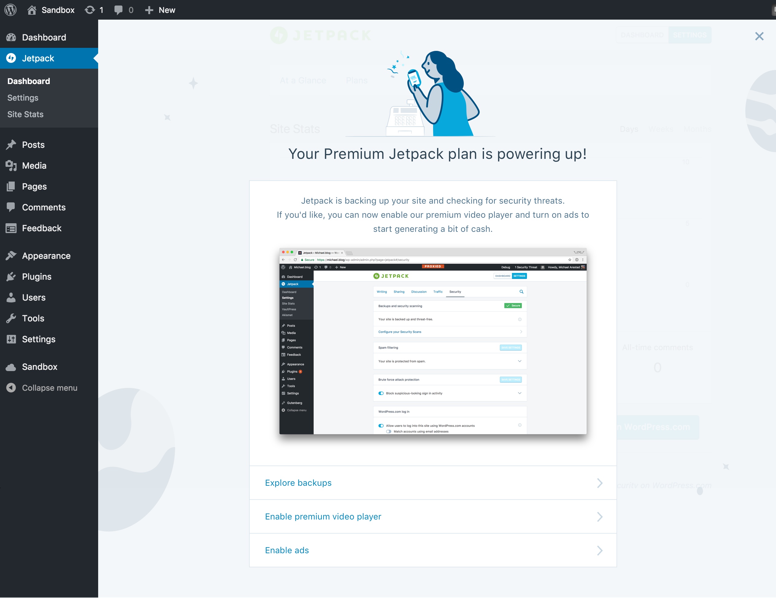
TITLE: Your Premium Jetpack plan is powering up!
IMAGE: TBD
BODY COPY: Jetpack is backing up your site and checking for security threats. If you'd like, you can now <a href="to video player setting">enable our premium video player</a> and <a href="to ads settings">turn on ads</a> to start generating a bit of cash.
BUTTON: Great!
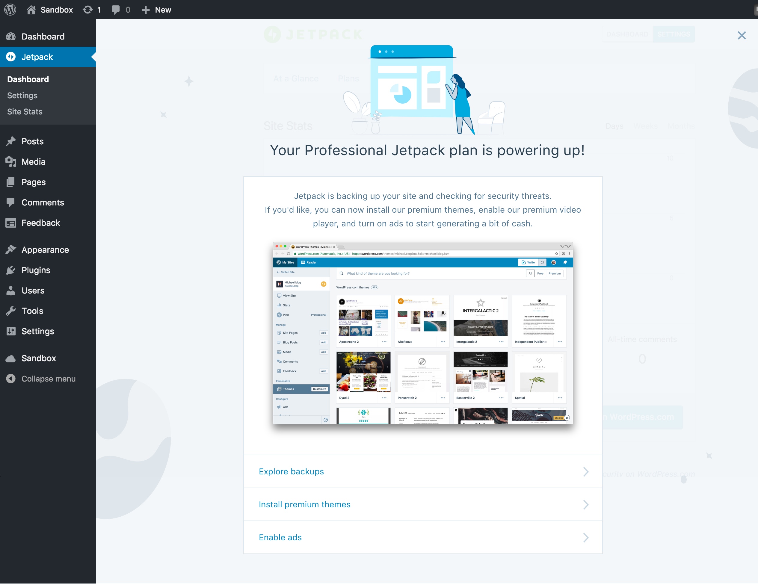
TITLE: Your Professional Jetpack plan is taking care of business!
IMAGE: TBD
BODY COPY: Jetpack is backing up your site and checking for security threats. If you'd like, you can now install our premium themes, <a href="to video player setting">enable our premium video player</a>, and <a href="to ads settings">turn on ads</a> to start generating a bit of cash.
BUTTON: Great!
@nicoleckohler and @richardmuscat I would love any copy suggestions (or replacements) you have. <3
MichaelArestad
on 28 Aug 2017
@MichaelArestad couple suggestions, use as you see fit :D
- Remove the first "now" in each line (so it reads "Jetpack is backing up...") - "now" gets used again later in the text, so this keeps it from sounding repetitive.
- Premium: I'd suggest changing "You can also" to "If you'd like, you can now" and then just removing the "should you so desire" bit. (So: "If you'd like, you can now enable our premium video player and turn on ads")
- Professional: Begin the sentence same as above -- "If you'd like, you can now" -- and make it all one cohesive bit: "If you'd like, you can now install premium themes, enable..."; also, suggest changing "premium Jetpack themes" to "premium WordPress themes" or just "premium themes" :)
Thanks!!
 nicoleckohler
on 28 Aug 2017
nicoleckohler
on 28 Aug 2017
@nicoleckohler Thanks! Made all of those changes.
MichaelArestad
on 28 Aug 2017
@MichaelArestad Yes, added to my list!
 cristelrossignol
on 29 Aug 2017
cristelrossignol
on 29 Aug 2017
Depending on the context, I'd suggest something along the lines of those illustrations:
https://cloudup.com/cUiWSxDDeva @MichaelArestad
cristelrossignol
on 8 Sep 2017
@cristelrossignol These are great! Where can I find these?
MichaelArestad
on 19 Sep 2017
Here @MichaelArestad
https://www.dropbox.com/s/66um890gk0tja4c/jetPack-poweringUp.svg?dl=0
https://www.dropbox.com/s/u9y5plaipaa2c9a/jetpack-enableAdsVideo.svg?dl=0
2 options for cash generating:
https://www.dropbox.com/s/1285fmnq5fuk9fi/jetpack-generateCash.svg?dl=0
https://www.dropbox.com/s/vmu6g02t81hclzk/jetpack-generatingCash-2.svg?dl=0
:)
cristelrossignol
on 21 Sep 2017
Updated mockups.
CC @dereksmart
As @rickybanister mentioned in a chat, we can iterate further on these (in other PRs) by splitting them up into blurbs that describe some of the major benefits. CC @richardmuscat
We can also probably tie these into a checklist UI similar to what is being worked on here: http://wp.me/p5XAZ9-1wt
MichaelArestad
on 21 Sep 2017
Looking good!
cristelrossignol
on 22 Sep 2017
I think I mentioned this in chat, but I'm concerned that by having a screenshot it will put all of the focus on this screen on that single screen or feature. The screenshots are also very desktop-centric AND will require us to update them as UI changes. The last pitfall I can imagine is the image size adding to the Jetpack bundle size.
Could we try svg icons instead that relate to the feature types (design, growth, security) to offer more flexibility? Those would correspond to your final screenshot's three clickable options.
 rickybanister
on 22 Sep 2017
rickybanister
on 22 Sep 2017
In addition to @rickybanister's concerns above, we definitely don't want screenshots in there with the "PROXIED" header in them :)
 beaulebens
on 25 Sep 2017
beaulebens
on 25 Sep 2017
Related issues
 BinaryMoon
·
3Comments
BinaryMoon
·
3Comments
 ockham
·
3Comments
ockham
·
3Comments
 NicktheGeek
·
3Comments
MichaelArestad
·
3Comments
NicktheGeek
·
3Comments
MichaelArestad
·
3Comments
 aheckler
·
3Comments
aheckler
·
3Comments