Jellyfin-web: Revamp the bottom half of the "Now Playing" screen
With the release of 10.5 comes a good opportunity to enhance the audio "Now Playing" ui both for cosmetics and accessibility.
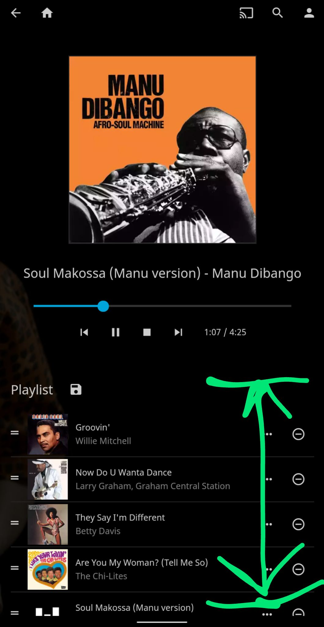
"Playlist" is not the correct term to use here. This is really a "Queue" of audio items.
Add a count of the number of items on queue preferably to the left of the "add to playlist" icon. For example: "(81 / 243)"
The top portion of the "Now Playing" ui includes the media controls. However when the user scrolls down through the queue (especially on mobile) the media controls disappear out of view. To remedy this, separate the Queue from the controls so that when one scrolls or swipes between the pictured green arrows, only the queue scrolls.
3a. Down the line the queue should reflect the Google Cast queue api implemented on both the v2 sender currently on jf-web and v3/CAF sender on cordova-chromecast-plugin.
 hamburglar2160
All 20 comments
I'd also like to have the artist clickable to get to the artist page.
It is often the case that I try to get to the artist and accidentally start playing a new song.
 Nickbert7
on 11 Mar 2020
Nickbert7
on 11 Mar 2020
I'd also like to have the artist clickable to get to the artist page.
It is often the case that I try to get to the artist and accidentally start playing a new song.
It'd probably be better to have something like Spotify, with "Go to artist", "Go to album" in the context menu.
 MrTimscampi
on 11 Mar 2020
MrTimscampi
on 11 Mar 2020
It'd probably be better to have something like Spotify, with "Go to artist", "Go to album" in the context menu.
This is already there, but maybe I just have to get used to it😅
Nickbert7
on 11 Mar 2020
This could be a start? What do you think?
The artist and album can be click to bring to the page of the artist or album.

 samuel9554
on 16 Mar 2020
samuel9554
on 16 Mar 2020
@samuel9554 This should be in #924
Regardless--my thoughts:
- Way too much padding and empty space.
1a. This includes album art--it should probably have ~10% margins on the left and right sides and reach to the top. - Go for
"Title
Album Artist - Album"
And i'd prefer seeing those aligned-left under the album art. - i'm not sure how strange this would appear but it'd at least match the Cast receiver client: Bring the progress bar to within a few pixels of the bottom of the album art.
hamburglar2160
on 16 Mar 2020
@hamburglar2160
I will work something later this week.
samuel9554
on 16 Mar 2020
I'd also like to have the artist clickable to get to the artist page.
It is often the case that I try to get to the artist and accidentally start playing a new song.It'd probably be better to have something like Spotify, with "Go to artist", "Go to album" in the context menu.
I agree with @Nickbert7 on this one. The left clicking options when it comes to music needs to be revamped, it's counter intuitive to how you'd expect it to work. Clicking some areas brings up the Now Playing playlist, when you'd expect the artist or the album, or it just starts playing the new song when you were just trying to navigate around.
To illustrate what I mean, take this for example
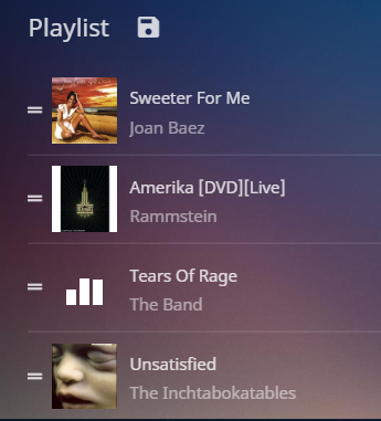
I would expect I would be able to Click on the Artist Name to bring me to the Artist Page or clicking on the Song to go to the Album Page. But the entire area is one section that will start playing that song instantly.
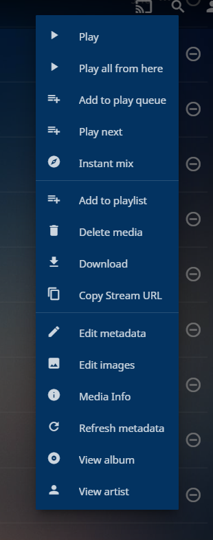
The context menu is also overloaded with options. It's worse for mobile. I'm not sure what Play all from here means, would that be a playlist or album list it's pulling from?
 Artiume
on 21 Mar 2020
Artiume
on 21 Mar 2020
@samuel9554 is this still being worked on?
 ZadenRB
on 9 Apr 2020
ZadenRB
on 9 Apr 2020
@ZadenRB I still working on it.
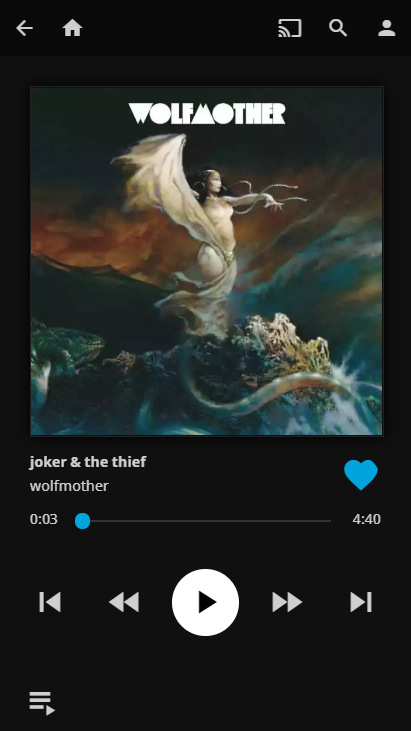
Missing a menu in the lower right.
samuel9554
on 9 Apr 2020
Is not perfect but I think for the moment it could do the job.
Can I have your opinion. @hamburglar2160 @Nickbert7
I still have to create a menu in the bottom right corner with a few option (Instant mix, Go to artist, Go to Album...).
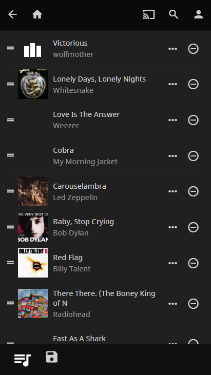
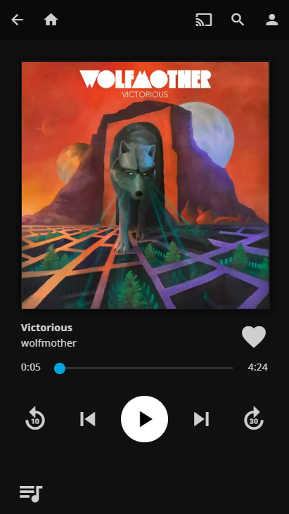
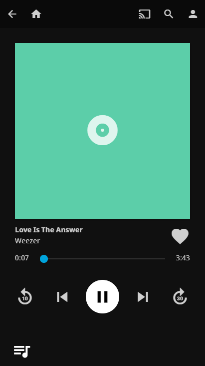
samuel9554
on 9 Apr 2020
Looks good so far👍
Would it be possible to add the album behind or below the artist?
Do you have a branch or PR to test it?
How does it look in desktop mode?
How does it look if you remotecontrol another device playing a movie? (IIRC it was the same page...)
Nickbert7
on 9 Apr 2020
@samuel9554 re: mobile interface. This should be continued in #924
Cool! My initial thoughts:
- i'd like to be able to scroll down from that "now playing" into the queue. i don't want to press a button to get there.
- album cover/art should be way closer to the top. the left/right padding is fine (i'd even bring it down 20%) but the top padding should be ~20% what it currently is. When scrolling down on mobile interface that bar already auto-hides.
- that heart/favorite button is too big. i personally prefer that it not be there at all. put it in a menu somewhere. if absolutely necessary give it a good amount of transparency and put it on the bottom right of the album art.
- the album artist and song title are there but the album title is missing. preferred format is
"song title (slightly bigger/bold text/more emphasized)
album artist - album title" - give me a shuffle queue button somewhere.
- the landscape version would probably have a similar feel as the web would. Album art big and on the left with the metadata to the right on the top half and buttons on the bottom half.
- i'm not a huge fan of the FOB-by _circle_ play/pause button.
- how about tapping the album and artist to get to their respective pages so they don't need extra menu buttons?
- less important but i'd absolutely love having a "swipe left or right" anywhere above the seekbar to go to the previous/next song.
that's just music. when we get to movies/tv shows the conversation will change a bit.
keep it up! this is a great start.
hamburglar2160
on 9 Apr 2020
i'd like to be able to scroll down from that "now playing" into the queue. i don't want to press a button to get there.
Hm, kind of disagree here. Every good player I've used has a dedicated player control screen and I think it's way better that way. Adding a playlist below would force the design to be squished up to show it (for discoverability) and would what should be a simple screen overly busy.
album cover/art should be way closer to the top. the left/right padding is fine (i'd even bring it down 20%) but the top padding should be ~20% what it currently is. When scrolling down on mobile interface that bar already auto-hides.
Taking the header bar into account, the margins on the top and on the side are identical, which is what looks best, IMO
that heart/favorite button is too big. I personally prefer that it not be there at all. put it in a menu somewhere. if absolutely necessary give it a good amount of transparency and put it on the bottom right of the album art.
It should be a tad smaller, I agree. But I'd keep it there since it mirrors Spotify, which a lot of users are used to. No transparency in the icons.
the album artist and song title are there but the album title is missing. preferred format is
"song title (slightly bigger/bold text/more emphasized)
album artist - album title"
That's very much personal preference, we should give some control over that, at some point.
Right now it mimics Spotify, which I think is a good starting point. @samuel9554 feel free to implement it or leave it out, it won't be a blocker either way.
give me a shuffle queue button somewhere.
I'd generally remove the Skip Backward/Forward and show the repeat and shuffle toggles instead.
i'm not a huge fan of the FOB-by circle play/pause button.
It looks good and it's pretty standard for Material-based music players, from what I've seen.
how about tapping the album and artist to get to their respective pages so they don't need extra menu buttons?
I'd argue that it's not very good from a discovery standpoint. How is the user supposed to know they need to tap the album art to get more options ?
less important but i'd absolutely love having a "swipe left or right" anywhere above the seekbar to go to the previous/next song.
Agreed, that always super useful for quick song change in the train or bus. Not going to be a blocker if this makes it to a PR though, since it can be done later. But it's definitely something that we'd want at some point.
MrTimscampi
on 9 Apr 2020
Hm, kind of disagree here. Every good player I've used has a dedicated player control screen and I think it's way better that way. Adding a playlist below would force the design to be squished up to show it (for discoverability) and would what should be a simple screen overly busy.
it already has this (see OP) and it's great. i just don't want to scroll away from the album cover controls. i do want to scroll through the queue though. i also want to see what the next song is that i'd be pressing the "next song" button for. this will go a long way for the remote control when listening to music on the new CAF for instance.
it is by no means squished or busy unless you're using a phone with a very low dpi or resolution from over 3-4 years ago. maybe we need two phone interfaces. one for modern phones over 5 inch on the diagonal and one for below.
Taking the header bar into account, the margins on the top and on the side are identical, which is what looks best, IMO
That's wasted screen real estate and less use of the high res album art i went through enough trouble to acquire and put into jellyfin. The top padding on Sammy's recent screenshot is most certainly higher than the side padding.
It should be a tad smaller, I agree. But I'd keep it there since it mirrors Spotify, which a lot of users are used to. No transparency in the icons.
Right now it mimics Spotify, which I think is a good starting point.
Jellyfin is not Spotify. i bet if you surveyed people who use jellyfin you'd find that the vast majority do not use "favorites" and "instant mixes." Having the favorites button jammed down our throats... meh. i put my favorite songs in a playlist which i would otherwise access through some other menu. great. Favorites doesn't need to be more prominent than playlists which is comfortably nestled elsewhere.
I'd generally remove the Skip Backward/Forward and show the repeat and shuffle toggles instead.
What if i'm watching a movie or TV show or some long podcast or anything longer than 6 minutes and am well aware that i want to go forward 30 seconds and not gamble on effective use of the seekbar? parity with the rest of jellyfin and the CAF is highly valued.
I'd argue that it's not very good from a discovery standpoint. How is the user supposed to know they need to tap the album art to get more options ?
because everywhere else in jellyfin i'm pressing bolded text am getting pushed to other pages. especially those in the item details page.
hamburglar2160
on 9 Apr 2020
How about something like this?
It's a compromise regarding the whole playlist and showing nothing.
At lest for me it would fit my needs, I know to which song I'm skipping to and it doesnt need to show the whole playlist.
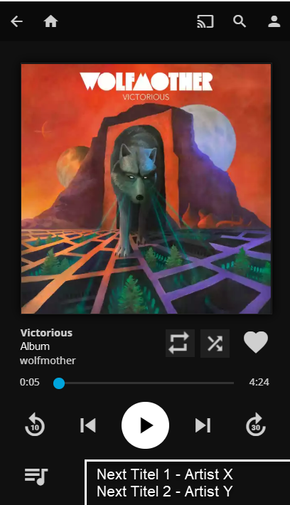
Or maybe we can keep forward/backward button for Movies, Shows and Podcasts and replace them for Music with the shuffle and repeat toggles?
Nickbert7
on 9 Apr 2020
if you're gonna get rid of the forward/rewind 30 buttons then you should get have a wider seekbar with the current time and end time below each end.
the new buttons are too large. they can be placed just above where they are now on the bottom right of the album cover to parallel those buttons in the the rest of the web-ui.
i really don't think the titles each need their own line. i still have an issue with the top padding--reigning that in would bring better results with whatever is below. those of us with higher resolutions will be able to see the queue or at least the next few songs and can scroll through it for the rest.
hamburglar2160
on 9 Apr 2020
i bet if you surveyed people who use jellyfin you'd find that the vast majority do not use "favorites" and "instant mixes."
Favorites, sure. I don't use them much. Instant Mixes? These are the future. They should be an integral part of the music library, they're equivalent to radio stations and shouldn't be minimalized.
Artiume
on 9 Apr 2020
i bet if you surveyed people who use jellyfin you'd find that the vast majority do not use "favorites" and "instant mixes."
Favorites, sure. I don't use them much. Instant Mixes? These are the future. They should be an integral part of the music library, they're equivalent to radio stations and shouldn't be minimalized.
Sure. Music library absolutely. Menu too.
it just doesn't need to be on the now playing/queue. i didn't need to mention the instant mixes above.
hamburglar2160
on 9 Apr 2020
I open a PR.
1056
Be free to comment.
Also I realize that I'm missing experience with Jellyfin so I might need help but I think that is good base.
samuel9554
on 10 Apr 2020
it already has this (see OP) and it's great. i just don't want to scroll away from the album cover controls. i do want to scroll through the queue though. i also want to see what the next song is that i'd be pressing the "next song" button for. this will go a long way for the remote control when listening to music on the new CAF for instance.
Honestly, the current player UI looks like garbage, so I wouldn't take it as an example. I very much prefer the way Samuel did it, with the context menu to show the playlist.
It's still there if you want it, it's one tap away and you can scroll through it.
it is by no means squished or busy unless you're using a phone with a very low dpi or resolution from over 3-4 years ago. maybe we need two phone interfaces. one for modern phones over 5 inch on the diagonal and one for below.
We're already maintaining three different layouts (two of which have at least two sub-layouts: portrait and landscape). We're not adding another one. We add graceful degradation where possible, but here every control shown is very much needed in all situations.
That's wasted screen real estate and less use of the high res album art i went through enough trouble to acquire and put into jellyfin. The top padding on Sammy's recent screenshot is most certainly higher than the side padding.
You can still adjust the margins with custom CSS afterward if you want. It's there for that. This isn't merged yet, adjustments will likely come during the review process. Not wasting screen real estate would mean not having margins on the cover, which would look terrible.
As this is not completely done yet, I don't feel like it's a time for details yet. Let the contributor get the big stuff in yet, we can adjust the details later (Think back to the process to get the details page done during 10.5.0)
Jellyfin is not Spotify. i bet if you surveyed people who use jellyfin you'd find that the vast majority do not use "favorites" and "instant mixes." Having the favorites button jammed down our throats... meh. i put my favorite songs in a playlist which i would otherwise access through some other menu. great. Favorites doesn't need to be more prominent than playlists which is comfortably nestled elsewhere.
It's not Spotify, but you're basically pulling stuff out of thin air, here. You don't use it, so you simply assume that nobody else does.
We've already removed stuff that "nobody uses" and have received complains from users. So trust me when I say you can't assume that "nobody uses it" simply because YOU don't.
What if i'm watching a movie or TV show or some long podcast or anything longer than 6 minutes and am well aware that i want to go forward 30 seconds and not gamble on effective use of the seekbar? parity with the rest of jellyfin and the CAF is highly valued.
You do know that we have access to the item type there and can customize the screen based on the type of content watched, right? We do it in plenty of places already. Getting the proper controls for the media type is important. Shuffle and Repeat are very much primary controls for music, imo, while skip forwards/backward are very much not.
because everywhere else in jellyfin i'm pressing bolded text am getting pushed to other pages. especially those in the item details page.
We're on a phone UI. Elements need to be a certain size to be easily clickable, both because it's annoying to have to pixel-tap on a phone AND for accessibility.
And sure, the mobile UI for Jellyfin is far from respecting this everywhere yet, mostly because we're trying to get the codebase to be more maintainable before really focusing on the three different experiences we ship to make them use their respective control schemes in the best way possible.
But a redesign like this is the perfect reason to start to enforce some usability rules for that platform on the screen that's being redesigned.
MrTimscampi
on 10 Apr 2020
Related issues
 majora2007
·
3Comments
majora2007
·
3Comments
 nyanloutre
·
7Comments
nyanloutre
·
7Comments
 Anan5a
·
3Comments
hamburglar2160
·
5Comments
Anan5a
·
3Comments
hamburglar2160
·
5Comments
 mitchelljfranklin
·
4Comments
mitchelljfranklin
·
4Comments
Most helpful comment
Favorites, sure. I don't use them much. Instant Mixes? These are the future. They should be an integral part of the music library, they're equivalent to radio stations and shouldn't be minimalized.