Jellyfin-web: Skip to next episode prompt is way too big and blocks ui
The idea is to make it smaller and less intrusive so that it can still be possible to control the playback and see the subtitles.
Blocked by #513
 hawken93
All 10 comments
It might be an option to control whether "play next" is on top or bottom, plus we can make it more transparent.
Also making it so playback controls are moved upwards a bit to be vertically stacked on it might be an interesting change.
 JustAMan
on 11 Jan 2019
JustAMan
on 11 Jan 2019
I think the playback controls should always stay on the bottom, and move the "play next".
If we strip enough info, we could put it on the side like Netflix:
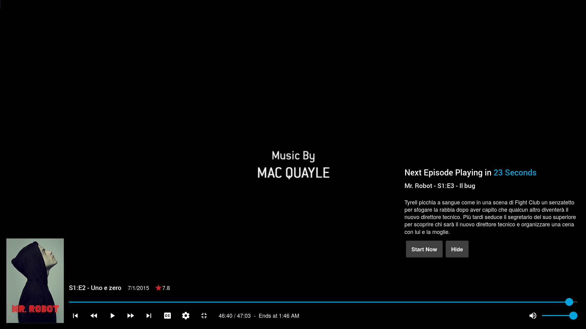
Since we should have an image for each episode, we could even put that image instead of the plot summary...
 drago-96
on 12 Jan 2019
drago-96
on 12 Jan 2019
I would not move the playback controls, see https://v.redd.it/1a5v9jrodrs11
hawken93
on 14 Jan 2019
However a simple "next episode [->]" could work for me, don't need all the extra info. Indeed something as simple as just an arrow could work. But don't ask a backend dude, more opinions welcome!
hawken93
on 14 Jan 2019
I've tagged this "discussion needed"
I agree this seriously needs doing but we need to seek input on how best to go about addressing this rather than just dictating it. Might be worth bringing this to a Reddit post and discussing there as well.
 sparky8251
on 7 Feb 2019
sparky8251
on 7 Feb 2019
Hello folks
My take on this: make this user configurable. And add the option to disable it. ;)
Being a purist, when watching a movie/tv show on Netflix or Amazon, I'm annoyed to the max as soon as the ads/notifications near the end show up. Every. single. time!
So I'd suggest to have at least the option to turn this off or only show a button/screen as soon as playback has stopped.
I think this is a topic worth a discussion with a broader context: having a clutter/distraction free UI (at least during playback). I know and respect that people want their trailers, logos and banners and info screens in every corner. But on the other hand you surely don't want to annoy those few movie enthusiasts while watching their own stuff at home. And it can be a performance issue on some slower devices.
 Unimeron
on 18 Feb 2019
Unimeron
on 18 Feb 2019
There is already a setting to turn it off (inherited from Emby). Dunno if it works, didn't check.
You can find it here: User preferences -> Playback -> Enable next video info during playback.
JustAMan
on 18 Feb 2019
Haha, didn't even knew that option existed. :D Thanks a lot!
Hope, other things like ui-less pause mode will be there, too. On any platform. I was highly disappointed when I learned that there's no Kodi skin offering this, so I modified one myself.
Unimeron
on 18 Feb 2019
Issues go stale after 90d of inactivity. Mark the issue as fresh by adding a comment or commit. Stale issues close after an additional 14d of inactivity. If this issue is safe to close now please do so. If you have any questions you can reach us on Matrix or Social Media.
![stale[bot] picture](https://avatars.githubusercontent.com/in/1724?v=4&s=40) stale[bot]
on 22 Apr 2020
stale[bot]
on 22 Apr 2020
We are cleaning up issues to be more in line with our current templates and accepted issue types here.
As this is more of a feature request/ui suggestion, please redirect it to https://features.jellyfin.org/
 MrTimscampi
on 30 Jul 2020
MrTimscampi
on 30 Jul 2020
Related issues
 AndreCarvalho
·
6Comments
AndreCarvalho
·
6Comments
 mitchelljfranklin
·
4Comments
mitchelljfranklin
·
4Comments
 hamburglar2160
·
5Comments
hamburglar2160
·
5Comments
 majora2007
·
3Comments
majora2007
·
3Comments
 Steve0w3n
·
6Comments
Steve0w3n
·
6Comments
Most helpful comment
There is already a setting to turn it off (inherited from Emby). Dunno if it works, didn't check.
You can find it here: User preferences -> Playback -> Enable next video info during playback.