Ipfs-companion: [META] Upgraded UI for IPFS Companion
ETA April 2020: :rofl:
Next steps for this need to be an analysis of the entire discussion chain and breaking what hasn't already been addressed out into more discrete, workable parts.
Original issue text:
Let's use this issue as an open space for discussing how we could improve current UI,
namely the main menu displayed after clicking on Browser Action.
@ipfs-shipyard/gui
 lidel
lidel
All 24 comments
Active Tab Actions
As a part of https://github.com/ipfs-shipyard/ipfs-companion/pull/687 I've been looking into ways we could make actions specific to Active Tab more prominent. Some ideas:
| A | B | C |
| ---- | ---- | ---- |
|  |
|  |
|  |
|
lidel
on 28 Feb 2019
New UI by Hugo
@hugomrdias posted well-thought mockup of complete rework in https://github.com/ipfs-shipyard/ipfs-companion/pull/687#issuecomment-467542577
I made a prototype which packs lots of ideas out of this PR scope
https://codesandbox.io/s/14y8r7qjo3
but basically i like toggles with explicit label and tooltip explaining everything like i'm 5.
I prefer label texts that don't change with state.
| Default | Expanded Node Info |
| ---- | ---- |
|  |
|  |
|
Thank you for putting this up! I believe we will use a lot of this in following iterations.
lidel
on 28 Feb 2019
@lidel uuuh, I like it. I'd just change the reds to our fantastic blue and somehow give it a more interplanetary feeling. Otherwise looks really good.
 hacdias
on 1 Mar 2019
hacdias
on 1 Mar 2019
Changes shipped in v2.7.5.748 (Beta) borrow some of the above ideas.
Key change is the introduction of toggle switches:
| regular website | dnslink website | offline mode |
| ---- | ---- | ---- |
|  |
|  |
|  |
|
What would be the next thing to tweak?
Making the node info more compact?
lidel
on 5 Mar 2019
i revisited my prototype to add more ideas
https://codesandbox.io/s/14y8r7qjo3
| default | expanded "Node Info" | expanded "More" |
| ---- | ---- | ---- |
|  |
|  |
|  |
|
 hugomrdias
on 5 Mar 2019
hugomrdias
on 5 Mar 2019
I love the new beta. +1 on clarifying "Redirect to gateway", though we still have some work to do to make that option make sense to new users. Perhaps _"Fetch sites via IPFS*"_ with a link to more info about how the HTTP to IPFS Gateway works, and that it will be activated by the existance of a _DNSLink_
Following on from the result of #687 I propose a small tweak / reversion to keep the parts of the menu that are always available together, and at the top of the list, and the part that is only available for a dnslink sites. That way the options appear in a stable position. We can drop the "tools" label from the current menu, as a i dont think it adds much. I imagine it like
- [header]
- Open Web UI...
- Share file via IPFS...
- Fetch sites via IPFS* [🔛...]
_domain.com is available on IPFS_
- Fetch
domain.comvia IPFS [🔛...] - Copy IPFS url _https://ipfs.io/ipfs/bafy..._
- Copy CID _/ipfs/bafy..._
- Pin CID* [🔛...]
 olizilla
on 5 Mar 2019
olizilla
on 5 Mar 2019
Here's a mock

olizilla
on 5 Mar 2019
There are some really nice ideas in https://github.com/ipfs-shipyard/ipfs-companion/issues/689#issuecomment-469637081 too
olizilla
on 5 Mar 2019
The key things i wanted to call out in my proposal are
- Replace "active tab" with some "x is available on IPFS!" excitement
- Keep menu items in the same position, so cluster things that are per site and things that aren't
- Fewer seperators is mo' better separators
it's kinda helpful to put "Copy CID" and "Pin CID" next to each other as it better highlights what you will be pinning, but how to explain what "Pin CID" will do is still difficult. I initially framed it as "Make available offline" as that's something the user might care about, but its not right. It's more like "Keep this snapshot in my local repo"
olizilla
on 5 Mar 2019
@hugomrdias @ https://github.com/ipfs-shipyard/ipfs-companion/issues/689#issuecomment-469637081:
- I like the idea of collapsing rarely used itemp under "More", but I am not a fan of hiding direct access to WebUI.
- IPFS Desktop provides direct links to Web UI screen, I believe we could the same.
Perhaps starting with subtle icons on the right? (at least Files, IPLD Explorer, Peers):
- IPFS Desktop provides direct links to Web UI screen, I believe we could the same.
- The File Share at the bottom is easily accessible, but takes too much space.
We should come up with something closer to inlined version proposed by Oli:
- IIRC file upload or drag&drop into popup menu did not won't work across vendors. That was the initial reason why quick upload screen in our extension is opened in a new tab.


@olizilla
We moved things around to keep redirect toggles together. If we move them back, we need to tweak language a bit:
- "IPFS" occurs too often in our UIs, which will be tricky to avoid :)
- "x is available on IPFS!" excitement is cool, but long hostnames are tricky if you can't truncate them: http://llanfairpwllgwyngyllgogerychwyrndrobwllllantysiliogogogoch.co.uk/
- Generic "This site is available on IPFS!" should do, and we avoid showing the hostname twice.
- I agree _"Redirect to Gateway"_ is too technical, and remains an empty phrase to regular people. _"Fetch sites via IPFS"_ is better, but it does not encompass ah-hoc IPFS resources found on random websites, and uses "IPFS" once more time.
- I've been thinking about simplifying language on _Preferences_ screen and replacing _"Custom Local Gateway"_ with just _"My Gateway"_.
Perhaps redirect toggle could be labeled _"Fetch with My Node"_ or "_Fetch sites via My Gateway"_? Does it sound better at all? - To simplify language even further, the label for per-site redirect opt-out could be renamed from _"Redirect on fqdn.tld"_ to generic _"Disable on fqdn.tld"_ (that way the toggle would match Pin - off by default). I wonder if it would be more useful if it would not only disable redirect, but also stop injecting content scripts.
- I really like the idea of "Copy CID" providing context for "Pin CID"!
For now, there is a tooltip with explanation I adapted from docs/concepts/pinning:
https://github.com/ipfs-shipyard/ipfs-companion/blob/27a62ad78aed9cb4040030fdbf25d585ee788202/add-on/_locales/en/messages.json#L79
- I've been thinking about simplifying language on _Preferences_ screen and replacing _"Custom Local Gateway"_ with just _"My Gateway"_.
lidel
on 5 Mar 2019
I hate to add noise to the conversation … but here's some noise anyway 😛
A couple of very cursory tweak suggestions on @olizilla's mockup (these don't take @lidel's notes into account):
- Shifted banner elements to a left-right layout, which makes for a more uniform design, puts all of the buttons more or less in vertical alignment, and saves vertical space
- Recolored the gray (inactive) toggle to #65757C, to bring the contrast with white up to 4.5:1, for accessibility

Also, the contrast on the light gray text seems low. thx
 ericronne
on 5 Mar 2019
ericronne
on 5 Mar 2019
@ericronne big +1
love all these iterations
just one thing that bugs me a little, hierarchically 'Copy * ' can't be above 'Pin CID', imo not even in the same visual level.
if we want to give context lets add a tooltip explaining Pinning or put the multiaddr there like in 'Copy CID' item.
Can we name it 'Persist resource' with a tooltip saying 'Persist ipfs resource from the current tab to IPFS Companion node' ?
What's the user journeys or value that these 'Copy *' have?
hugomrdias
on 5 Mar 2019
@hugomrdias I'm in favour of replacing the Copy * options with labelled fields as you have them in your proposal. I just wanted to offer up some minor tweaks to what we have now, as I find having the tools section split out at the bottom awkward (in the current look and feel).
The purpose of Copy IPFS URL them is to be able to grab a shareable IPFS http url. The brower URL bar will show http://localhost:8080/ipfs/bafy... which you can't share with folks who aren't using IPFS.
The purpose of Copy CID is to let the user grab the resolved CID for an ipns address. The site might point to the mutable /ipns/ipfs.io and there isn't an easy way to see which CID it was resolved to otherwise. It lets the user copy and paste the value into the command line tool where ipns addresses and urls are not supported.
Can we name it 'Persist resource
I am all in for a better name and explanation of Pin but it's such a weird concept that any name that makes sense is also wrong. It is literallly "Please dont delete this content that I already have locally at some arbitrary time in the future". I'm inclined to calling it Pin until we come up with a better API that lets a user deliberatly re-host a website for [week, month, for ever] as beaker does.
olizilla
on 5 Mar 2019
@ericronne please give us all your feedback! Dont worrry about adding noise, we really want your thoughts!
olizilla
on 5 Mar 2019
thank you for the "Copy *" explanation super useful :)
in my head "Please dont delete this content that I already have locally at some arbitrary time in the future" === "Persist content" (Persist is at least more of a common knowledge word than Pin) but i understand your point.
hugomrdias
on 5 Mar 2019
Toggle color tweaks in https://github.com/ipfs-shipyard/ipfs-companion/pull/692:
| on/on/off | off/disabled/on |
| ---- | ---- |
|  |
|  |
|
This landed in v2.7.5.753.
lidel
on 6 Mar 2019



 hazae41
on 4 Apr 2019
hazae41
on 4 Apr 2019
I really like how this layout saves vertical space by grouping action buttons, but it does not seem to account for labels having different lengths in different languages: Redirection,Open WebUI, Quick Upload and Pin resource may not fit in a single line when translated.
Not sure how big problem would that be.
Maybe just something we need to think about while designing the look of those buttons.
lidel
on 4 Apr 2019
The pill buttons could wrap in those instances — creating a rag-right button layout — so that's probably not a big issue. Interesting stuff @Hazae41, thanks. I'm doing a visual audit of this and the desktop companion right now, actually, and some of what you have here could inform our direction. I, too, like the accordions.
ericronne
on 4 Apr 2019
I really like how this layout saves vertical space by grouping action buttons, but it does not seem to account for labels having different lengths in different languages:
Redirection,Open WebUI,Quick UploadandPin resourcemay not fit in a single line when translated.Not sure how big problem would that be.
Maybe just something we need to think about while designing the look of those buttons.
It wraps correctly
| justify-content: 'none' | justify-content: 'center' |
| ------------- | ------------- |
|  |
|  |
|
hazae41
on 4 Apr 2019
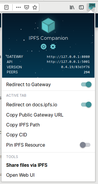
Ok, let's revisit this. Right now, the menu looks like this:
Problems:
- Actions look the same: Copying paths and URLs is presented in the same way as "opening Web UI" or "sharing files"
- We use bold text to highlight sharing files
- Some items cause menu to close when clicked (_Copy.._)
- Some items cause new page to be opened in a new tab: _Open WebUI, Share.._
Changes to explore
- change the way things are grouped (good exploration in previous comments)
- add icons that differentiate features
- I imagine Sharing having consistent icons in Companion menu and Web UI:
>
- I imagine Sharing having consistent icons in Companion menu and Web UI:
- adding some indicator to items that open things in new tabs
- an icon on the right or starting all labels with "Open.." would remove surprises
- Keep in mind labels are not set in stone: if we have better metaphors we should consider changing language around some features (eg. replace "Pin" with "Co-host")
Would appreciate some comments on this.
lidel
on 26 Jul 2019
Adding notes on back-end control from https://github.com/ipfs-shipyard/ipfs-companion/issues/491 -- closing that issue in favor of this one, so please be sure to look through that issue before proceeding.
 jessicaschilling
on 8 Apr 2020
jessicaschilling
on 8 Apr 2020
Update: Going to start noodling on some (but not all) of the remaining items in this discussion in a PR for miscellaneous UX improvements. Watch this space.
jessicaschilling
on 25 Jun 2020
We'll have made substantial progress against most, if not all, of the items discussed here under https://github.com/ipfs-shipyard/ipfs-companion/pull/907. Keeping in mind the age of this thread, and how much has evolved since some of it was written, I'm going to close this and suggest that we open new (ideally more granular) issues for new thoughts that arise. Thank you!
jessicaschilling
on 8 Jul 2020
Related issues
lidel
·
4Comments
lidel
·
3Comments
 djdv
·
5Comments
djdv
·
5Comments
 flowpoint
·
3Comments
lidel
·
3Comments
flowpoint
·
3Comments
lidel
·
3Comments
Most helpful comment
I hate to add noise to the conversation … but here's some noise anyway 😛
A couple of very cursory tweak suggestions on @olizilla's mockup (these don't take @lidel's notes into account):
Also, the contrast on the light gray text seems low. thx