Ios: Long folder names are not distinguishable
Expected behaviour
A user should be able to distinguish two long folder names in the folder tree in the iOS app Example:
- Klasse-P5_a_2018-2019_Brunnmatt-Steigerhubel
- Klasse-P5_a_2018-2019_Brunnmatt-Steigerhubel-Vorlagen
Actual behaviour
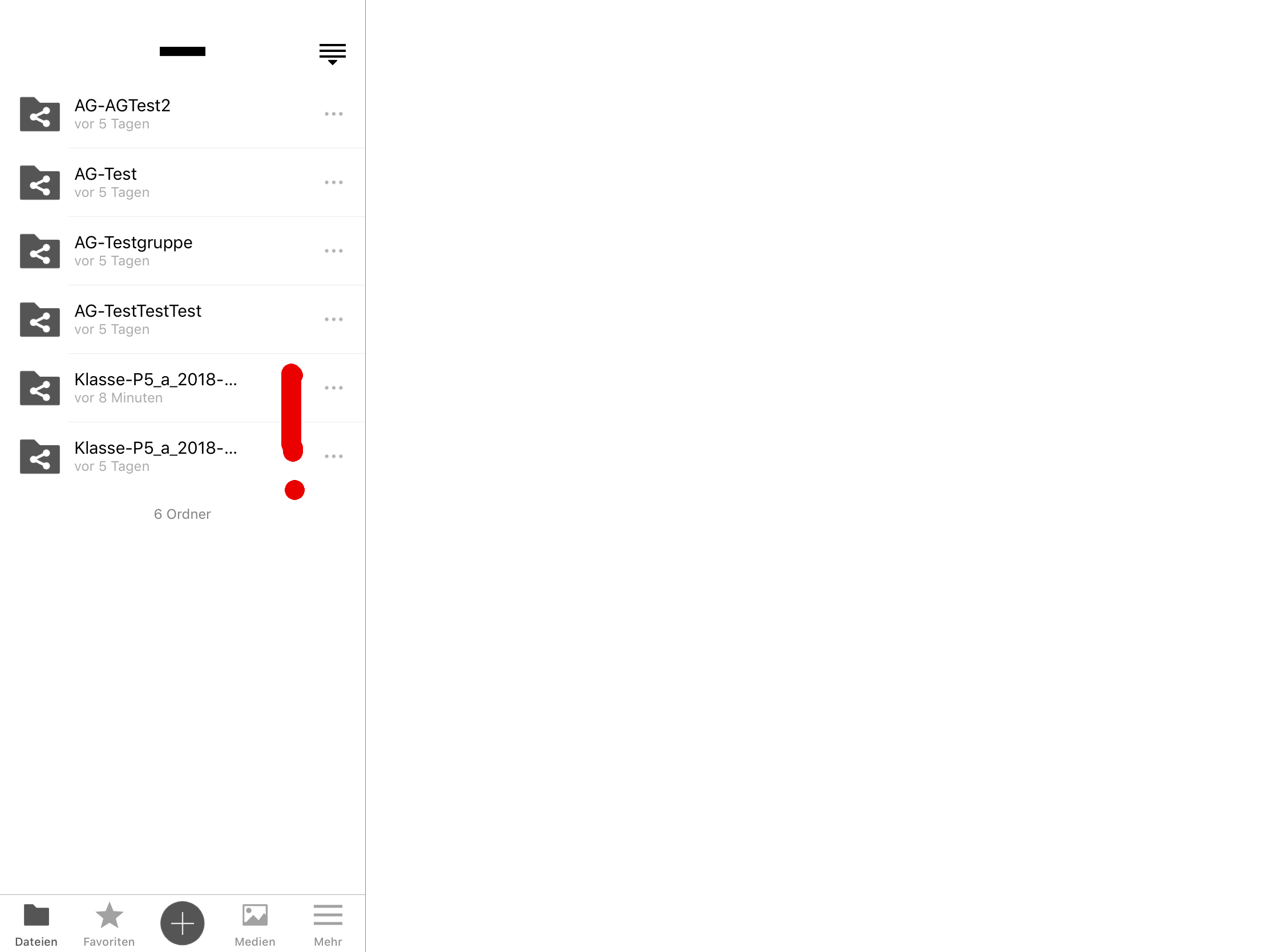
The app shows three dots in the name after ~17 characters and it seems not possible to easily get the whole name. This is also true after accessing the folder - the name is displayed in a truncated way too.
The behaviour is reflected by the following picture:
Steps to reproduce
Create two folder in your Nextcloud with e.g. the following names:
- Klasse-P5_a_2018-2019_Brunnmatt-Steigerhubel
- Klasse-P5_a_2018-2019_Brunnmatt-Steigerhubel-Vorlagen
Access the folder containing those folders with the iOS app on e.g. an iPad.
iOS version
iOS 12.1 (16B92)
App version
Nextcloud for iOS 2.22.7.4
Additional notes**
It's maybe important to note, that I use an iPad Pro (with 9" and 13" screens) to tests this. I totally understand, that the screen size is very limited on a phone, but on a tablet one could probably risize the file/folder list a bit?
Thanks for looking into this, just let me know, if I can give more details or help somehow.
All the best,
Nicolas
 nikslor
All 9 comments
I can use the Line break: truncate middle
 marinofaggiana
on 15 Jan 2019
marinofaggiana
on 15 Jan 2019
Dear @marinofaggiana
Thank you very much for looking into this!
I think this could be a solution. I only fear, that we'll have some files/folder where the middle part is the relevant part. I propose to implement this change as it solves most (I think) usecases.
Is there a way to also implement a "popup" (e.g. through "long press") to see the whole name in cases where the name are not distinct?
Thank you very much for your help!
All the best,
Nicolas
nikslor
on 17 Jan 2019
Hi @nikslor, I think that extended the peek pop (now used only for preview a image) can be a solution, the long press is used for copy/paste files ... whats do you think ?
marinofaggiana
on 24 Jan 2019
Hi @nikslor, I think that extended the peek pop (now used only for preview a image) can be a solution, the long press is used for copy/paste files ... whats do you think ?
I think it would be a good start and improve the usability of the app.
But as a long term solution I would strive to have the ability to resize the left navigation panel, this would really help. :)
 AndrewwHummer
on 30 Jan 2019
AndrewwHummer
on 30 Jan 2019
An newline would be great, too
Truncated in the middle will lose other informations sometimes
 seraphyn
on 12 Feb 2019
seraphyn
on 12 Feb 2019
User PeekPoop for read the name :
(Available on TestFlight 2.23.2 Build 4)
marinofaggiana
on 6 Mar 2019
Hi @nikslor, I think that extended the peek pop (now used only for preview a image) can be a solution, the long press is used for copy/paste files ... whats do you think ?
I think it would be a good start and improve the usability of the app.
But as a long term solution I would strive to have the ability to resize the left navigation panel, this would really help. :)
the "resize the left navigation panel" is in ToDo but required several time and now isn't in priority list
marinofaggiana
on 6 Mar 2019
Just tested it and it works brilliantly, it is just a little bit finicky that a second hard press opens the file or enables the share menu.
But still very useful. Well done!
AndrewwHummer
on 6 Mar 2019
or enables the share menu.
mmm yes, good ... next build ;) Build 5
marinofaggiana
on 7 Mar 2019
Related issues
 MarcusE1W
·
5Comments
MarcusE1W
·
5Comments
 helmut72
·
4Comments
helmut72
·
4Comments
 MorrisJobke
·
4Comments
MorrisJobke
·
4Comments
 immortal79
·
4Comments
immortal79
·
4Comments
 AxelGard
·
4Comments
AxelGard
·
4Comments