Elfdalian is a language spoken in the Älvdalen region of Sweden.
Inter already supports Swedish, Icelandic, and several languages that use letters with the ogonek, which together cover most of Elfdalian.
What's missing is Y with ogonek (Y̨, y̨) and Å with ogonek (Ą̊, ą̊).
The full alphabet is as follows:
A Ą B C D Ð E Ę F G H I Į J K L M N O P Q R S T U Ų V W X Y Y̨ Z Å Ą̊ Ä Ö
a ą b c d ð e ę f g h i į j k l m n o p q r s t u ų v w x y y̨ z å ą̊ ä ö
And (at least on KDE) the currently missing letters look pretty bad. :)
 snaeugla
All 19 comments
Being Swedish myself, we of course have to make this happen!
Tackar & bockar!
 rsms
on 27 May 2020
rsms
on 27 May 2020
Underbart!
To my knowledge, that would make Inter the first open source font with good Elfdalian support.
Not even Noto handles it well.
snaeugla
on 27 May 2020
@rsms slowly reveals more and more of himself in these comments on issues.. >:D
 Derpitron
on 29 May 2020
Derpitron
on 29 May 2020
Looking into this today I found that there are no Unicode code points assigned to these glyphs; they are purely compositions i.e. "y̨" is U+0079 & U+0328 ("y" followed by combining ogonek.) The best I could do is to introduce a ligature for this pair.
See:
rsms
on 17 Aug 2020
Okay, here's where I ended up, adding four new specialized glyphs which do not have unicode mappings but are instead triggered by OpenType ccmp (glyph composition.)
- /Aringogonek for A + ring + ogonek
- /aringogonek for a + ring + ogonek
- /Yogonek for Y + ogoneknosp
- /yogonek for y + ogoneknosp

rsms
on 17 Aug 2020
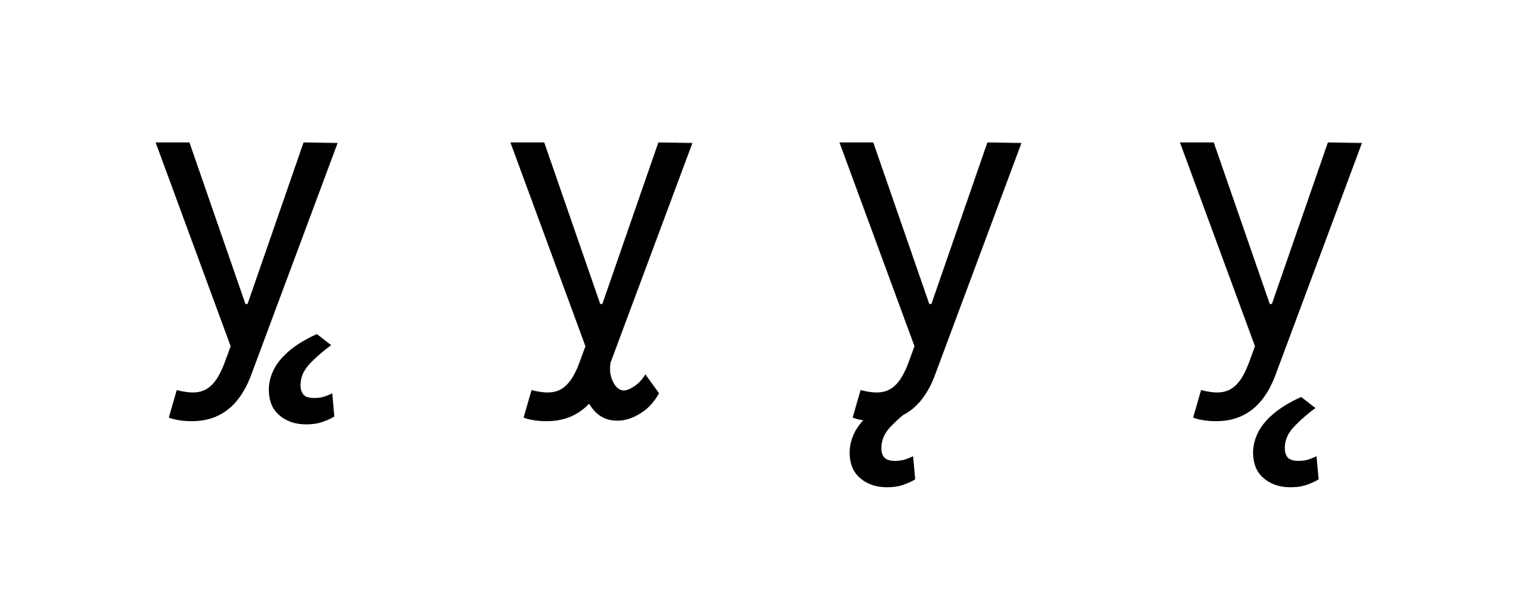
The "y̨" was tricky as the configuration varies when sampling images of prints. Some fonts have really elaborate lettershapes where the bottom tail of the "y" splits in two, like a really integrated special ogonek, while others have a regular ogonek that's attached and some have a regular ogonek that's separate. The latter ended up feeling more readable and I saw more modern designs using this approach. The caveat is that the heavier weights have a customized ogonek that is more of a teardrop shape as the heavy weights otherwise has a relatively thick ogonek.
rsms
on 17 Aug 2020
This has now been released as part of version 3.14 🎉
rsms
on 18 Aug 2020
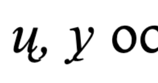
The ogonek should attach to the letter in Elfdalian.
The issue with looking at other fonts, is that it’s not clear which one was designed with Elfdalian in mind.
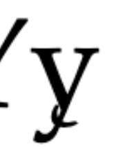
Here’s how it looks in Råðdjärum, Älvdalska språkrådet, 2005, Förslag till en enhetlig stavning för älvdalska:
Here is a sample from Yair Sapir and Gunnar Nyström, 2015, Introduktion till älvdalska:
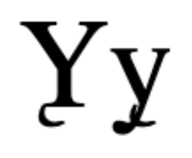
While these are not perfect, they do show the ogonek attached. For context, Yair Sapir was consulted by Råðdjärum, Älvdalska språkrådet when 2005 orthography was created and Gunnar Nyström was part of that committee.
Your second design would probably be the best:
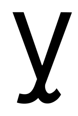
I did find an example with the ogonek detached from (http://www.ulumdalska.se/2018/12/nu-ar-den-pa-vag/) but the ogonek is between two letters, closer to the second letter, so this seems like an error.
Since the first two samples come from good sources, it seems the ogonek should be placed just below the baseline and attached to the y.
It would be better to contact an Elfdalian expert to be sure what is preferred.
 moyogo
on 18 Aug 2020
moyogo
on 18 Aug 2020
I am not an expert either.
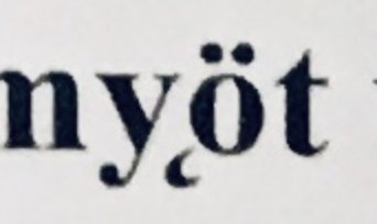
I have two Elfdalian books, and they both use the "split" y̨.
I've attached a photo of what it looks like in Älvdalsk Grammatik by Bengt Åkerberg and Gunnar Nyström.
Dialekt Uni is the typeface used in this book (website seems to be unavailable at the moment.)

snaeugla
on 18 Aug 2020
This is really helpful. Thank you.
rsms
on 18 Aug 2020
Looking into this today I found that there are no Unicode code points assigned to these glyphs; they are purely compositions i.e. "y̨" is U+0079 & U+0328 ("y" followed by combining ogonek.) The best I could do is to introduce a ligature for this pair.
The recommended design for y-ogonek does need its own glyph, but the design you had made or the Y-ogonek didn’t.
Glyphs.app or fontmake will generate the mark feature that font shapers will use to position the combining ogonek on the y with the "ogonek" and "_ogonek" anchors. There are plenty of letters used in various orthographies that a shaped this way. It is not necessary to have single glyphs for all of them.
That said, if you have a yogonek with its own outline instead of components, it may be more practical to have a Yogonek for other features, even if it is a composite glyph.
moyogo
on 19 Aug 2020
@moyogo I've spent an incredible amount of time trying to make anchors like "ogonek" & "_ogonek" work and end up in the final font file. We're talking over a week in total of time, like multiple weekends. I gave it another go this morning, spend 3 hours testing everything I could think of. Debugged with four different font tools to be sure and tested in multiple apps on both macOS and Windows 10. I've also compiled font files using four different compilers.
Simple repro, with fontmake: (using fontmake to reduce the surface area of issues, e.g. with Inter's own build system)
git checkout 206f684bfae76f693e4809d4a98832d826bb32e3(this contains a patch that causes all anchors to be included in the UFO)- Generate UFO from the glyphs source:
make build/ufo/Inter-Regular.ufo - Install fontmake:
pip install fontmake fontmake -u build/ufo/Inter-Regular.ufo --output-path Inter-Regular-fontmake.ttf- Inspect the resulting file
Inter-Regular-fontmake.ttfin FontForge or any other font file debugger that support full parsing (note that Glyphs.app does not)
I _think_ that what is happening is ufo2ft being "smart" and converting anchors into mark and mkmk OT features.
rsms
on 19 Aug 2020
Indeed that is what is happening.
Fontmake uses ufo2ft’s MarkFeatureWriter to writer the mark and mkmk features if there are anchor in the UFOs.
You can use fontmake’s --debug-feature-file parameter to see what feature file is generated and used.
The mark and mkmk features add support to a large number of language orthographies that use accented letters that didn’t make it in time before Unicode stopped encoding composed accented letters as single characters.
Beside Elfdalian’s y-ogonek, there are many examples like G̃ g̃ used in Guarani in Paraguay, N̈ n̈ used in Malagasy, Ɛ̈ ɛ̈ used in Dinka-Nuer, Ɔ́ ɔ́ used in Lingala, Ẹ́ ẹ́ used in Yoruba, etc.
The advantage of having a mark feature for every possible base glyph + mark glyph combination is that it is future proof. If there’s a combination you didn’t think of, you won’t need to add it or modify it unless it’s a special case.
Glyphs.app also propagate anchors, for example it copies the bottom and ogonek anchors from A to Aacute. Fontmake’s MarkFeatureWriter doesn’t, but the glyphs2ufo --propagate-anchors argument or ufo2ft’s PropagateAnchorsFilter can be used for this.
That said there’s an issue with the MarkFeatureWriter and PropagateAnchorsFilter when a spacing mark has anchors and is used in composite glyphs instead of the equivalent non-spacing mark.
For example, Inter has /acute with anchors, /acutecomb as a composite of /acute, and /aacute as a composite using /acute instead of /acutecomb.
The MarkFeatureWriter will put /acute in the mark feature and in the GDEF mark glyph class since it has anchors, which means font shapers will make it non-spacing and position it on base glyphs that have matching anchors.
One possible fix is to remove the anchors from /acute, put them in /acutecomb instead, use /acutecomb in composite glyphs instead of /acute.
And of course, that fix creates another issue: nested components. In theory nested components are great, in practice some TrueType/OpenType implemenations, like some printers, fail to handle them correctly. Luckily, ufo2ft has a FlattenComponentsFilter, which can turn nested components (aacute using acutecomb using acute) into flat components (aacute using acute) but at build time and after the PropagateAnchorsFilter has done its job.
moyogo
on 20 Aug 2020
Thank you @moyogo, very helpful information!
rsms
on 20 Aug 2020
I've done a few more takes on /yogonek. It's really tricky to make it legible at small (text) sizes with the detailed attached ogonek/tail. Here are some versions at small sizes:
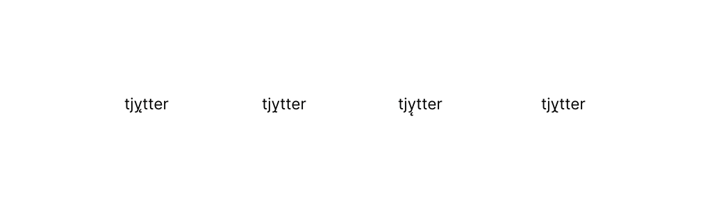
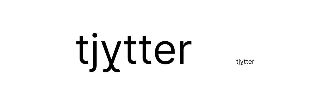
I kind of like the last one. It's a bit unorthodox but works well at small sizes:
rsms
on 20 Aug 2020
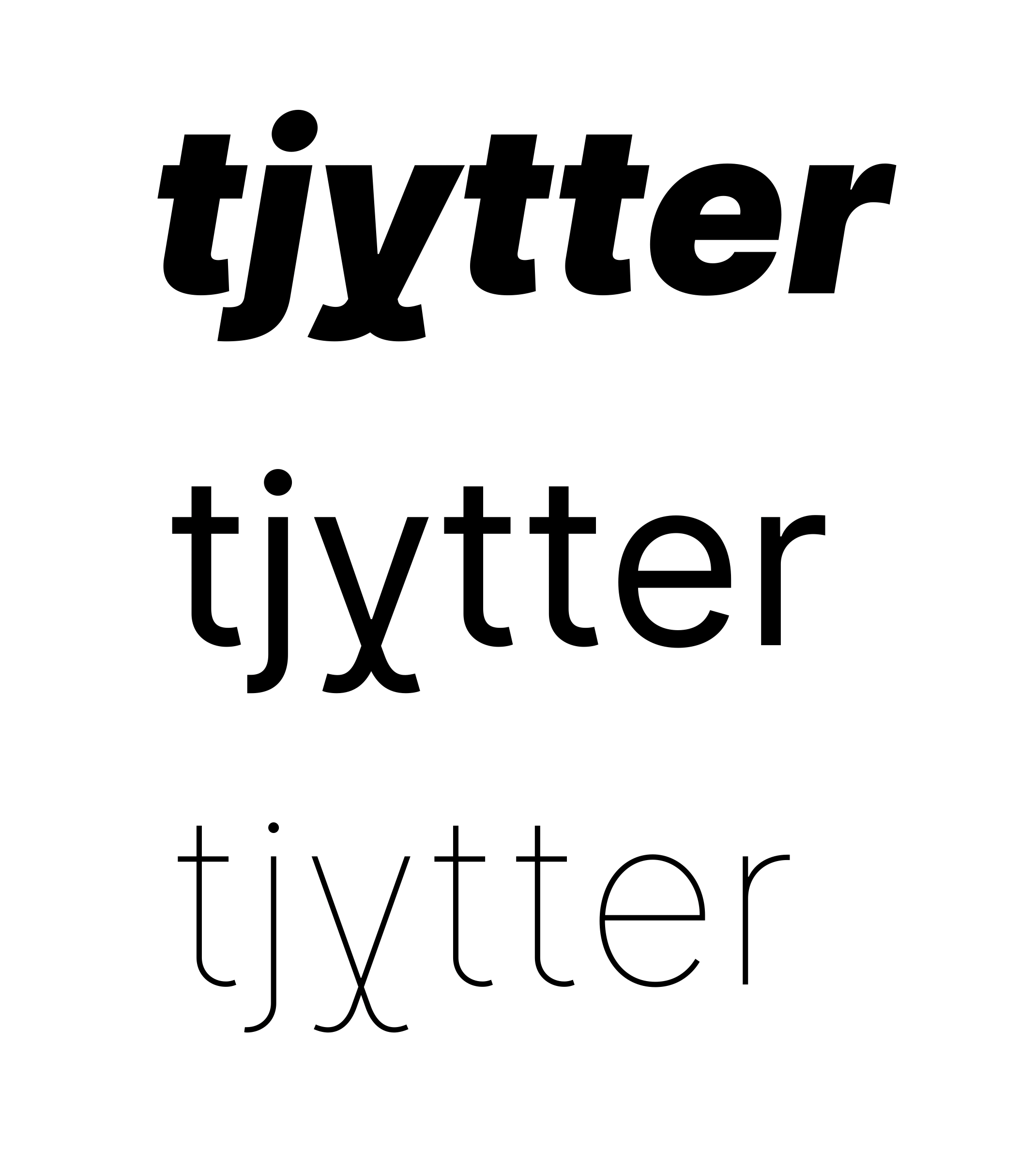
(no idea if"tjy̨tter" is a word, by the way :–)
rsms
on 20 Aug 2020
Here's a pre-release build with the above adjustments:
Inter-3.15-text-f7924a233e.zip
rsms
on 20 Aug 2020
@rsms Interesting solution :-)
moyogo
on 20 Aug 2020
This has now been released as part of version 3.15 🎉
Try it out here: https://rsms.me/inter/lab/?sample=Elfdalian

rsms
on 20 Aug 2020
Related issues
 y6nH
·
4Comments
y6nH
·
4Comments
 cssobral2013
·
3Comments
cssobral2013
·
3Comments
 sk1nzz
·
4Comments
sk1nzz
·
4Comments
 PolMrt
·
5Comments
PolMrt
·
5Comments
 ivan-kleshnin
·
6Comments
ivan-kleshnin
·
6Comments
Most helpful comment
Being Swedish myself, we of course have to make this happen!
Tackar & bockar!