Inter: Improvements to decsender/cyrtic in cyrillic "ц"
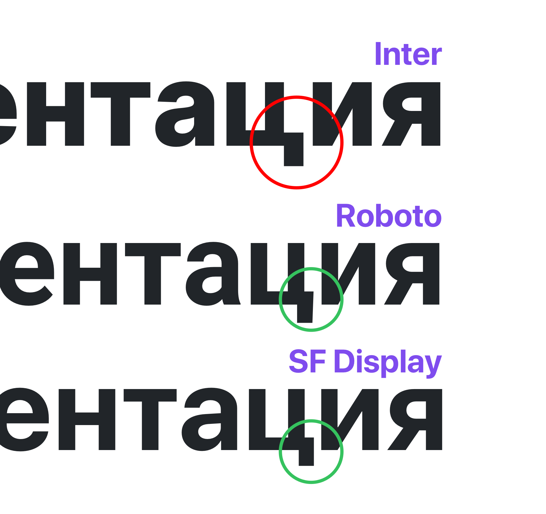
Strange and unnatural descender of the cyrillic letter "ц". It is obvious to russian-speaking people. Too compressed in 100-300 weights and too huge in 700-900. Weights 400-500 are acceptable.
At the same time, a similar letter "щ" has almost normal descender (probably not perfect but pretty good). You can take it as an example to follow (including a slight skew).

Environment
- OS: Windows 7
- Software: Any
- Version of font: 3.3;20b39288a
 dom1n1k
👍1
All 3 comments
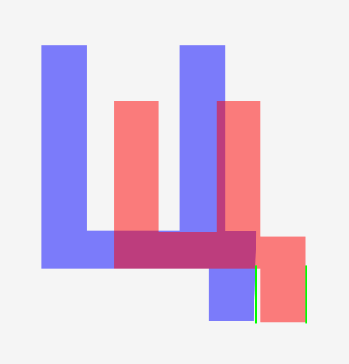
There's a problem only with small «ц» letter. Capitalized letter works normal and has a skew
 dtroode
on 12 Aug 2019
dtroode
on 12 Aug 2019
Maybe this helps.
 barmallion
on 5 Sep 2019
barmallion
on 5 Sep 2019
❤3
@rsms is it possible I help here not having Glyphs app?
Maybe I can fix ц and щ in _Inter UI glyphs_ file, and you copy-paste them to Glyphs after?
 romashamin
on 9 Nov 2019
romashamin
on 9 Nov 2019
Was this page helpful?
0 / 5 - 0 ratings
Related issues
 reinhart1010
·
8Comments
reinhart1010
·
8Comments
 csampersand
·
3Comments
csampersand
·
3Comments
 itsnwa
·
4Comments
itsnwa
·
4Comments
 pakastin
·
8Comments
pakastin
·
8Comments
 y6nH
·
4Comments
y6nH
·
4Comments
Most helpful comment
Maybe this helps.
