Euro sign € looks a bit weird:
- a bit too condensed – could be at least more like an open circle (~280°)
- bottom of the two horizontal lines should be shorter
I'm not saying it should be exactly this, but at least closer to: https://en.wikipedia.org/wiki/Euro_sign#/media/File:Euro_Construction.svg
ps. I have to say how excited I'm about this project! Inter UI is the most beautiful UI font I've ever seen and it's getting even better all the time – thank you for doing this! ❤️
design
 pakastin
All 8 comments
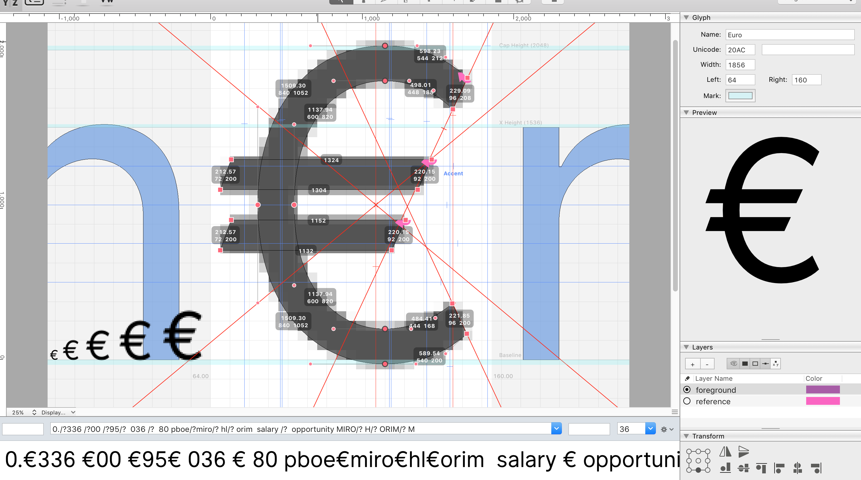
Work in progress:
 rsms
on 30 Oct 2017
rsms
on 30 Oct 2017
👍2
Wow, that’s a beauty! 👌
pakastin
on 30 Oct 2017
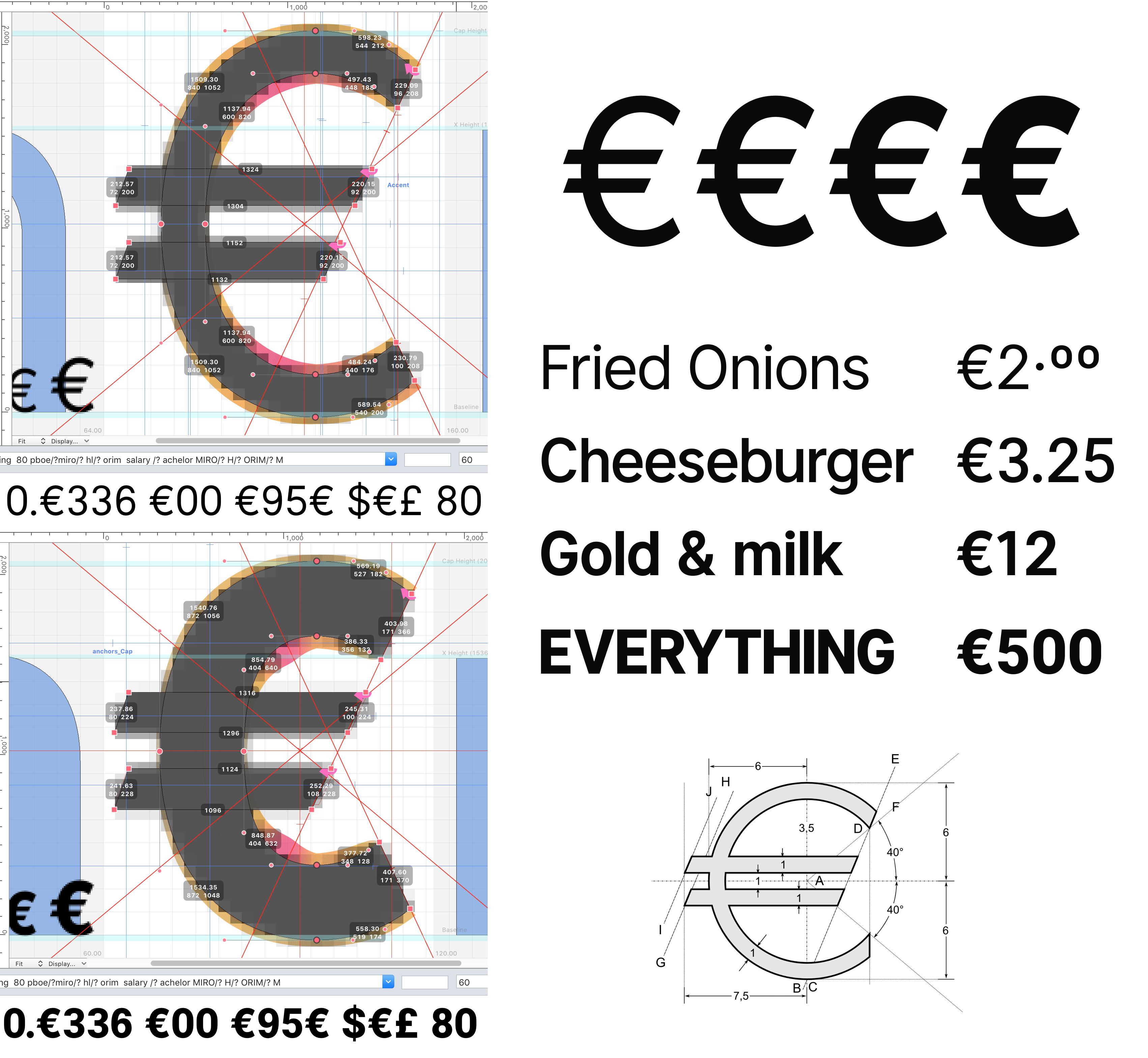
Progress update
rsms
on 4 Nov 2017
👍1
I saw that on Twitter, it’s a beauty! 😎
pakastin
on 4 Nov 2017
rsms
on 4 Nov 2017
🎉1
Thank you, will try soon in practice!
pakastin
on 4 Nov 2017
It's perfect, thank you! 🎉
pakastin
on 30 Nov 2017
😃
rsms
on 1 Dec 2017
Was this page helpful?
0 / 5 - 0 ratings
Related issues
 vladmoroz
·
3Comments
vladmoroz
·
3Comments
 ivan-kleshnin
·
6Comments
ivan-kleshnin
·
6Comments
 dom1n1k
·
3Comments
dom1n1k
·
3Comments
 chrisdrackett
·
6Comments
chrisdrackett
·
6Comments
 thundernixon
·
3Comments
thundernixon
·
3Comments
Most helpful comment
Work in progress:
