Inter: Tweak the interrobang (U+203d) glyph
Wow, your font is beautiful! I recently learned about it from here.
I might switch to it as the default font on my blog!
I love interrobangs (‽). Can you please tweak its design so that the exclamation and question mark components of that unicode are not superimposed strictly vertically? (I like the fact that in the version in Inter UI, the ! is not intersecting ? -- which happens in almost all sans serif fonts.. making that glyph look like a typo!).
For example, the interrobang in Iosevka (specimens - U+203d) is creatively designed; it's distinguishable, and also doesn't look like a typewriter typo.
Thanks!
 kaushalmodi
All 16 comments
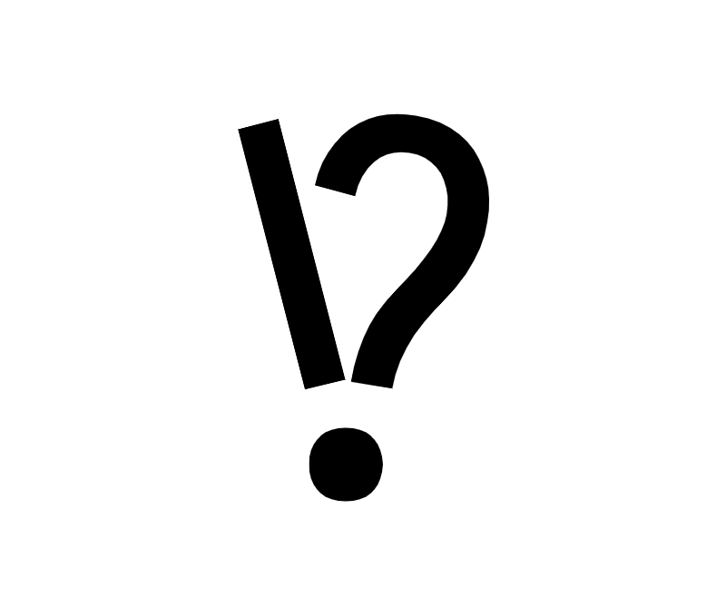
[Reference: Interrobang of Iosevka]
 rsms
on 17 Sep 2018
rsms
on 17 Sep 2018
BTW, have you seen this @kaushalmodi
https://www.netflix.com/watch/80243761
rsms
on 17 Sep 2018
@rsms Thanks for categorizing this as an enhancement.
have you seen this @kaushalmodi https://www.netflix.com/watch/80243761
I have not seen that (didn't know of that "Explained" series).. adding that to my Watch List :)
I got hooked onto interrobangs after I listened to the 99% Invisible podcast episode - Interrobangs. That led me to buy the Shady Characters book (which has the most delightful typography that I have seen in print). I am reading through it right now.
So, while I cannot do much typography stuff myself, I am really interested in it, and so will definitely watch the link you pasted :)
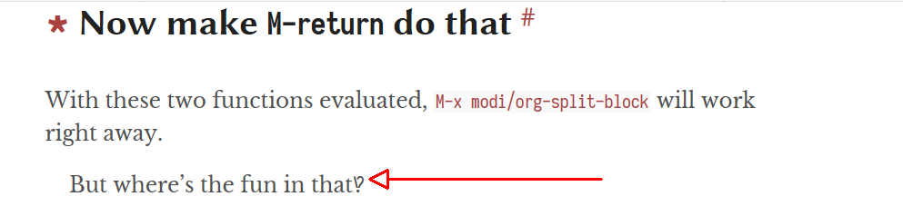
Right now, for the lack of a good interrobang glyph in Serif fonts, I am forced to use the Iosevka Interrobang on my blog:
kaushalmodi
on 17 Sep 2018
@rsms Thanks for linking that Explained episode. It contains more details about Interrobang history that the Shady Characters book did not cover.
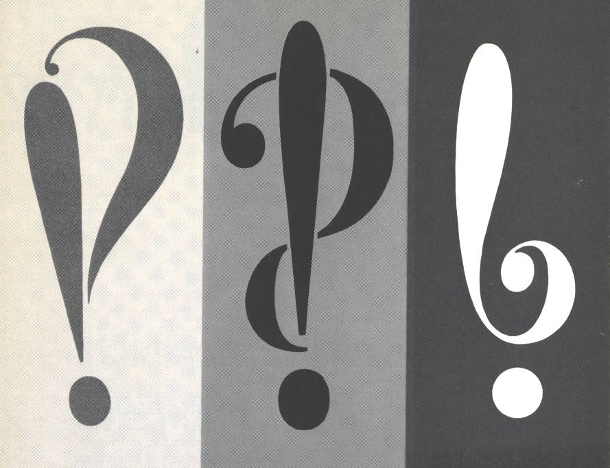
Btw, another good candidate, I think, for the Interrobang glyph is the middle one in the picture below:
kaushalmodi
on 18 Sep 2018
Finally got around to this today and made a bunch of variations, both in the style of "punch out hole in question mark" as well as the "v" shaped approach. Settled on the latter as the former degraded quickly with small sizes.
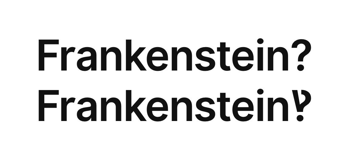
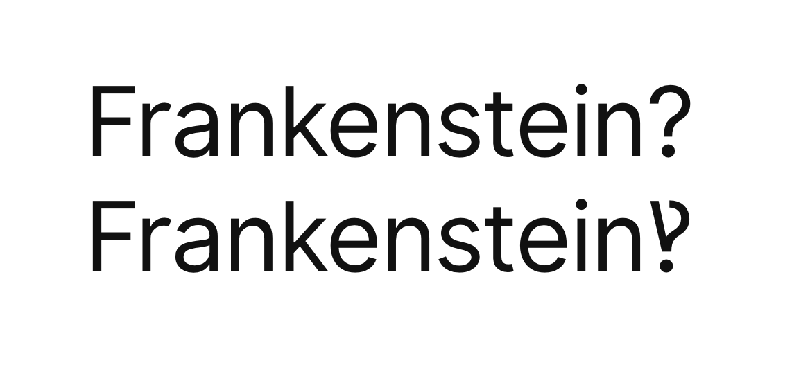
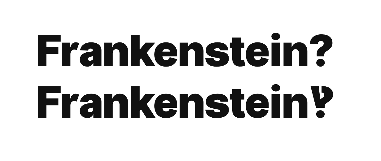
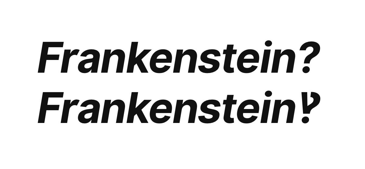




This was part of a larger set of work for v3 on both question marks and exclamation points:
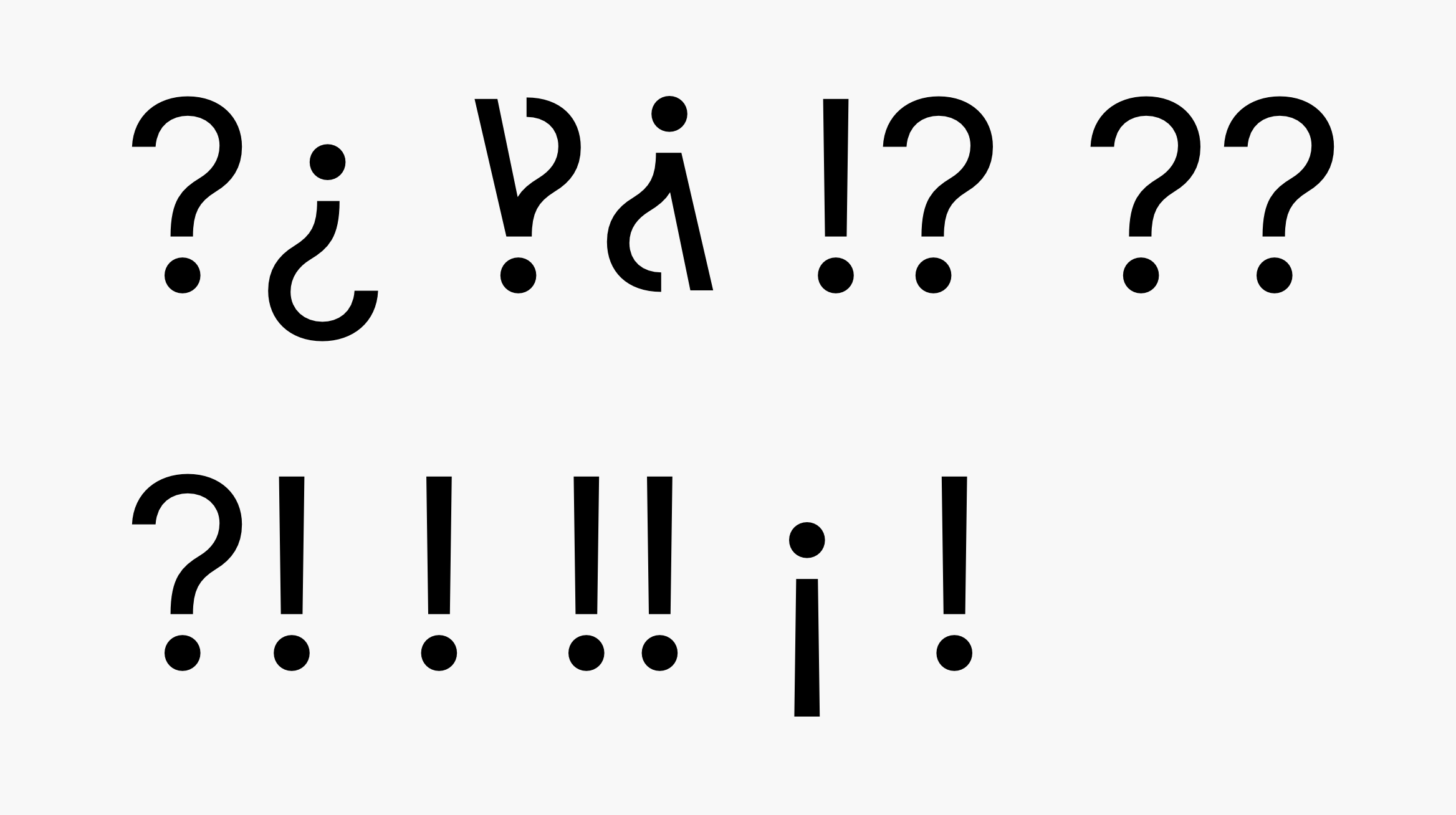
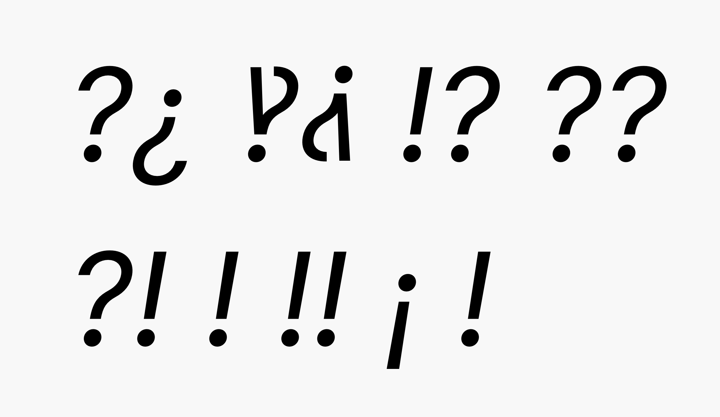
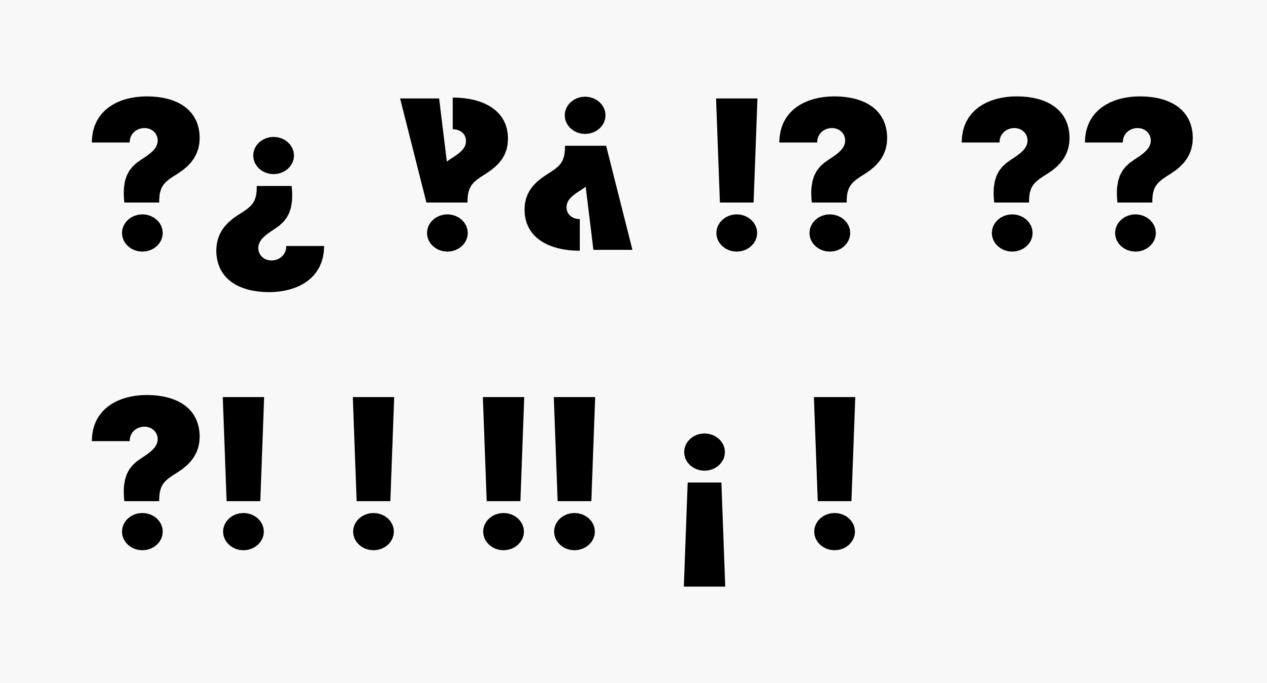
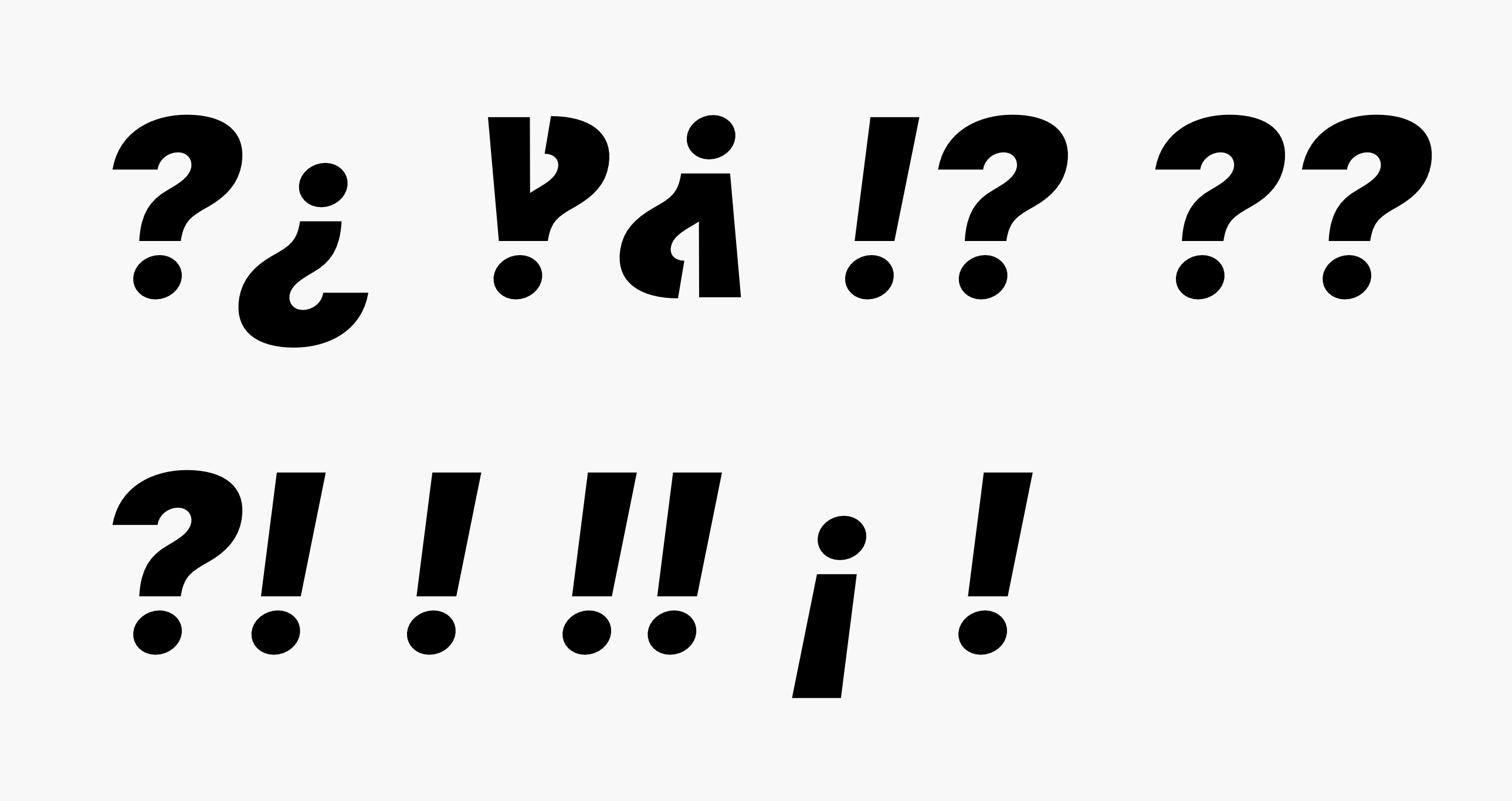
cc @mwichary
rsms
on 23 Sep 2018
Here's a build with the above to test:
Inter-UI-3.0-c178ada07d.zip
rsms
on 23 Sep 2018
@rsms Wow, thank you so much! That interrobang looks amazing!
kaushalmodi
on 23 Sep 2018
Thanks @kaushalmodi. I’m not entirely sold on this yet though. Would be great to have this tested in some real-world scenarios. I’m a little worried that it loses the question mark shape surrounded by lots of text.
rsms
on 23 Sep 2018
I’m a little worried that it loses the question mark shape surrounded by lots of text.
I'll deploy this beta version of Inter UI on my blog in the next week, and provide my feedback. Thanks again.
kaushalmodi
on 24 Sep 2018
I’m a little worried that it loses the question mark shape surrounded by lots of text.
I can also kind of see that.. (non-typographically-technical lanuguage follows..)
The regular question mark has 270 degrees or roughly around that curve forming the top portion of the "?" .. and I believe the new ‽ has 180 degrees of that curve? is that the reason?
Would the Inter UI ‽ hold more of the "question mark value" if the curve is somewhere between 180 and 270 degrees i.e. make it look more like a hook than a sideaways bowl?
I really apologize for this metaphorical explanation.. I don't know how to describe it technically.
kaushalmodi
on 24 Sep 2018
Here's a take that's more similar to that of Iosevka:

Compared to other iterations:


rsms
on 24 Sep 2018
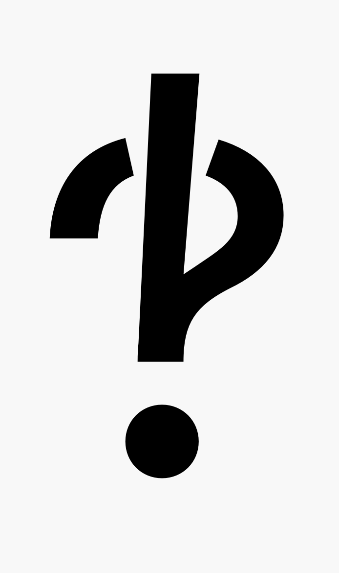
A few more


Close-ups of some of the alternatives:




rsms
on 24 Sep 2018
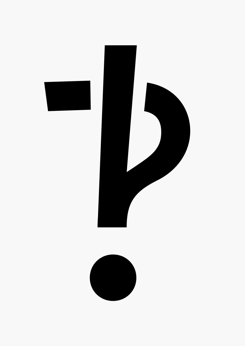
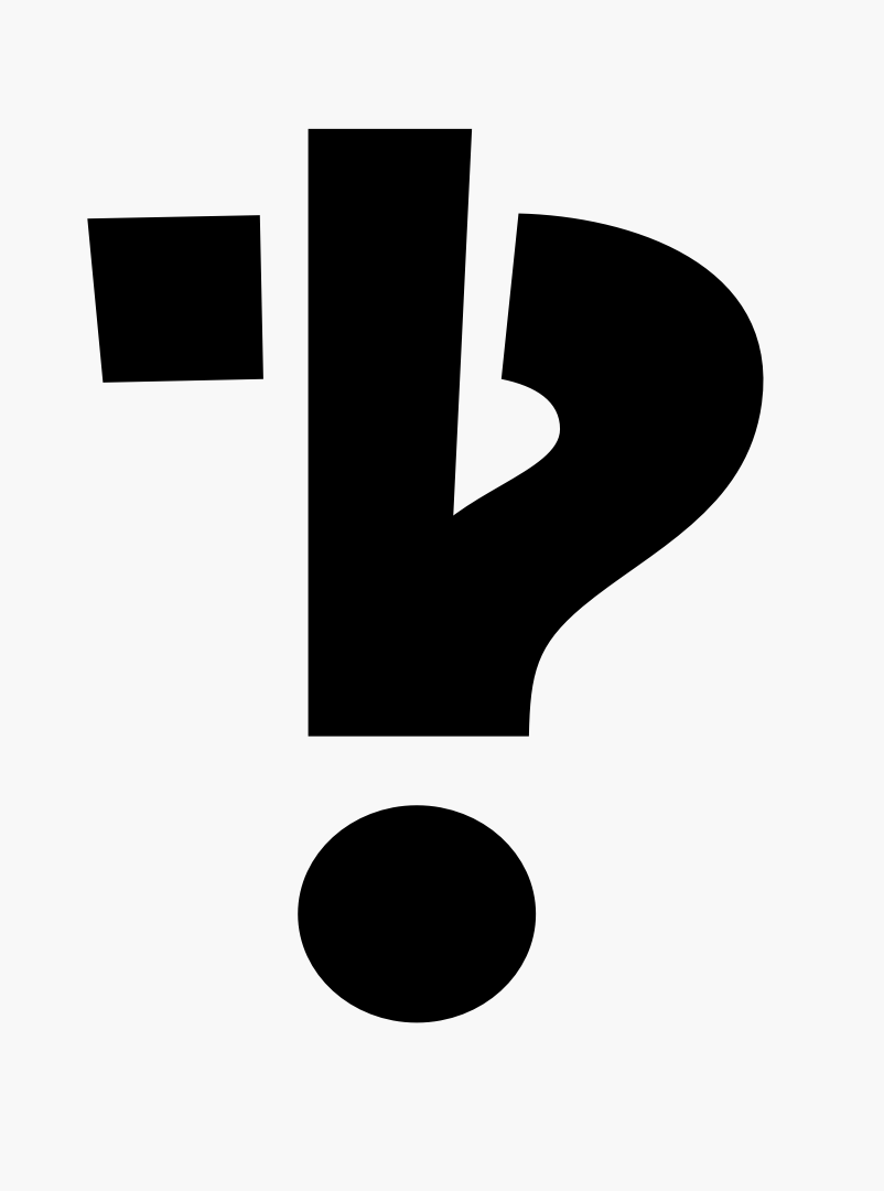
Final take for tonight:



Close up: (doesn't look very good large)
rsms
on 24 Sep 2018
Pref 1
In terms of simplicity, and having the glyph quickly convey its meaning to the reader, I find this to be the best:
Pref 2
This one is stylistic but not at the cost of losing its meaning. It's unique too.
Pref 3
About this last iteration, I'm not so sure and may be it's just me.. just because this does not have the 270 degree question mark hook.
I cannot make up my mind on "Pref 1" vs "Pref 2"; both are awesome. I'll go by your judgment.
kaushalmodi
on 24 Sep 2018
@rsms Was something else expected from me? Did my last comment not help?
kaushalmodi
on 24 Nov 2018
@kaushalmodi It shipped in version 3.0 :–) I just forgot to close the issue when it did.
rsms
on 24 Nov 2018
Related issues
 csampersand
·
3Comments
csampersand
·
3Comments
 thundernixon
·
3Comments
thundernixon
·
3Comments
 cssobral2013
·
3Comments
cssobral2013
·
3Comments
 speckz
·
4Comments
speckz
·
4Comments
 sk1nzz
·
4Comments
sk1nzz
·
4Comments
Most helpful comment
Finally got around to this today and made a bunch of variations, both in the style of "punch out hole in question mark" as well as the "v" shaped approach. Settled on the latter as the former degraded quickly with small sizes.
This was part of a larger set of work for v3 on both question marks and exclamation points:




cc @mwichary