Integration: Relocate install, upgrade... Buttons to the top
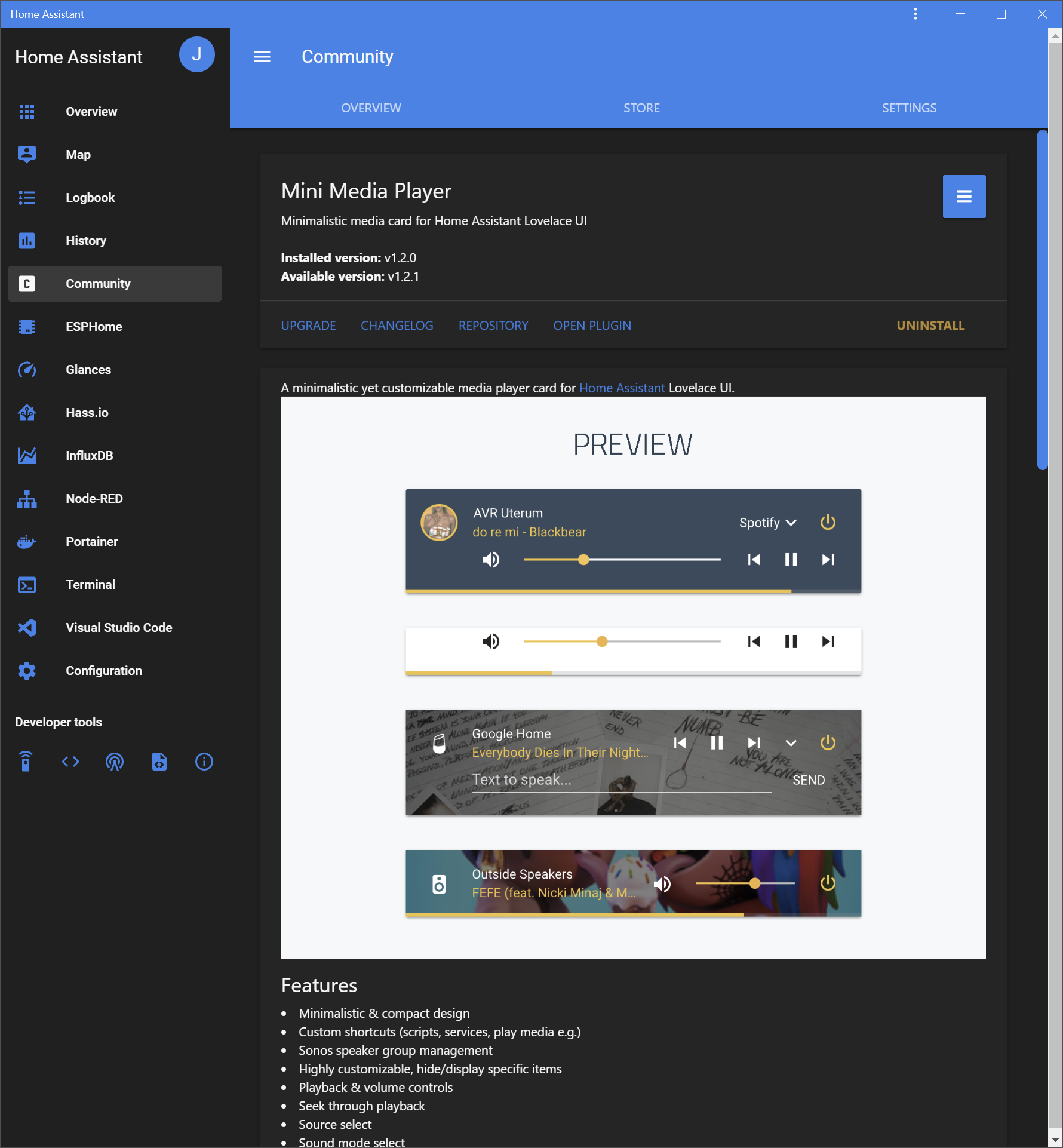
When checking any custom components, all buttons to install, upgrade, repository, uninstall are located on the bottom. Some integrations like the Mini Media Player have a lot of documentation so you have to scroll all the way to the bottom to install it.
I would suggest moving the buttons to the top similar to the regular add-on in Hass.io.
 JuanMTech
All 5 comments
There is a reason I chose to do it this way if the buttons are at the bottom it "forces" the user to "read" potentially important information from the developer.
I'm not saying no, but this change needs consensus from more users/devs before implemented.
 ludeeus
on 29 Jun 2019
ludeeus
on 29 Jun 2019
Please build a poll in the community.home-assistant.io forum to gather consensus for this one way or the other.
 cdrom1028
on 29 Jun 2019
ludeeus
on 30 Jun 2019
cdrom1028
on 29 Jun 2019
ludeeus
on 30 Jun 2019
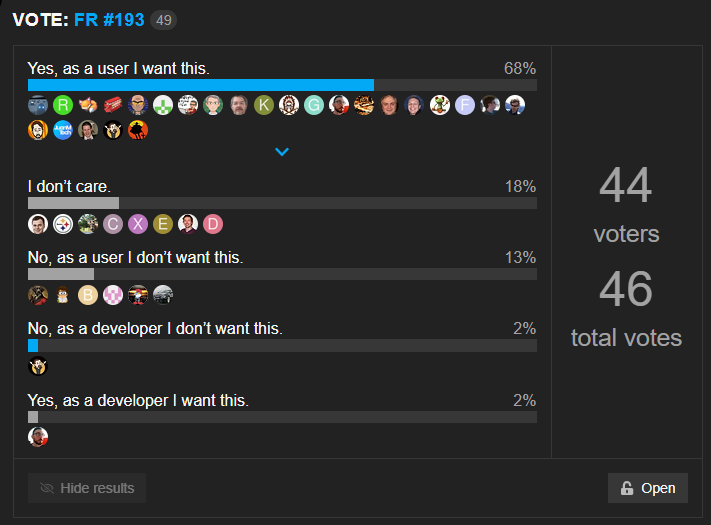
ludeeus
on 1 Jul 2019
Implemented in 0.11.0 https://github.com/custom-components/hacs/releases/tag/0.11.0
ludeeus
on 1 Jul 2019
Related issues
 vturekhanov
·
7Comments
vturekhanov
·
7Comments
 astrandb
·
3Comments
astrandb
·
3Comments
 Tamas-Toth-ebola
·
6Comments
Tamas-Toth-ebola
·
6Comments
 SeanPM5
·
6Comments
SeanPM5
·
6Comments
 noxhirsch
·
6Comments
noxhirsch
·
6Comments