Insomnia: [BUG] Font rendering on ubuntu is bad
In general, fonts for Insomnia in Ubuntu 17.10 render really badly - hinting is probably wrong as the smaller the font, the less readable they are.
- Insomnia Version:
Version 5.15.0
Shell 1.7.13
Node 7.9.0
V8 5.8.283.38
Architecture x64
- Operating System: Ubuntu 17.10 / Unity 7
I'm attaching a number of partial screenshots:
Some of the other electron apps I'm using (eg VSCode) do not show this problem and indeed render fonts just like any other native app.
Seems to be all fonts, not just the interface fonts I've highlighted - embiggening the text editor font mitigates the problem in there, but by no means fixes it.
 luispabon
All 21 comments
👋 Thanks for opening your first issue! If you're reporting a 🐞 bug, please make sure
you include steps to reproduce it. If you're requesting a feature 🎁, please provide real
use cases that would benefit. 👪
To help make this a smooth process, please be sure you have first read the
contributing guidelines.
![welcome[bot] picture](https://avatars0.githubusercontent.com/in/4141?v=4&s=40) welcome[bot]
on 3 Apr 2018
welcome[bot]
on 3 Apr 2018
I don't think your screenshots are high enough quality for me to tell what's wrong with the font. Maybe a screenshot that shows side-by-side with another app with better font rendering?
 gschier
on 20 Apr 2018
gschier
on 20 Apr 2018

luispabon
on 20 Apr 2018
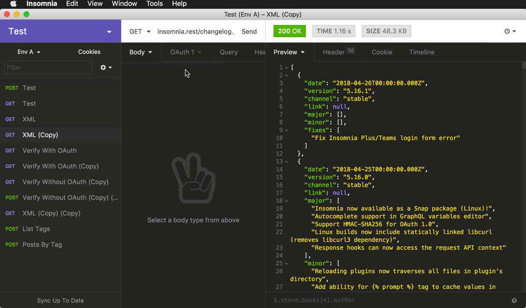
You need to open the image by itself to remove github's zooming as the blur masks the issue. This is on a 1920x1080 screen. In 4K the problem is less apparent.
You can see both JSON render very similarly, same font but insomnia's sizing is a little lower. That's fine.
The issue comes on the interface elements, like the tabs, the POST button, the URL. Rendering is pretty bad there and makes the labels hard to read. It is possible it's the font being used, since the comparing screenshot is vscode which also uses electron. vscode is using the default system font, in my case this is Ubuntu. vscode's rendering is really smooth, where insomnia's is rather jaggy, like the hinting is all wrong.
luispabon
on 20 Apr 2018
Oh ya, I think I see it now. The JSON looks much smoother.
This is likely an issue with the default interface font. Do you know what font-face visual studio is using?
gschier
on 20 Apr 2018
vscode seems to be using the system defined default fonts (several variations on the Ubuntu font) for its interface elements and labels. The editor is using Fira Code.
luispabon
on 20 Apr 2018
Hmm, ya I should probably just copy what VSCode uses for it's default fonts. Right now Insomnia includes the Open Sans font from Google Fonts (only the .woff2 format) which might not behave well with Ubuntu.
gschier
on 20 Apr 2018
:+1: do gimme a shout if you need a hand with testing it out
luispabon
on 20 Apr 2018
Sure, thanks 😄
gschier
on 20 Apr 2018
@gschier I just got updated to 5.16.1, did this fix make it in there? I see no real change on font rendering.
luispabon
on 27 Apr 2018
Ya it's in there. I guess that wasn't the correct fix, then 😿
gschier
on 27 Apr 2018
Since yesterday I now have a "retina" install of Ubuntu running in VMWare so I can test it out 👍
gschier
on 27 Apr 2018
@luispabon Can you do me a favor and check which font-family is actually showing for you? In Ubuntu 18.04 it's Liberation Mono but I don't have a 17.10 to test with.
_Note: the following screen recording was done on Mac_
gschier
on 27 Apr 2018
It is liberation mono local as per your screegrab, and it is just fine on the editor and the response preview, timeline etc.
The place where weird font rendering remains is on the UI elements such as folder names, tabs etc. which is also liberation local. This is really puzzling though because the same font at the same size on a plain html loaded in chrome renders much better
luispabon
on 27 Apr 2018
I'm messing about with the dev tools and styles see if I can hit the spot
luispabon
on 27 Apr 2018
Oh right, got confused again as to which font was messed up. Let me know if you can figure out a font that works for you 😄
gschier
on 27 Apr 2018

Added ubuntu to the UI elements at the top and it's a lot better. I think Liberation at these sizes might have some hinting issues.
Perhaps would it be possible to make UI font size somewhat configurable? I believe most if not all of the issues remaining could be fixed with a slightly bigger font
luispabon
on 27 Apr 2018
Nice, I can change it to the Ubuntu font for now and see what happens. Changing the UI font size is actually pretty tricky because all of the padding/margin/etc is tied to it (scaled using rem). I'd consider it though. Note that you can also change the zoom level using ctrl +/-
gschier
on 27 Apr 2018
Understood, and thank you for your help :+1: I use insomnia constantly so good fonts are important to avoid eye strain
luispabon
on 27 Apr 2018
I'm having similar problem on Ubuntu 18.04 with Insomnia version 5.16.1.
I've checked the font family in dev tools and it is using: Courier New.
Is there any way I can change the font myself?

 jdorleans
on 28 Apr 2018
jdorleans
on 28 Apr 2018
Going to close this now that there is the ability to select a custom font. Hopefully the user will be able to chose one with more weight.
gschier
on 14 Dec 2018
Related issues
gschier
·
42Comments
 GuihaiHU
·
27Comments
GuihaiHU
·
27Comments
 kasradzenika
·
21Comments
kasradzenika
·
21Comments
 317174106
·
22Comments
317174106
·
22Comments
 UUsmonov
·
21Comments
UUsmonov
·
21Comments
Most helpful comment
I'm having similar problem on Ubuntu 18.04 with Insomnia version 5.16.1.
I've checked the font family in dev tools and it is using: Courier New.
Is there any way I can change the font myself?