Incubator-superset: UI not adaptive on mobile devices
Superset version
Superset 0.19.0
Expected results
When view on mobile device, it makes adaptive UI with useable fonts, images, graphs
Actual results
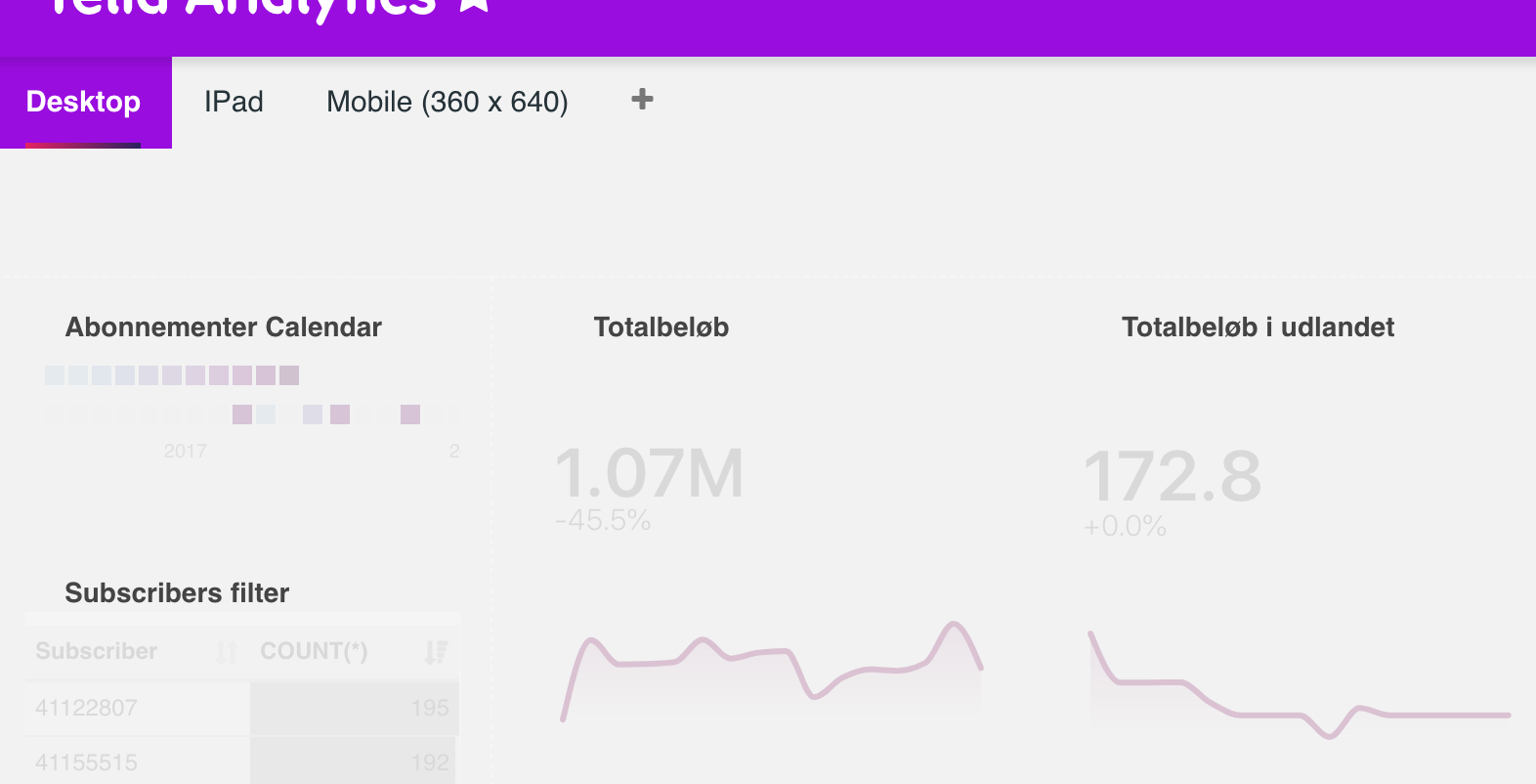
It renders the same as on desktop, but with broken layout - the blocks are located on wrong places.
Steps to reproduce
Create a dashboard and view on mobile phone
 izetex
All 14 comments
Which view(s) specifically?
 mistercrunch
on 21 Aug 2017
mistercrunch
on 21 Aug 2017
Dashboard first of all
izetex
on 22 Aug 2017
We use react-grid-layout which has a responsive grid. On small screen it has less columns (8 instead of 12 I believe) and that forces the layout to change. Dashboards may have to be designed with that in mind.
I'm not sure what else we can do to accommodate small screens, ideas are welcomed.
mistercrunch
on 22 Aug 2017
Try add
<meta name="viewport" content="width=device-width, initial-scale=1.0">
to head section - may be it helps
izetex
on 22 Aug 2017
@izetex it would be nice if you can try that and open a PR if it makes things better
 xrmx
on 23 Aug 2017
xrmx
on 23 Aug 2017
Notice: this issue has been closed because it has been inactive for 242 days. Feel free to comment and request for this issue to be reopened.
mistercrunch
on 23 Apr 2018
Any relevant and productive updates on the responsiveness issue?
 D-Mahajan
on 15 Apr 2019
D-Mahajan
on 15 Apr 2019
What about having some sort of special tabs for different resolutions @mistercrunch?
We can load one or another tab based on device and will still compatible with current grid designer
 gbrian
on 13 Jun 2019
gbrian
on 13 Jun 2019
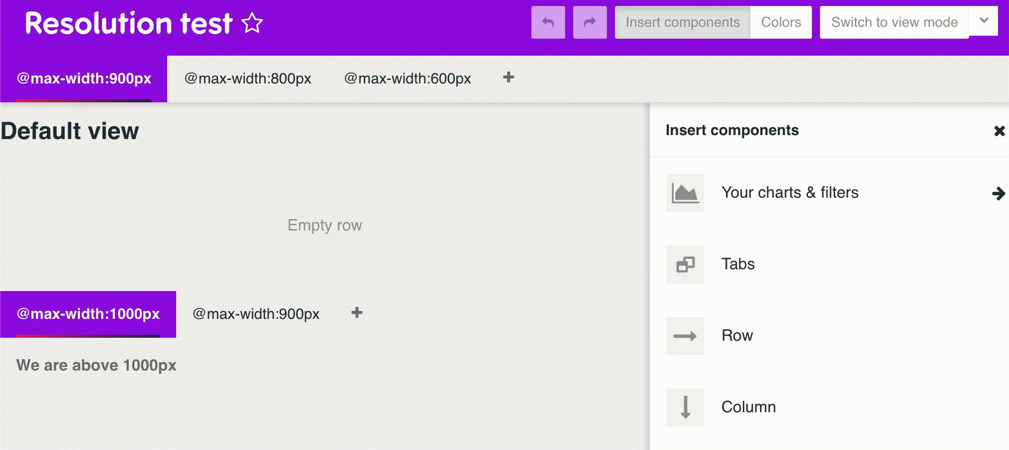
Me again... what about adding @media (max-width:800px) for tabs?
Example:
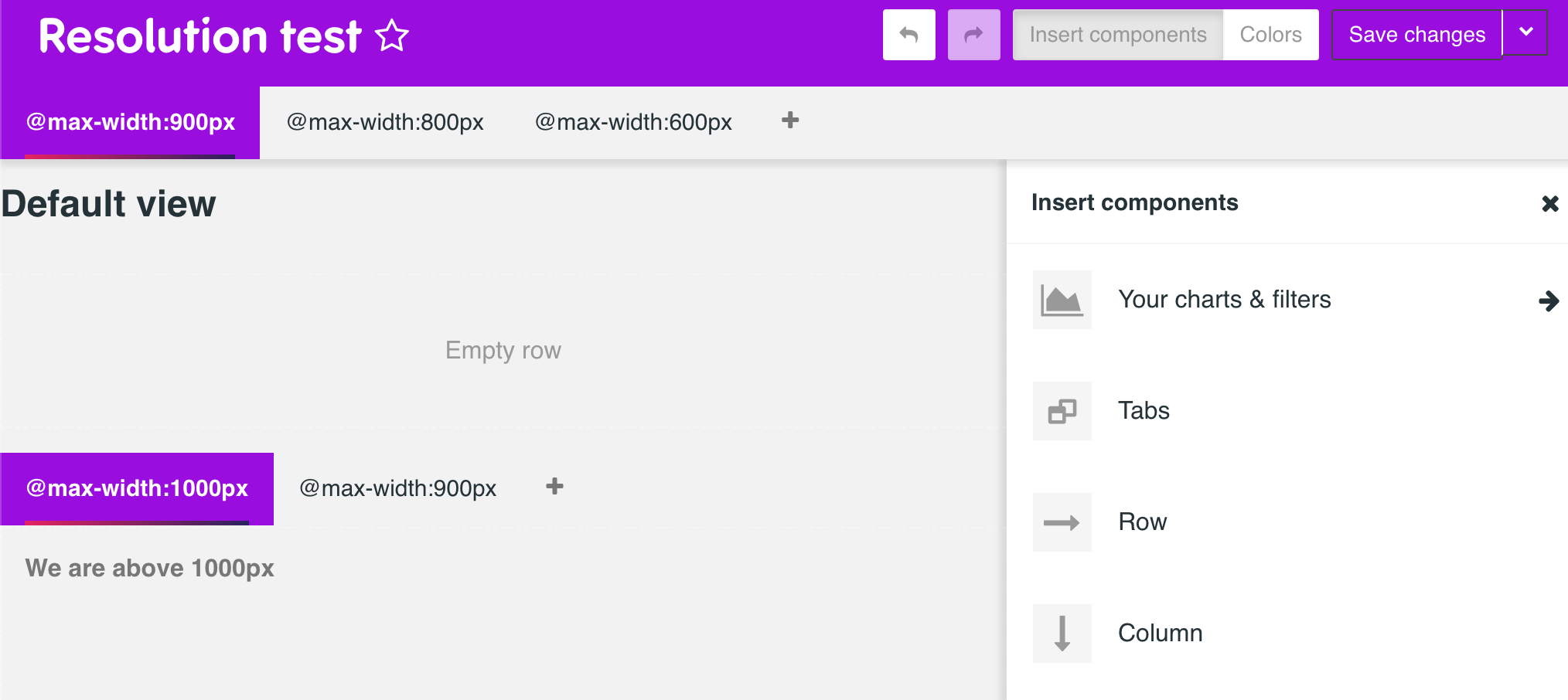
Some JS to do the effect:
gbrian
on 14 Jun 2019
hi i am needing such ui adaptive feature @gbrian gbrian
 kalimuthu123
on 16 Sep 2019
kalimuthu123
on 16 Sep 2019
@kalimuthu123 , currently is on-hold due to other tasks on my project. For sure I'll get back to it but can't manage now, sorry :(
I'll keep you updated on this thread
gbrian
on 16 Sep 2019
Hi @gbrian ,
any update on the above feature level
kalimuthu123
on 7 Apr 2020
Hi @kalimuthu123, you find me me testing vvvb.js 😅 was on my mind for long... Is a POC to have a CMS approach dashboard creation that can benefit from templates and responsiveness at the time anyone can build their own pages. This approach aims to convert every page in a dashboard... crazy thing I'll post test results 🤞
gbrian
on 7 Apr 2020
Promising!

gbrian
on 8 Apr 2020
Related issues
 fly-high-bj
·
3Comments
fly-high-bj
·
3Comments
 XiaodiKong
·
3Comments
gbrian
·
3Comments
kalimuthu123
·
3Comments
XiaodiKong
·
3Comments
gbrian
·
3Comments
kalimuthu123
·
3Comments
 john-bodley
·
3Comments
john-bodley
·
3Comments
Most helpful comment
Promising!
