Image-sequencer: New design layout for Save and Add areas
I'd like to reorganize the Save and Add boxes a bit, because they're a bit confusing, i think.
Brainstorming some issues:
- the difference between Save sequence and Save image may be confusing
- we should have a place to output the whole string syntax of the current sequencer, besides just the URL bar
- maybe View Gif and Download PNG should be near each other since they're kind of similar?
- We should highlight the most common actions and de-emphasize ones that are a bit more obscure, maybe?
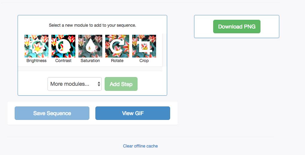
What about something like this?
Love to hear ideas and input!
design
 jywarren
All 4 comments
Also please ignore the design of the final step, that's just for context (using an old mockup from our shared mockups document here: https://docs.google.com/presentation/d/1TCZoTfuhamRVrUak8aDgqJAwSgyhRtZg2Pgacl2_4zc/edit#slide=id.g3211328fd3_0_0)
jywarren
on 31 Jan 2019
Great ideas @jywarren ! If you have no rush, I'd like to work on this. I could create a PR and update it as the ideas come up in this discussion.
 IgorWilbert
on 1 Feb 2019
IgorWilbert
on 1 Feb 2019
👍2
@IgorWilbert go ahead!
 harshkhandeparkar
on 1 Feb 2019
harshkhandeparkar
on 1 Feb 2019
👍1
That'd be awesome!
jywarren
on 1 Feb 2019
👍1
Was this page helpful?
0 / 5 - 0 ratings
Related issues
 blurry-x-face
·
4Comments
jywarren
·
5Comments
harshkhandeparkar
·
4Comments
jywarren
·
5Comments
harshkhandeparkar
·
3Comments
blurry-x-face
·
4Comments
jywarren
·
5Comments
harshkhandeparkar
·
4Comments
jywarren
·
5Comments
harshkhandeparkar
·
3Comments
Most helpful comment
Great ideas @jywarren ! If you have no rush, I'd like to work on this. I could create a PR and update it as the ideas come up in this discussion.