Igniteui-angular: igxGrid position of header's feature icon (e.g. filtering icon) and header text become inverted on number columns
Description
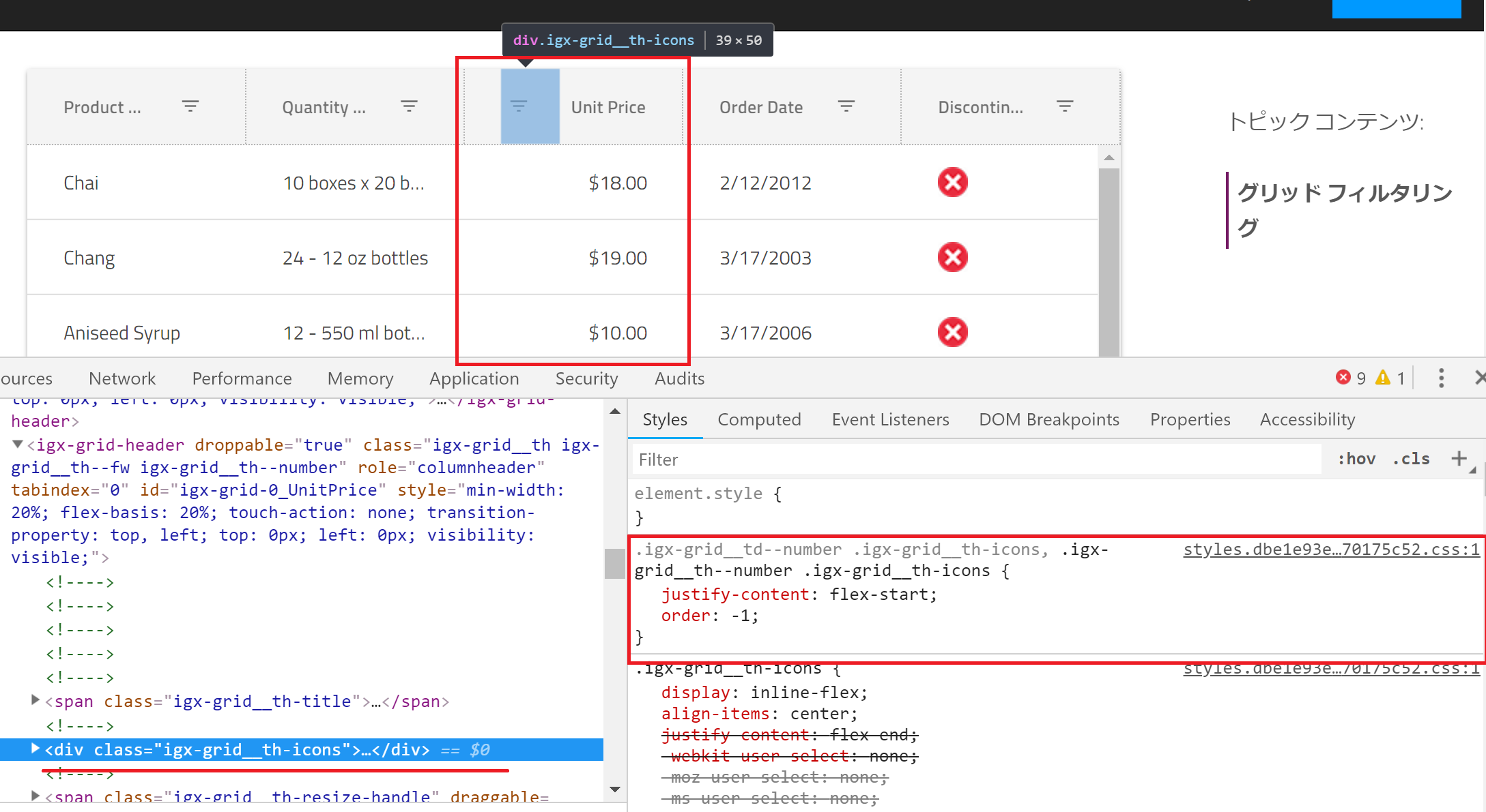
On number type columns, cell values get right-aligned which is great, and the position of the header's feature icon (e.g. filtering icon) and the header text become inverted. The icon is placed on the left of the header text on number column. I've got questions regarding this behavior from SEVERAL customers that they feel this behavior unnatural, some of them said operational icons (e.g. filtering icon) should be placed on the same position even on a number type (right-aligned) column in terms of UX.
Is this designed in the material guideline? If it's by designed with a certain reason then could you consider to have an option to allow developers to choose the alignment?
- igniteui-angular version: 6.1.5
- browser: whatever
Steps to reproduce
- Open https://jp.infragistics.com/products/ignite-ui-angular/angular/components/grid_filtering.html
- Check the header of Unit Price column
Result
The filtering icon is placed on the left of the header text "Unit Price"
Expected result
The icon should be placed on the same place on every column regardless of the column's dataType.
Attachments
 gdayori
All 7 comments
The layout is by design as described in the Material guidelines https://material.io/design/components/data-tables.html#specs
 StefanIvanov
on 28 Sep 2018
StefanIvanov
on 28 Sep 2018
@gdayori, also, the users can alter the look & feel of our components using Sass. Let us know if you need a sample demonstrating how to achieve the desired scenario using custom styles.
 tiliev
on 1 Oct 2018
tiliev
on 1 Oct 2018
@StefanIvanov I couldn't find description that icons should be placed on the left of the header text. Where's described about it?
gdayori
on 2 Oct 2018
@tiliev Thanks! I know how to achieve it with Sass but I just want to discuss how the default style should look.
gdayori
on 2 Oct 2018
@StefanIvanov I couldn't find description that icons should be placed on the left of the header text. Where's described about it?
It is not mentioned in written but it is visible on each of their screen shots, which lead to our decision to match their visuals with the given default look on our end.
StefanIvanov
on 2 Oct 2018
@StefanIvanov Thanks for your reply. I found some images indicating that you are right... I understand that this UI is exactly following the Material Guideline.
gdayori
on 5 Oct 2018
I'm closing this since the current UI is by design.
gdayori
on 5 Oct 2018
Related issues
 brianlagunas
·
3Comments
brianlagunas
·
3Comments
 Hypenate
·
3Comments
Hypenate
·
3Comments
 ChronosSF
·
3Comments
ChronosSF
·
3Comments
 nikunjgajera
·
3Comments
nikunjgajera
·
3Comments
 cornel-stoica-str
·
3Comments
cornel-stoica-str
·
3Comments