Igniteui-angular: Support for quick filter in igx-grid
Description
The old ignite-ui supported a quick filter field in addition to the popup for more advanced filtering. We would very much like to see this feature continued, as this quick filtering is a popular feature among our users.
Result
User must perform one extra click every time he/she wants to apply a filter with the current solution.
Expected result
Possibility to make basic filtering/search within a column without extra clicking.
Attachments

 Eralmidia
All 18 comments
Assigning to @sbozalieva for review.
 kdinev
on 2 Feb 2018
kdinev
on 2 Feb 2018
@Eralmidia Your feature request is already in progress you will get an update on it next week. Will keep you posted! Have a great weekend!:)
 sbozalieva
on 2 Feb 2018
sbozalieva
on 2 Feb 2018
@Eralmidia Here you can review the initial spec for the filtering row https://github.com/IgniteUI/igniteui-angular/wiki/Filtering-Row
sbozalieva
on 9 Feb 2018
Looks good 👍 One question though: Will it be possible to define a fixed list of filtering options, meaning that the user can only filter based on a drop down list instead of a input field? The spec mentions custom filtering, but I'm not sure if this includes such a scenario, or just the ability to add to the filtering options list.
Eralmidia
on 9 Feb 2018
@Eralmidia Thanks. Yes it will, next week will be focused on creating the ui assets for the dropdown. We are currently working on a filtering demos roadmap. It will include samples with excel style, custom/advanced, cross-field filters etc.
sbozalieva
on 9 Feb 2018
Perfect. Keep up the good work. Looking forward to this is implemented. Along with #524 and #520 this is probably what we need the most for fully starting to adopt the igx components.
Eralmidia
on 9 Feb 2018
Any chance of seeing this in the current milestone?
Eralmidia
on 30 May 2018
@Eralmidia at this we don't plan to implement it since the current filtering is basically covering this scenario. It will be a Pending discussion after the end of June
 SlavUI
on 30 May 2018
SlavUI
on 30 May 2018
It is covered yes, but you are degrading the usability by adding an extra click to open a drop down before being able to filter ect. It's a small thing, but for users who use a lot of filtering, this will seem cumbersome, compared to the old jquery based grids.
Anyway, looking forward to an update after you have discussed it further :)
Eralmidia
on 31 May 2018
At this point we don't have a plan to implement it in the current Milestone :) I will differently discuss this again with @kdinev and see also what he thinks ;) Thanks @Eralmidia for the good input
SlavUI
on 31 May 2018
@SlavUI @kdinev Thank you. Looking forward to hear what you decide.
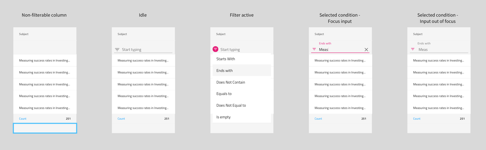
As a further argument (in addition to save the extra click), I would also add that this:

is a lot more clear than:

It's easier for the user to miss that some filtering condition is actually applied, since it's only a small color change which indicates that a filter is applied. With the filter row, it's quite easy to see.
Eralmidia
on 15 Jun 2018
@Eralmidia It looks like we would eventually have to implement it the way you're requesting, because our current design conflicts with a column chooser implementation (Ops UI), because we would have to otherwise open a second overlay, after choosing filtering from the first overlay - the ops UI. An ops UI is where you can choose to hide/pin/do other operations on a per-column level.
kdinev
on 15 Jun 2018
I see. Yes, and to me it also makes sense to separate these things. Hiding, pinning ect, are options (as you say ops UI), more in the sense of "this is how I want my grid to look/work". Filtering on the other hand, is usage, and should be as accessible to the user as possible.
Eralmidia
on 15 Jun 2018
 StefanIvanov
on 21 Aug 2018
StefanIvanov
on 21 Aug 2018
spec has been updated with the final design
StefanIvanov
on 21 Sep 2018
@StefanIvanov This looks very good 👍 "As a developer I want to create custom filtering conditions." Does this mean that you can define a fixed list of conditions the user can choose from? Meaning a dropdown instead of a text field input
Eralmidia
on 21 Sep 2018
Absolutely! And a dropdown with predefined "queries" is exactly what we envision as a sample of this functionality.
StefanIvanov
on 21 Sep 2018
Quality stuff! Looking forward to see this in action 🥇
Eralmidia
on 21 Sep 2018
Related issues
 SAndreeva
·
3Comments
SAndreeva
·
3Comments
 nikunjgajera
·
3Comments
nikunjgajera
·
3Comments
 ViktorSlavov
·
3Comments
ViktorSlavov
·
3Comments
 tkiryu
·
3Comments
tkiryu
·
3Comments
 Hypenate
·
3Comments
Hypenate
·
3Comments
Most helpful comment
Quality stuff! Looking forward to see this in action 🥇