Icingaweb2: Theme solarized-dark on 2.7.0 has contrast issues / ambiguous controls
Describe the bug
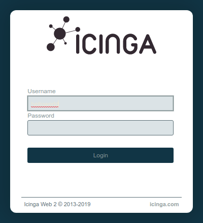
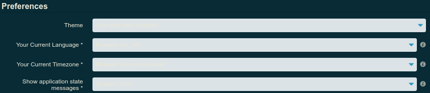
After updating Icinga Web 2 to 2.7.0 via CentOS repos, I noticed couple issues with the choice of colours causing some issues with either text being invisible or control elements having ambiguous states due to their colours.
To Reproduce
- Update Icinga Web 2 to version 2.7.0
- Browse to the login page (first issue)
- Login and open any service with at least warning state, click acknowledge (first issue, textareas)
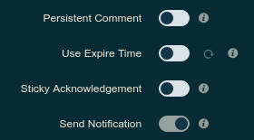
- On the same page, further down on the form (second issue).
- Navigate to Configuration -> Application (first issue, dropdowns)
- On the same page, after the options (nitpick on the button colours)
Expected behavior
Text should be clearly visible on the appropriate elements and the controls should not be ambiguous if they are toggled or not.
Screenshots
First one is visible on the login page (the username field has helloworld written in it):
This is also present on textareas (the textarea has Hello world! written in it):

And on dropdowns:
The second issue relates to the toggles: which ones are enabled and which are disabled?
As a last nitpick, the primary/secondary colours for the buttons could use some love:

Your Environment
- Icinga Web 2 version and modules (System - About): 2.7.0
- Web browser used: Google Chrome v75.0.3770.142 (64-bit)
- Icinga 2 version used (
icinga2 --version): r2.10.5-1 - PHP version used (
php --version): 7.0.27 - Server operating system and version: CentOS Linux release 7.6.1810 (Core)
Additional context
SELinux is not enabled on the server.
 Diftraku
All 11 comments
Hi, thanks for the report!
We seem to have overlooked our own themes. :roll_eyes:
@theFeu Please have a look at all the built-in themes and fix them if they show the same issue.
 nilmerg
on 1 Aug 2019
nilmerg
on 1 Aug 2019
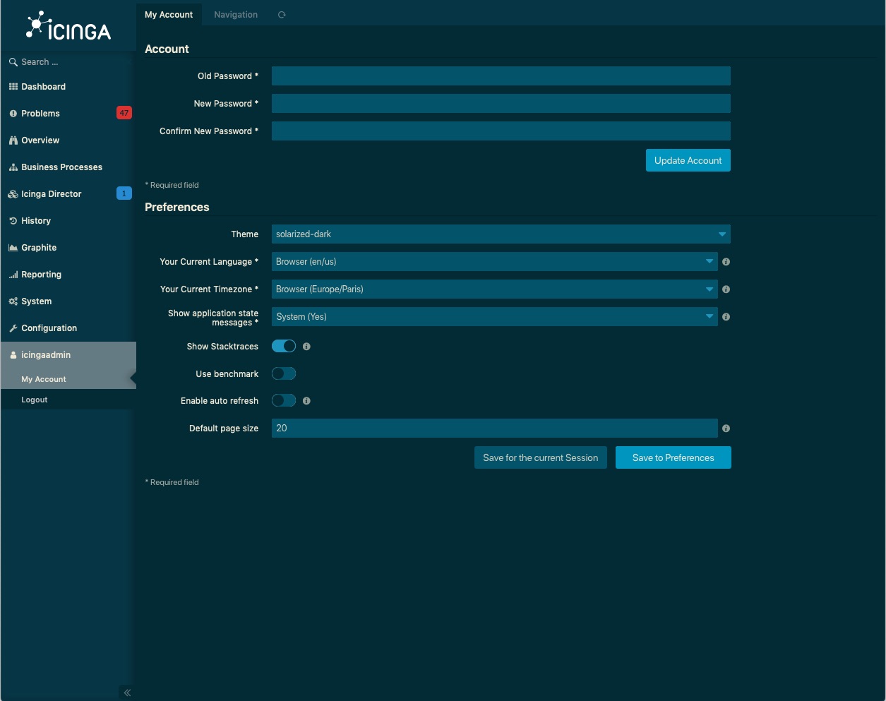
@theFeu Can you please adjust the colours of the form like the following? This way it's more consistent with the dark color style.
 flourish86
on 1 Aug 2019
flourish86
on 1 Aug 2019
@flourish86 I used the same background colour as in the sidebar now, because I felt like the blue-ish colour you chose doesn't work too well with the dropdown-triangles for the selects.
The contrast is less crisp, but I think it still fits the theme :)
Edit:
The checkboxes were hard to see with the dark background, so I did make it a little lighter, as you suggested
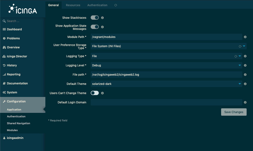
 theFeu
on 2 Aug 2019
theFeu
on 2 Aug 2019
Both of these are a big improvement over the current one. Could the toggle colouring be inverted so the state is not ambiguous (dim when off, bright when on)?
Diftraku
on 2 Aug 2019
@Diftraku It's still a work in progress, I will update it over the course of the day :)
theFeu
on 2 Aug 2019
Added love to toggles, input backgrounds and buttons!
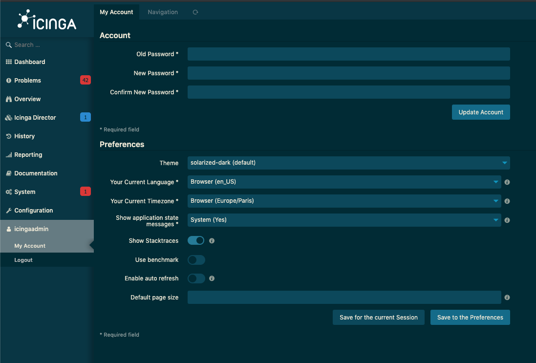
theFeu
on 2 Aug 2019
Also adapted the sidebar colours in the last commit - if there is anything I overlooked, please do tell!
@Diftraku: There is no such thing as being too nitpicky, appreciate the help in spotting inconsistencies! :)
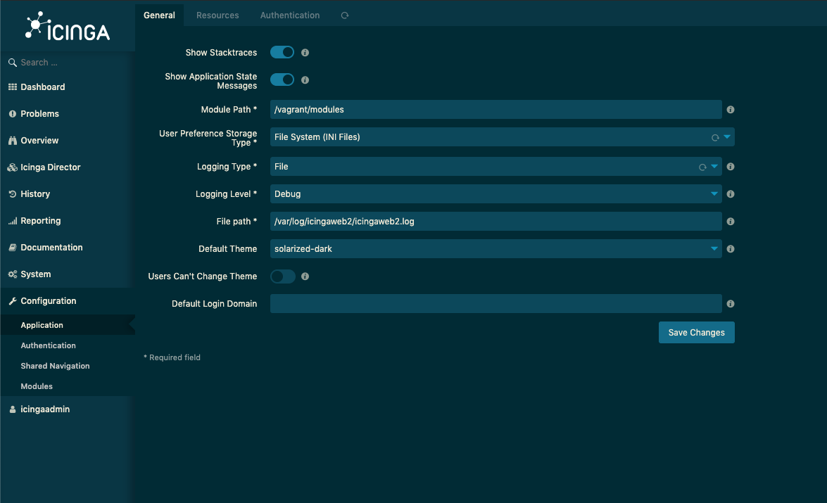
theFeu
on 2 Aug 2019
The editor controls also need to be adjusted. Could you take care of it as well, @theFeu?
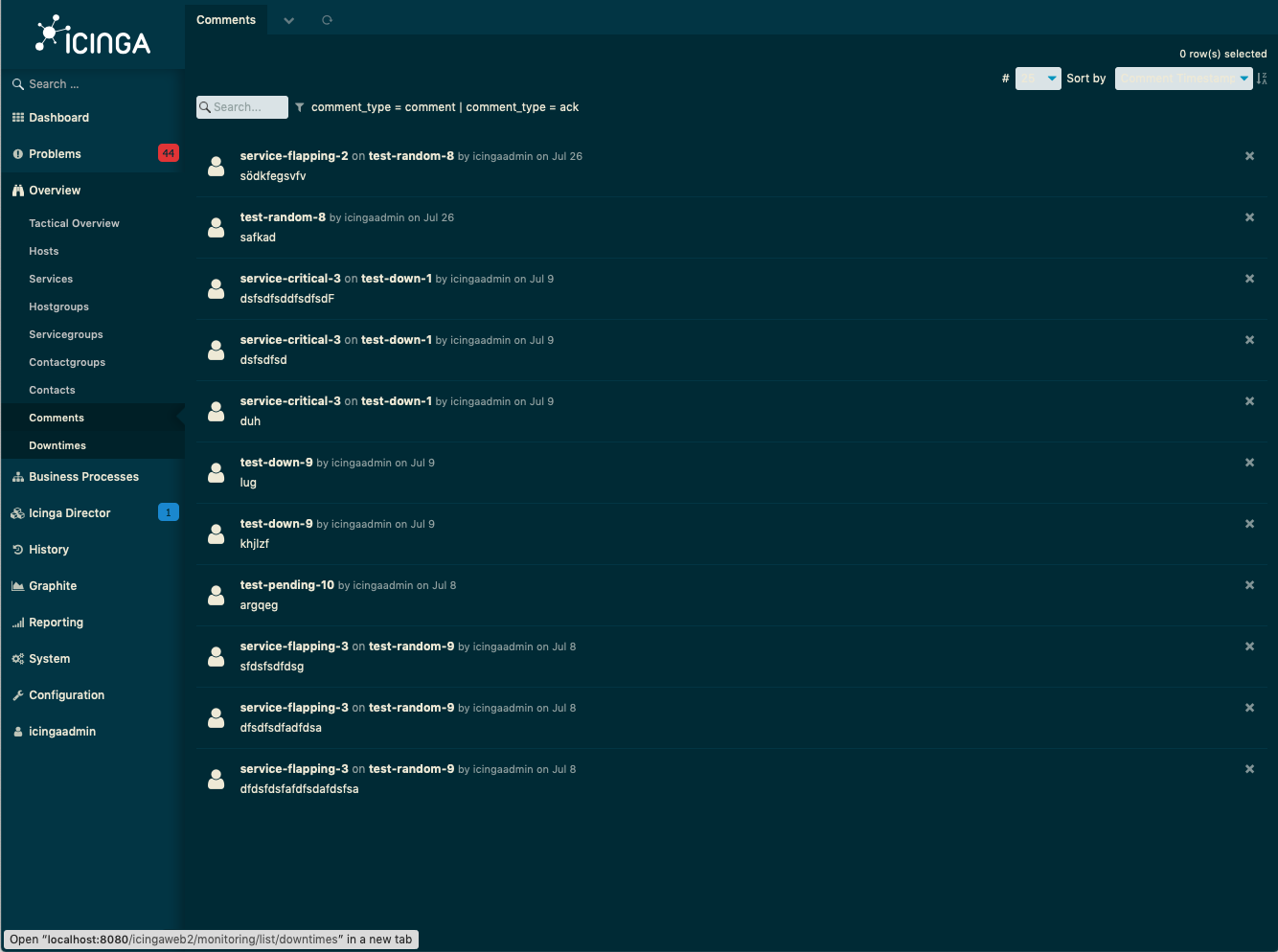
flourish86
on 5 Aug 2019
While I see this, please remember that our form styles are now encapsulated in two main classes: icinga-form (layout), icinga-controls (style)
Because the editor shouldn't require any special styles, instead it should apply to the general form style. (Since it has class icinga-controls applied to it)
nilmerg
on 5 Aug 2019
@nilmerg
Made it apply to icinga-form and controls now, that ok?
theFeu
on 5 Aug 2019
Maybe, though without a PR I don't look at the code :wink:
nilmerg
on 5 Aug 2019
Related issues
theFeu
·
4Comments
 Al2Klimov
·
6Comments
Al2Klimov
·
6Comments
 ghost
·
5Comments
ghost
·
5Comments
 mhutter
·
10Comments
mhutter
·
10Comments
 K0nne
·
4Comments
K0nne
·
4Comments