Iceraven-browser: Another new logo?
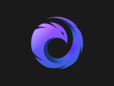
This shall be a very short and quick feedback issue. There is another new design for a logo, and I want to take a quick survey of people's opinion. The question is much simpler than the previous poll: keep the existing newly designed logo, or switch to another even newer design (courtesy @hbarsaiyan)?
| Existing logo 👍 | New logo 🚀 |
|---|---|
|  |
|  |
|
Give a 👍 for sticking with existing logo. Give a 🚀 for new logo.
NOTE: This poll is to get an idea of user sentiment. It is not a binding poll, and we are not obligated to stick with the "winner" of this poll. Also note that the new logo is a sample and we may change the color a little if needed to suit the name iceraven. But just imagine this logo, perhaps in a more icy color.
 abhijitvalluri
All 24 comments
My opinion in this regard is clear: choose the best logo possible for the app regardless of poll results etc. And we don't have to stick with one and never consider alternatives. Ultimately it is a stylistic choice and will be polarizing and it is not a popularity contest, or a democratic process. So, while opinions are welcome, it is not simply a matter of majority wins.
I personally prefer the new one, and I never liked the current "existing" logo, and did not vote for it simply because I felt it neither looked like a raven or any bird, nor did it look particularly icy. The new logo is both simple and striking at the same time and just pops!
abhijitvalluri
on 16 Oct 2020

I personally like this one the most. The gradient looks dope imo. Time to change name to fireraven lol.
 bajjou13214
on 16 Oct 2020
bajjou13214
on 16 Oct 2020
The left one is also fine, without the amniotic sac.
 mackeev
on 16 Oct 2020
mackeev
on 16 Oct 2020
@WeAreJMJ how do you feel? I don't want you to feel upset that we're proposing a new logo so soon after adopting yours.
I might prefer the current one, even though we still have to solve the it-looks-like-a-bird-in-an-egg problem of #219 now that it's on the circle. The new one looks Dota-related, and reminds me of the Magic the Gathering red mana symbol. Overall kind of game-ish. 
Either one would work, though.
With the new one, can we get good edge definition/contrast on background colors similar to the icon color, without a background circle? If it's easier to pull that off with this design than the current one, that would recommend it.
 interfect
on 17 Oct 2020
interfect
on 17 Oct 2020
I am fine with the current logo because as far as the browser is working fine i don't care much about the logo. I posted the new logo on the other thread after the poll was over because it would have been wasted anyways so it's not like i am contesting his logo. And i guess we should make a final decision now and stick with it.
 hbarsaiyan
on 17 Oct 2020
hbarsaiyan
on 17 Oct 2020
The design of the purple logo is awesome but imho it would look better if it were light blue on a dark blue background. Basically the swaped colors of the first logo.
 NM-E
on 18 Oct 2020
NM-E
on 18 Oct 2020
how do you feel?
@interfect :D Happy of course! New designs not only make the project better, but also inspire me. A slight palatte change would be enough, ie, need to be in the blue to green gamut of colours. Purple is... a little bit adventurous.
 WeAreJMJ
on 18 Oct 2020
WeAreJMJ
on 18 Oct 2020
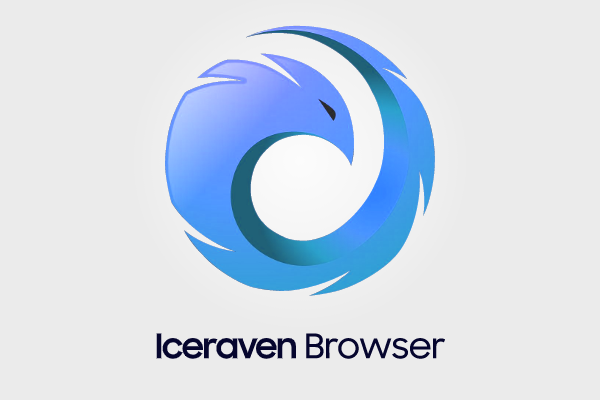

hbarsaiyan
on 18 Oct 2020
That looks really good.
interfect
on 18 Oct 2020
how do you feel?
@interfect :D Happy of course! New designs not only make the project better, but also inspire me. A slight palatte change would be enough, ie, need to be in the blue to green gamut of colours. Purple is... a little bit adventurous.
Purple is not necessarily a bad idea as there is quite a lot of purple in the app like the private browsing mode. But the new color that @hbarsaiyan made above looks very nice as well and fits the iceraven name better
abhijitvalluri
on 18 Oct 2020
This is the best ever!
 aquaspy
on 19 Oct 2020
aquaspy
on 19 Oct 2020
@interfect @hbarsaiyan please don't mind my rant. I am all in for the new logo. I wanted to just convey some ironical statements that made me laugh. The following happened in the prior thread:
@abhijitvalluri 's messages:
I strongly prefer a logo that closely justifies the "Ice raven" aspect of the brand which the first two do well...
For some reason it always looks like a four legged mammal to me... Probably a bear. Definitely blue
But now he seems to be fine with the new logo(when the colour was purple) and I am really surprised he didn't comment it looked like a tadpole....How come? Hmmm...
@bajjou13214 's comments:
i will just say that it appears that people are voting more on which logo looks more like a 'raven' rather than which icon looks more like an 'iceraven' as a whole.
It's like choosing an icon for firefox based on which logo looks more like a 'fox' rather than which looks more like a 'firefox'.That's definitely not ice-blue more like ocean-blue. And about the second thing i guess you are getting too real with the icon.....I don't know if people have forgotten that the name of the browser is Iceraven so the raven should have an 'ice' tone to it and the first two icons do full justice to that and mimic Firefox's own icon style perfectly.
As for people saying it has icy color (even though not icy enough imo) i think it should be on the raven. It's like having a firefox icon where we will have fire color on the sphere rather than the fox.
But he now seems to be happy enough to change name of the project to FireRaven.... So your original comments on mine weren't yours? If it was, my bad. I thought it was a completely different person, since the logic didn't check out in this thread.
I am bound to be viewed as a sore loser :) But I wanted to take it off my chest and repeat the same thing I said last time:
lopsided demoralisation is really bad for a community contribution.
WeAreJMJ
on 19 Oct 2020
@WeAreJMJ hey buddy I did not mean to upset you or offend you in anyway or downplay your contribution. I appreciate your hardwork. If you note in the opening post, I did say we may want to change the color of the logo to suit the name better. I simply said that purple is not a bad choice given the color scheme in the app, in response to your comment that it was adventurous. To me, it fit with the app's color scheme, even if it did not fit the name. Therefore I already noted at the start that we may need to change the color, and I asked people to imagine it in a more icy color.
And secondly, calling it a tad pole is an interesting observation. The main thing I noted was a clearly defined head that looked very bird like. The rest is quite abstract obviously, but had some kind of appearance like feathers. Again it is a deeply personal opinion, and one may feel it looks like something else, like a tad pole, but that was not my initial association, especially since a tad pole is smoother, more rounded head etc, without the feathery look. Also, I do not mean to demean your contribution either but I personally could not see a bird in that design. It just did not look like a bird to me, but it is far more impressive than anything I can come up with so I am glad you contributed.
abhijitvalluri
on 19 Oct 2020
Also, if you are upset with how I put the logo in a white circle, then I am sorry for making some people feel like it looks like a baby in a womb than a bird! Not my intention. I thought it was pretty clear and obvious that the logo will be in a shape of some kind, because that is the recommended way to design logos nowadays, the so called adaptive icon design that Google recommends. Any new logo we choose to go with will also be put in some kind of a circle or other shape as is defined in your Launcher preferences.
And the reason it was a white shape/circle is because that helped make the icon be more visible as it was hard to see the outline on a dark background.
abhijitvalluri
on 19 Oct 2020
@bajjou13214 you always have the option to ignore if you don't like something or your opinions don't match. Anyways i hope you doesn't make such comments in the future.
@WeAreJMJ Btw you don't need to feel bad. Your icon looks way better than what i made in my first try and the head of the bird in the new icon is also inspired from your logo :)
hbarsaiyan
on 19 Oct 2020
@abhijitvalluri Can we do adaptive icons? I dont know much about how Android Studio worksbut I found this guide
I was thinking of using the dark blue color in the background of the adaptive icon if we are going with this icon.
hbarsaiyan
on 19 Oct 2020

I had to change the colors and reduce the gradients because the above icon was not much clear when reduced to size of icon. I will add comparison later. I also got rid of angular gradients (which are not scalable in svg) so the logo is now fully scalable and i don't want to make anymore modifications to it (unless you guys really think some change needs to be made).
hbarsaiyan
on 20 Oct 2020
I have been very busy for last several weeks, so I couldn't work on this project for a while. Now that I have a small amount of time, I am wondering what we need to about this. @interfect should we consider this logo and update it or remove the white circle for existing one?
abhijitvalluri
on 13 Nov 2020
I think we should adopt this new one; the emoji show a clear preference, and it looks nicer in the circle. I just haven't gotten around to doing it myself.
interfect
on 13 Nov 2020
I have been very busy for last several weeks, so I couldn't work on this project for a while. Now that I have a small amount of time, I am wondering what we need to about this. @interfect should we consider this logo and update it or remove the white circle for existing one?
Good to see you back!
hbarsaiyan
on 13 Nov 2020
Are we considering the last logo as seen in https://github.com/fork-maintainers/iceraven-browser/issues/224#issuecomment-712815382 or the one in the first comment https://github.com/fork-maintainers/iceraven-browser/issues/224#issue-722760530 that has 54 emoji votes? The most recent one has some mixed reactions 🙂 the latest one is simplified to be better compatible in small sizes, which is good! @hbarsaiyan if you can provide the svgs then I could take a look when I get some free time.
abhijitvalluri
on 13 Nov 2020
I think my favorite is the blue one in https://github.com/fork-maintainers/iceraven-browser/issues/224#issuecomment-711155999 but @hbarsaiyan mentioned that didn't scale down properly which is why https://github.com/fork-maintainers/iceraven-browser/issues/224#issuecomment-712815382 was made.
I'd see how the Android Studio icon importer handles the blue one, and if it comes out nice and looks OK tiny maybe stick with that one? If not, we should use the simplified white on blue one.
What SVGs do you have @abhijitvalluri? I don't have any of them.
interfect
on 15 Nov 2020
I think my favorite is the blue one in #224 (comment) but @hbarsaiyan mentioned that didn't scale down properly which is why #224 (comment) was made.
I'd see how the Android Studio icon importer handles the blue one, and if it comes out nice and looks OK tiny maybe stick with that one? If not, we should use the simplified white on blue one.
What SVGs do you have @abhijitvalluri? I don't have any of them.
I only have the svg for #224 (comment) as my ssd got corrupted and i had to format it. But i did try to import the first one in Android Studio and the inner grey shadows were not looking good. Anyways here is the svg for the last one.
hbarsaiyan
on 16 Nov 2020
@interfect did you try?
hbarsaiyan
on 20 Nov 2020
Related issues
mackeev
·
6Comments
 bbigras
·
8Comments
bbigras
·
8Comments
 CharmCityCrab
·
7Comments
CharmCityCrab
·
7Comments
 resynth1943
·
6Comments
resynth1943
·
6Comments
 linsui
·
4Comments
linsui
·
4Comments
Most helpful comment