Iceraven-browser: Vote for new browser logo
Cast vote here: https://github.com/fork-maintainers/iceraven-browser/issues/134#issuecomment-698722536
This is the first time i have made a logo so suggestions are welcome.


https://drive.google.com/file/d/160L-gCtZ9AXFg0KZqOtgp9vpzPlcfQe6/view?usp=sharing

https://drive.google.com/file/d/1bdx6KyPo8NEbvSEwbKBAKbHW3ufIC2FA/view?usp=sharing

https://drive.google.com/file/d/1D1wk58AEr4WhfN0mUZrxuVoKTvl7TCOY/view?usp=sharing
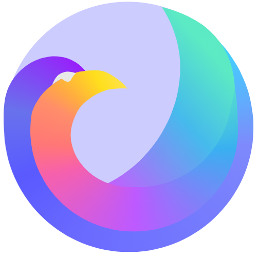
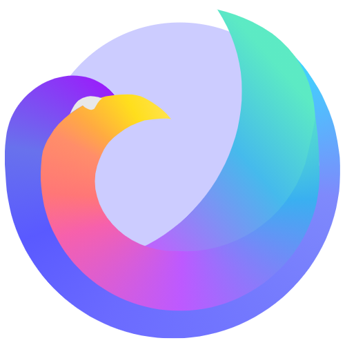
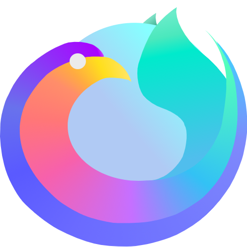
 hbarsaiyan
All 82 comments
Here is the SVG if anyone is interested: https://drive.google.com/file/d/1Uq8Ka6g23DRMynDDTNqHidFS5XANLPy-/view?usp=sharing
hbarsaiyan
on 18 Sep 2020
That's a parrot, not a raven
 ghost
on 18 Sep 2020
ghost
on 18 Sep 2020
That's a parrot, not a raven
ok i updated it, hope it looks fine now
hbarsaiyan
on 18 Sep 2020
Looks good!
 abhijitvalluri
on 18 Sep 2020
abhijitvalluri
on 18 Sep 2020
Most ravens don't have a plume on the back of their head. But that beak is very raveney.
 bbigam
on 19 Sep 2020
bbigam
on 19 Sep 2020
Looks good man! Great work.
ghost
on 19 Sep 2020
Here it is tiny:

It could be a raven I suppose. Do they widen at the tail like that? It's convincingly "ice".
A lot of detail is lost when you shrink it, but it still is distinctive, which is its most important job.
 interfect
on 19 Sep 2020
interfect
on 19 Sep 2020
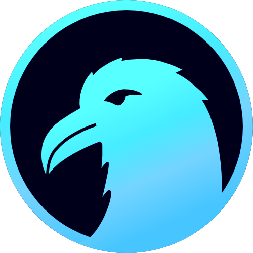
How about this? @interfect I will fine tune it a little later
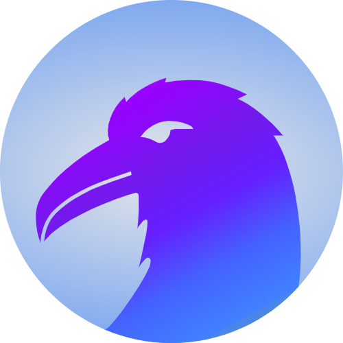
hbarsaiyan
on 19 Sep 2020
hbarsaiyan
on 19 Sep 2020
That looks really nice and very professional! We can try other colors as well. We could try to incorporate a globe as well may be? Make the circle look like the earth 🌍 perhaps.
abhijitvalluri
on 19 Sep 2020
Good work! And I appreciate how responsive you are to feedback. Really looking like a raven now. I like the second-to last one best so far, where you say "I will fine tune it more later" because the coloring gives more sense of being cold like ice. But I do like the ring around the edge of the last one, and the contrast in it... so I guess I like aspects of both.
I think you may be really close to one that could be a final candidate!
bbigam
on 19 Sep 2020
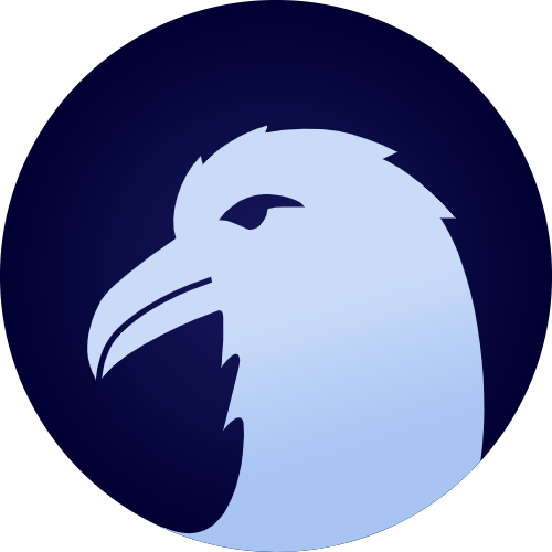
@bbigam @abhijitvalluri thank you for the response. Yes the last one didn't look much "icy". The ring also looks good when the image is big but when set as icon the ring does not look very nice so I removed it. As for the background being earth I will look into that ;)
hbarsaiyan
on 19 Sep 2020
@hbarsaiyan I really like this latest! I think it's ready to be a strong candidate for our final icon.
Some have suggested a more detailed icon, which is a reasonable suggestion. But most people will usually only see the icon in small form in the launcher and about page. For a minimalistic style icon, I think this is great.
Good work!
bbigam
on 19 Sep 2020
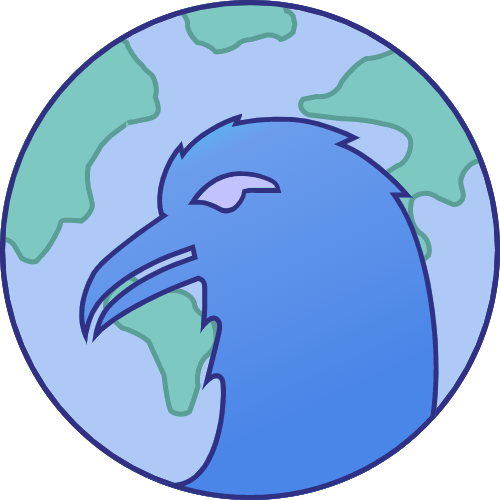
@abhijitvalluri this is how it looks with earth as background. A bit cartoonish to be honest and detail will get lost when minimised.
hbarsaiyan
on 19 Sep 2020
Of the two last versions, I much prefer the non-earth-background one. Looks really sharp.
@hbarsaiyan If Iceraven ends up using one of your designs for the final icon, are you willing to contribute it under a compatible free/open source or free content license?
bbigam
on 19 Sep 2020
Of the two last versions, I much prefer the non-earth-background one. Looks really sharp.
@hbarsaiyan If Iceraven ends up using one of your designs for the final icon, are you willing to contribute it under a compatible free/open source or free content license?
Yes of course
hbarsaiyan
on 19 Sep 2020
Great, I figured, just had to check! :-)
Sometimes projects end up in a mess if they're not proactive about
licensing issues. I am not a lawyer, but I try to ask the questions anyway.
On Sat, Sep 19, 2020, 2:30 PM hbarsaiyan notifications@github.com wrote:
Of the two last versions, I much prefer the non-earth-background one.
Looks really sharp.@hbarsaiyan https://github.com/hbarsaiyan If Iceraven ends up using one
of your designs for the final icon, are you willing to contribute it under
a compatible free/open source or free content license?https://freedomdefined.org/Licenses
http://www.gnu.org/licenses/license-list.html#OtherLicenses
Yes of course
—
You are receiving this because you were mentioned.
Reply to this email directly, view it on GitHub
https://github.com/fork-maintainers/iceraven-browser/issues/134#issuecomment-695341770,
or unsubscribe
https://github.com/notifications/unsubscribe-auth/AQQNFQYAWZJ4GA6GG2WJA23SGT2CTANCNFSM4RSHUSPA
.
bbigam
on 19 Sep 2020
Maybe even a Firefox style logo can be done but given my skills I cannot promise anything. Will try doing it tomorrow.
hbarsaiyan
on 19 Sep 2020
@abhijitvalluri this is how it looks with earth as background. A bit cartoonish to be honest and detail will get lost when minimised.
Ya, this one doesn't look that great. I was thinking more subtle like the older Firefox logos with the globe.
The second last one (the one from this comment https://github.com/fork-maintainers/iceraven-browser/issues/134#issuecomment-695330228) looks really good. As @bbigam mentioned regarding details, we could try to add a little more detail to the raven. Right now it looks a bit flat and 2D. However, we could add some shading to it to give it more detail like the current FF logo:

The FF logo has some subtle gradients, a few different tones of red/orange to give it more depth. I am wondering if you can add these kinds of details to give more depth to the raven.
abhijitvalluri
on 19 Sep 2020
@abhijitvalluri I will try tomorrow
hbarsaiyan
on 19 Sep 2020
Excellent! I am excited to see the end result. It looks really good so far. And thanks for your hard work and contributing this for the project!
abhijitvalluri
on 19 Sep 2020
I like the raven with a planet as a mock-up, but, probably, if we want to adopt that, it might be better to fill in the Raven's eye with whatever a raven's eye looks like or a random solid color like a darker blue than the planet's oceans or orange as an ode to Firefox or whatever (As it stands, the see through eye is a little creepy looking- not sure if that is an intentional design decision or not), and to sort of randomize the continents a bit (i.e. Make it so they are not obviously from planet earth. Although, really, I suppose we could do planet earth. It's just that randomizing it makes it so people don't feel marginalized if their corner of the planet isn't in the logo since doing a random Civilization [A series of video games that have historically been very popular with computer users] style map sort of equalizes it and I think kind of sparks the imagination a little with implicit questions like, you know, "Which planet is this?" and "What sort of wonderful aliens or exotic planets and animals might one find if it were real and one could travel down there?".) and perhaps make them a bit sharper on the final version.
Of the other ones proposed, I think the turquoise (ish?) raven with the back background and the turquoise circle boundary looks the nicest, and that the white raven (There actually are white ravens in real life, if I recall correctly, it's just that the black ravens are better known.) in the navy blue circle is the second nicest.
One thing I haven't seen yet that I would like to see is something loosely based on the format of the 2004 Firefox logo, but with a raven (Probably a black raven would work best there) instead of a fox and a globe that has slightly different continents for copyright reasons and possibly with a little more snow cover on the continents by the poles related to 2004 (To show the "ice" in the Iceraven name), while still keeping the continents mostly green, especially by the equator, or something similar to that.
That last paragraph is just to add a traditional option for any open vote that might take place, or for the leader developers, the maintainers, or whomever is going to make the final call on this, to consider. I don't know if it'll look better or be better than the other options or not. It just seems like something that should be there in any sort of poll or whatever that takes place. Of course, the developers or the users of the browser may feel they want a more distinctive separate visual brand identity than that relative to Firefox, which does have it's own advantages and disadvantages (Potential advantages to the more distinct approach would include perhaps making it easier for people just looking for a cool new browser or switching over from Chrome and other non-Firefox and non-Firefox related browsers to feel at home and not like they are sort of adopting Firefox, a browser they may not like, in a roundabout fashion. Potential disadvantages is that people switching from Firefox, or another Firefox fork, or who just have warm feelings about Firefox or the way Firefox used to be or should be might be more comfortable with something familiar looking (WIthin the bounds of it being based on Iceraven's actual name and in following trademark and copyright restrictions).
It occurs to me that potentially a logo could have more detail for larger uses like if it is used on a blank new tab page or something, with a less detailed version for the most obvious primary use as the little icon one touches on Android to launch the program.
 CharmCityCrab
on 19 Sep 2020
CharmCityCrab
on 19 Sep 2020
For reference, this is the 2004 Firefox logo:
https://vignette.wikia.nocookie.net/logopedia/images/0/01/Mozilla_Firefox_2004_Logo.png
One thing that I had forgotten about is that it actually doesn't have green continents, just varying shades of blue. I think we might consider green (and perhaps partially white by the polls) continents anyway, as it'd probably look nicer, but perhaps we could consider having versions both with and without them and seeing what people like the best. That all blue look does in and of itself sort of convey "ice", though.
Of course, this can only be a reference. The continents would have to be different to just make extra sure we aren't infringing on Mozilla's trademarks or copyrights, and because of the browser name, the fox would have to be a raven.
CharmCityCrab
on 19 Sep 2020
Another thing sort of implicitly floating around in the ether is whether we want a modern looking Android icon that is consistent with all the latest trends and guidelines in icon artwork and design but may seem outdated in a couple years (Though it could always be changed when and if that happens), or whether we want sort of a timeless throwback type logo that has lasting appeal but may not be considered as hip.
I'm not trying to put my thumb on the scale either way. It's just something to think about. Most of the logos I'm seeing so far seem to lean towards the more current fashions, but that may or may not be what is best for the browser or what would work the best for our anticipated user base.
Just throwing stuff out there for folks to think on.
CharmCityCrab
on 19 Sep 2020
Another thing that I'm just putting out there is that I know that the DuckDuckGo browser actually has an option that allows the user to select his or her own browser logo, out of 6 or 8 potential choices. I think in that case they are all basically the same logo, but with different colors, but they wouldn't necessarily have to be if implemented by a different browser like Iceraven.
That seems like a time consuming thing to code that might not be what the developers want to or can afford to devote their time to at the moment, but it's a long-range option of sorts to consider. Also, it would become much more viable short term if DDG is a fork of Firefox and has open-source code that would be compatible with Iceraven since most of the work would already be done in that case.
CharmCityCrab
on 19 Sep 2020
Wow, you are very verbose @CharmCityCrab! That's a lot to read and parse!
abhijitvalluri
on 19 Sep 2020
Tinified:


I think it looks more like an eagle than a raven. But it's quite iconic!
The continents kind of get lost with their low contrast when you shrink it down.
If you are going to have a planet, you know what screams ice? Ice caps!
If we could add selectable app icons, that would be great, but it sounds like a nontrivial piece of work to do.
I do personally love a good 2004 icon, but that's just me. "Modern" Android icons are also fine, and probably actually better at the tiny sizes they have to be on phones.
I think we might have to organize another emoji poll.
interfect
on 20 Sep 2020
When used as the app icon, the icon itself gets put on a solid background of a certain color by the launcher. So maybe we want just the head of the light-colored bird, and we put it on a purple background that matches the purple UI highlight color that we use everywhere, inherited from Firefox.
interfect
on 20 Sep 2020
The trouble with an old-style icon can be that some people just finding the app look at the icon and think "old outdated app." But of course, others think nostalgia.
That said, I'd rather just use an icon we like, without worrying about whether it's "modern" or "classic" or whatever. I thought I would want a more detailed icon, but I like the minimalistic one in https://github.com/fork-maintainers/iceraven-browser/issues/134#issuecomment-695330228 so much I could vote for it today.
bbigam
on 20 Sep 2020
Wow, you are very verbose @CharmCityCrab! That's a lot to read and parse!
Yeah. It's been kind of a thing with me. In the 90s it was appreciated, but since then it has kind of fallen out of style online.
Unfortunately, I have a great deal of trouble summarizing- I try to stick a "TL;DR" type summary on the bottom of really epic things if I can figure out how to sum up what I just typed. :). Those summaries actually sometimes take me significantly longer than typing the post itself! And a lot of times important things still get lost in the summaries, which I am only rarely successfully able to make them completely accurate (I've had forums where people encourage me to shorten my posts, and I do, but then the shortened versions confuse people, and it takes a bunch of replies back and forth with a lot more reading and writing time for everyone involved to communicate what a slightly longer post would have communicated the first time!) .
My hope is that people can overlook length and still get something out of my posts in various places. If nothing else, there is a lot of information in there and it can, I would hope, when it comes to things like software, be useful sometimes in terms of feedback with stuff where folks often already know what people think in broad strokes, but genuinely aren't sure why they think it or how it could be applied it to specific things.
CharmCityCrab
on 20 Sep 2020
Shape is not perfect right now but this is what i had in mind
hbarsaiyan
on 20 Sep 2020
The concept is very nice and perfectly mimics Firefox logo.
abhijitvalluri
on 20 Sep 2020
Hmm, the latest is a nice concept and does indeed reflect general Firefox style. I would suggest making the beak slightly more raven-ey - a little longer, maybe open slightly like your other logo - and toning down the colors a bit. Personally, I think it's a bit too pastel and colorful to be an _ice raven_. And I don't think a circle works quite right for a raven's eye.
That said, I could imagine a vote that comes down to some version of this one, versus the one in https://github.com/fork-maintainers/iceraven-browser/issues/134#issuecomment-695330228
If that's what happens, either way, @hbarsaiyan would win (as would the whole community)! :-)
bbigam
on 20 Sep 2020
This is my favorite so far, and I'll respectfully differ from the post above me and say that I really like how colorful it is and the kind of relaxing vaguely tropical vibe (Totally subjective, opinions vary, no right or wrong, etc. :) ). It'd certainly grab people's attention. I won't pretend I have my finger on the pulse of what's hip, but it seems like something that could be considered cool, and maybe attract some users who are just looking for a nice looking browser.
It'd also resolve issue #141.
At first, I thought the eye needed a black pupil inside the white part, but I realized that when one shrinks it down to the size of an Android icon, the eye may only be one pixel on some phones anyway, leaving no room for a pupil.
Part of me still wants a planet there in the middle, but then it occurred to me that maybe the ball is a block of ice for the Iceraven. If one really wants to stretch it, maybe it's an ice planet. :)
CharmCityCrab
on 21 Sep 2020

hbarsaiyan
on 21 Sep 2020
The ice part is very tricky. If I make the sphere look icy then the bird needs to be dark. So it won't be an 'ice raven'. And if the bird is made icy then the edges won't be distinct on a white app drawer so will need to do another layer of masking. So the only available region will be the middle portion.
hbarsaiyan
on 21 Sep 2020
Or we do it like firefox focus https://encrypted-tbn0.gstatic.com/images?q=tbn%3AANd9GcTj5y8rpPZ5AEwm45pU3dHgHf__MAwotjYXuA&usqp=CAU
hbarsaiyan
on 21 Sep 2020
This reminds me a little bit of the Firefox Nightly logo. If Iceraven were ever set up to have two simultaneous branches, perhaps the colorful version, which was the most recent logo posted before this one, could be the main/stable/release channel logo, and the less colorful one could be the nightly/beta/preview/testing logo.
Iceraven isn't big enough for two versions right now, but if we choose the colorful one as the logo for the one version that exists today, maybe the less colorful one could be saved for later in case the browser ever gets the kind of userbase where the devs would find having two versions helpful in working out bugs before they hit the main browser's users.
Gotta say, I like the colorful one better, but I'm fine with the other one, too, if that's what wins a potential poll. I almost feel like we might want to start with separate polls to figure out which "bird head" version people like best, and which "firefox-esque" option people like best, and then pit the two winners against each other in a third poll for all the marbles. :). Like two primaries, followed by a general election- minus the politics, of course. :). That way we wouldn't have various iterations of similar things splitting the vote; we'd have a final round with just the two things people like best, and one would have over 50%.
Maybe I'm overcomplicating this, though. If we did preliminary rounds, we'd probably want to make those polls really short, like 24-48 hours, and then give people maybe a week to weigh in with the final round, and advertise that in the release notes the way the emoji naming poll was advertised in the final Iceweasel release notes.
I still kind of wish someone would really do a straight-forward 2004 Firefox type thing so it's at least an option. Then we could have a final round that was one of the bird head logos from upthread, one of the sort of modern Firefox-esque logos from here, a throwback 2004 type option, and maybe the current logo as option 4 in case people have grown attached to it really quickly or something. :)
We're getting some good stuff here, though, and we of course are limited to what people are willing to make and offer us. I think I'd be pretty happy with the colorful version of this logo with the nice relaxing tropical vibe. One side benefit of that is that whatever colors get used inside the browser for stuff will probably kind of fit the logo- it in some way incorporates basically every color likely to be used within the browser (The inside of the browser in some cases may use different shades for some things, but I think that's okay.), which is good for branding consistency. It'd probably be easier on the developers to use a logo like that that is likely a close enough match to the accent colors used in upstream within the program itself than to try to alter the program's interior design to match a logo that is centered around totally different colors. Not that things really absolutely have to match.
CharmCityCrab
on 21 Sep 2020
An alternate idea for voting would be to open a thread on r/browsers on reddit or something and let people vote over there. The plus is that it would kind of advertise the browser and probably get more participation. The minus is that people who have no intention of ever using the browser could be the ones who pick the logo instead of the people who do use it and will get to/have to look at the logo every day (It could also turn into a lot of people asking what the browser is and other miscellaneous questions, people advertising Brave [Because they always show up whenever browsers are discussed], people arguing about how Iceraven compares to their favorite brower[s], and other miscellaneous weirdness).
CharmCityCrab
on 21 Sep 2020

This is the best i can do design wise. Maybe I will play with the colours later to give it a more 'icy' look. Suggest some colour scheme ideas if you have.
hbarsaiyan
on 21 Sep 2020
This is shaping up very nicely!
bbigam
on 21 Sep 2020
Final Submission @abhijitvalluri @interfect
hbarsaiyan
on 22 Sep 2020

This is how it looks in app drawer
hbarsaiyan
on 22 Sep 2020
I preferred the globe as a gradient rather than the lines in the new one. It looked nice and simple and the color in this version looked good too.
abhijitvalluri
on 22 Sep 2020
@hbarsaiyan I really like the latest one, with the lines!
@interfect Maybe it's time for a vote on 2-3 of these options?
bbigam
on 22 Sep 2020
>
I preferred the globe as a gradient rather than the lines in the new one. It looked nice and simple and the color in this version looked good too.
Maybe the gradient in the previous version is not much visible on the sphere but it is on both the lines and the sphere. I made it blue rather than purple so it looked like earth. Anyways I have made the gradient more prominent now.
hbarsaiyan
on 22 Sep 2020
Okay! I think we have a great logo! We can settle on one of the above choices. Looks very good!
abhijitvalluri
on 22 Sep 2020
Do we have SVGs up for all the options that import cleanly in Android Studio? The last thing I want to happen is that we run a poll and pick an icon and we can't actually adopt it because of technical difficulties.
If you attach some SVGs to the Github thread here I can test importability.
I do like this last batch a lot and I think we're ready to pick.
interfect
on 23 Sep 2020
Do we have SVGs up for all the options that import cleanly in Android Studio? The last thing I want to happen is that we run a poll and pick an icon and we can't actually adopt it because of technical difficulties.
If you attach some SVGs to the Github thread here I can test importability.
I do like this last batch a lot and I think we're ready to pick.
I have added the svg on the first post but haven't tested importing them in Android Studio.
hbarsaiyan
on 23 Sep 2020
Thanks! I tried the SVGs and they work perfectly.
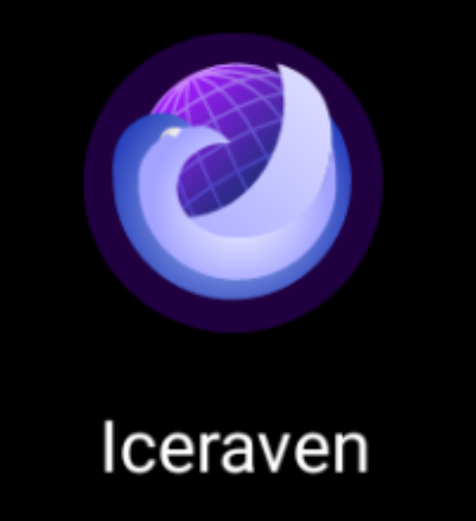
I tried two different logos from the first post (2nd and 3rd) and this is how they look on my Pixel 2 phone in dark mode, light mode and on a wall paper.
For https://drive.google.com/file/d/1D1wk58AEr4WhfN0mUZrxuVoKTvl7TCOY/view?usp=sharing:
|  |
| 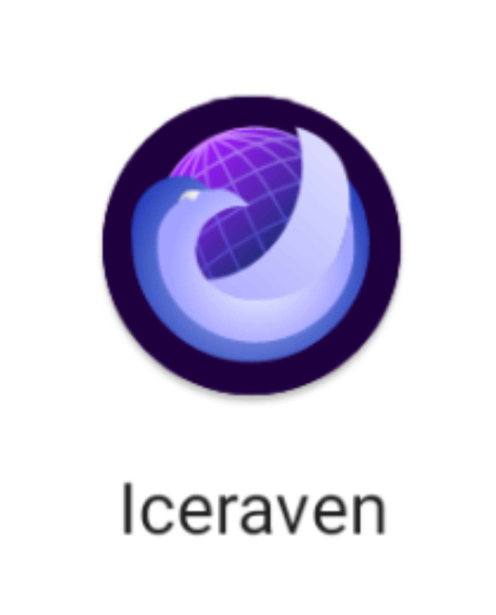 |
| 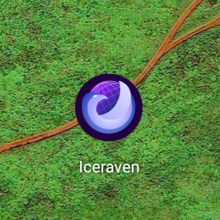 |
|
|---|---|---|
For https://drive.google.com/file/d/1bdx6KyPo8NEbvSEwbKBAKbHW3ufIC2FA/view?usp=sharing
|  |
|  |
| 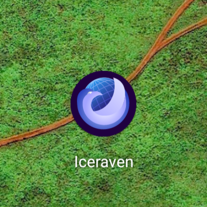 |
|
|---|---|---|
I personally prefer the first one. I just like the more purple tone in the globe!
abhijitvalluri
on 23 Sep 2020
@abhijitvalluri Thank you for testing!
hbarsaiyan
on 23 Sep 2020
Cast your ballots now:

\=
:laughing: :tada: :heart:
Polls will close in 1 week.
EDIT: Late entrant:
 or
or

\=
:rocket:
interfect
on 25 Sep 2020
Cast your ballots now:
😆 🎉 ❤️
Polls will close in 1 week.
Hey, I just want to make sure I'm clear on this. We are taking a final poll to choose between three nearly identical white and blue snaketail ravens, each wrapped around a similar looking ball with a grid, with the primary differences being that the grid ball is dark blue in one, light blue in another, and purple in a third?
The tropical colored raven (purple, orange, yellow, turquoise, blue) around the light icecube blue ball with no grid from four days ago, and the various raven heads in profile from much earlier in the thread, have been ruled out?
I don't have an issue with picking between the three nearly identical logos in the post if that is what we are doing. The tropical raven around the no-grid ball* was my favorite, but I'm not picking that hill to die on. :). The options in the final poll are all reasonable. I'm just double checking to make sure this isn't a "primary" to determine the best of the the blue and white ravens wrapped around a grid ball to face off with other options later, or that you didn't intend to have three more distinct choices going up against each other.
CharmCityCrab
on 25 Sep 2020
Cast your ballots now:
😆 🎉 ❤️
Polls will close in 1 week.
Hey, I just want to make sure I'm clear on this. We are taking a final poll to choose between three nearly identical white and blue snaketail ravens, each wrapped around a similar looking ball with a grid, with the primary differences being that the grid ball is dark blue in one, light blue in another, and purple in a third?
The tropical colored raven (purple, orange, yellow, turquoise, blue) around the light icecube blue ball with no grid from four days ago, and the various raven heads in profile from much earlier in the thread, have been ruled out?
I don't have an issue with picking between the three nearly identical logos in the post if that is what we are doing. The tropical raven around the no-grid ball* was my favorite, but I'm not picking that hill to die on. :). The options in the final poll are all reasonable. I'm just double checking to make sure this isn't a "primary" to determine the best of the the blue and white ravens wrapped around a grid ball to face off with other options later, or that you didn't intend to have three more distinct choices going up against each other.
To be frank the only reason I did not go with that colour scheme again was because it was inconsistent with the name of the browser 'Iceraven'. As far as I am concerned I don't have much problem in reverting the colour scheme to give another option.
And about the other icons being eliminated, I thought this design was more consistent with Firefox's own icon design, so this made more sense after all this is a fork of it.
But of course it's upto you guys to decide if you want them as an option.
hbarsaiyan
on 25 Sep 2020
Oh sorry, I thought the ones edited into the first post were the final submissions. I can add in the colorful one.
interfect
on 26 Sep 2020
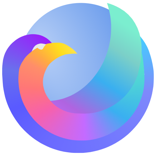
@CharmCityCrab New icon with old gradients. Sorry i forgot about it before.
hbarsaiyan
on 26 Sep 2020
@CharmCityCrab New icon with old gradients. Sorry i forgot about it before.
My preference is actually for the older version of the colorful logo. I like the way it flows. It feels more alive to me.
The later version quoted above gets rid of a lot of the wings/feathers/plumage as well as the "3d" element of part of the tail end coming up behind the ball, all of which were elements that I thought were nice.
Also, I think on the newer version, the color of the outside arc of the raven is close enough to the revised color of the ball that on a scaled down phone sized logo, it's not going to be clear whether it's part of the the raven or the ball. The original version has a much clearer distinction there.
I also like the way the colors transition in the older version, and the slightly increased prominence of the light green in the older one.
The newer logos in general feel a bit odd, like a bird head atop a triangle on top of a ball.
Anyway, I don't mean to nitpick this to death. I also should probably emphasize that this is all the artwork of the person I'm replying to, so every time I praise the logo and the version I like relative to the other ones, it all comes about even. :) I'm not praising one person's art and criticizing another person's art- I just feel like he got this right earlier in the process is all. :)
It's possible to keep fiddling until some of the magic of early versions of things are lost. I've heard stories of movie directors or music producers stopping a scene or a band after a first, or fairly early, scene or take and saying "We've got it.", because they feel like doing it over and over again will lead to second guessing and perfectionism that will cause the actors or musicians to overthink it and lose some of the magic of that first or those early run-through(s). Sometimes the early run-throughs in those other fields are also more "real", because the actors and musicians are fresher and doing things more naturally.
I'm just happy the colorful bird was added to the poll in any form, though, and I appreciate all the hard work everyone has done on this (The art, and the browser in general). I just wanted to mention that I liked the initial colorful bird that I quoted above better than the new colorful bird from today, and explain why. What people ultimately do or don't do with that is their call.
I guess at a basic level, the older colorful bird speaks to me as art in a way that the newer one does not (Though I do like both better than the other three options).
CharmCityCrab
on 26 Sep 2020
The third and fhe fifth are the best)
Third is more iceraven, I think. Fifth is pretty colourful, but looks like parrot not raven)
 Zaotar
on 26 Sep 2020
Zaotar
on 26 Sep 2020
@CharmCityCrab New icon with old gradients. Sorry i forgot about it before.
Honestly I am loving this! Love the colors! Can we get a SVG of this as well so I can try making some mock ups of how this will look on a phone screen?
abhijitvalluri
on 26 Sep 2020
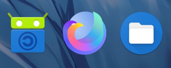
Looks good to me. It could be icier. I hope that the ball can be put at the center of the icon and have a circle background. But anyway it looks much better than the current one and I want to get it as soon as possible. :joy:
 linsui
on 27 Sep 2020
linsui
on 27 Sep 2020
looks nice! Clearly my favorite of the bunch!
abhijitvalluri
on 27 Sep 2020
@abhijitvalluri i personally like the first one since it is a complete circle but still that's just me lol
https://drive.google.com/file/d/1gtEf2cpM21vYIV0-Pmv2uJS8ONhuqlaC/view?usp=sharing
https://drive.google.com/file/d/1Bozd66ZzzHIlA9CYpR1K1IhDcYH_6JPr/view?usp=sharing
hbarsaiyan
on 27 Sep 2020
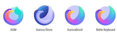
The second one retains most detail when reduced to size of icon.
hbarsaiyan
on 27 Sep 2020
I think this is the best i can do (considering the fact that i could not even draw a curved line before this). Of course everyone will not be happy with my design. If someone wants to improve on my design (maybe play with the colors?) i have uploaded it here . You can open the file here https://designer.gravit.io/ But be warned i have done a very hacky job :p
hbarsaiyan
on 27 Sep 2020
The second one retains most detail when reduced to size of icon.
Awesome! Just amazing work! You should receive a massive thank you for all the effort you put. We will certainly have a very stylish logo as a result!
Personally I prefer the last one (the one above BeHe Keyboard). It is similar in style to firefox's logo, with the globe in the middle being smaller. Gives it more style, the one which is a perfect circle looks a bit simple in comparison, not that it is bad at all!
But honestly the second one looks great too, and will be more in line with the "ice" raven name.
abhijitvalluri
on 27 Sep 2020
why these are not in perfect Circle shape 😀
 0xTyagi
on 28 Sep 2020
0xTyagi
on 28 Sep 2020
why these are not in perfect Circle shape 😀
I have reworked the whole design. This time it's a perfect circle. I did some reading on the tools in the designer. So this time it will be better at least geometry wise. Need to get the colors done right this time. Using too many gradients is making it look bad when minimised to the size of icon. So i will use only 1-2 gradients this time.
hbarsaiyan
on 29 Sep 2020
No please no perfect circles. This thread has become an example of "too many cooks spoil the broth". Everyone is suggesting their personal preferences and we are getting an icon designed by committee. I strongly oppose further changes and enhancements to the icons and will want this to be finalised asap.
abhijitvalluri
on 29 Sep 2020
Can't we just go with the current winner from https://github.com/fork-maintainers/iceraven-browser/issues/134#issuecomment-698722536?
If not we will allow one last iteration of the design before locking this thread and moving to just voting. So @hbarsaiyan I'll give you one more round for designing some new logos. Then I'll request you to list all the designs you want considered for a vote. Please include the original "imperfect" circle designs as well. Many people liked them and we don't want them to be ignored due to the preferences of some people.
I'll give my rational behind bit having a perfect circle. This design is clearly inspired by Mozilla's Firefox logo. Then it should continue to follow it's key trait which is not having a perfect circle. So it makes sense that our logo also doesn't have a perfect circle.
abhijitvalluri
on 29 Sep 2020
@abhijitvalluri i guess i wasnt clear about what i meant by a 'perfect circle'. i was talking about the outer circle having a smooth edge and the inner circle being at the centre. As for me creating many logos, i guess you are right i should just stick to one and not come with a logo every once in a while. I think i have managed to get things right and have it the way i wanted it to look with this logo so i wont bug people now with new logos lol.
You are free to close it now.
hbarsaiyan
on 29 Sep 2020
We can definitely keep evolving the icon over time. The trouble is figuring out who likes what better.
Maybe we should just change the icon whenever we feel like it and gauge what's best by the volume of complaints.
interfect
on 30 Sep 2020
We can definitely keep evolving the icon over time. The trouble is figuring out who likes what better.
Maybe we should just change the icon whenever we feel like it and gauge what's best by the volume of complaints.
Yeah I guess that would be the right thing. Anyways here is how my logos compare


hbarsaiyan
on 30 Sep 2020
@interfect @abhijitvalluri I know there's already a poll running, but I guess it would be better if one of you closes this and do the poll on a new issue since the poll is in the middle of the chaos (mostly because of me). But anyways it's your decision and once again sorry for all the clutter I have caused here.
hbarsaiyan
on 30 Sep 2020
No please no perfect circles. This thread has become an example of "too many cooks spoil the broth". Everyone is suggesting their personal preferences and we are getting an icon designed by committee. I strongly oppose further changes and enhancements to the icons and will want this to be finalised asap.
Lets do a poll for Circle shape. let fan decides what they want.
We can definitely keep evolving the icon over time. The trouble is figuring out who likes what better.
Maybe we should just change the icon whenever we feel like it and gauge what's best by the volume of complaints.
👍
0xTyagi
on 1 Oct 2020
why these are not in perfect Circle shape grinning
Because that would be ugly.
I think the logo is more on track with the first three of the poll above. Any one of them is good enough. I think having more purple in the globe is better since it's a raven, but going an icy blue and having more purple/dark in the bird isn't a bad move either. The weird topical one with all the oranges is not good. Feels like a parrot, not a cool raven. Orange screams warmth too, this is an ice raven not a fire raven.
 hockeymikey
on 1 Oct 2020
hockeymikey
on 1 Oct 2020
@bbigam @abhijitvalluri thank you for the response. Yes the last one didn't look much "icy". The ring also looks good when the image is big but when set as icon the ring does not look very nice so I removed it. As for the background being earth I will look into that ;)
In fact this one get most upvote. Why not put this one in the poll?
linsui
on 1 Oct 2020
We can definitely keep evolving the icon over time. The trouble is figuring out who likes what better.
Maybe we should just change the icon whenever we feel like it and gauge what's best by the volume of complaints.
Yeah I guess that would be the right thing. Anyways here is how my logos compare
I'm really a fan of this last one in line although I probably have an unpopular opinion if things stand to reason like they normally do.
 L31FY
on 1 Oct 2020
L31FY
on 1 Oct 2020
197 as a new submission. Please don't consider this as hijacking the thread 😃
 WeAreJMJ
on 2 Oct 2020
WeAreJMJ
on 2 Oct 2020
@WeAreJMJ Nice work there!
hbarsaiyan
on 2 Oct 2020
@abhijitvalluri @interfect is the pole over?
hbarsaiyan
on 2 Oct 2020
I will leave it to @interfect to make a final decision. But I think the previous pole is invalidated due to additional entries since then. I will create a new issue for a final poll.
abhijitvalluri
on 2 Oct 2020
I think we should use the new poll; we kept getting new entries after the first one started.
interfect
on 4 Oct 2020
Related issues
CharmCityCrab
·
4Comments
 resynth1943
·
6Comments
resynth1943
·
6Comments
 bbigras
·
8Comments
bbigras
·
8Comments
 kufue
·
4Comments
bbigam
·
9Comments
kufue
·
4Comments
bbigam
·
9Comments
Most helpful comment
Cast your ballots now:

\=
:laughing: :tada: :heart:
Polls will close in 1 week.
EDIT: Late entrant:
\=
:rocket: