Hey everyone !
In order for the new website to happen, we need to define some sort of branding for Iced. Since this should be a community effort, here are my first thoughts / mind map of how I reasoned about the logo and color scheme.
Logo
What is Iced ?
- GUI Framework
- Platform-agnostic
- Written in Rust
- Elm Architecture
What does iced mean ?
Ice
- Ice Cubes
- Snowflakes
- Mountains / Glacier
- Icebergs
- Sharp edges
- Mostly light-blue colors
Iced Coffee
- Ice cubes
- Brown / Orange colors
Modern GUI / Elm
- Font has to be sans-serif. Having serif makes everything look automatically older.
- Flat
- Square-ish shape
- Draft / Prototyping
Rust
- Light-Orange color (Github) and black color
- "Jagged R" Rust Logo : maybe we can have a slight reminder of Rust in the shape of the logo ?
Possible inspiration
This whole article on the amethyst.rs website
![]()

![]()

Colors
We need to define :
- One main color - 3 shades
- One "accent" color - 3 shades
- One shade of light color
- One shade of dark color
In my opinion, it is obvious that Iced's main color should be light-blue.
White could also largely be used as a reminder of snow.
I'm thinking a slightly brown dark color could be used for texts.
I'm undecided for the accent : I like light-green together with light-blue, though I think an orange accent would make for a better result because they are often used as opposite colors in video games. Take Rocket League for example. I also tried brown/orange as an alternative.
My suggestions
So here are my 2 cents. I'm terrible at graphic design (I'm just an engineer) and this is of course a draft that I hope someone will take further.
For the color scheme, I took images of a glacier and extracted some colors. This would be my "main color" suggestion.
I took another image of an emerald glacier and extracted shades of green - I think it's called teal.
Finally, I got an image of an iced coffee and exrtacted shades of orange / brown.

As per the logo, I think I'm on to something. These are the result of my first iteration. I'm willing to add some sort of gradient to the ice cubes when I can figure out how to do that in Inkscape.

I think it's simple enough. A cool logo should never be complex as evidenced by the "possible inspirations" part, and should work in a monochrome context (both black and white), which I think is kind of the case here.
What are your thoughts ? Any help welcome! :pray:
 AlisCode
All 99 comments
This is amazing, @AlisCode! I believe there is a lot of work in the library that will need exploration like this and you are setting a really good precedent. Thank you very much! :heart:
As you probably realized, I named the library Iced because it started as a part of [coffee]. So, I've always had ice cubes in mind and I think they could work well as a logo. Adding some coffee to the equation would be great, but I am not sure how we could do that without the brown color taking all the protagonism (I'm also just an engineer :sweat_smile:).
The drafts look like a nice starting point! As you said, some gradients (and maybe some shiny spots and rounded corners?) would probably make the ice more recognizable. Adding some context is also an interesting approach, like the drink one. It definitely helps to identify the ice.
For the text, I think we should just capitalize the first letter: Iced. The name is short and using all upper-case may make it seem like it's some kind of acronym (e.g. Internal Compiler Error).
I also think we should strive for simplicity (just like the library!) and I believe this is a really great start!
 hecrj
on 6 Jan 2020
hecrj
on 6 Jan 2020
Hi, I want to share my modest contribution, definitely not a final version, but if I can help for the final design ;-)

 othelarian
on 7 Jan 2020
othelarian
on 7 Jan 2020
@othelarian Thanks! I feel there are too many elements here. We should try to keep it simple.
I think the logo should be a single "element" with a simple shape and one or two flat colors at most. As I mentioned, blue and brown seem to be hard to mix.
I do not think of ice when I look at these squares, maybe we could play with isometric cubes? I believe the idea of the logo being part of the "i" dot may be interesting.
hecrj
on 9 Jan 2020
I'm under the same impression. The big problem with "amateur" logos is that they tend to show too many ideas at the same time, resulting in a confusing / meaningless logo.
Just take Flutter for example : 3 bars vaguely resembling the shape of an "F", as in "Flutter". One drop shadow. One modern font, no serif. It's as simple as that. You just "know" it's about something like UI, and it's modern. Great logo IMHO.
I also don't particularly like the option of making the logo "take part" in the font itself: I just feel like it usually doesn't work.
I'm working on a second iteration so that we can start looking at other ideas.
AlisCode
on 9 Jan 2020
My idea would be that the logo could be something like this with text below it?

The ice cubes are stacked on top of each other forming a kind of layout. However, the possibility of the ice melting could suggest it's not a very durable formation 😅 Just a suggestion.
Something like this above with whiskey on the rocks:
Font: Permanent Marker (Apache License)

The brown-ish whiskey could resemble the Rust part of Iced?
If whiskey is not your thing:

Illustrator file if anyone wants to play around:
iced.zip
 JakubKoralewski
on 9 Jan 2020
JakubKoralewski
on 9 Jan 2020
So I just had this idea which I think could look like something cool given a bit more work.

Granted we have to change the font, colors and proportions (this was drafted in 2 minutes with Inkscape) :)
AlisCode
on 9 Jan 2020
@JakubKoralewski whiskey?! this isn't on-the-rocks!
 artursapek
on 10 Jan 2020
artursapek
on 10 Jan 2020
@JakubKoralewski Awesome! I like the font, like the colors, but I don't get the "it's a UI framework" vibe from it.
There's definitely something that can be done with that layout though :)
Edit: Do you think it would be possible to design these 3 ice cubes as I showed and combine them like you did ?
We could also maybe apply a gradient on the outline to make it look 3d-ish ?
AlisCode
on 10 Jan 2020
@artursapek but if my English does not lead me astray on the rocks means iced
@AlisCode you mean like a little pyramid out of these kind of cubes?

It would also be interesting to try to recreate the Elm logo using ice cubes somehow maybe
JakubKoralewski
on 10 Jan 2020
@JakubKoralewski that's exactly what I meant ! I'm not sure how good that would look, though. You seem to be quite Illustrator-savvy, maybe you can try that as an experiment ?
I'll try to make a correct SVG of that cube and experiment with colors during my lunch break.
I like the idea of representing an ice cube, and the nodes at the coners are great in my opinion : They represent modularity and "communication" logic which are core Iced principles. I lke your font, and the idea of having the logo on top of the text. I will try to use it :)
AlisCode
on 10 Jan 2020
@AlisCode The gaps you're leaving out on some lines next to the dots have some sort of rule where they appear or is it your creative decision? If it looks like I'm savvy in logo making then sorry for misleading you 😅

I took the liberty to add some colors and stuff don't know if you like that.
Another idea is to change the crates in the crates logo to ice cubes? I edited the colors a bit to make the cardboard boxes(?) look more like ice

I guess the tape doesn't make sense and it's a very low effort rip-off. But just another idea.
JakubKoralewski
on 10 Jan 2020
@JakubKoralewski the gaps were purely my creative decision - if you could call that creative, lol.
I don't like the colors of the outline - it doesn't play well in my opinion :( we need to do more research.
Btw, I re-did my cube thing with better proportions, applied some gradient to it (random colors, still needs work :) ), Montserrat Alternates font. I think it looks better with gaps but just to give an overview of what I think a cool logo would look like :

(sorry for the mouse in the screenshot)
Thoughts ?
AlisCode
on 11 Jan 2020
@AlisCode That looks great imo. I like the left one more, but I feel like the name should pop more, maybe a bolder weight?
EDIT: Or could you make one version where the text doesn't have a gradient? The brighter side on the left kind of blends with the white background
JakubKoralewski
on 11 Jan 2020
@JakubKoralewski I'm not Inkscape-capable this weekend but will make sure to try that sunday evening and afterwards.
I think defining 3-4 colors as "main palette" and 3-4 colors as "accent palette" would be a good "next step" :)
AlisCode
on 11 Jan 2020
Added the gaps and removed gradient on text - tested with 3 different font weight (normal - medium - semi-bold)

I think the middle one with decent colors could be pretty good ! Thougts ?
AlisCode
on 12 Jan 2020
@AlisCode Amazing work.
@hecrj Take a look.
JakubKoralewski
on 13 Jan 2020
Nice! Very excited with the progress! I think we are onto something here.
Some thoughts:
- I feel using an outline stroke increases the overall complexity of the logo. I believe it will be hard to make it look good at smaller scales.
- It looks a bit "flat" to me. It should look like a cube. I think the gradient may be the culprit.
- While the blue colors help, I personally still don't see the ice. I understand making a simple logo look like ice is very challenging...
- The vertices feel a bit too big for me, I'd try using smaller sizes. This is probably just a nitpick.
The isometric cube seems like an interesting idea, though! Maybe we could try different angles?
hecrj
on 13 Jan 2020
This is with fill-mode instead of stroke-mode :

After reducing the "handles" and adding shinyness, I get something like this which doesn't feel quite right ...

I think a schematic isometric ice cube is impossible to do correctly, we're trying to illustrate rather than suggest. If we want this to "feel like ice", we probably want something that suggests a shape directly related to ice ; a cube is too generic. Here is what @hecrj and I discussed:
- Schematic Iceberg ? with "handles" (nodes like I did with the cube) ?
- Stalactites ?
- Snowflakes ?
Anyone willing to give this a shot ?
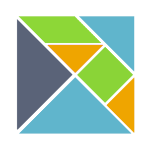
AlisCode
on 13 Jan 2020
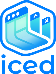
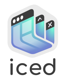
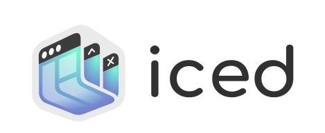
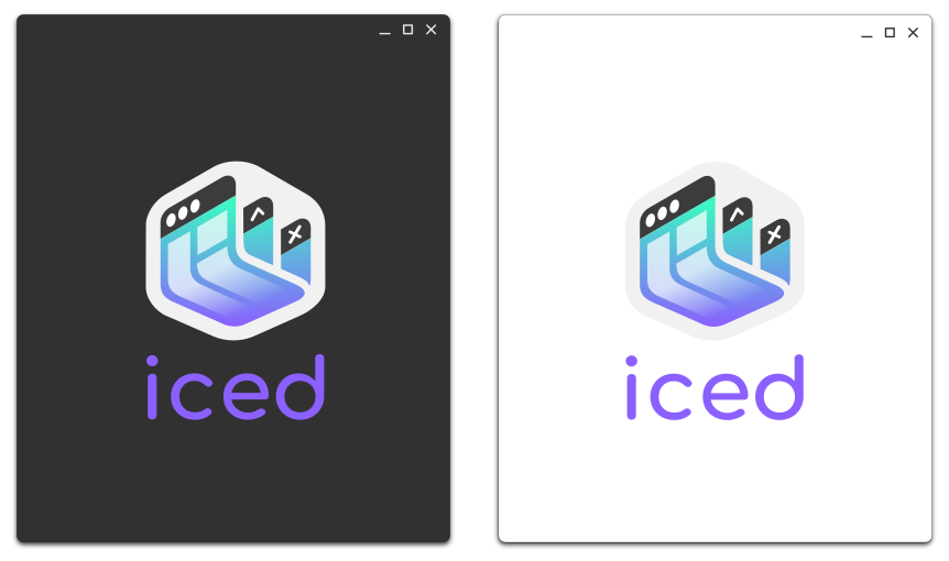
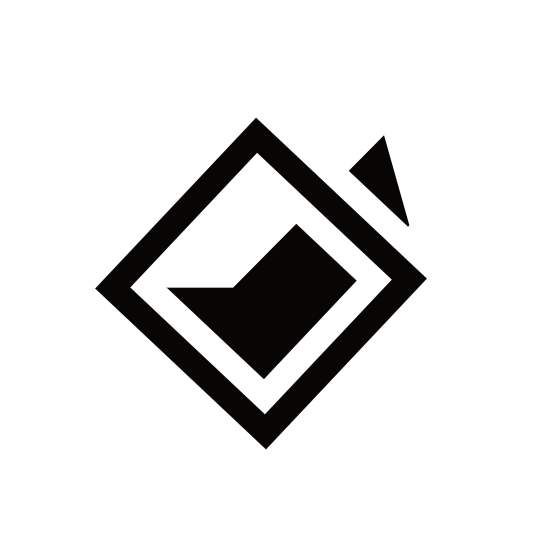
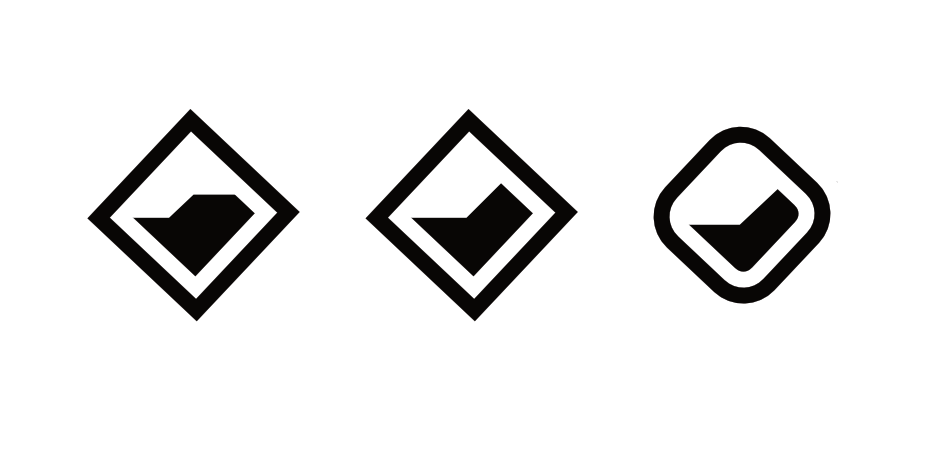
I got it guys.

 ronCYA
on 14 Jan 2020
ronCYA
on 14 Jan 2020
Let's pack it up boys. I think we found it.
Unless...

JakubKoralewski
on 14 Jan 2020
I wonder if we can bring some "impossible shapes" into logo. It means " impossible is possible" :)
below are some examples:

 piaoger
on 15 Jan 2020
piaoger
on 15 Jan 2020
@piaoger I dig that
artursapek
on 16 Jan 2020
I absolutely love this one, I've got some graphic designing background
under my belt. I'd like to help out if possible.
On Tue, 14 Jan 2020, 02:58 Olivier Pinon, notifications@github.com wrote:
This is with fill-mode instead of stroke-mode :
[image: image]
https://user-images.githubusercontent.com/12024408/72295278-8a62b200-3657-11ea-8879-dfde7146294f.pngAfter reducing the "handles" and adding shinyness, I get something like
this which doesn't feel quite right ...[image: image]
https://user-images.githubusercontent.com/12024408/72295152-3f489f00-3657-11ea-8217-eff20338a6d3.pngI think a schematic isometric ice cube is impossible to do correctly,
we're trying to illustrate rather than suggest. If we want this to "feel
like ice", we probably want something that suggests a shape directly
related to ice ; a cube is too generic. Here is what @hecrj
https://github.com/hecrj and I discussed:So, ideas :
- Schematic Iceberg ? with "handles" (nodes like I did with the cube) ?
- Stalactites ?
Anyone willing to give this a shot ?
—
You are receiving this because you are subscribed to this thread.
Reply to this email directly, view it on GitHub
https://github.com/hecrj/iced/issues/143?email_source=notifications&email_token=AKCH6QPAR55OJ53X52OFTOLQ5TPXTA5CNFSM4KC5MW7KYY3PNVWWK3TUL52HS4DFVREXG43VMVBW63LNMVXHJKTDN5WW2ZLOORPWSZGOEI2OH5I#issuecomment-573891573,
or unsubscribe
https://github.com/notifications/unsubscribe-auth/AKCH6QMH4AYDGCVCSCYH2RLQ5TPXTANCNFSM4KC5MW7A
.
 Taha-Firoz
on 16 Jan 2020
Taha-Firoz
on 16 Jan 2020
Since I didn't have much time this past week and likely won't have much time during the next one either, I'm leaving here my Inkscape SVG draft for anyone to use.
@Taha-Firoz please feel free to submit your ideas or realisations ! This issue is here to provide a community best-effort :)
AlisCode
on 18 Jan 2020
@AlisCode I pulled down your SVG and had a play around.


I just picked a couple of random icey colours for the gradient in GIMP.
 mr-road
on 6 Feb 2020
mr-road
on 6 Feb 2020
Glad to see some activity on this issue ! :D
As I mentionned I don't particularly like the idea of using shapes for letters, it's not always easy to see what the logo is meant to be in those cases. I like the colors you picked, though :)
I think we were not far from something good with the gradient in fill mode. Any suggestion ?
I'll try to make some room in my weekend for this issue :)
AlisCode
on 6 Feb 2020
I doodled the following two. I reused the color scheme provided but I would tune it for the 2nd one, I don't think it's a nice fit (even though it's much more close to the idea of a layout).


 gsurrel
on 27 Feb 2020
gsurrel
on 27 Feb 2020
These look all awesome!
However in the long term I think we need an accompanying logo beside the text so examples can use them e.g. for the taskbar, title bar, notification icon, executable icon etc.
 Songtronix
on 27 Feb 2020
Songtronix
on 27 Feb 2020
deleted
 yaskhan
on 28 Feb 2020
yaskhan
on 28 Feb 2020
@Songtronix you're absolutely right, we need some sort of accompanying logo : that's what my schematic ice cube was about. I'm not sure as to what to do better, appart from adding explicit iced forms, like icebergs, mountains or stalactites which I think would be great, if done properly.
My very first thought before drafting those SVGs was something like this :

@gsurrel while your two doodles are great, I feel like :
- In your first one the C is not explicit enough compared to the other letters.
- The second one is a bit too complex for my taste : there are too many "corner spots" perhaps we could just keep one in each corner of the word (as opposed to letters, here) and reduce the number of arrows, especially in the E. I like gradients, too (it's modern and usually good-looking), perhaps we could try that on your example ?
AlisCode
on 5 Mar 2020
Thank you everyone so far for the contributions! It's great to see so many different ideas. I really appreciate the efforts :bowing_man:
I apologize if I haven't been very active in this issue. I would love to help here but my knowledge when it comes to graphics design is very limited and, so far, I agree with most of the critiques.
I believe our efforts should be focused on making a simple, standalone logo (ideally just a couple of shapes/elements) that somewhat reminds us of ice. I think the Amethyst logo does this very well.
@AlisCode I like the polygonal ice concept! It's a very simple approach and reminds me of the Elm logo which, as you know, is the main inspiration of the library. It may be worth exploring.
hecrj
on 12 Mar 2020
I had this idea, quite different from the previous ones I sent. We lose the associated meanings, as it is 100% based on letters design and composition. Nothing like a final design, just food for thoughts:

gsurrel
on 3 Apr 2020
@AlisCode Sure I'll try getting a draft in by the end of the week
Taha-Firoz
on 3 Apr 2020
I also got an idea. But its more like a snowflake:)

 dunef-com
on 6 Apr 2020
dunef-com
on 6 Apr 2020
I had the same idea, a snowflake will make it alot easier to work with and
it'll be alot more distinguishable on smaller sizes. Can we please have the
colour palette revised? I can't think very creatively with them.
On Mon, 6 Apr 2020, 03:07 dunef-com, notifications@github.com wrote:
I also got an idea. But its more like a snowflake:)
[image: iced_logos]
https://user-images.githubusercontent.com/59920068/78511113-8055d880-779a-11ea-8c88-634ea4b0522c.png—
You are receiving this because you were mentioned.
Reply to this email directly, view it on GitHub
https://github.com/hecrj/iced/issues/143#issuecomment-609492337, or
unsubscribe
https://github.com/notifications/unsubscribe-auth/AKCH6QKQTQ2WGIPUO7U6UIDRLD6IPANCNFSM4KC5MW7A
.
Taha-Firoz
on 6 Apr 2020
Based on some of the existing stuff (Alis codes glacier and the amethyst logo) along with the idea of being simple, and also trying to come up with a smooth font, I came up with this.

Everything is "hand drawn" in inkscape (not a font) so the proportions aren't exact, nor are the colors, but I think it shows the concept well. I don't think it has so much detail that it would have trouble scaling.
 JeremySorensen
on 7 Apr 2020
JeremySorensen
on 7 Apr 2020
@JeremySorensen I love your concept! Especially the icicle logo. It gave me some inspiration :) !

dunef-com
on 7 Apr 2020
Cool ideas! Perhaps we could try some gradients on that Icicle concept ? (Yes, I love gradients)
Also, feel free to tweak the colour palette, this is mostly random colours picked in random iceberg pictures, and was just to give an example of what we're aiming for.
Though to be fair, nobody was going to aim for red anyway
AlisCode
on 7 Apr 2020
@AlisCode Yeah alright. I think darker blue colours are better, because for the colours of an iceberg its difficult to give it enough contrast and on dark backgrounds they lose their "coldness" effect (in my opinion). But i like the gradients on darker blue colours, it kinda gives the logo a more luxurious vibe.

dunef-com
on 7 Apr 2020
I'm publishing my Inkscape SVG in case someone wants to tinker around with it :)
dunef-com
on 7 Apr 2020
Sorry for spamming too much, but i think these ones are nice.

dunef-com
on 7 Apr 2020
These are looking really good. I guess since we want lowercase letters we can't have the ice coming off the "D" :-/ I still like the crystals to be at an angle though, so I grabbed the SVG and modified my favorite light and dark versions. I did not intentionally change the font, I like the original font @dunef-com used, I think I just don't have it on my machine.

I also wonder if having each of the three crystals outlined (only affects the center one where it overlaps the other two) would look better, having the subtle difference between the gradients looks a bit like an accident to me.
Finally I feel like I should point out that ice crystals like these would never naturally occur, but I think that is fine since it does evoke a feeling of ice.
JeremySorensen
on 7 Apr 2020
Really liking the fact that it looks somewhat like the amethyst logo (good reminder of Rust / gamedev ecosystem) and Elm logo since it is formed of polygons, while still being original.
I believe that if we're going to gradient way, it should be applied to the whole logo as opposed to being applied on each separate polygon composing it.
Regarding the font, I suggest at least trying with Montserrat Alternates which looked pretty good in my initial examples, IMHO.
AlisCode
on 7 Apr 2020
I think the gradient across all the crystals will make then look flat, which may be fine. Looking back I think the crystals with the William Shakespeare logo are a nice compromise between simple, 3D, and having a gradient.
JeremySorensen
on 7 Apr 2020
Okay so I'm having a really hard time coming up with something thats to my liking. I'm sorry to say but I'm not going with any of the typefaces that are being used. I really wish we could have something more minimal or we could include Ferris in this somehow.


Taha-Firoz
on 9 Apr 2020
@dunef-com It's a good idea but I really can't top associating it with the Addidas Logo.

Taha-Firoz
on 9 Apr 2020
Any inspiration can be taken from these?


Perhaps something like the top-right ICE CUBE but then like "windows" with titlebar, minimize/maximize/close button, some other GUI elements like a button?
 richarddewit
on 17 Apr 2020
richarddewit
on 17 Apr 2020
Just adding some inspo for some more geometric simple stuff and colours
I like the colours in this one.

Simple-ish, flat, geometric

Thought the design was creative, not super keen though

Geometry is pretty neat in this one

Simpler, flat version of previously mentioned, the geometry is neat in this one too

 krooq
on 19 Apr 2020
krooq
on 19 Apr 2020
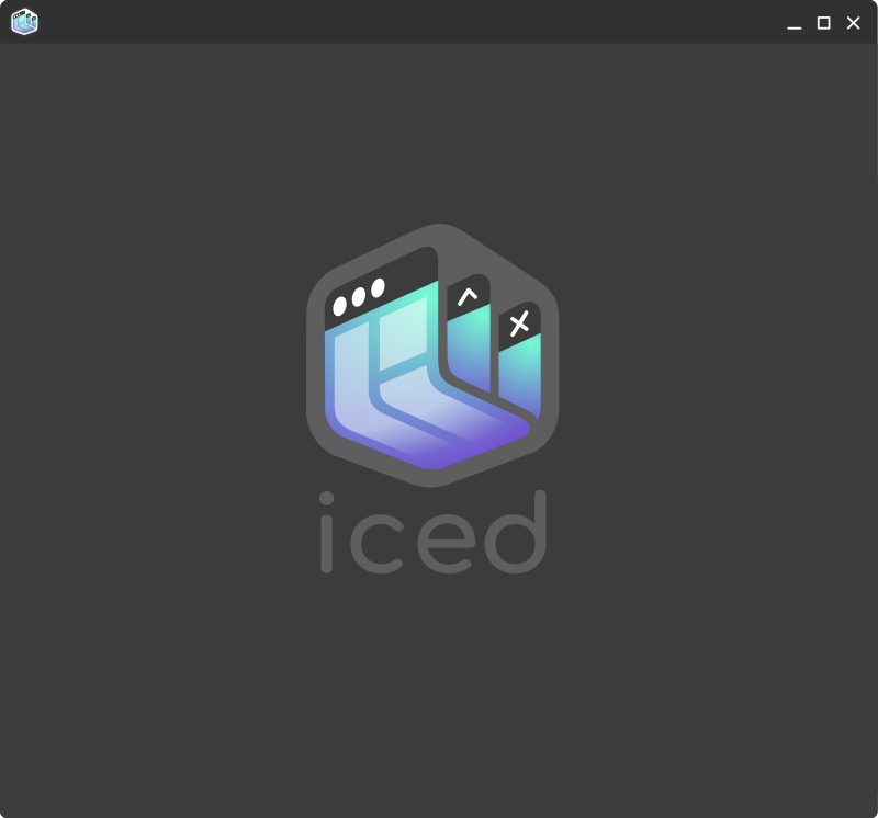
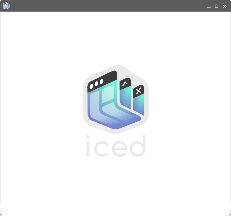
I saw this thread today while looking through the issues, and thought I'd toss this concept in the ring. The goal was to symbolize "cross platform gui" in a stylized ice cube. Smaller icon versions can lose the window control details while retaining the silhouette/form.
I wanted to avoid leaning on Rust iconography; it feels a bit overdone and I think a good brand should stand on its own. That said, the typeface is a bit of a nod to Mozilla.
I felt that lower case made it clear the name is not an acronym, and balanced well with the symbol when centered. Not certain if the font is exactly right, but this is at least the style I was going for.


 aevyrie
on 28 Apr 2020
aevyrie
on 28 Apr 2020
Slightly updated to add contrast and make it a bit more ice cubey:

Light on dark badge:

Icon:


aevyrie
on 28 Apr 2020
(Last post, I swear)
An alternate typeface. Too playful?

aevyrie
on 28 Apr 2020
I like the general idea of that last concept too. Contains everything that I mentioned in the first post of this issue. Nice work :)
I'd still advocate for Montserrat Alternates as a typeface which is both modern and ... Feels right for an UI framework. That said, the "playful" one symbolizes the "toy" aspect of the Iced framework fairly well IMO. Thougts ?
Side note: this issue has been going on for a while, I'm not sure what the process to go about actually choosing a logo as a community is. Make a public poll ? Open it to the Rust community on Github, Discord, maybe Reddit ?
Last but not least, we never talked colors that much. Not that I dont like the color-scheme that I introduced but I think there's a lot of room for improvement, and I think it's an important part of branding.
AlisCode
on 28 Apr 2020
I'm not a huge fan of design by committee, though it isn't my place to say. I'm of the opinion that while this is a community project and we can steer this conversation, at the end of the day it's up to @hecrj to decide. They came up up with the name, and probably have a good idea of what they think represents the project best. 😊
aevyrie
on 28 Apr 2020
@AlisCode
Last but not least, we never talked colors that much. Not that I dont like the color-scheme that I introduced but I think there's a lot of room for improvement, and I think it's an important part of branding.
As a note, I played around with other colors, but decided against including them because I felt it would distract from discussing the form of the logo. I think blue/green might work well for ice, and is complementary with a coffee color.
Unfortunately this is (no surprise) very similar to the Starbucks brand palette. 😄
I'd be happy to explore some other design directions if you have any suggestions. I don't get the chance to do creative work often enough! Where would the logo be used? Website branding, program icons?
aevyrie
on 28 Apr 2020
@aevyrie I like it! I already found the window idea by @Taha-Firoz interesting. The way your concept mixes it with the ice cube shape to convey cross-platform support is awesome. I also like the round and clean shapes.
I prefer the first typeface. I feel the other one is too playful, but I believe it could grow on me.
I would try to keep the controls on the windows for smaller icons if possible, like in your last concept.
Where would the logo be used? Website branding, program icons?
The logo would be included in the header of the main README, the Zulip server profile picture, and the website (once we have one). Maybe we will use it in some of the examples too.
Last but not least, we never talked colors that much. Not that I dont like the color-scheme that I introduced but I think there's a lot of room for improvement, and I think it's an important part of branding.
Definitely. Don't feel obliged to use a specific color palette. Feel free to be as creative as you want.
I'd be happy to explore some other design directions if you have any suggestions.
I believe the issue has a lot of interesting ideas. Are there any that you think may be worth exploring further? I liked the direction of the polygonal icicles, but I am not sure how we could tie it with the "GUI" idea.
hecrj
on 29 Apr 2020
@aevyrie Loving the color palette, even though we're missing blue/light-blue. Perhaps we can pick one from the first post, or use one of the provided photos.
You're right saying it's close to Starbucks' identity but that's indeed no surprise. For reference by the way, here's the branding guide of Starbucks, not that we should use it but since the lib has this inspiration, it makes sense that we'd float around the same ideas.
As for "other design directions", I'd say that the only thing that distracts me a bit from your last round of examples is that "shadow effect" to add contrast at the bottom of the ice cube. I dont know if anyone feels the same, but it looks a bit weird with it, and empty without it. So, I suggest:
- Perhaps more gradient, with one accent color ?
- Maybe a last, soft detail reminding Elm instead ?
- Maybe something reminding mobile UI ? (not that Iced targets mobiles just yet, but it's a metaphor for modernity and UI)
- Something reminding GPU or wgpu ?
I feel like having something too detailed here would possibly bloat an already meaningful logo so I'm definitely not sure any of those ideas would work. Maybe it's worth a try :)
Cheers!
AlisCode
on 30 Apr 2020
@AlisCode @hecrj
Thanks for the feedback!
I would try to keep the controls on the windows for smaller icons if possible, like in your last concept.
Unfortunately I think the design as I have it now is already bordering on too detailed. For something used as an actual icon, such as in the taskbar, desktop, or window icon, that detail will get lost and muddy the identity of the logo.
the only thing that distracts me a bit from your last round of examples is that "shadow effect" to add contrast at the bottom of the ice cube
I agree 😊. As you said, without anything there it looks a bit flat, but I don't think the "shadow effect" is the best solution. I'll try to mess around with some of these ideas.
I was hoping to contribute code to this project, but I suppose this is as good a start as any 😄.
aevyrie
on 30 Apr 2020
As I mentioned, blue and brown seem to be hard to mix.
Actually I think blue and brown can work pretty well with brown as a background.
This is not supposed to be a logo, just a color test, but dim colors like these could work.
553A3A, #AAEEFF
This might be drifting from modern to retro a little too much, though.
 oliver-moeller
on 30 Apr 2020
oliver-moeller
on 30 Apr 2020
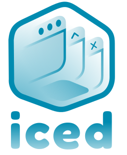
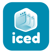
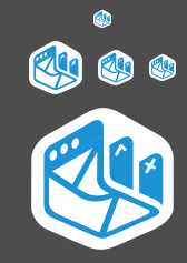
Here's an exploration of the idea. This time the front window wraps around to give the cube depth, the foreground gradient is removed, and the MacOS icons are shifted over to the correct side. The windows now form a "W" to represent web/wgpu.
Large/medium/small icons:


Badge:
Palette:

An alternate version with stylized silhouette to look more like an ice-cube:

aevyrie
on 1 May 2020
Wonderful work ! Loving it, best one so far IMO :)
I'm not sure we can do better. As I've stated before, more would be overcharged, less would be insufficient.
Feedback:
- The stylized silouhette is perhaps a bit too much. At least, I prefer the simpler one. More on that later.
- Nitpicking at this point but in the small icon you can't really distinguish the white dots, can you ? Can we do something about it ? (Dont think so)
- Also nitpicking, the outer margins dont match the width of the inner margin. I'm not saying it's better if it's "uniformized", but perhaps that will look more "perfect" like so ?
Silly idea for a variation (I know it won't look great as a logo, but perhaps we can use this as an animation on the website): mimic Apple's three-dots colors by using the colors in your palette.
Second silly idea: perhaps the stylized silouhette can be used as a funny animation ?
Btw, loving Montserrat Alternates, I think it's a great fit for the logo. Feel free to try other fonts though, especially the playful one which I think was a great fit too.
Thank you so much for your work, I'm sure I'm not the only one appreciating it so far :)
AlisCode
on 1 May 2020
Glad you like it!
Nitpicking at this point but in the small icon you can't really distinguish the white dots, can you ? Can we do something about it ? (Dont think so)
I did as much as I could to make the controls visible in icon form, per @hecrj 's request. I think it's actually pretty legible even in the smallest size:

Also nitpicking, the outer margins don't match the width of the inner margin. I'm not saying it's better if it's "uniformized", but perhaps that will look more "perfect" like so ?
The design certainly needs a polish pass, this is all freehand splines that I eyeballed. The interior spacing was left smaller intentionally, so the windows all appear visibly grouped together as one within the boundary of the cube. I'm sure it could be improved though.
Btw, loving Montserrat Alternates, I think it's a great fit for the logo. Feel free to try other fonts though, especially the playful one which I think was a great fit too.
I can see if anything else seems to fit, it's easy enough to iterate on font quickly.
Thank you so much for your work, I'm sure I'm not the only one appreciating it so far :)
Thanks. 🙂
I was thinking it might be cool to try a version that has UI layout elements on the big MacOS window in front, using some of the other accent colors. It might be too busy in icon form, but it's worth a try. I think it would further reinforce the "GUI" part.
Edit: Something like this:

aevyrie
on 2 May 2020
@aevyrie I really like this concept. I think you are nailing it!
It's great to see a different color palette! Here I personally feel the transition between blue and green is a bit too noticeable.
On a related note, is the gradient necessary? I think it may be adding to the feeling of "complexity" in the logo. Maybe we could play with different shades of the same color for each window instead.
I did as much as I could to make the controls visible in icon form, per @hecrj 's request. I think it's actually pretty legible even in the smallest size
Love it. I also think they are pretty distinguishable, considering the resolution.
I think it would further reinforce the "GUI" part.
I believe this last concept conveys the "GUI" idea quite well, specially if we compare it with the logos of Flutter, Electron, or Elm. I'd try to keep it simple.
In any case, I think we are very close! Thank you very much for all your work so far!
hecrj
on 2 May 2020
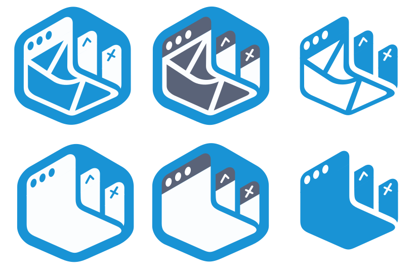
Here are some iterations based on your feedback, @hecrj :
Simple gradient
Outlined Gradient
Flat
Outlined Flat
Some badges showing light on dark:


I did some work to make an icon version, which is still readable down to 16px:


aevyrie
on 3 May 2020
Wow. What would it look like with no green tones and only blue?
On Sun, 3 May 2020 at 10:05, Aevyrie notifications@github.com wrote:
Here are some iterations based on your feedback:
1.
Simple gradient
[image: image]
https://user-images.githubusercontent.com/2632925/80895119-26133f00-8c96-11ea-8861-9e5f6c0675d4.png
2.Outline Gradient
[image: image]
https://user-images.githubusercontent.com/2632925/80895074-c6b52f00-8c95-11ea-9e5c-773e8d678d9c.png
3.Flat
[image: image]
https://user-images.githubusercontent.com/2632925/80895160-a20d8700-8c96-11ea-9289-dba46e3d04ed.pngSome badges showing light on dark:
[image: image]
https://user-images.githubusercontent.com/2632925/80895019-48588d00-8c95-11ea-9e92-9325859da138.png[image: image]
https://user-images.githubusercontent.com/2632925/80895015-37a81700-8c95-11ea-8c93-9a02121ab753.pngI did some work to make an icon version, which is still readable down to
16px:
[image: image]
https://user-images.githubusercontent.com/2632925/80894953-c9635480-8c94-11ea-8587-5577b9d929c2.png
[image: image]
https://user-images.githubusercontent.com/2632925/80894960-d7b17080-8c94-11ea-9f24-1c366fa588f2.png
[image: image]
https://user-images.githubusercontent.com/2632925/80894969-e6982300-8c94-11ea-8418-577afe64f322.png
[image: image]
https://user-images.githubusercontent.com/2632925/80894947-b0f33a00-8c94-11ea-8cb1-0552dece3509.png—
You are receiving this because you commented.
Reply to this email directly, view it on GitHub
https://github.com/hecrj/iced/issues/143#issuecomment-623031830, or
unsubscribe
https://github.com/notifications/unsubscribe-auth/ABMEN2YHSCAYZPG5IWUM4LTRPSYLXANCNFSM4KC5MW7A
.
ronCYA
on 3 May 2020
Wow. What would it look like with no green tones and only blue?
I tried that earlier, but couldn't come to a result I was super happy with. Did you have anything more specific in mind?
In the meantime, here's another color and font exploration. 🙂
Dark/light theme:
Icons:


aevyrie
on 3 May 2020
That new font is a great fit :)
In my opinion, the blue / white color combo, makes the ice cube "pop" more. But on my screen it looks a bit bright though. Thoughts ?
AlisCode
on 3 May 2020
The contrast is certainly higher with the white/blue version! 🙂
I was going for something a bit less jarring, and maybe a bit more professional in the latest version. I was especially interested in attempting to use a more nuanced color scheme, with an example of how it might look in use.
That new font is a great fit :)
I'm really liking it too!
aevyrie
on 5 May 2020
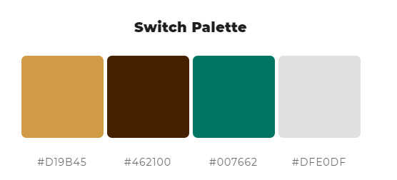
Here's an update with:
- More contrast
- Smoother, shared gradient across the whole logo
- Lines aligned and cleaned up
- Slightly tweaked palette
aevyrie
on 5 May 2020
@aevyrie Those look great! I think I like the "feel" of the flat version the most. We should definitely keep the last improvements, though!
The new font is perfect. Love it.
As @ronCYA mentioned, I'd also like to see a version with mostly blue instead of green/purple. Maybe the cube background could be blue and the windows white?
hecrj
on 5 May 2020
@hecrj I'll give it a shot. 🙂
aevyrie
on 6 May 2020
It sounds like you're looking for flat and blue. Lucky for you, there's a similar logo we can draw inspiration from 😄. Here are some explorations of flat and blue - with a dash of elm thrown in for good measure:


A preview of what this might look like in practice:
Icons:
aevyrie
on 6 May 2020
@aevyrie This is amazing. I love the idea of adding the Elm geometry and I like all the concepts!
I think we need at least 3 colors to make the windows recognizable. The title bar boundaries are lost when we use only 2 colors, but it does make the logo simpler overall. I am a bit torn here!
I'd like to know what other folks (you included) think about it. From all the concepts so far, which one would you choose/like the most?
PD: A small nitpick, have you changed the X icon? I feel it was more symmetrical in some of the previous concepts.
hecrj
on 7 May 2020
For what it's worth I like it much better in the latest round without the gradients.
From the 2x3 grid in this post I like the upper left the best. Just my $0.02.
 ethanpailes
on 7 May 2020
ethanpailes
on 7 May 2020
@aevyrie This is amazing. I love the idea of adding the Elm geometry and I like all the concepts!
Happy to hear it!
I think we need at least 3 colors to make the windows recognizable. The title bar boundaries are lost when we use only 2 colors, but it does make the logo simpler overall. I am a bit torn here!
I'm also torn. I think the 2 color is simpler and still identifiable as windows, but I agree the 3 color is even easier to read.
I'd like to know what other folks (you included) think about it. From all the concepts so far, which one would you choose/like the most?
Honestly, I really dig the last iteration with the gradient. I feel like the 100% flat look has been done to death recently. I like the gradient for a few reasons: it lets you add visual interest without having a complex silhouette, it more easily conveys softness and/or depth, and you can integrate multiple brand colors in a contiguous region. To me it also feels much more modern; however it is a bit trendy at the moment, for better or worse.
But if you aren't crazy about it, that's totally cool! I think the flat design included in the last mockup (that @ethanpailes likes) is pretty strong.
PD: A small nitpick, have you changed the X icon? I feel it was more symmetrical in some of the previous concepts.
Good catch. In an attempt to make everything line up and match, the perspective of the drawing makes one leg of the X look thicker than the other. I'll try to fix it.
As always, appreciate the feedback. 🙂
aevyrie
on 8 May 2020
Perhaps flat for 16 and 32, then gradient > 32?
Agreed the gradient looks great.
ronCYA
on 8 May 2020
@aevyrie these are really nice, kudos
artursapek
on 8 May 2020
Honestly, I really dig the last iteration with the gradient.
@aevyrie Yeah, after asking around and thinking about it, I believe the versions with the Elm geometry would be great for a project directed to Elm users. When it comes to iced, most of our userbase will not be familiar with Elm, so the geometry adds a bunch of complexity without much payback. The ice cube feel is also lost in this version.
I think we can settle with the last iteration with the gradient you mention. I love it too! I'd try to replace the purple with blue instead, like in your previous concept. The comment where you presented this version has the most reactions, so I am assuming it's the favorite one!
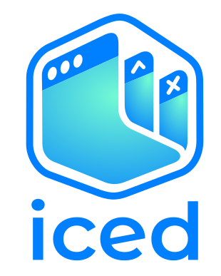
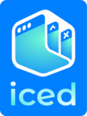
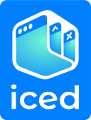
Once we do that, I think we'll finally have an official logo!
hecrj
on 8 May 2020
@hecrj Okay! I'm happy to go either way, but I agree with your overall conclusion.
I'll try to get something done for tomorrow.
Once we do that, I think we'll finally have an official logo!
Exciting!
@aevyrie these are really nice, kudos
Thank you!
aevyrie
on 8 May 2020
@hecrj Hopefully I understood your direction:
aevyrie
on 12 May 2020
@aevyrie Looks great!
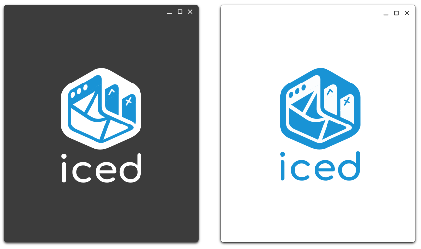
- I think I like the white cube on a dark background, like in this version.
- Maybe we could make the text black in the light background version?
I am also torn between blue and purple, they both look great :sweat_smile: Which one do you prefer?
hecrj
on 16 May 2020
I think I like the white cube on a dark background, like in this version.
Agreed
Maybe we could make the text black in the light background version?
Sure thing. I was trying to get something that worked well on light and dark backgrounds, but that might not be the best way to do this. That's the same reason I ended up using the brand color for the logo in the version you linked.
I am also torn between blue and purple, they both look great 😅 Which one do you prefer?
I prefer the blueish purple. 😄
I'm thinking it might be worth trying to flip whether the cube is white or the windows are white when inverting the background color, something like this:
https://user-images.githubusercontent.com/2632925/81149488-267c3600-8f33-11ea-8e02-19bce675e3a7.png
aevyrie
on 16 May 2020
I'm thinking it might be worth trying to flip whether the cube is white or the windows are white when inverting the background color
Yes! Blue cube and white windows could look great on a light background.
hecrj
on 16 May 2020
Just randomly arrived here, but the latest logo that you guys have been discussing breaks my brain when I look at it.
I just see a hollowed out icecube with escher like decorations on the side.
 Aeolun
on 18 May 2020
Aeolun
on 18 May 2020
Also just randomly arrived here, I think the light gray text on white background is too low contrast to see well (the dark one is more OK) FYI :)
 osdiab
on 19 May 2020
osdiab
on 19 May 2020
I just see a hollowed out icecube with escher like decorations on the side.
Ouch, thanks for that. Now I can't _unsee_ that any more. My brain is as confused as yours is right now.
(still love the design, though)
 JeanMertz
on 28 May 2020
JeanMertz
on 28 May 2020
Hey, just arrived here. I think the design @aevyrie proposed looks extremely aesthetically pleasing. However, there is quite much stuff going on with it. I think, especially for a logo, the design should be minimal, like Flutter and Elm. I have some ideas, let me prepare some screenshots.
 johannesvollmer
on 31 May 2020
johannesvollmer
on 31 May 2020
Maybe, the ice cube in the coffe is unique enough to be recognizable. Ignoring colors for a while, this might be a direction we might want to go in:

Keep in mind that the idea behind a logo does not necessarily have to be recognized on the first glance. Going more abstract could yield this:
Splash!


Altough an ice cube has round edges, sharp edges can look nice too:
Coloring this can look like this:

johannesvollmer
on 31 May 2020
@johannesvollmer I like these a lot. 🙂
aevyrie
on 1 Jun 2020
Thank you. Which one do you like most, and why?
johannesvollmer
on 1 Jun 2020
I dont know, I feel like it's simple enough but doesn't give the idea of an UI Framework at all ...
Flutter for example gives the idea of material design, which instantly makes you think of something craftable or interactive.
The latest proposals from @aevyrie makes me automatically think of an UI too, but perhaps these last doodles are showing that we need to make that more subtle ?
AlisCode
on 2 Jun 2020
@johannesvollmer
Keep in mind that the idea behind a logo does not necessarily have to be recognized on the first glance. [...]
I agree. I think the last designs I proposed are still too detailed for a logo. They seem more appropriate for a hero image or something; they don't scale well or have an immediately recognizable silhouette. I prefer the direction of some of the minimal concepts I did earlier:

Which one do you like most, and why?
I'd love to see more exploration of this concept you presented:

The rounded corners and the curved wave/reflection remind me of an ice cube, and I like the softness/balance that the curves bring.
aevyrie
on 2 Jun 2020
The latest proposals from @aevyrie makes me automatically think of an UI
Although it's not the major goal of a logo to inform but rather to identify, it's of course always nice if the logo hints at the one or two most important properties of the represented product, I agree.
I prefer the direction of some of the minimal concepts I did earlier
Yeah I think those are awesome. They are definitely more versatile than the rather detailed ones. I think I might have an idea that combines core concepts of the two logos that you mentioned last.
johannesvollmer
on 2 Jun 2020
I have read all the remarks from everyone again and believe we can consider/finalise various contributions with this:
Starting with this design: https://github.com/hecrj/iced/issues/143#issuecomment-627187153
- with white text + stroke/fill colours for dark background, and blue for light background (https://github.com/hecrj/iced/issues/143#issuecomment-629695125)
- Lose the gradient and inner details at sizes 48x48 and below (https://github.com/hecrj/iced/issues/143#issuecomment-637189676 and https://github.com/hecrj/iced/issues/143#issuecomment-637269969)
Hopefully this brings us back closer to "Once we do that, I think we'll finally have an official logo!" (https://github.com/hecrj/iced/issues/143#issuecomment-625615607) 😄
ronCYA
on 4 Jun 2020
@ronCYA
Hopefully this brings us back closer to "Once we do that, I think we'll finally have an official logo!"
I've been meaning to follow up on this, but I haven't had the time to complete the work yet. I also thought @johannesvollmer has valid points worth discussing. Plus, it's not like we're working on a deadline, right? 😄
aevyrie
on 4 Jun 2020
I prefer the direction of some of the minimal concepts I did earlier:...
@aevyrie I feel that this one could benefit from having the title bar a different colour and losing the icons, unfortunately they are just too small for a logo.
Saying that makes me sad, the cross platform feel from the icons is so damn cool.
I also think we can still keep the dope gradient, it works for the firefox app icon (one of the best app icons ever imo).
Absolutely loving the designs!
krooq
on 7 Jun 2020
Way late to this party, but is it too late to suggest something based on iced<T> (iced tea)?
 RLHerbert
on 21 Jul 2020
RLHerbert
on 21 Jul 2020
Keep it coming, this deserves any kind of progress
johannesvollmer
on 21 Jul 2020
Just a mock up idea:

I feel like the ice cube goes well in the i, a la Pixar lamp. And the t/tea color is quite similar to the actual color of Rust. Lowercase t just to match the lowercase iced. Alternatively the logo could be "carved" out of ice or the letters of iced could be the ice cubes in a drink, but my graphics design skills are by far inadequate to attempt such a design.
RLHerbert
on 21 Jul 2020
My two cents : )
- Inspired by a "2.5D"-esque flattened ice cube and the current _Elm_ logo.
- Font: Roboto Slab by Christian Robertson, Apache License, Version 2.0.
Mockup

Palette

 cristianovitorino
on 4 Aug 2020
cristianovitorino
on 4 Aug 2020
Related issues
johannesvollmer
·
4Comments
 Charles-Schleich
·
3Comments
Charles-Schleich
·
3Comments
 aentity
·
4Comments
aentity
·
4Comments
 Gohla
·
4Comments
hecrj
·
3Comments
Gohla
·
4Comments
hecrj
·
3Comments
Most helpful comment
I got it guys.