Hyrax: Edit Work buttons layout re-factor
Descriptive summary
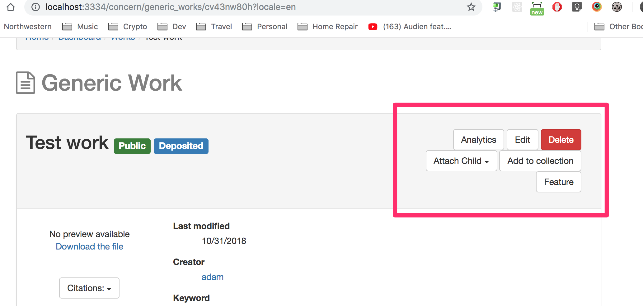
The layout of main buttons for Edit Work page is confusing, and could be better organized. Investigate alternative layout options.
Link to related tickets or prior related work here.
 adamjarling
All 12 comments
@chrisdaaz @vantuyls 2 options for how to clean this display up a bit. Preference? I also fixed the label sizing next to the Title, and made the buttons the primary button color to follow suit on Edit Collections page. Trying to get some consistency.


adamjarling
on 1 Nov 2018
i prefer the second, as it places the buttons in the same horizontal space. i'm assuming there is a hard line break between the two rows to prevent the icky re-stacking effect we're currently seeing.
also, how does this do on mobile?
 vantuyls
on 1 Nov 2018
vantuyls
on 1 Nov 2018
@samvera/hyrax-repo-managers may want to have a peek at this
vantuyls
on 1 Nov 2018
@vantuyls Sounds good. Yes it is a hard line-break between the two rows. And the first row is grouped by some type of permission or edit access, so those three buttons should probably stay together.
Here's how it looks on mobile:
After:
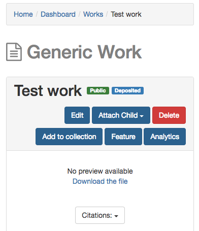
Before:

adamjarling
on 1 Nov 2018
looks much better!
 julesies
on 1 Nov 2018
julesies
on 1 Nov 2018
@jcoyne How about these two options? The 2nd option, of putting the buttons in their own row, is how Github might approach this. Maybe Github should just be the style guide for how to implement Bootstrap in Hyrax when in doubt.
If I ran further with this, I'd go buttons above title, then break out "Relationships" and "Items" in their own panel groupings, with a lower subhead <h3>. To make the content separation more distinguishable maybe?
Button Group


Button in own row
Above title

Below title


adamjarling
on 1 Nov 2018
Last screenshot, then I'll give it a rest. Something like this...

adamjarling
on 1 Nov 2018
of those, i like the buttons above the title. that way they don't invade the metadata box. not sure there is a "best" approach, though.
vantuyls
on 1 Nov 2018
Great. @vantuyls Are you ok with 'panelizing' Relationships and Items sections in this page as well?
adamjarling
on 2 Nov 2018
My idea is that maybe we're currently using panels as a container to shove all the page content in them, instead of using them to visually group UI segments.
adamjarling
on 2 Nov 2018
I think the last screenshot is the most well organized for a variety of reasons:
- similar content is grouped
- tertiary content (relationships, Thumbnails) are cleanly broken out
- user actions are grouped by similar tasks (e.g. Edit, attach child, delete)
The work type ( "Generic Work") looks to be the Header of the page. It seems that should be lower on the page hierarchy than the title of the work. Even if it's above the Title it should be obvious it's of lower importance visually.
 davidschober
on 2 Nov 2018
davidschober
on 2 Nov 2018
Here's another version, with the following updates:
- Uses the work title(s) as
<h1>tag(s) which may be better for seo and accessibility? - Swaps the "CRUD" type function buttons (Edit, .... Delete), to the right which is more typical in the application.

adamjarling
on 2 Nov 2018
Related issues
 mjgiarlo
·
4Comments
mjgiarlo
·
4Comments
 hannahfrost
·
7Comments
hannahfrost
·
7Comments
 carolyncole
·
4Comments
carolyncole
·
4Comments
 tworrall
·
5Comments
mjgiarlo
·
3Comments
tworrall
·
5Comments
mjgiarlo
·
3Comments
Most helpful comment
@vantuyls Sounds good. Yes it is a hard line-break between the two rows. And the first row is grouped by some type of permission or edit access, so those three buttons should probably stay together.
Here's how it looks on mobile:
After:
Before: