Hyrax: Long Collection Titles Overflow in Facet Dropdown Menu
Descriptive summary
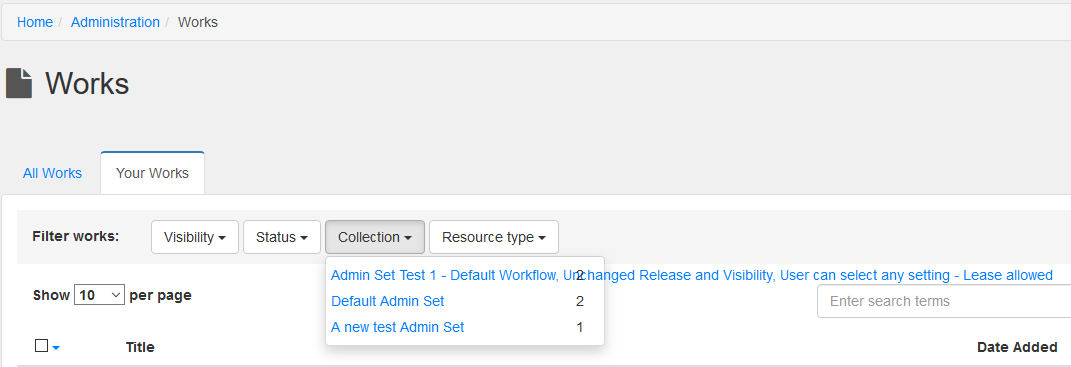
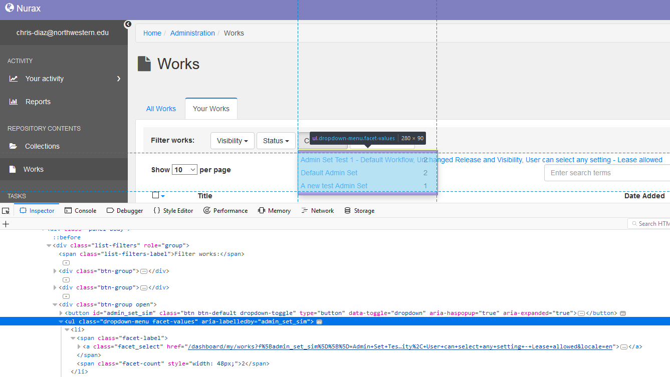
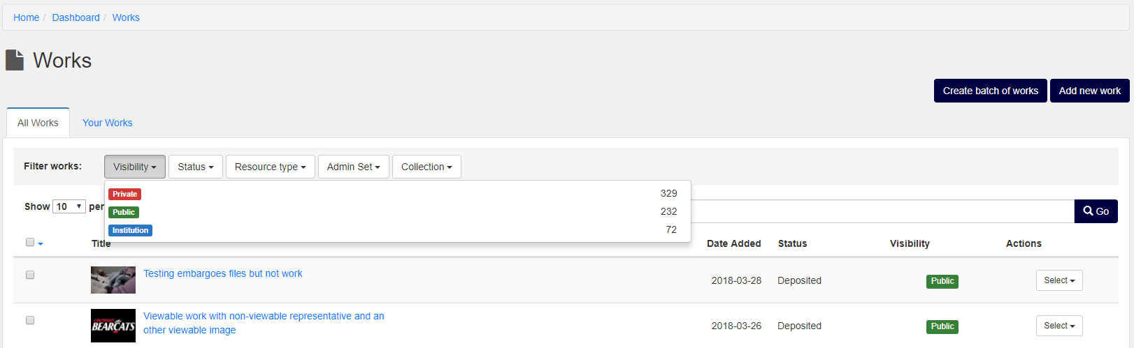
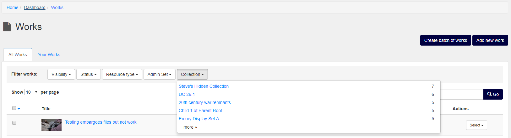
Long titles of collections and administrative sets overflow in the facet drop down menu.
Expected behavior
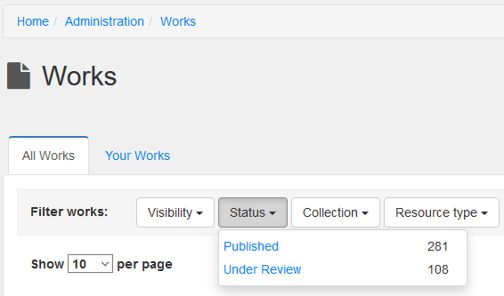
Facet options should be contained within facet menu:
Actual behavior
User:
Dev Tools:
Steps to reproduce the behavior
- Repository contents > Works
- Filter works by collection
Related work
moved from https://github.com/curationexperts/nurax/issues/177
 chrisdaaz
All 7 comments
@chrisdaaz Guessing this is using a plugin for the dropdown UI. The easy solution would be just 'cut off' the text from overflowing past the selection. Is that ok? Getting the text to wrap might be more difficult as you might be getting into the plugin's styles.
 adamjarling
on 20 Mar 2018
adamjarling
on 20 Mar 2018
@adamjarling what adjusting the width of the drop-down.
it starts to look better by tripling it:
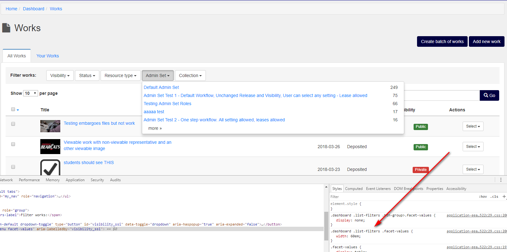
i don't know what the optimal width would be because it affects the other fields too:
@samvera/hyrax-ui-ux-advisors
chrisdaaz
on 29 Mar 2018
@chrisdaaz Yeah I'm with @adamjarling on the truncating the long collection names and perhaps using an ellipses at the end. Otherwise you get into word wrapping and then the dropdown gets really long vertically. Perhaps filtering by collections in this manner isn't ideal if a) they are wordy b) there are a lot of them?
 mtribone
on 29 Mar 2018
mtribone
on 29 Mar 2018
If you truncate the collection/admin set titles (a reasonable idea, since I suspect relatively few real admin set/collection titles will be as long as the longer examples in the screenshots and thus it won't happen all that often), you definitely should add ellipses to indicate the title was truncated. I think the Rails truncate method makes this pretty easy.
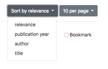
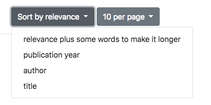
I believe you should be able to make the pulldown menus automatically adjust to the longest item in the list, rather than setting a fixed width. As an example, see the results page of the Blacklight Demo, where there are two pulldown menus:
Default width
With a longer title (no CSS changes)
Worst case, you should be able to add classes to the menus you want to make wider and target those specifically in the CSS, so you don't affect the other menus that don't need to be wider (but again, I don't think that approach is optimal or necessary).
 ggeisler
on 29 Mar 2018
ggeisler
on 29 Mar 2018
@mtribone @ggeisler @adamjarling From the notes in this issue, I am seeing consensus in the approach to truncate the title and add ellipses. Please give thumbs up on this and I will work on getting someone to fix this issue.
 elrayle
on 30 Mar 2018
elrayle
on 30 Mar 2018
@elrayle I'll pick this up. I think the best approach will be to try @ggeisler 's suggestion and truncate on the Rails end, as <select> <option> might not pick up the standard CSS "ellipsis" style. And I also think best to let the dropdown menu stay dynamic width instead of fixed.
If we provide a Rails title truncation for this piece of UI, cap it at 7-8 words? I'll play with it and see what seems reasonable...
adamjarling
on 4 Apr 2018
@elrayle In the local dev environment, how do I get the "Collections" dropdown to appear in the "Filter Works" section of the Works page (trying to match the original screen shot above in this ticket, from Nurax)? I see "Admin Sets", but not "Collections"...
adamjarling
on 11 Apr 2018
Related issues
 tahirpoduska
·
6Comments
tahirpoduska
·
6Comments
 younga3
·
6Comments
younga3
·
6Comments
 carolyncole
·
4Comments
carolyncole
·
4Comments
 mbklein
·
4Comments
mbklein
·
4Comments
 straleyb
·
6Comments
straleyb
·
6Comments
Most helpful comment
@mtribone @ggeisler @adamjarling From the notes in this issue, I am seeing consensus in the approach to truncate the title and add ellipses. Please give thumbs up on this and I will work on getting someone to fix this issue.