Hyrax: Search results have no dividing lines
See nurax issues for comments: https://github.com/curationexperts/nurax/issues/158
Descriptive summary
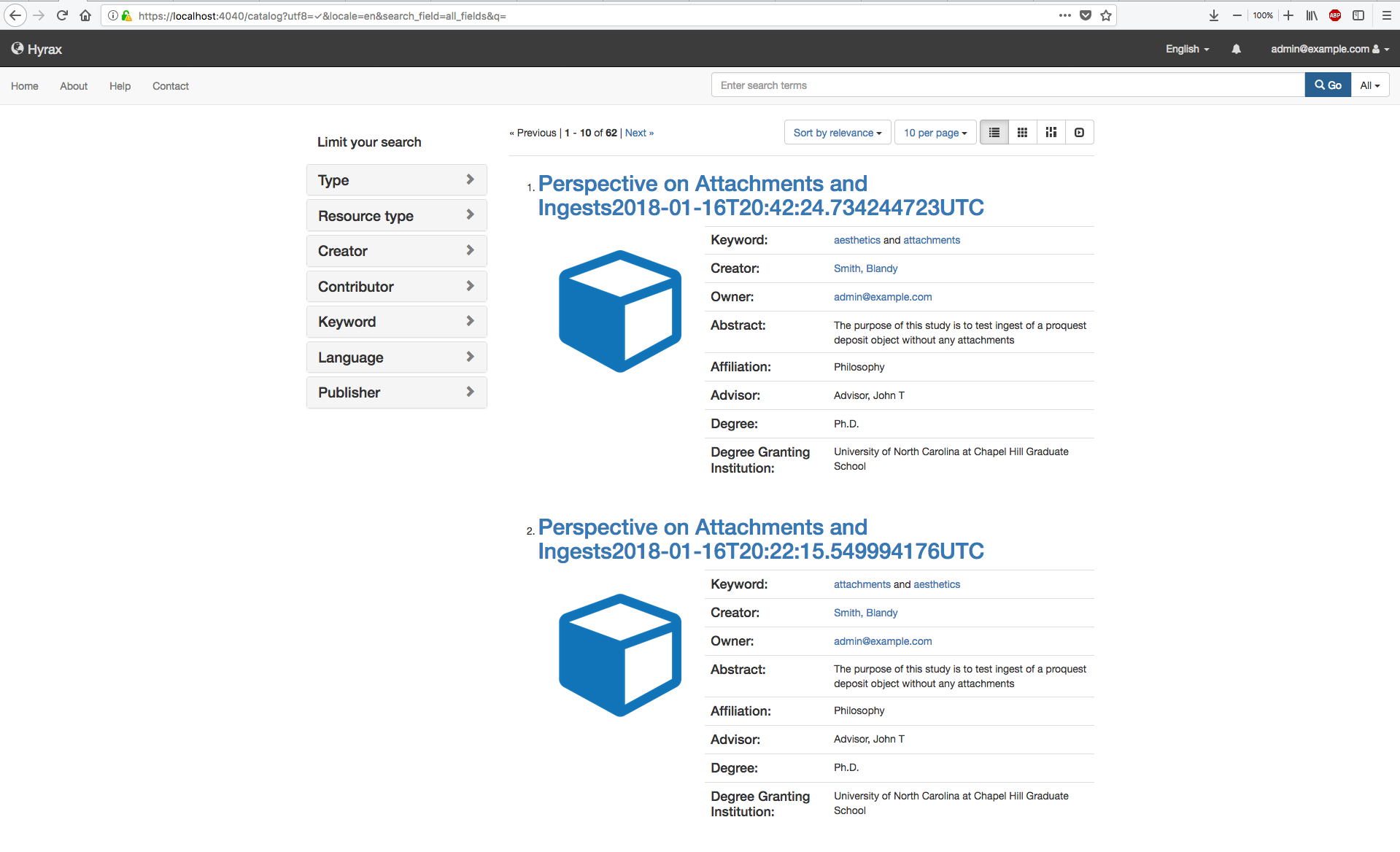
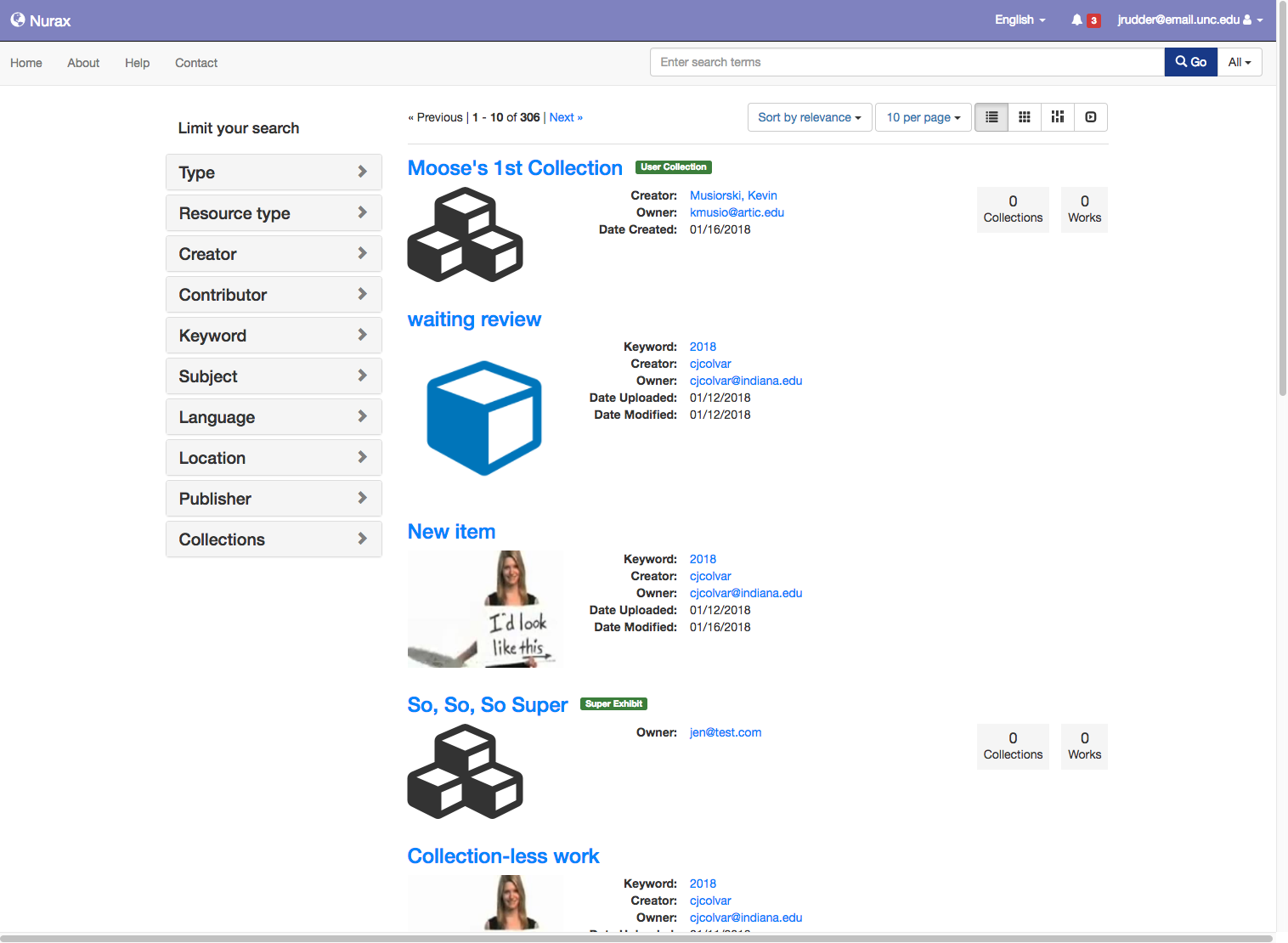
The search results page has changed and I'm not sure if it's intentional or not. It does seem less readable with lots of whitespace and the loss of separating lines between results.
Before shot in 2.0:
Now:
 julesies
All 14 comments
@jrr @vantuyls @no-reply @jcoyne This was a redesign based on the UI/UX mockups. The change was requested in issue https://github.com/samvera/hyrax/issues/1473
Additional discussion in nurax issue https://github.com/curationexperts/nurax/issues/158
@ggeisler Can you comment?
 elrayle
on 1 Mar 2018
elrayle
on 1 Mar 2018
@julesies @elrayle Comparing before and after screenshots it doesn't look to me that there was a "loss of separating lines between results"; what was removed was the separating lines between metadata fields for each item. I don't know what mockup was used to make those changes, but in the closest mockup of mine that I can find (below) you'll see that I did include separating lines between results items:
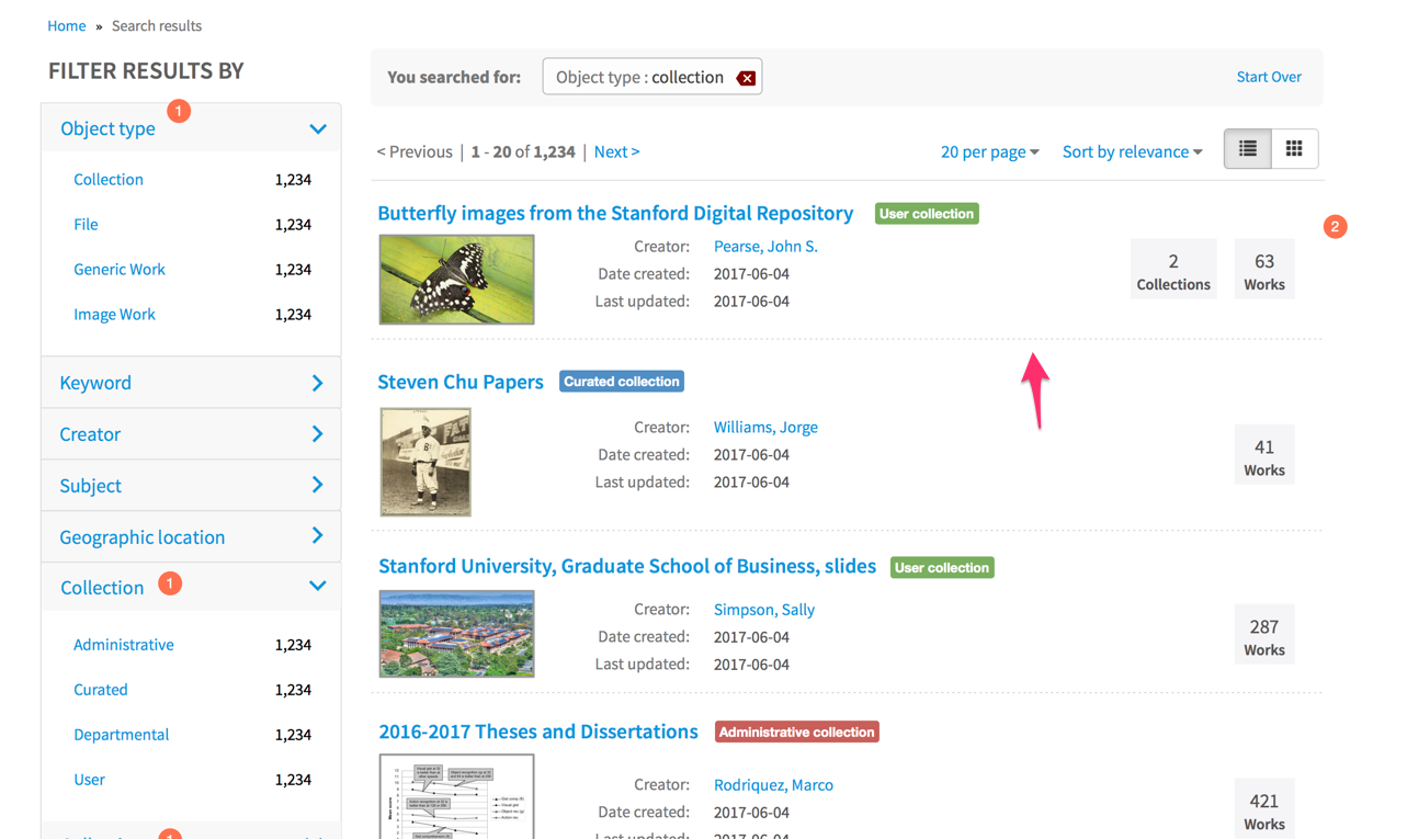
Feel free to make whatever changes you want, but in my opinion including separation lines between results, rather than between metadata fields, is sufficient to distinguish results. That's all Blacklight does, for example.
I also think the "before" screenshot appears to separate result items better because it happens to include items that have longer titles, which help to serve as a more clear separator between items, as well as longer metadata values. So that's partly why the "now" screenshot has more whitespace (although whitespace is generally considered to be an aid to readability, so I'm not sure more whitespace is a bad thing).
Finally, I'd also suggest the metadata fields in the current version are too close together, vertically (compare with my mockup above). They could probably use about 6 - 10px of additional padding between them. And, in my opinion, the size of the icons/thumbnails for each result item is too large (vertically).
 ggeisler
on 1 Mar 2018
ggeisler
on 1 Mar 2018
@ggeisler you can see here better that there are no longer separating lines between search results.
https://nurax.curationexperts.com/catalog?utf8=%E2%9C%93&locale=en&search_field=all_fields&q=
julesies
on 1 Mar 2018
@julesies Sure, thanks, but my point is I don't think I suggested there not be any separating lines between result items. @elrayle implied that your "now" layout is based on my mockups, but I cannot find any mockup I've done that doesn't include the separation line between result items. My mockups also don't show the metadata fields to be so cramped vertically. So to me this is an implementation issue, not a design issue. I had no involvement in the implementation of my designs. All I can offer is that you all consider the suggestions I made in my previous comment.
ggeisler
on 1 Mar 2018
@ggeisler ah okay! We were assuming this change was unintentional and not based on mockups as there was not a PR that intentionally made any changes to this view (to my knowledge).
It's good and helpful to have this mockup for the fix. thanks for giving feedback on why the view is off. Much easier now to hand off to a dev with your suggestions above in addition to adding a line between results.
julesies
on 1 Mar 2018
@elrayle ☝️ based on comments on the other tickets this change was unintentional.
julesies
on 1 Mar 2018
The same mockup was used for the refactor, but it appears that a few things got missed.
To summarize from @ggeisler, it looks like the following work remains...
- [x] add separating lines between results (not between metadata fields)
- [x] add a bit more spacing between the metadata fields
- [ ] change text 'Limit your search' to 'FILTER RESULTS BY'
- [x] change text 'Clear filters' to 'Start Over' (visible when filters applied)
elrayle
on 1 Mar 2018
@elrayle I'd suggest the last two of the items in your comment above are "optional" in that someone might want to make sure they are consistent with the current application UI in general. They are more minor updates and without being involved in the current application development I can't say whether they still make sense to change or not.
ggeisler
on 1 Mar 2018
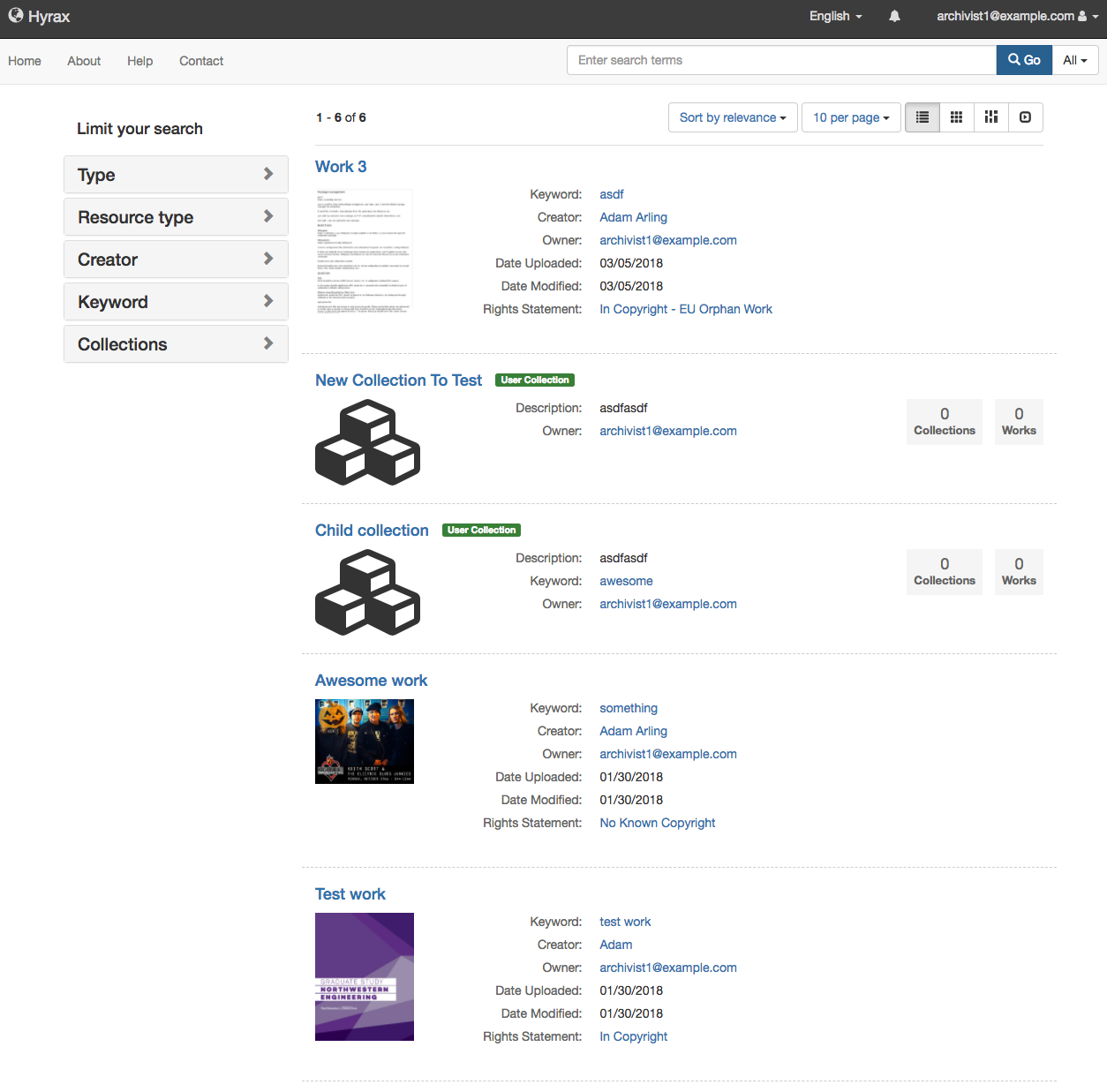
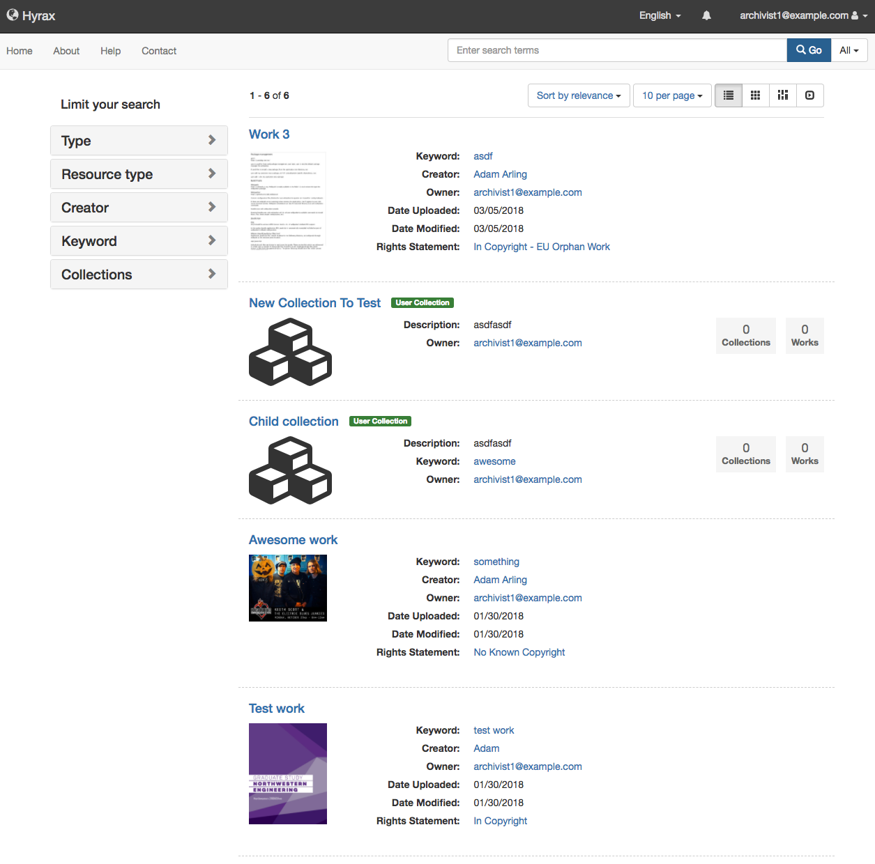
@ggeisler Hey, I'm working on this now, and the wireframe above is super helpful. For the metadata definition list titles ('Creator:', 'Date created:', etc.) should I stray from Bootstrap's <dl> styling and make the labels lighter colored (greyish) and non-bold? Here's how it'd look in Hyrax:
 adamjarling
on 5 Mar 2018
adamjarling
on 5 Mar 2018
or standard:
adamjarling
on 5 Mar 2018
@adamjarling Either approach looks okay to me (I like the improvements you made). Maybe the deciding factor is to be consistent with any existing pages that show metadata in a similar <dl> approach. I'm not familiar with the current state of the app but maybe being consistent with the Work show page metadata presentation, for example?
Sorry for the inconsistency but when doing wireframes for Samvera I was sometimes conflicted over making what I thought were visual design improvements versus being consistent with design I think could be improved.
ggeisler
on 5 Mar 2018
@ggeisler No worries. The current pattern for <dl> follows suit with Bootstrap default: bolded titles. I like your design, seems cleaner, but perhaps a better approach would be to make this style pattern consistent across all the application's <dl>s at a later date.
adamjarling
on 5 Mar 2018
@elrayle The text line in your checkbox list above "change text 'Limit your search' to 'FILTER RESULTS BY'" I think is coming from Blacklight. Do we want to pull in the Blacklight view/partial and override it in Hyrax?
adamjarling
on 5 Mar 2018
Not at this point. We'll wait for another round of UI/UX analysis and recommendations.
elrayle
on 7 Mar 2018
Related issues
 jcoyne
·
5Comments
jcoyne
·
5Comments
 svanschuyver
·
5Comments
svanschuyver
·
5Comments
 carolyncole
·
4Comments
carolyncole
·
4Comments
 mjgiarlo
·
6Comments
mjgiarlo
·
3Comments
mjgiarlo
·
6Comments
mjgiarlo
·
3Comments
Most helpful comment
@julesies @elrayle Comparing before and after screenshots it doesn't look to me that there was a "loss of separating lines between results"; what was removed was the separating lines between metadata fields for each item. I don't know what mockup was used to make those changes, but in the closest mockup of mine that I can find (below) you'll see that I did include separating lines between results items:
Feel free to make whatever changes you want, but in my opinion including separation lines between results, rather than between metadata fields, is sufficient to distinguish results. That's all Blacklight does, for example.
I also think the "before" screenshot appears to separate result items better because it happens to include items that have longer titles, which help to serve as a more clear separator between items, as well as longer metadata values. So that's partly why the "now" screenshot has more whitespace (although whitespace is generally considered to be an aid to readability, so I'm not sure more whitespace is a bad thing).
Finally, I'd also suggest the metadata fields in the current version are too close together, vertically (compare with my mockup above). They could probably use about 6 - 10px of additional padding between them. And, in my opinion, the size of the icons/thumbnails for each result item is too large (vertically).