There was no padding in the header before:

But now it does have it:
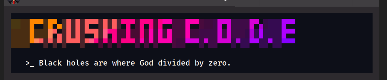
Nothing changed in the _index.md file
    height: 155
    paddingX: 50
    paddingY: 0
    align: left
 nisrulz
All 20 comments
The text moved a bit up and is not in line with the drop icon and the logo

The whole bar:

nisrulz
on 25 Jan 2020
Something changed when I tried to support IE11.
Thanks! Will be fixed
Edit: The header padding deleted. but the navbar icon, when I test it on my end, it seems to align well.

I made some changes here https://github.com/zzossig/hugo-theme-zzo/commit/4663bd7e4f5809cb5c2feaadcb6dd304c2ef7b89#diff-3a7b22602cbde6317d65381673cac126R29
Let me know if it's still not aligned
 zzossig
on 26 Jan 2020
zzossig
on 26 Jan 2020
I meant this actually:
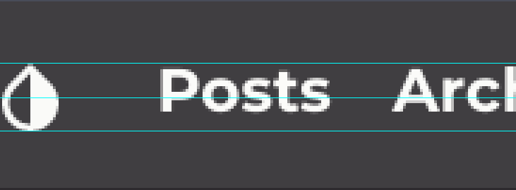

The text is not vertically centered wrt to the height of the logo or drop icon.
I will look into it and maybe open a PR.
Edit:
Maybe it is not fixable right away. I don't see anything in the css that could be causing this.
Will investigate further.
nisrulz
on 26 Jan 2020
I think the logo text aligned well.
But look like the icon in the image is still mispositioned.
I made some changes. Looks good my end
zzossig
on 26 Jan 2020
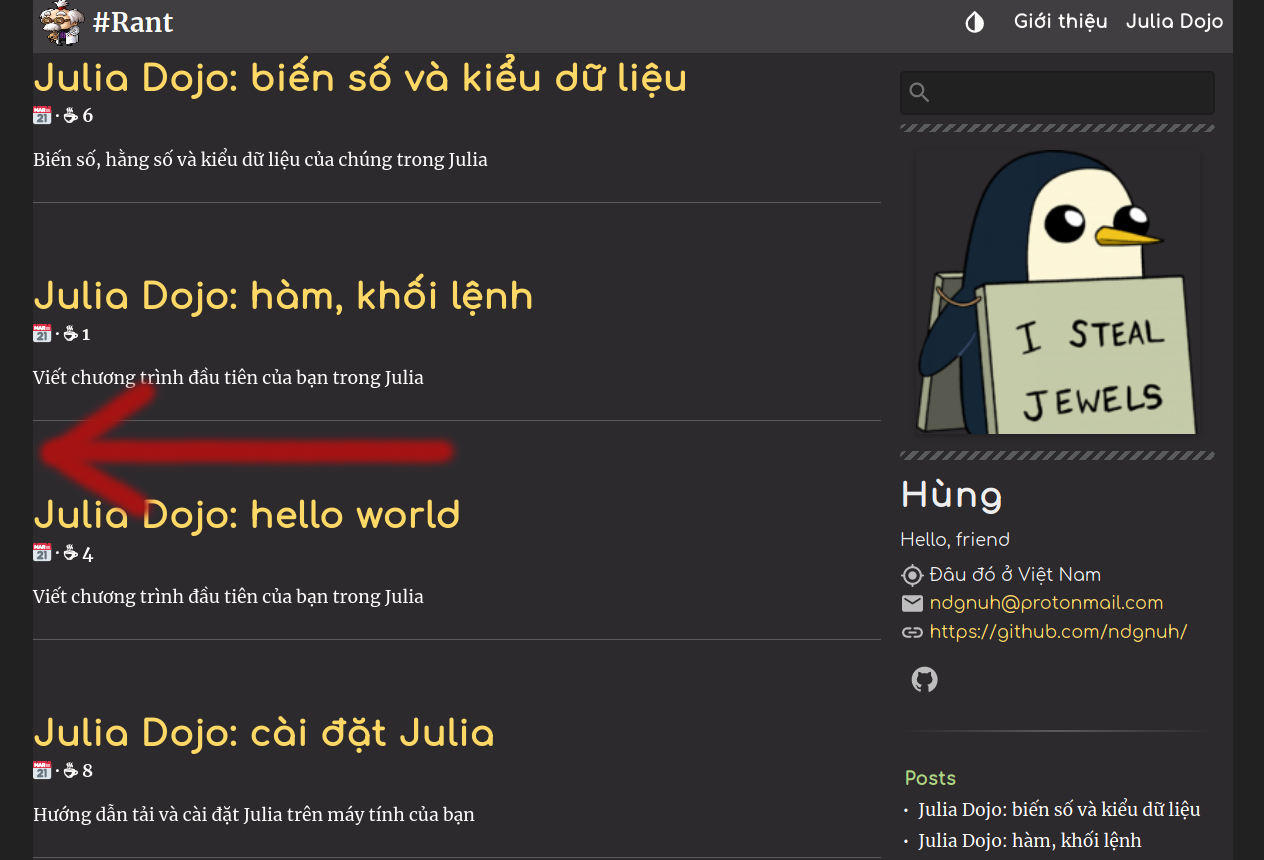
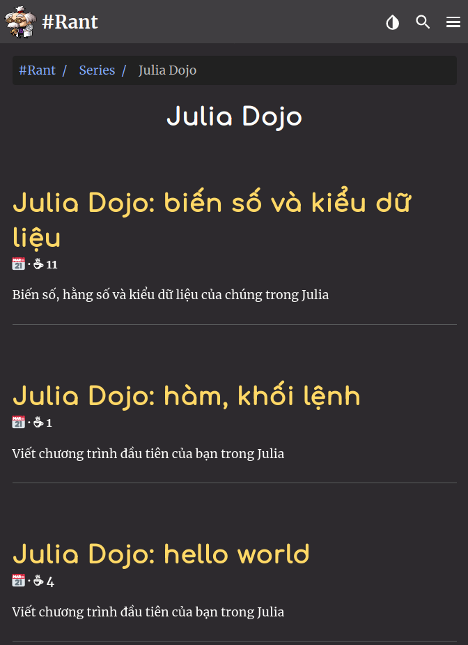
I think the list of posts can use a little padding too. Mine just looks like this, with no padding at all:
 ndgnuh
on 27 Jan 2020
ndgnuh
on 27 Jan 2020
Edit: Did you update the theme latest? I can't reproduce it on my end
zzossig
on 27 Jan 2020
Edit: Did you update the theme latest? I can't reproduce it on my end
I actually updated the theme just before taking that screenshot, let my try updating again...
Edit: yes, the theme is up-to-date. I notice that this is only obvious when you move the sidebar to the right.
ndgnuh
on 27 Jan 2020
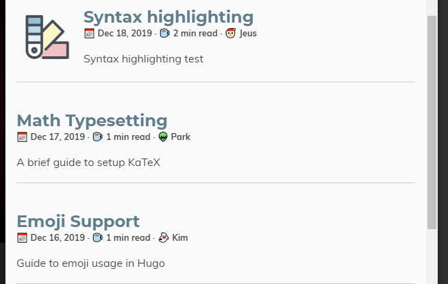
Can you check the issue on this site?
https://themes.gohugo.io/theme/hugo-theme-zzo/en
Or can you give me some repository that I can take a look at?
The official demo site looks fine
zzossig
on 27 Jan 2020
Weird, the example site looks fine, I'll have to check if I messed something up.
Edit: I inspected both sites and found some different:
The article card from my website:
<article class="summary-card">
  <header>
    <h5 class="title h5"><a href="http://localhost:1313/julia-dojo/variables-constants/"> Julia Dojo: biến số và kiểu dữ liệu</a> </h5>
    <h6 class="subtitle caption"><time title="">📅 </time>  <span title=""> · ☕ 11 </span></h6>
  </header>
  <div class="summary-card__content">
    <div class="summary-card__text p2">
      Biến số, hằng số và kiểu dữ liệu của chúng trong Julia
    </div>
  </div>
  <hr>
</article>
The one from the example site:
<article class="summary-classic">
<div class="summary-classic__flex-box">
<div class="summary-classic__content">
<header>
<h5 class="title h5"><a href="https://themes.gohugo.io//theme/hugo-theme-zzo/en/posts/math-typesetting/"> Math Typesetting</a> </h5>
<h6 class="subtitle caption"><time title="Written At">📅 Dec 17, 2019 </time> <span title="Reading Time"> · ☕ 1 min read </span>· <span title="WRITTEN BY">👽 Park</span></h6>
</header>
<div>
<div class="summary-classic__text p2">
A brief guide to setup KaTeX
</div>
</div>
</div>
</div>
<hr>
</article>
Ah, this is my mistake.
I just found that your blog uses summary shape to card.
I'll update soon
@ndgnuh One more update plz. I fixed it
zzossig
on 27 Jan 2020
Works perfectly. Thank you!
ndgnuh
on 27 Jan 2020
I want to report a few more problems (with some suggestion). Since this issue is about small UI fixes, I guess I'll put small visual bugs here.
The date shows up in my list, but not in single pages

Markdown in notice shortcodes
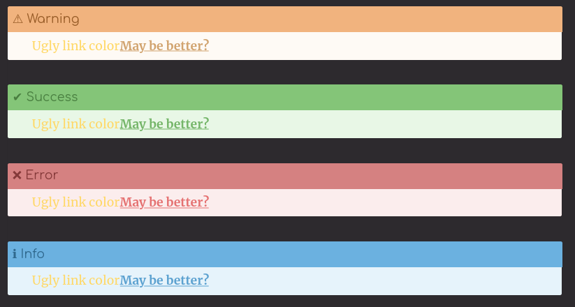
I suppose I can put markdownify in the notice shortcode, but then the element looks weird inside:
- The links are unreadable, i suggest make them bold, underline and have the color of the border minus 16 each color. (eg: info border is
#6bb1e0, we'll use#5bc1d0for the links)
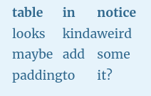
The tables doesn't have any padding
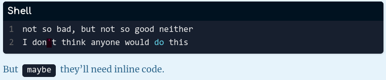
Code elements doesn't really goes with the notice (still, it's readable)
Headers inside notice is possible, but it's weird and impractical to do this, let's just skip this one
ndgnuh
on 30 Jan 2020
Thanks for the issue, I always welcome the UI fixes.
I have some questions.
Do you have
i18nfile in your language? In your case, you may needvi.tomlfile inroot/i18nfolder
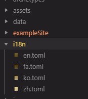
I don't understand what you mean
Code elements doesn't really goes with the notice (still, it's readable)
How can I do for this?
zzossig
on 30 Jan 2020
- I have i18n folder and file for my language, but it's under /root, not /root/data/, I don't have my laptop now, so I'll try it later
- Sorry, I forgot to include suggestion. Imo the inline codes should have the same background color of the notice, but a little bit darker. Since they don't have highlight, you won't have to worry about readability. I think multiline code fences is fine they way it is, there's no reason to include it in a notice anyway.
ndgnuh
on 30 Jan 2020
Oops I mistyped. Your i18n file should inside the root/i18n folder, not data folder.
Ok I’ll do some work on this
zzossig
on 30 Jan 2020
@ndgnuh
Now we have better notice shortcode thanks for your advice.
And I suspect you might have the wrong configuration regarding i18n.
Check the defaultContentLanguage value set to your language, check the languages.toml file,
zzossig
on 30 Jan 2020
The date bug was by bad, sorry, I didn't read the example i18n/en.toml. But I suggest the README should either: link to the example i18n/en.toml, or suggest users to copy that file then modify it instead of making a new one.
Edit: the new notice shortcode looks awesome, also
ndgnuh
on 30 Jan 2020
Ok, I’ll add it in the documentation
zzossig
on 30 Jan 2020
I've ran into some other problems:
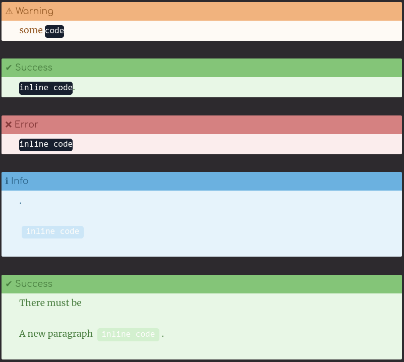
- Inline code have different color when it's on the first paragraph.
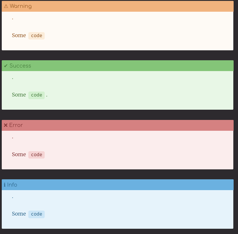
- The white color doesn't look easy to read in the second bg, maybe using the same text color as the paragraph for inline code block?
Current:
Suggestion (I changed code's color to inherit)
ndgnuh
on 30 Jan 2020
@ndgnuh Thanks for the suggestion.
I made some changes. I didn't used inherit but it works anyway.
And always feel free to open new issue to suggest fixing UI.
I prefer to solve the issue one by one, each of them keeps the small piece and deal with only one subject.
@nisrulz I'm closing this issue because this thread is too long and I think the icon is aligned center now.
zzossig
on 31 Jan 2020
Related issues
 VictorZakharov
·
3Comments
zzossig
·
6Comments
nisrulz
·
5Comments
VictorZakharov
·
3Comments
zzossig
·
6Comments
nisrulz
·
5Comments
 Gictorbit
·
3Comments
nisrulz
·
4Comments
Gictorbit
·
3Comments
nisrulz
·
4Comments
Most helpful comment
@ndgnuh Thanks for the suggestion.
I made some changes. I didn't used
inheritbut it works anyway.And always feel free to open new issue to suggest fixing UI.
I prefer to solve the issue one by one, each of them keeps the small piece and deal with only one subject.
@nisrulz I'm closing this issue because this thread is too long and I think the icon is aligned center now.