Hugo-theme-zzo: Blog has issues with being responsive
Here are some examples:

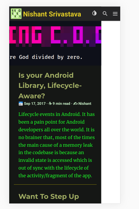

- Notice the white space on the side.
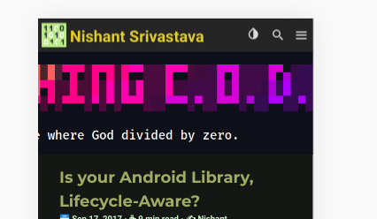
- Notice if I just have the background image for the header, it is not scaled down to fill the container but is cut off from the sides.
How to test:
- Right click and select inspect
- Select mobile view and then change width.
- Select devices option from the top bar. It breaks for iPhone 5/6/7 and Samsung Galaxy devices.
 nisrulz
All 9 comments
Thank you for the issue!
I'll fix it soon😊
 zzossig
on 13 Jan 2020
zzossig
on 13 Jan 2020
I found that your update-dependencies-code-repeat.md file,
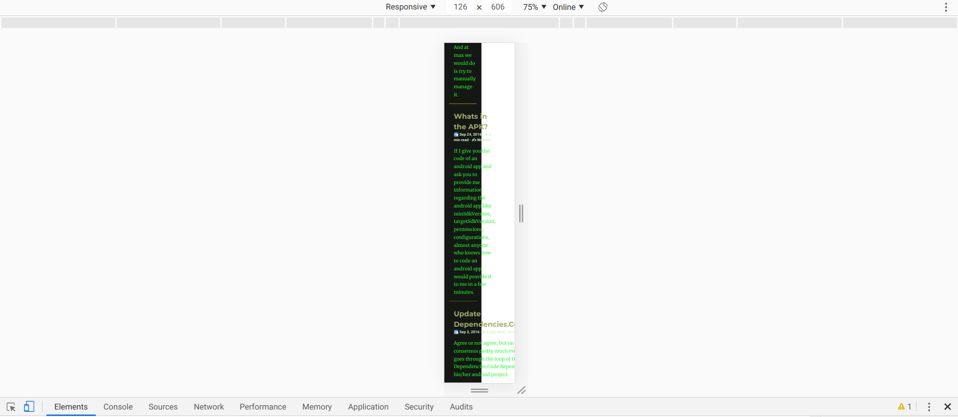
the browser doesn't wrap the title Update Dependencies.Code.Repeat
zzossig
on 13 Jan 2020
You mean this:
nisrulz
on 13 Jan 2020
I found that your
update-dependencies-code-repeat.mdfile,
the browser doesn't wrap the titleUpdate Dependencies.Code.Repeat
I have bigger titles than just that. I think the longest is this: "I could not find a simple Gesture Detection android library, so I built one"
nisrulz
on 13 Jan 2020
Can you edit the update-dependencies-code-repeat.md file
this
title = "Update Dependencies.Code.Repeat."
to this
title = "Update Dependencies .Code. Repeat."
add space between .
This is just a quick solution. I'll investigate more about it.
zzossig
on 13 Jan 2020
I updated to wrap the summary title
zzossig
on 13 Jan 2020
Whatever change you made, fixed the responsive issue. Now the blog fits in all phone sizes. I just tested! :tada:
The only question to ask is can the background image for header also scale down to fit ?
nisrulz
on 13 Jan 2020
Can you try to change the imageSize param?
- type: img
    ...
    imageSize:
    ...
imageSize: auto | length | cover | contain | initial | inherit
If it does not solve the problem, tell me
zzossig
on 13 Jan 2020
I think contain works. I am looking into making it work. I think this issue can be closed.
Thank you :)
nisrulz
on 13 Jan 2020
Related issues
nisrulz
·
5Comments
nisrulz
·
5Comments
 Gictorbit
·
4Comments
Gictorbit
·
3Comments
Gictorbit
·
4Comments
Gictorbit
·
3Comments
 jtara
·
7Comments
jtara
·
7Comments