Holoviews: implement "robust" colormaps in the presence of outliers
Is your feature request related to a problem? Please describe.
I am frustrated when I use holoviews (often with datashader) and the colorbar chosen does not show what I want because of the presence of outliers.
Describe the solution you'd like
I would like holoviews to implement the robust keyword, similar to xarray: http://xarray.pydata.org/en/stable/plotting.html#robust
The easy way to visualize the data without the outliers is to pass the parameter robust=True. This will use the 2nd and 98th percentiles of the data to compute the color limits.
Describe alternatives you've considered
I can manually set the colorbar limits. However, this does not work well with datashader, when I am exploring a large image
Additional context
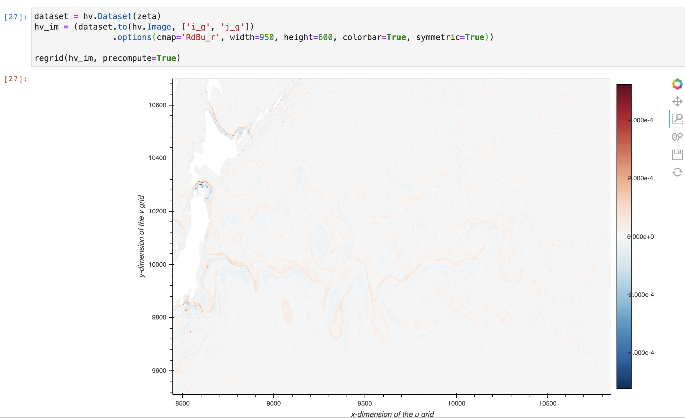
Example of a washed out, uninformative default colormap
 rabernat
All 4 comments
I like this idea, should be straightforward to implement and should be able to go into 1.14.0, due in two weeks.
 philippjfr
on 12 Nov 2020
philippjfr
on 12 Nov 2020
We should also very soon have support in Bokeh for proper colorbars for histogram-equalized colormappers. At that point I'd recommend viewing the same data multiple ways to really understand how it is distributed in the value dimension:
- The eq_hist version will give let you see patterning across the full value range, even for very skewed data, but gives a color bar that's more difficult to interpret numerically because it's not regularly spaced
- For roughly linearly or log distributed data with outliers, robust linear or log auto-ranging should work similarly to eq_hist but is better for sharing your results because the numeric range is much more interpretable. But if outliers come in clumps, you'll get very different plots than with eq_hist.
- Pure auto-ranged linear or log colormapping unambiguously shows the actual range, which will be very sensitive to outliers but still tells you something important.
If all three of these are similar, then your data is very well behaved and it doesn't much matter which you choose. If one of these is very different from the others in appearance, then it's really important to take the time to understand those differences so that you can draw reasonable conclusions.
 jbednar
on 12 Nov 2020
jbednar
on 12 Nov 2020
I think it'd be neat if colorbars could be directly zoomed in/out like the x/y-axis. Currently, one could add a slider
jslinked to the colorbar. https://discourse.holoviz.org/t/how-to-use-jslink-for-updating-plot-properties/1088
 ahuang11
on 13 Nov 2020
ahuang11
on 13 Nov 2020
Implemented as clim_percentile which can be set to True (to match the behavior of robust in xarray) or a specific percentile value.
philippjfr
on 30 Nov 2020
Related issues
 nbren12
·
5Comments
nbren12
·
5Comments
 rjp23
·
4Comments
ahuang11
·
5Comments
rjp23
·
4Comments
ahuang11
·
5Comments
 claresloggett
·
5Comments
claresloggett
·
5Comments
 Forander
·
6Comments
Forander
·
6Comments
Most helpful comment
Implemented as
clim_percentilewhich can be set to True (to match the behavior ofrobustin xarray) or a specific percentile value.