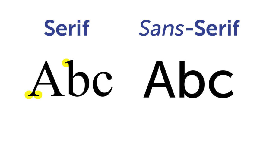
Heidisql: Dont use Serif for the logo
Nice with a new logo but having Serif as the font in the logo does no good for it.
I really think the readability on small icons and screens the logo could be improved if you used Sans Serif
Also I see no Serif other places:


 gemal
gemal
All 15 comments
Really?
Sigh.. well I see your point.
 ansgarbecker
on 2 Mar 2020
ansgarbecker
on 2 Mar 2020
Really, make sense. But taking advantage of the topic, the new icon, although more elegant, is practically unreadable in 16x16 (the upper part).

 rentalhost
on 2 Mar 2020
rentalhost
on 2 Mar 2020
FWIW, i liked the yellow in the previous logo more than the white in the new one.
/$0.02
 leeoniya
on 2 Mar 2020
leeoniya
on 2 Mar 2020
The "new" logo in my opinion is ugly and almost unreadable. Fortunately the old one is still used in the uninstaller and I could use that one instead.
 wrufeger
on 3 Mar 2020
wrufeger
on 3 Mar 2020
So you say I should bring back the old one?
ansgarbecker
on 3 Mar 2020
I actually like the new logo, just with a minor "fix" for the serif font :)
gemal
on 3 Mar 2020
I would return to the old icon as it was a recognizable CI for the last years. But in the end its your decision and its just an icon. Features, performance and stability are way more important.
wrufeger
on 4 Mar 2020
Here's a new attempt, bringing most of the old style back:

... here's the now less problematic 16px version:

ansgarbecker
on 5 Mar 2020
Maybe you can keep the new version, but for small versions (16px and 32px) you outline with a white color, so HS will be highlighted anyway.
How I don't have the source, so I did an (ugly) draft of Photoshop:
32px version (keep same, but with Sans-serif):

32px version:

16px version:

The radius of white outline could be reduced for 32px version, and the letter could be increased for 16px version a very bit.
I really liked of the new version because the outline seems like a glass border.
rentalhost
on 5 Mar 2020
Speaking of an icon that is practically unreadable in 16x16, in windows10 shortcuts it is missing.
But I really want to report the main ERROR: The Program is closing (does not respond) when the connection to the bank drops (Ex .: in cases of IP change)
 eletroe
on 5 Mar 2020
eletroe
on 5 Mar 2020
But I really want to report the main ERROR: The Program is closing (does not respond) when the connection to the bank drops (Ex .: in cases of IP change)
@eletroe please keep the discussion here on-topic.
https://github.com/HeidiSQL/HeidiSQL/issues/877 is already open for this - you would see this if you did a 30s issue search first. if you want to report something different than what's described there, please open a new issue.
leeoniya
on 5 Mar 2020
@leeoniya I don't speak your language, I used the translator for the report. Sorry if I offended you.
eletroe
on 5 Mar 2020
no worries, i was not offended.
leeoniya
on 5 Mar 2020
@rentalhost Thanks for your input. I just pushed exactly what you suggested, see the pdn file for Paint.net in the above commit. I think that's it.
ansgarbecker
on 6 Mar 2020
@ansgarbecker what is the font family?
rentalhost
on 17 Jun 2020
Related issues
 Ivan-Perez
·
3Comments
Ivan-Perez
·
3Comments
 chrysler5798
·
5Comments
chrysler5798
·
5Comments
 andreybatalof
·
4Comments
andreybatalof
·
4Comments
 mpaland
·
5Comments
mpaland
·
5Comments
 hkaraoglu
·
3Comments
hkaraoglu
·
3Comments
Most helpful comment
Here's a new attempt, bringing most of the old style back:
... here's the now less problematic 16px version: