Habitica: Heading level hierarchy is not accurately reflected by heading appearance (e.g., h5 larger than h3)
_The non-italics words below are taken direct from @citrusella's post in the Report a Bug guild. I've added [my own comments in italics and square brackets]._
Have been seeing how used to the new font changes I can get and noticing something that feels weird/confusing/possibly-buggy/unintended.
The h1, h2, h3, h4, h5, h6 hierarchy looks like this:
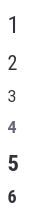
_[Below is the markdown code that produced those headings, with blank lines removed to save space.]_
# 1
## 2
### 3
#### 4
##### 5
###### 6
Is it deliberate that some in the middle are smaller? h3 feels especially confusing--it's the same size (or very slightly smaller) and weight/color (or again, very slightly different) as regular text and nigh indistinguishable from it, which is throwing me off every time I look at my task list because I have "header tasks" for different sections of my task list and now they just... look like not-due tasks. (I'm not sure "header tasks" is a super common use case, but it is one highlighted on the wiki--I was using h3 because it was small enough to not wrap on the majority of the header tasks I'd made and large enough as to be visually distinguishable from standard text.)
For example, here's h3 vs regular text (there's some spacing difference if the lines wrap but that's about it--the color is a little more distinguishable here than it is on tasks, BTW):
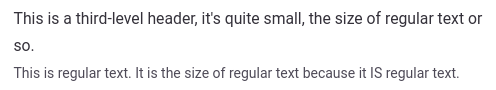
_[Below is the markdown code that produced those two lines.]_
### This is a third-level header, it's quite small, the size of regular text or so.

This is regular text. It is the size of regular text because it IS regular text.
I'm on the lookout for other things that look odd with the changes but I think most of the other things I go "weird, don't like that" with are just things I'm not used to yet.
_[I'm labelling this as needs design for a design-related decision. @Tressley ]_
 Alys
Alys
All 6 comments
I feel a need to note that the third-level text and regular text look closer for me than that screenshot looks (that screenshot looks like the h3 is slightly larger?).
 citrusella
on 26 Oct 2020
citrusella
on 26 Oct 2020
And just to be complete since I mentioned it looking even more indistinguishable on tasks... here's h3 versus normal text on tasks, where the text color is also closer:
(If it's not obvious: The first is h3 (###), the second is just text.)
citrusella
on 26 Oct 2020
Just a note that the headings styles are different between markdown (tasks, chat, ...) and normal non-markdown text. I think so far this issue has been around markdown headings
 paglias
on 26 Oct 2020
paglias
on 26 Oct 2020
I think the styling of some non-markdown headings changed too, but none of it has as confusing effects (visually, anyway) as far as I can tell.
citrusella
on 26 Oct 2020
There were changes to headings that accidentally touched the task styles. @negue is currently working on fixing them.
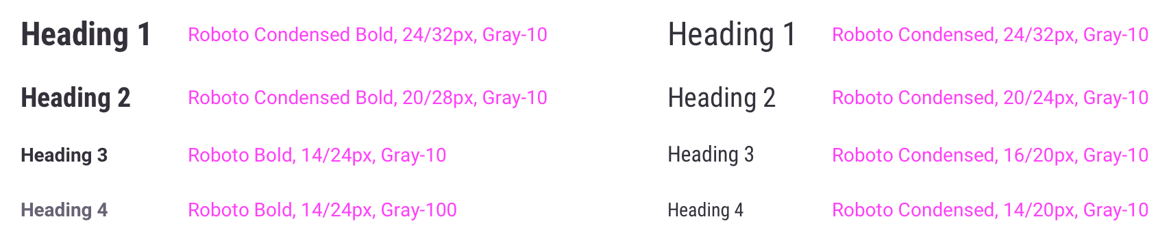
I'd like to point out that Habitica's type scale didn't account for h5 and h6 as they're not used in our UI. That would be the reason the type scale seems out of sorts. However, we have been making updates which you can see outlined here:
 Tressley
on 26 Oct 2020
Tressley
on 26 Oct 2020
@Tressley great, thanks! I've marked it as in progress since @negue is working on it
Alys
on 27 Oct 2020
Related issues
 evanostroski
·
4Comments
Alys
·
3Comments
evanostroski
·
4Comments
Alys
·
3Comments
 kantamablade
·
4Comments
Alys
·
4Comments
kantamablade
·
4Comments
Alys
·
4Comments
 thebadwolfgirl
·
4Comments
thebadwolfgirl
·
4Comments
Most helpful comment
There were changes to headings that accidentally touched the task styles. @negue is currently working on fixing them.
I'd like to point out that Habitica's type scale didn't account for h5 and h6 as they're not used in our UI. That would be the reason the type scale seems out of sorts. However, we have been making updates which you can see outlined here: