Gutenberg: Placeholders to look more like placeholders
Is your feature request related to a problem? Please describe.
With the direction of G2 styling, placeholders look a bit too much like the rest of the UI, with little distinction with it. I suggest modifying the placeholder component a bit to make it more apparent that its drag-and-drop capable (if the prop exists), and stands out as a placeholder more.
Some callouts:
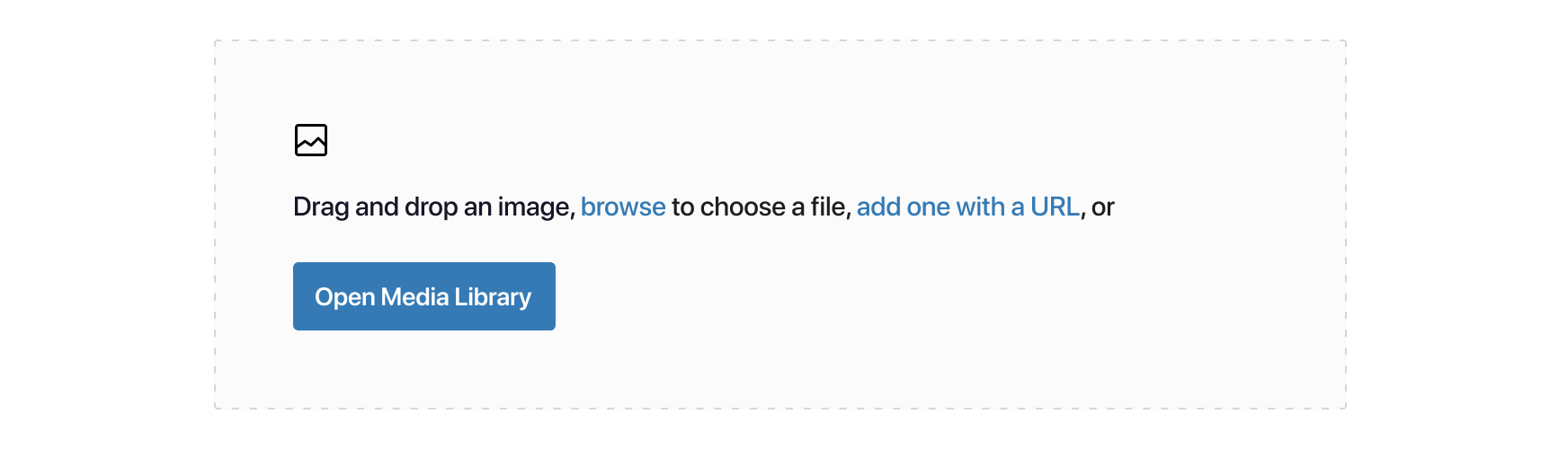
- Currently we don't draw any attention to the drag-and-drop nature of the placeholder. It doesn't look, or say, the part. I added a dashed border to draw attention to that, as well as added language for it.
- I noticed that "Browse" is used a good bit for referencing the uploading of assets online.
- I simplified the instructions + multiple call to actions by combining them and using the descriptive text as CTAs.
- I moved the Media Library action as the primary here, though we could move it to Browse/Upload if data suggests that's the primary action.
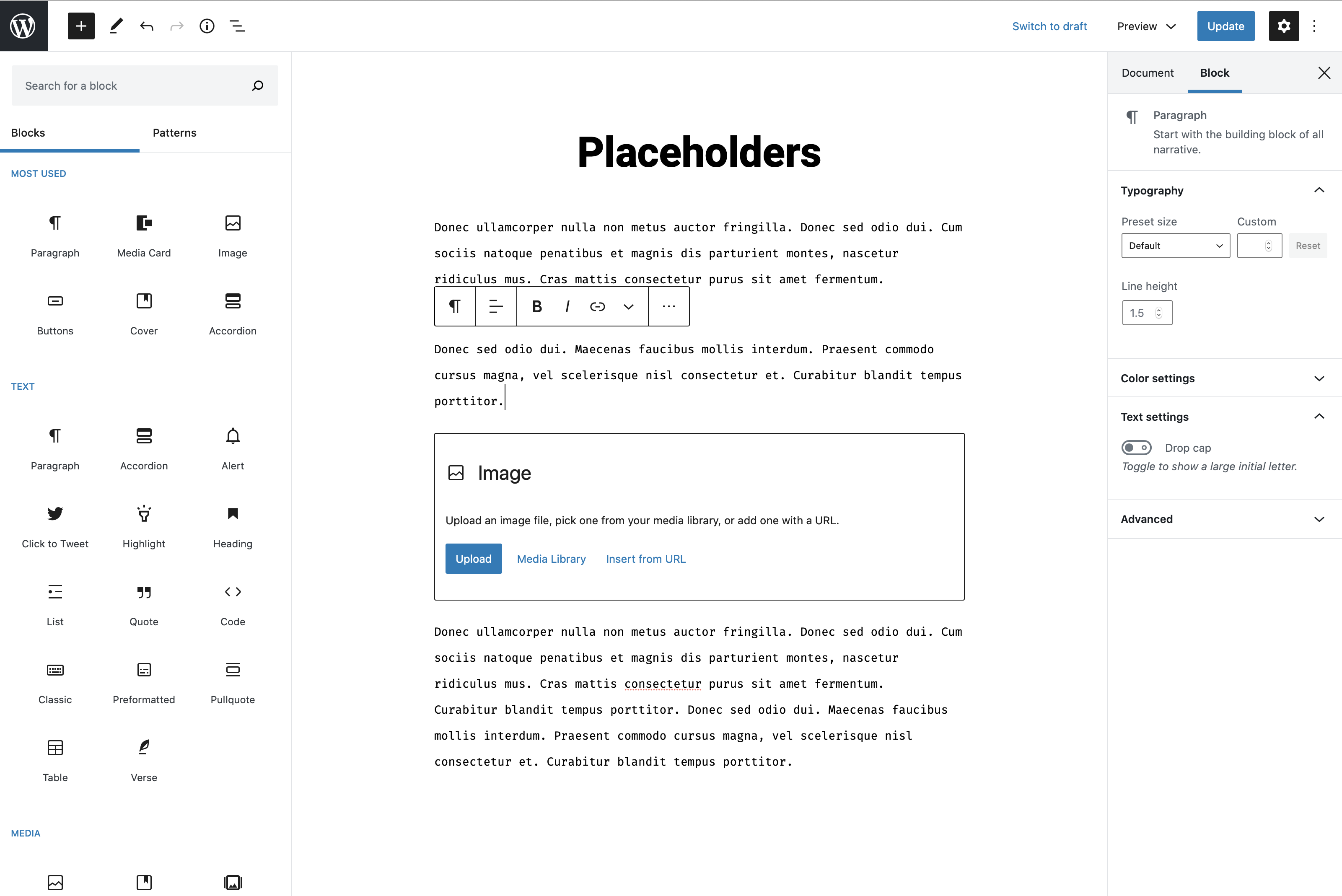
Current placeholder in full context:
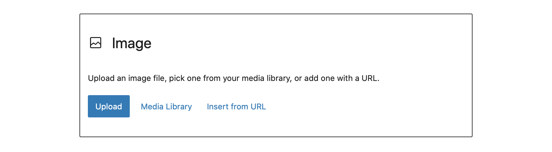
Current placeholder:
Suggested:
Thoughts? :)
 richtabor
All 3 comments
This looks great @richtabor .
P.S. Looking back I think the placeholders (and a few other bits of the Gutenberg UI) have regressed as they were better with a grey background and center aligned.
 NewJenk
on 12 Jun 2020
NewJenk
on 12 Jun 2020
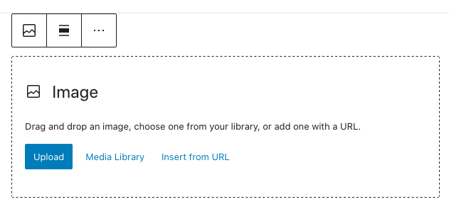
Perhaps there's a compromise that could be made here that's closer to the current design using higher contrast colors and almost identical patterns.
Forgive my in-browser mock:
 MichaelArestad
on 3 Jul 2020
MichaelArestad
on 3 Jul 2020
I agree the compromise is a big step in the right direction. How about a background color as well? 🙏
richtabor
on 6 Jul 2020
Related issues
 aduth
·
3Comments
aduth
·
3Comments
 nylen
·
3Comments
nylen
·
3Comments
 pfefferle
·
3Comments
pfefferle
·
3Comments
 moorscode
·
3Comments
moorscode
·
3Comments
 maddisondesigns
·
3Comments
maddisondesigns
·
3Comments
Most helpful comment
This looks great @richtabor .
P.S. Looking back I think the placeholders (and a few other bits of the Gutenberg UI) have regressed as they were better with a grey background and center aligned.