Gutenberg: Improve drag handle on blocks
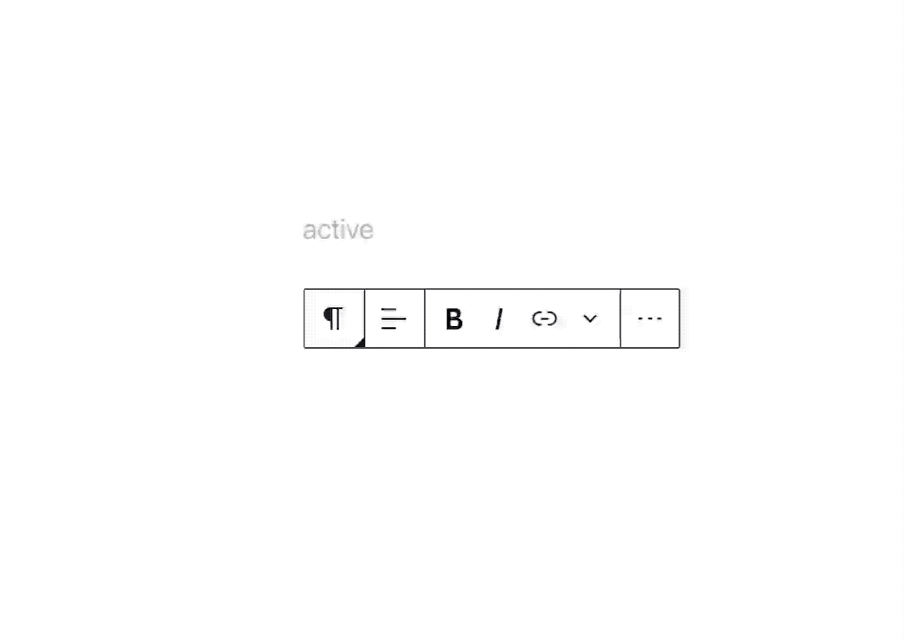
When pressing on the movers to drag a block we are only changing the cursor icon. We should look at updating the handle itself (following the proposed prototype: dark background and handle instead of arrows) to reflect the change in state better:
I think we should also start with adding tap-to-drag when in "selection" mode by default. In Selection mode:
- Click / Tap engages edit mode.
- Click / Tap and Drag moves the block.
 mtias
mtias
All 6 comments
At the same time we also need a bigger drop zone. A thin blue line makes it more difficult to drop exactly where one wants to drag the block to. https://github.com/WordPress/gutenberg/issues/8540
 paaljoachim
on 10 Mar 2020
paaljoachim
on 10 Mar 2020
Ideally we also implement some sort of drag displacement, so that dragging a block makes space for it. Example: https://codesandbox.io/s/framer-motion-drag-to-reorder-pkm1k?fontsize=14&module=%2Fsrc%2FExample.tsx
mtias
on 10 Mar 2020
I also think that having to hover over the toolbar to show the drag and drop tool adds an unnecessary and confusing step. Also the current visual of just an up and down arrow doesn't imply that it can be dragged, just that it can be clicked up and down. Not good. Old way was better.
 giorov
on 23 Mar 2020
giorov
on 23 Mar 2020
Another thing that came up here.
https://github.com/WordPress/gutenberg/issues/21199
"No borders around blocks so I can't see if I'm actually dragging a block into another (container) block;"
We could give a visual signal of the size of the block one is dragging from one location to another.
paaljoachim
on 30 Mar 2020
I've noticed a few people commenting that they can't find the block drag handle since it was moved to the toolbar:
- https://wordpress.slack.com/archives/C02QB2JS7/p1584003176266800
- https://wordpress.slack.com/archives/C02QB2JS7/p1585826232434100
- https://github.com/WordPress/gutenberg/issues/20840
So I think discoverability could be improved.
One easy option is to have a slightly more informative label for the buttons (as long it's relatively short). E.g. "Move up or hold to drag".
 talldan
on 6 Apr 2020
talldan
on 6 Apr 2020
@jasmussen is working on a drag and drop PR here: https://github.com/WordPress/gutenberg/pull/23024
paaljoachim
on 10 Jun 2020
Related issues
 wpalchemist
·
3Comments
wpalchemist
·
3Comments
 jasmussen
·
3Comments
jasmussen
·
3Comments
jasmussen
·
3Comments
jasmussen
·
3Comments
 BE-Webdesign
·
3Comments
BE-Webdesign
·
3Comments
 ellatrix
·
3Comments
ellatrix
·
3Comments
Most helpful comment
Ideally we also implement some sort of drag displacement, so that dragging a block makes space for it. Example: https://codesandbox.io/s/framer-motion-drag-to-reorder-pkm1k?fontsize=14&module=%2Fsrc%2FExample.tsx