Gutenberg: Fullscreen icon - cycle between various screen modes.
EDIT: I am looking into adjusting the exit arrow in Gutenberg. Which shows up in Fullscreen mode. It gives an association of in a way exiting the customizer. It would be better to find a way to readjust how this arrow works. Change the icon and look for a better overall solution.
We can make it easier to switch between various screen modes.
Photoshop UI overview.

Photoshop has an icon at the bottom of the toolbar:

Standard Screen Mode
Full Screen Mode with Menu Bar
Full Screen Mode.
Clicking the shortcut F multiple times cycles through these various screen modes.
We can bring something similar to Gutenberg.
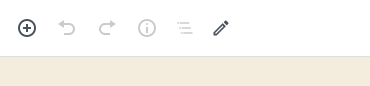
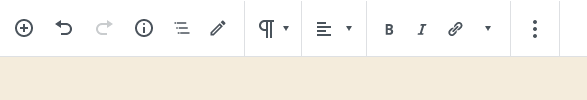
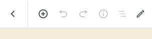
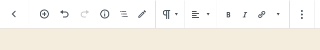
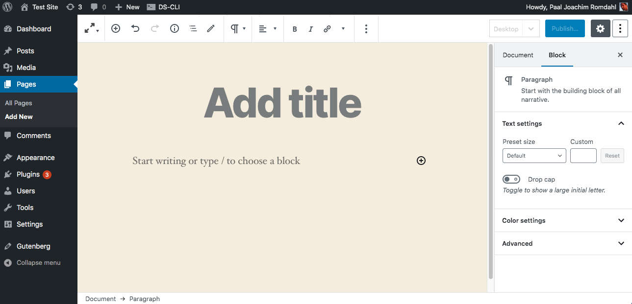
In Gutenberg there are various types of top toolbars. (More icons will over time also be added.)
Top toolbar
Top toolbar with block toolbar.
Top toolbar with exit to all pages/posts screen
Top toolbar with exit to all pages/posts + block toolbar
Switching out the icon and feature so one does not exit Gutenberg as if it was the customizer one could instead have an icon with a drop down to where one selects which screen mode to enter into. Perhaps something like this:
The reasoning behind the icon and the drop down is to give a signal to the user that is is very easy to cycle between various screen modes. There could be a visible icon for each mode. The top icon could then show the mode that is active.
One can Collapse menu in the WP menu sidebar. To almost remove the left WP menu.
One can go into the 3 dot drop down and select full screen mode. But that is hidden inside a drop down. Adding a screen cycle mode with an easy to access icon would make it easier for users to just quickly cycle through the modes to find their own perfect layout. It could also be incorporated into Full Site Editing.
 paaljoachim
All 4 comments
This is an outdated capture. Check out https://github.com/WordPress/gutenberg/issues/20579
 mtias
on 7 Mar 2020
mtias
on 7 Mar 2020
I think having a fullscreen icon, especially in that position, brings too much importance to switching between fullscreen and not. I believe most users will pick one and stick with it making this icon less important, and more of a setting that is adjusted once and left alone.
I'm glad you did the exploration because I had been kicking this around in my head as well.
There are definite improvements that need to happen with the "W", but with one click on the "W", I'm back to the list of my posts or pages. In this case, I'd have to click two times to get there.
Let's see how the "W" feels for a bit, @paaljoachim. If there's still problems arising, we can review this again. Cool?
 mapk
on 11 Mar 2020
mapk
on 11 Mar 2020
I am very hesitant in having to click the W to get back to all pages/all posts when in full screen mode. I am wondering what problem the W button is trying to solve.
But yeah. Let's try it out for a bit and see how we feel.
paaljoachim
on 11 Mar 2020
Alrighty, let's close this for now.
mapk
on 14 Apr 2020
Related issues
 ellatrix
·
3Comments
ellatrix
·
3Comments
 wpalchemist
·
3Comments
wpalchemist
·
3Comments
 franz-josef-kaiser
·
3Comments
franz-josef-kaiser
·
3Comments
 jasmussen
·
3Comments
jasmussen
·
3Comments
 youknowriad
·
3Comments
youknowriad
·
3Comments