Gutenberg: Design of 'Set featured image' button now strays from core
Describe the bug
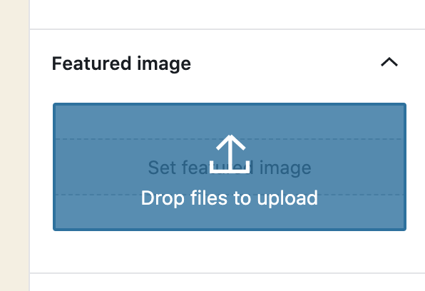
In WP 5.4RC1 I found the 'Set featured image' button to be a larger rectangle than in 5.3.2 which strays away from the design of other similar buttons in core such as the Background Image or Select Site Icon buttons.
To reproduce
Steps to reproduce the behavior:
- Install WP 5.4RC1
- Create a Post/Page
- Expand the Featured Image accordion
- See the larger 'Set featured image' button
Expected behavior
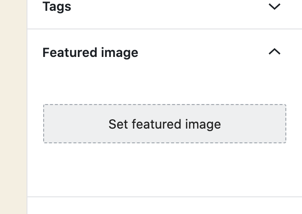
The button shouldn't have changed as it was previously matching the core design for such buttons.
Screenshots
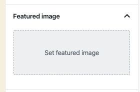
*New Size
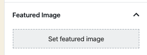
*Original Size
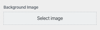
*Other WP Core button
Desktop (please complete the following information):
- Device: MacOS 10.15.3
- Browser: Chrome Version 80.0.3987.122
- Version: 5.4RC1
 garretthyder
All 7 comments
Hi @mapk, is the new bigger design of the button something expected or we should consider this size a bug (and fix it before 5.4 is released)?
 jorgefilipecosta
on 9 Mar 2020
jorgefilipecosta
on 9 Mar 2020
I believe this may be a bug. Dropping it back down to the smaller size sounds right.
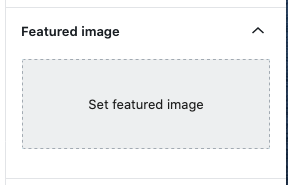
I currently see:
 mapk
on 14 Apr 2020
mapk
on 14 Apr 2020
Hi, @mapk. It looks like this button was given a 90px min height as part of #17486 to accommodate drag and drop for the featured image panel. While the user is dragging a file, the panel gets this overlay that is ~90px high:
Options
- Don't change anything; keep it as is with the tall button.
- Make the button smaller with whitespace above and/or below, maybe like this:
The drag and drop UI state will fill the whitespace; see my first screenshot just above.
- Make the button smaller without the whitespace, and expand the panel while the user is dragging and dropping. (I feel this is a bad option because having UI shifting mid-drag doesn't seem like a good idea.)
- Adjust the style of the dropzone component. This is probably not a good option because the component is used in so many places. We could apply custom styles only for the featured image panel, though.
Let me know what you think. Self-assigning this issue because I have a branch in progress.
 johnwatkins0
on 3 May 2020
johnwatkins0
on 3 May 2020
@johnwatkins0 I'd like both the button and the draggable area to match in size. If the reason it was made larger was for a larger draggable area (good investigation there BTW) than I'm fine leaving it at the larger size.
I'm really not sure where else in Core this sort of button exists. The block editor is core now, so it seems to have replaced itself?
mapk
on 5 May 2020
Agreed, thank you for the sleuthing @johnwatkins0, I'm also casual to close if the change was to improve the ability to get a file into the draggable area. And if that becomes a core standard we can look into other places within core where the image select button exists and update it to support drag-drop-upload. For example the Image Widget and the Customizer Background Image.
garretthyder
on 5 May 2020
👍 Sounds good. Unassigning myself as it sounds like no dev work is needed now.
johnwatkins0
on 5 May 2020
Let's close this out then, @mapk feel free to reopen if there's anything further to pursue. I'll take a look at instances in core and see if it makes sense to make them support the drag-drop stuff.
garretthyder
on 5 May 2020
Related issues
 hedgefield
·
3Comments
hedgefield
·
3Comments
 davidsword
·
3Comments
davidsword
·
3Comments
 maddisondesigns
·
3Comments
maddisondesigns
·
3Comments
 moorscode
·
3Comments
moorscode
·
3Comments
 jasmussen
·
3Comments
jasmussen
·
3Comments