Gutenberg: Standarize 'close' icon across the UI
Describe the bug
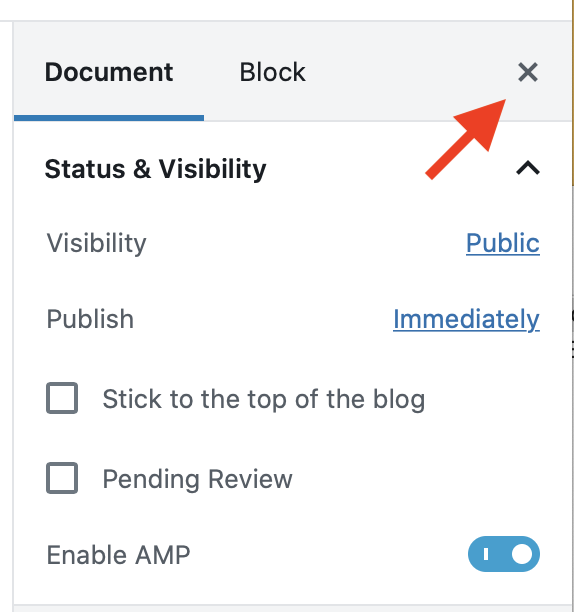
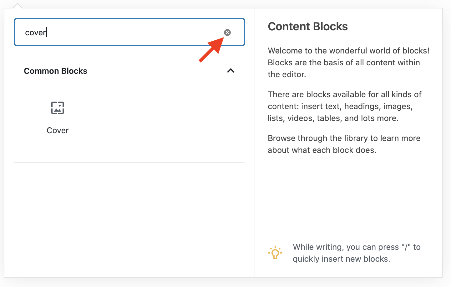
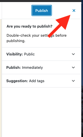
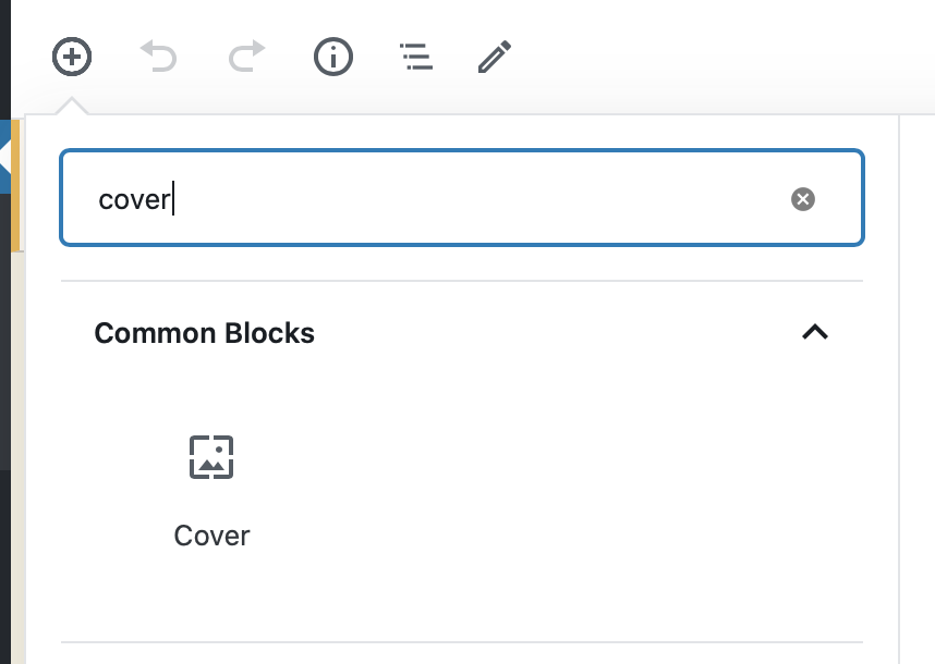
We are currently using different versions of the 'close' icon in different parts of the UI. It'd be best if we standarize to a single one.
Screenshots
 enriquesanchez
All 8 comments
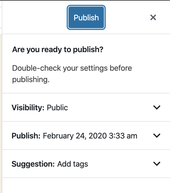
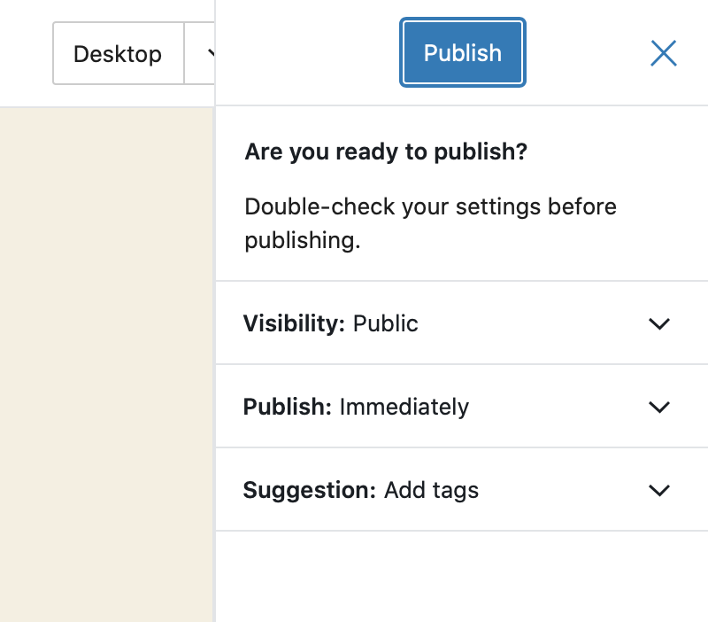
In today's Design triage in slack, we felt the different action of the input field icon was reason enough to keep it different from the other close X icons.
Next steps:
- Make the circle icon in the search input field larger so it's clear.
- Make the blue icon in the Publish slideout grey so that it matches the other icons.
 mapk
on 18 Feb 2020
mapk
on 18 Feb 2020
1. The circle icon is a native browser feature for <input type="search">. Every browser renders it a little different. Only Firefox is not showing this icon, but there is an issue in mozillas bugzilla.
There is a way to style this icon in webkit based browsers and IE , see: https://stackoverflow.com/a/20804207/1378097
Chrome

Safari
Firefox
2. I am not able to reproduce the blue icon:
 Soean
on 24 Feb 2020
Soean
on 24 Feb 2020
The circle icon is a native browser feature for . Every browser renders it a little different.
Thanks @Soean, I did not know this!
Given that the clear icon is a native browser element, I don't think we should attempt to style it differently then. What do y'all think? @mapk
I'm still able to reproduce the different colored hover state on the sidebar.
enriquesanchez
on 4 Mar 2020
How does this look now in light of G2 being merged? Can you take a look, @enriquesanchez?
mapk
on 6 Mar 2020
@mapk it's a little less noticeable now that we're using those new close icons, but the color difference is still there:
I did a little digging and I think I found the source of the problem:
in button/style.scss there's this:
&[aria-expanded="true"],
    &:hover {
        color: $theme-color;
    }
Looks like the close button on the publish panel has the "hover" style because of the aria-expanded attribute. Removing that "fixes" this difference in color, I'm however not sure about why that declaration is there in the first place, and the implications a change like this would have on other buttons.
@joen would you happen to know why we apply the hover style to buttons that have aria-expanded="true"?
enriquesanchez
on 7 Mar 2020
@jasmussen I meant to ping you on the above comment and instead pinged someone else.
enriquesanchez
on 11 Mar 2020
I'll take a look first thing tomorrow!
 jasmussen
on 11 Mar 2020
jasmussen
on 11 Mar 2020
Good detective work. The aria-expanded property is at fault, but the rule presence in the button is appropariate — the button SHOULD be blue when toggled/expanded.
The question is: why does the close button have an aria-expanded property set to true in the pre-publish dialog? The close button hasn't opened a menu. So that seems to be the thing to track down and remove.
jasmussen
on 12 Mar 2020
Related issues
 mhenrylucero
·
3Comments
mhenrylucero
·
3Comments
 youknowriad
·
3Comments
youknowriad
·
3Comments
 pfefferle
·
3Comments
pfefferle
·
3Comments
 maddisondesigns
·
3Comments
maddisondesigns
·
3Comments
 aaronjorbin
·
3Comments
aaronjorbin
·
3Comments
Most helpful comment
In today's Design triage in slack, we felt the different action of the input field icon was reason enough to keep it different from the other close
Xicons.Next steps: