Gutenberg: [Feature Request] Optionally don't expand "Most Used" accordion item
Is your feature request related to a problem? Please describe.
Not a problem, just a frustration.
In the block editor, when clicking to add a new block, the popup shows an accordion with the first item expanded ("Most Used"). It gets in the way - I almost always end up choosing something from another group. So it just adds friction... it's a small nuisance but I've stumbled over it a hundred times.
Describe the solution you'd like
An option to open the popup with all accordion items collapsed.
Describe alternatives you've considered
userscripts
 lonix1
All 10 comments
Same thing for the block editor (on the right hand side, after clicking a block). I it automatically opens the first accordion item.
lonix1
on 12 Dec 2019
Yes, the "Most Used" category is super annoying, I don't see any reason for it. The blocks in each category already appear to organize themselves based on the recently used.
I hide the Most Used category with CSS BUT then realized the search results show up in there. So I guess there really isn't a way for us to hide it.
 jeathree
on 4 Feb 2020
jeathree
on 4 Feb 2020
I'm in favor of making the "Most Used" group optional
 clarkewd
on 6 Feb 2020
clarkewd
on 6 Feb 2020
+1 for me too. I've also hidden the Most Used tab with css.
Also, I would like to raise a doubt about the mechanism of "show on top the most recent used blocks". I think this feature should be also considered to became an "optional" feature.
When a user search for a block the first time, he expect to find that block in the same position.
Changing the blocks order could give a feeling of confusion and impermanence.
Maybe someone could consider very useful to see the most recent used block on top of every category, but I don't think could be considered comfortable for all.
Why not make this feature optional.
 virgo79
on 28 Mar 2020
virgo79
on 28 Mar 2020
We added an option to disable this panel. This is solved now.
 youknowriad
on 2 Jul 2020
youknowriad
on 2 Jul 2020
@youknowriad Hey Riad, would you mind pointing out to the documentation page where this information is? I can't sem to find it 🤔 Thanks!
 brisa-pedronetto
on 29 Jul 2020
brisa-pedronetto
on 29 Jul 2020
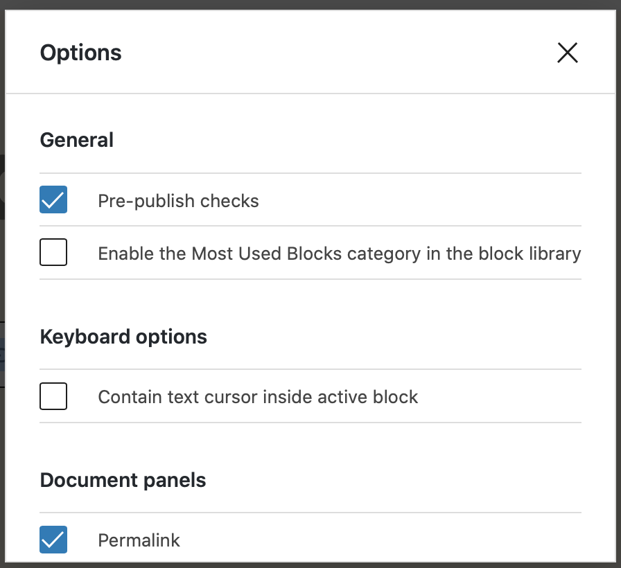
I'm not sure there's a documentation page about this but you can see the option here: (second checkbox of the options modal)
youknowriad
on 29 Jul 2020
Thanks for the answer! That's funny, I'm using Wordpress 5.4.2 this is what shows in the Options panel. Any ideas?
brisa-pedronetto
on 29 Jul 2020
@brisa-pedronetto yes, this is coming in WordPress 5.5 (next week). You can also install the Gutenberg plugin if you want to get features early but know that the Gutenberg plugin is considered as the "alpha" version of the next WordPress block editor.
youknowriad
on 29 Jul 2020
Super! Thanks again for your support 👍
brisa-pedronetto
on 29 Jul 2020
Related issues
 mhenrylucero
·
3Comments
mhenrylucero
·
3Comments
 BE-Webdesign
·
3Comments
BE-Webdesign
·
3Comments
 hedgefield
·
3Comments
hedgefield
·
3Comments
 cr101
·
3Comments
cr101
·
3Comments
 aduth
·
3Comments
aduth
·
3Comments
Most helpful comment
+1 for me too. I've also hidden the Most Used tab with css.
Also, I would like to raise a doubt about the mechanism of "show on top the most recent used blocks". I think this feature should be also considered to became an "optional" feature.
When a user search for a block the first time, he expect to find that block in the same position.
Changing the blocks order could give a feeling of confusion and impermanence.
Maybe someone could consider very useful to see the most recent used block on top of every category, but I don't think could be considered comfortable for all.
Why not make this feature optional.