Gutenberg: Alternative styles buttons: insufficient focus indication
Indication of focus can't rely on color alone. It needs an additional shape.
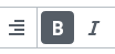
Noticed while testing #10128 and it applies to all the Styles "buttons" (actually, they're not real <button> elements).
To reproduce, use the keyboard and move through the Styles buttons. Examples from the Button component styles in #10128
Initial active style state: dark grey box-shadow
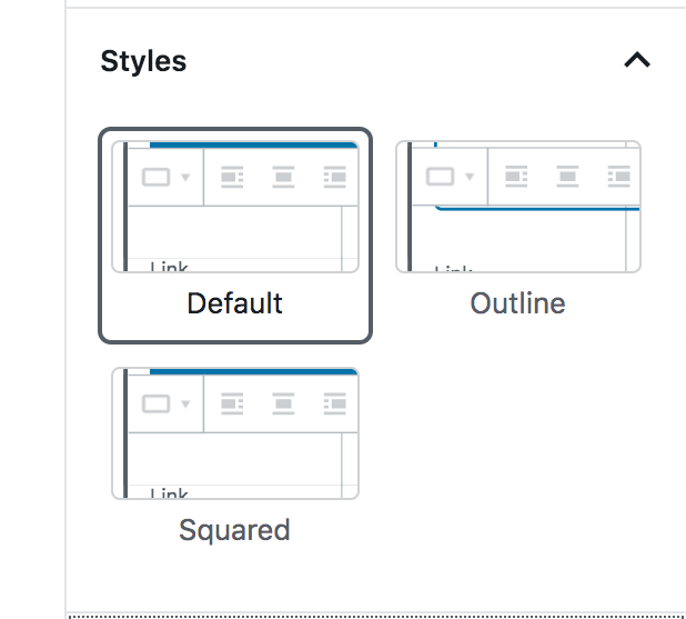
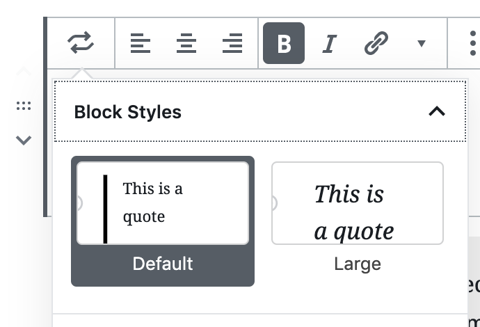
Focus on the active style: blue box-shadow: in absence of color, this can't be distinguished from the normal state:
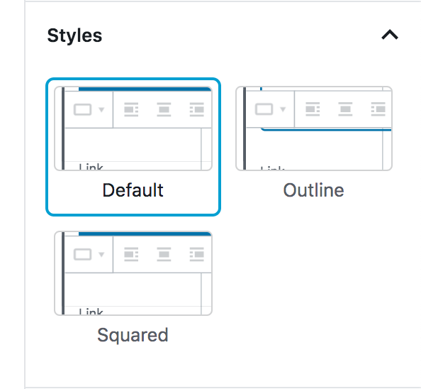
Move focus to the adjacent button: blue box-shadow: in absence of color, this can't be distinguished from the normal state:

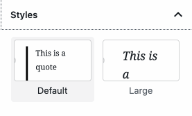
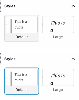
Same applies to Styles for other components, e.g. the Quote:

 afercia
All 14 comments
These buttons use our standard block library styles, so there's no precedent for an active/selected state, combined with a focus state.
A few possible options:
- Add a second blue border when the active style is focused:
_Located outside the box:_

_Or, located inside the box:_

- Implement a slightly thicker blue border on focus.
_3px focus border:_

_4px focus border:_

- Rather than alter the focus state, change the treatment of the active state:
My preference is number 3, so that we can continue using the same focus styles as the block library. For the "active" treatment there, I've adopted the usual hover state to indicate that the item is active, and implemented a slightly darker background on hover.
 kjellr
on 12 Jun 2019
kjellr
on 12 Jun 2019
I like 3 as well, but what if it also had a 1px grey border?
 melchoyce
on 12 Jun 2019
melchoyce
on 12 Jun 2019
I like number 3 too. It shows an active state similar to how icons show a background color when they are active in the block toolbar. Albeit they show a much darker background color, but it would probably be too much in this case.
 mapk
on 12 Jun 2019
mapk
on 12 Jun 2019
Thanks, I agree. I tired that out initially, but it felt very heavy in context:

I'll spin up a PR with the lighter gray focus state. 👍
kjellr
on 12 Jun 2019
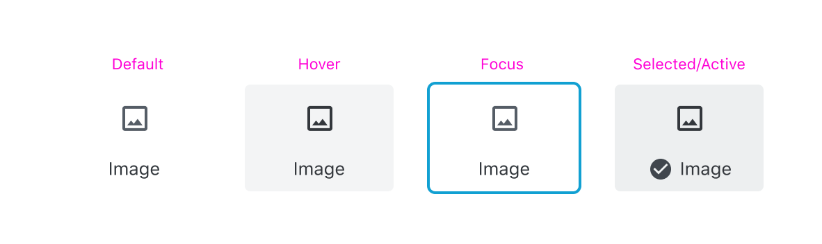
Another option for the selected state would be to have some sort of check mark indicator, like we do for the colors panel options:

Maybe something like this:
kjellr
on 12 Jun 2019
Before I actually bring this into a PR, I wanted to check out how this may end up looking from a component basis. Here's the current state, with today's styles:

As noted above, this doesn't work for us because when the focus ring is applied to a "selected" state, there's just a single color state to indicate focus, which isn't adequate for accessibility.
Here's a range of the possible options for the selected state:
Dark gray (mimics our "selected" state for iconButtons)

Blue

Light gray
Light gray with check:
kjellr
on 13 Jun 2019
Looking at all the options laid out like this, I think I have to reverse my previous opinion — I think the solid colors are most obviously selected.
melchoyce
on 13 Jun 2019
Yeah I agree. I'm leaning more towards the dark gray version than I was initially. The blue looks good visually, but I worry that it reads color-wise like a primary button, which isn't ideal.
kjellr
on 13 Jun 2019
That's a good point. I still find the grey really heavy, but maybe heavy is still preferable to subtle.
melchoyce
on 13 Jun 2019
Just a quick consideration: the new focus style for input fields and textareas use a thin "outline" for the normal state. On focus, the outline changes color _and_ gets thicker. That's OK, as the thickness change is perceivable also without colors. Just wondering it a similar pattern could be used for the selected / focus states discussed here.
afercia
on 13 Jun 2019
On focus, the outline changes color and gets thicker. That's OK, as the thickness change is perceivable also without colors. Just wondering it a similar pattern could be used for the selected / focus states discussed here.
Yeah — I didn't mock this up there but my thought was that we could adopt the outer ring style we use in the Button block for the focus states here:

This approach gets us a brand new outer border, which adds thickness and color to the focused item.
kjellr
on 13 Jun 2019
Hi guys,
I just wanted to throw in these 2 ideas I sketched at the contributor day.
I know they are not thought through yet, but wanted to manifest these ideas here :)
Var 01a
I wanted to show the idea of an overlapping checkmark to stand out more to emphasise the selected state.In this sketch it will touch the neighboured element, because of the small margin
so I had the Idea of Var 01b
Var 02
Or a complete different approach could be elevation levels (shadows) for hover, focus or selective state, which I think is also part of MD.

 manuelesposito
on 22 Jun 2019
manuelesposito
on 22 Jun 2019
Thanks for those additional thoughts, @espman! It's great to see the explorations with Material's elevation.
mapk
on 25 Jun 2019
I dove into this a bit more in the context of #16283, and I'm wondering if we're actually overthinking this a bit. Maybe the default + active borders just need to be inset, and the outside borders need to be outset:

This doubles up the borders on focus, but I think that feels totally fine.
kjellr
on 3 Jul 2019
Related issues
 jasmussen
·
3Comments
jasmussen
·
3Comments
 aduth
·
3Comments
aduth
·
3Comments
 maddisondesigns
·
3Comments
maddisondesigns
·
3Comments
 nylen
·
3Comments
nylen
·
3Comments
 youknowriad
·
3Comments
youknowriad
·
3Comments
Most helpful comment
Hi guys,
I just wanted to throw in these 2 ideas I sketched at the contributor day.
I know they are not thought through yet, but wanted to manifest these ideas here :)
Var 01a
I wanted to show the idea of an overlapping checkmark to stand out more to emphasise the selected state.In this sketch it will touch the neighboured element, because of the small margin
so I had the Idea of Var 01b
Var 02
Or a complete different approach could be elevation levels (shadows) for hover, focus or selective state, which I think is also part of MD.