Gutenberg: Issuu embed block is not responsive
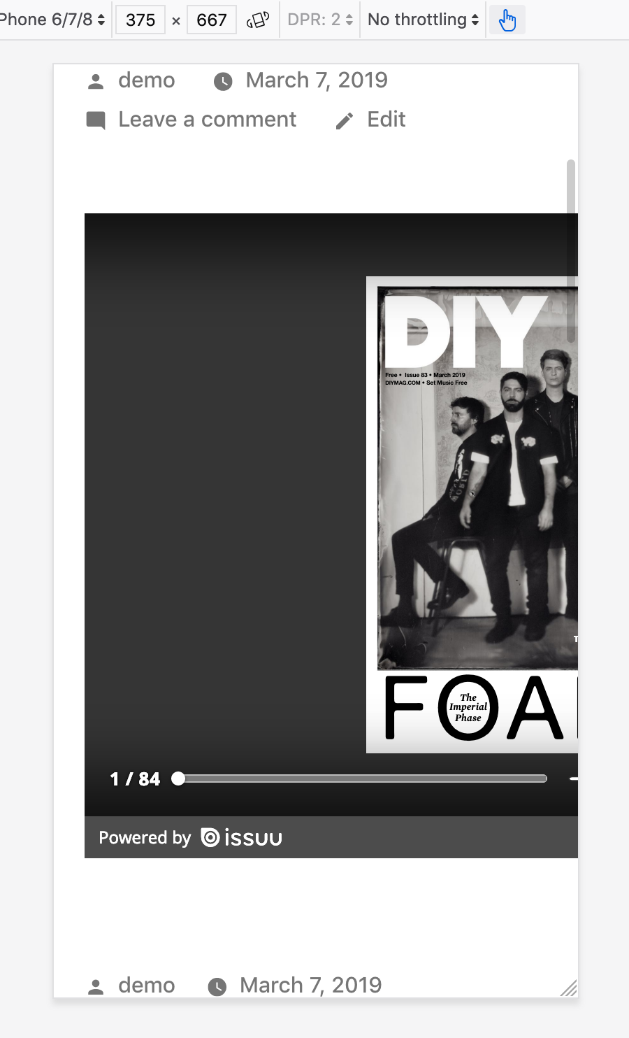
The Issuu embed block is not responsive on smaller screens. The embedded JS that comes from Issuu adds an inline width: 640px and height: 461px to the <iframe> container block regardless of the screen size. An easy solution is to add some CSS: .issuu-isrendered { max-width: 100%; }
To Reproduce
Steps to reproduce the behavior:
- Create a new post
- Add an Issuu embed block
- Add an Issuu URL to the embed field (eg: https://issuu.com/diymagazine/docs/diy_march_2019)
- Save page and then view on a mobile device/browser with responsive mode.
Screenshots
Additional context
- Bug affects any theme, but initially reported on Argent. I tested on Twenty Nineteen.
- Gutenberg in WP 5.1
 crunnells
All 4 comments
Thanks for opening this issue.
Unfortunately the styles and the content of the embeds is not controlled by WordPress, this issue is better raised directly to the oembed provider (issuu here).
 youknowriad
on 7 Mar 2019
youknowriad
on 7 Mar 2019
Although we're not able to control the style and content, we can definitely make the container responsive, which will also make the iFrame in it responsive:
.embed-issuu  {
  position: relative;
  max-width: 100%;
  height: 0;
  overflow: hidden;
  padding-bottom: 75%;
}

.embed-issuu .issuuembed {
  position: absolute;
  left: 0;
  top: 0;
  width: 100% !important;
  height: 100% !important;
}
 senff
on 5 May 2019
senff
on 5 May 2019
Additional report in 2352576-zd
 samiff
on 16 Sep 2019
samiff
on 16 Sep 2019
Hi
Same here.
WP 5.3.2
The embed has a style in the <div data-url="url_from-issuu" style="width:1200px;height:848px" class="issuuembed issuu-isrendered">
Change the style to style="width:100%;height:848px"makes it responsive
EDIT: Now issuu embed is only for payd users. See https://help.issuu.com/hc/en-us/articles/211809598-Embedding-Your-Own-Publication
"NOTE: The Embed feature is not available on our Basic plan. It is available only on our paid plans - Starter, Premium and Optimum. Users on Basic plan will not have the ability to create embeds·
 Lofesa
on 4 Feb 2020
Lofesa
on 4 Feb 2020
Related issues
 wpalchemist
·
3Comments
wpalchemist
·
3Comments
 davidsword
·
3Comments
davidsword
·
3Comments
 jasmussen
·
3Comments
jasmussen
·
3Comments
 pfefferle
·
3Comments
pfefferle
·
3Comments
 moorscode
·
3Comments
moorscode
·
3Comments
Most helpful comment
Although we're not able to control the style and content, we can definitely make the container responsive, which will also make the iFrame in it responsive: