Gutenberg: Increase the contrast of the selected block outline
Splitting this out from #11737
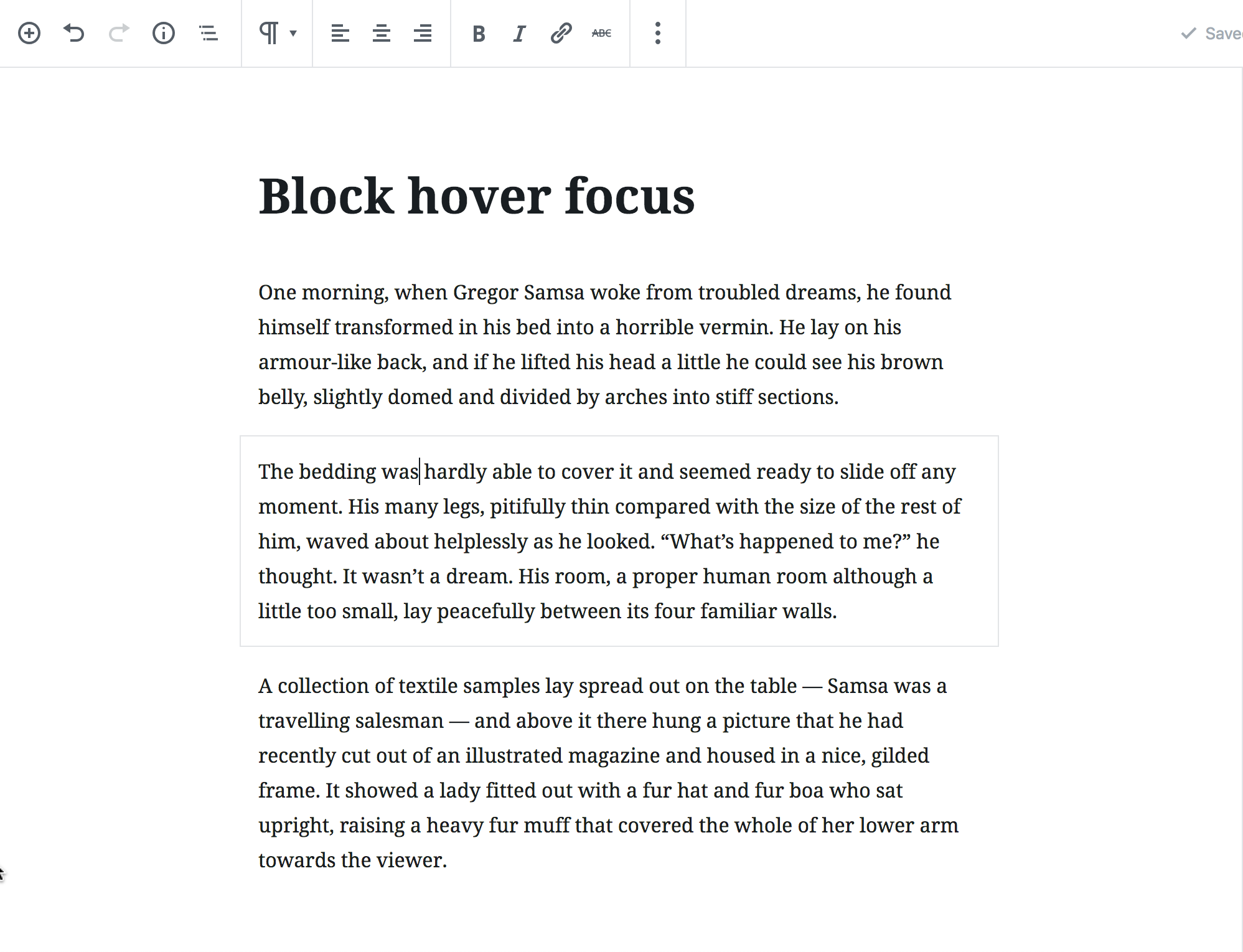
Indication of the active part in an UI is of fundamental importance for keyboard users and benefits all users. Usually this applied to the element that has focus. In Gutenberg it applies also to the "selected" block.
According to the WCAG 2.1, non-text contrast (which means contrast of UI components) must be at least 3:1. In https://github.com/WordPress/gutenberg/pull/11737#issuecomment-440004015 it was agreed the selected outline contrast can be increased slightly.
The current "selected" indication is a very light grey outline:
Among the current available greys in the color palette, #8d96a0 is the one to use for non-text contrast against a white background. However, this grey needs to be slightly adjusted. Just checked and, though it's a matter of roundings, the actual contrast ratio against white is 2.99:1 🙂 For formal compliance it must be 3:1.
 afercia
All 5 comments
Well, actually some tools report a 2.99 ratio, other tools 3.00:
3.00
https://jdlsn.com/color/?type=hex&color=8d96a0&color2=ffffff
2.99
https://contrast-ratio.com/#%238d96a0-on-%23ffffff
I'd suggest to slightly adjust it anyways, just in case.
afercia
on 20 Nov 2018
If the threshold is so small, makes sense to update it slightly to be squarely within it.
 mtias
on 30 Nov 2018
mtias
on 30 Nov 2018
Anyone able to pick a colour for us to use here?
 noisysocks
on 10 Dec 2018
noisysocks
on 10 Dec 2018
@afercia I think this might be a dupe I was working on it in this PR last week https://github.com/WordPress/gutenberg/pull/12478
 timwright12
on 10 Dec 2018
timwright12
on 10 Dec 2018
Oh yes this is a duplicate of https://github.com/WordPress/gutenberg/issues/12254 (or the other way around).
afercia
on 18 Jan 2019
Related issues
 ahmadawais
·
271Comments
ahmadawais
·
271Comments
 DeveloperWil
·
102Comments
mtias
·
83Comments
DeveloperWil
·
102Comments
mtias
·
83Comments
 maddisondesigns
·
79Comments
maddisondesigns
·
79Comments
 melchoyce
·
95Comments
melchoyce
·
95Comments
Most helpful comment
Well, actually some tools report a 2.99 ratio, other tools 3.00:
3.00
https://jdlsn.com/color/?type=hex&color=8d96a0&color2=ffffff
2.99
https://contrast-ratio.com/#%238d96a0-on-%23ffffff
I'd suggest to slightly adjust it anyways, just in case.