Gutenberg: Gallery Block using Gutenberg
Gallery shows up fine on my desktop, but once I view it on my iPad, only one row of Gallery images shows and covers up text that is at the top of the page. This image shows the one row out of three that is showing and it's covering my text:
I expect to see my text as well as the whole Gallery of images on my iPad.

iPad (please complete the following information):
- IOS - Ver 9.3.5
- Both Chrome and Safari
Additional context
The Gallery looks perfect on the desktop, it's only on the iPad that it doesn't. Thank you.
 AKLaura
All 14 comments
I'm seeing a related but slightly different issue on Safari 10.1 with Mac Sierra and Safari 9.1 with Mac El Capitan.
The one-column gallery has all images stacked one on top of the other and the gallery appears to be positioned halfway above the top of the page, overlapping all the content (including the header).
The issue can be viewed here : http://new.kasutan.odns.fr/portfolio/lapeyre-recrutement/
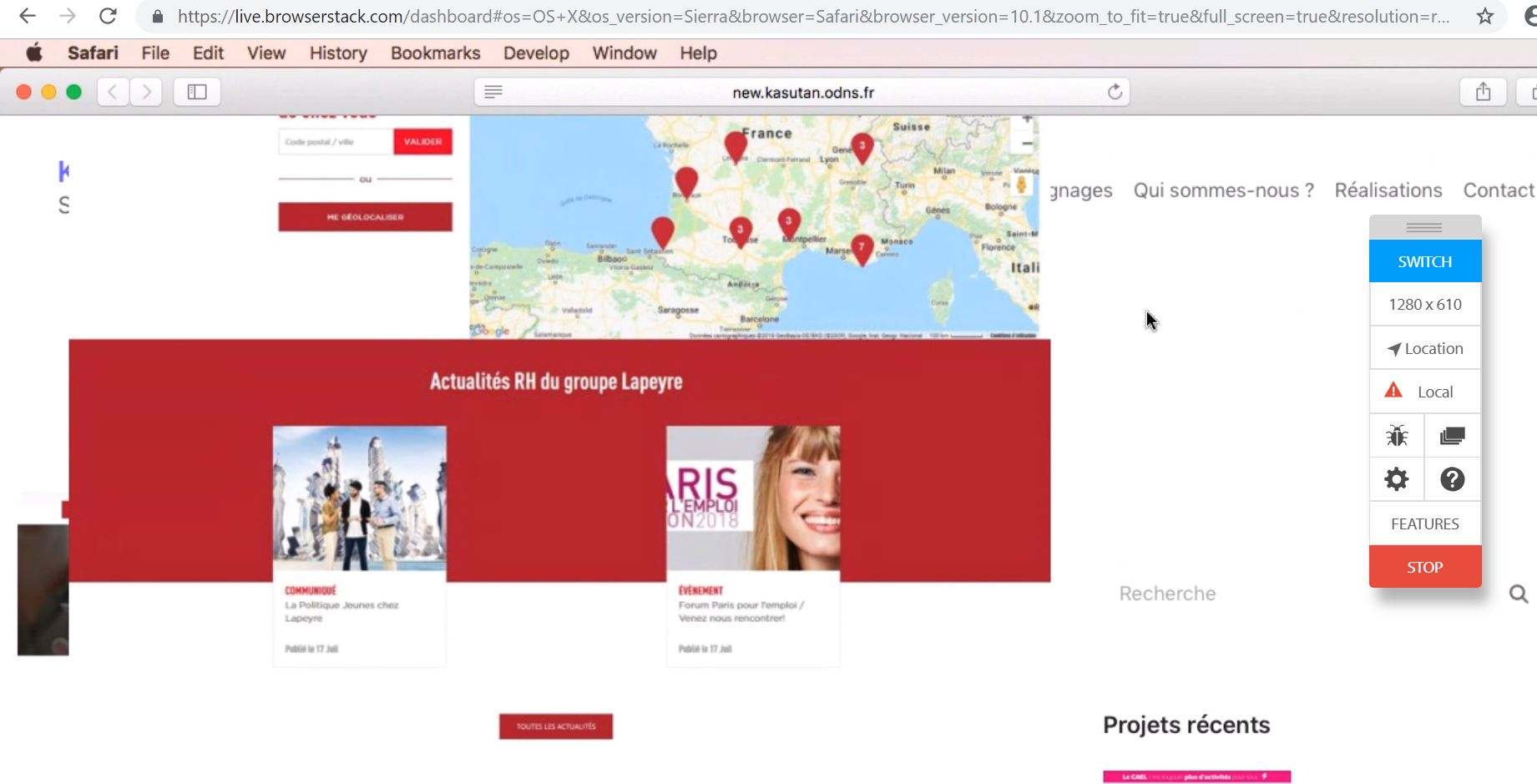
Using browserstack, I tested with several versions of Safari:
- Gallery works fine on Safari 11.1 with Mac High Sierra
- Bug on Safari 10.1 with Mac Sierra
- Bug on Safari 9.1 with Mac El Capitan
- Gallery positioned correctly on Safari 8 with Mac Yosemite but list-markers are shown
 Kasutan
on 27 Sep 2018
Kasutan
on 27 Sep 2018
I'm seeing the same issue as originally reported. Gutenberg Gallery on iPad is on top of the content above. In this example I have an h2 heading block that says This is a WordPress Gallery above the gallery. The gallery isn't showing all of the images
Looks fine in the chrome simulator and on desktop but not on the device
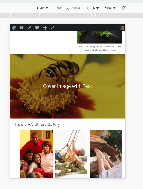
On iPad it is a mess both portrait and landscape

Tested on
- iPad iOS 10.3.3
- Safari
 ruthmaude
on 6 Dec 2018
ruthmaude
on 6 Dec 2018
A few people have tested ...
Works fine on iPhone 6 (iOS 12.1.1) but display is broken on iPhone 4 (iOS 9.3.5) and iPhone 5 (iOS 10.3.3)
One person checked on iOS 10.3.3. and it was broken they updated to 12.1.1. and it was fixed.
My iPhone and iPad are 10.3.3. Phone says my software is up to date, I'm not getting an option to update the software. This means I see all Gutenberg galleries as broken.
ruthmaude
on 10 Dec 2018
Pre-iOS 11 Flexbox bug due to absence of parent or child height property. Temporary fix for single column on mobile ( wrap in relevant media query):
.wp-block-gallery .blocks-gallery-image figure, .wp-block-gallery .blocks-gallery-item figure {
    height: auto;
}
 diggeddy
on 11 Dec 2018
diggeddy
on 11 Dec 2018
Thanks! I added that to my theme and it works. That could be added to all gutenberg themes.
Here's what I've used and it is working...
@media only screen
and (min-device-width : 320px)
and (max-device-width : 480px) {
.wp-block-gallery .blocks-gallery-image figure, .wp-block-gallery .blocks-gallery-item figure { height: auto; }
}
@media only screen
and (min-device-width : 768px)
and (max-device-width : 1024px)
and (-webkit-min-device-pixel-ratio: 2) {
.wp-block-gallery .blocks-gallery-image figure, .wp-block-gallery .blocks-gallery-item figure { height: auto; }
}
ruthmaude
on 11 Dec 2018
I am seeing a similar issue as well on an Ipad running iOS Safari.
All gallery images are pulled upward covering above text/images etc.
 paaljoachim
on 22 Jan 2019
paaljoachim
on 22 Jan 2019
also seeing this issue. waiting for the fix pls!
 overcatbe
on 10 Feb 2019
overcatbe
on 10 Feb 2019
Yep, broken layouts all over the shop with multi-column galleries on iPad model MD511B/A running 10.3.3. Any fixes planned?
 gruffvaughan
on 23 Feb 2019
gruffvaughan
on 23 Feb 2019
Also seeing this issue on Safari 10.1 (testing via BrowserStack).
The fix suggested by @diggeddy solved the issue for me, but created a new one in IE11 where the container wasn't collapsing to the height of the resized flexbox images, and so creating a load of whitespace under each image row. As per https://github.com/philipwalton/flexbugs/issues/75
Adding min-height: 1px; solves the IE issue. So in full:
.wp-block-gallery .blocks-gallery-image figure,
.wp-block-gallery .blocks-gallery-item figure {
    height: auto;
    min-height: 1px;
}
 hexagongirl
on 17 Apr 2019
hexagongirl
on 17 Apr 2019
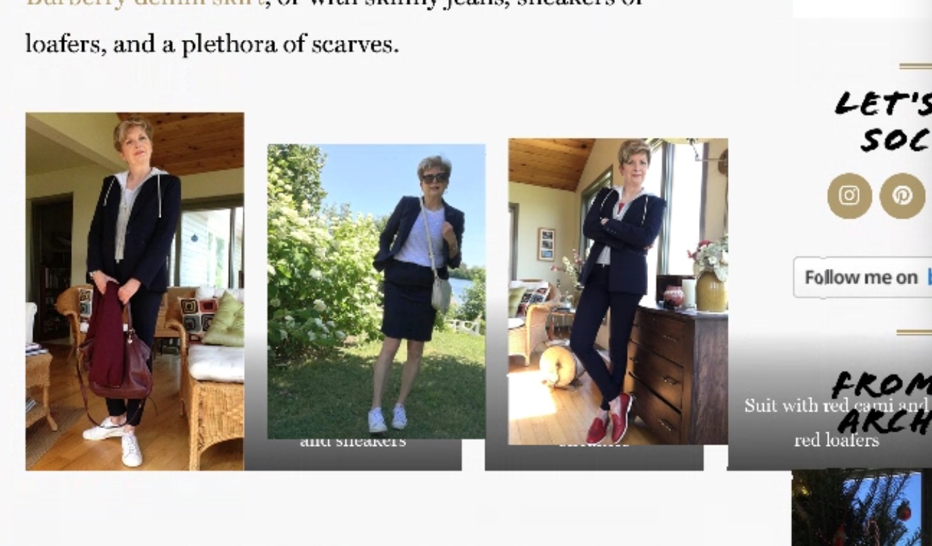
I'm also still seeing this issue on iPad Mini's running OS 9.3. The other issue (even with the fixes suggested by hexagongirl and ruthmaude are the captions aren't aligning with the photo. See the attachment below. The CSS fixes did fix the image overlapping the main body text, but now I can't seem to get captions to align properly and overlay on the photos. Any suggestions?
 brandonquinnsmith
on 17 May 2019
brandonquinnsmith
on 17 May 2019
Having the same issue on iPad using Safari.
The fix above helped align the images and this helped me with the captions
.wp-block-gallery figcaption,
.wp-block-image figcaption {
    left: 0;
    right: 0;
}
 Julix91
on 7 Jun 2019
Julix91
on 7 Jun 2019
Realised that my earlier fix prevents images being cropped to the same dimensions (at least on the custom theme I'm currently building - haven't tested on vanilla WP).
Using display: block; instead of the default display: flex; appears to be an alternative fix whilst maintaining cropping behaviour in newer browsers and keeping captions intact. Sure there must be a downside somewhere - let me know if you find it! I've tested on Chrome, FF, Edge, Safari 10.1 and IE11
.wp-block-gallery .blocks-gallery-item,
.wp-block-gallery .blocks-gallery-image {
    display: block;
}
re: Pre-iOS 11 Flexbox bug due to absence of parent or child height property
Found this solution/explanation very useful:
https://stackoverflow.com/questions/33636796/chrome-safari-not-filling-100-height-of-flex-parent
HTH
 BigFig001
on 23 Sep 2019
BigFig001
on 23 Sep 2019
Closing this as it's no longer an issue since iOS 11, and we support the latest 2 versions of iOS/Safari. Feel free to reopen if it occurs again on the latest versions.
 tellthemachines
on 23 Apr 2020
tellthemachines
on 23 Apr 2020
Related issues
 moorscode
·
3Comments
moorscode
·
3Comments
 cr101
·
3Comments
cr101
·
3Comments
 wpalchemist
·
3Comments
wpalchemist
·
3Comments
 franz-josef-kaiser
·
3Comments
franz-josef-kaiser
·
3Comments
 aduth
·
3Comments
aduth
·
3Comments